

Create Realtime Marketing Dashboards in D365
source link: https://meganvwalker.com/create-realtime-marketing-dashboards-in-d365/
Go to the source link to view the article. You can view the picture content, updated content and better typesetting reading experience. If the link is broken, please click the button below to view the snapshot at that time.

Create Realtime Marketing Dashboards In Dynamics 365
*** NOTE: ALL INFORMATION IS ACCURATE AT DATE OF PUBLISHING ***
Want to know how to create Realtime Marketing Dashboards in D365? Before we begin, this isn’t new functionality… but it’s taking advantage of age old CRM views, charts and dashboards and creating some overviews that may be helpful for marketers and managers to get an understanding of some of the records being used in D365 Marketing (Customer Insights Journeys). For those of you who are old school, you likely know this already, but this post is for anyone a little newer to Dynamics 365, and maybe those who have only ever used the Marketing App. Enjoy!
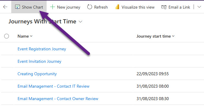
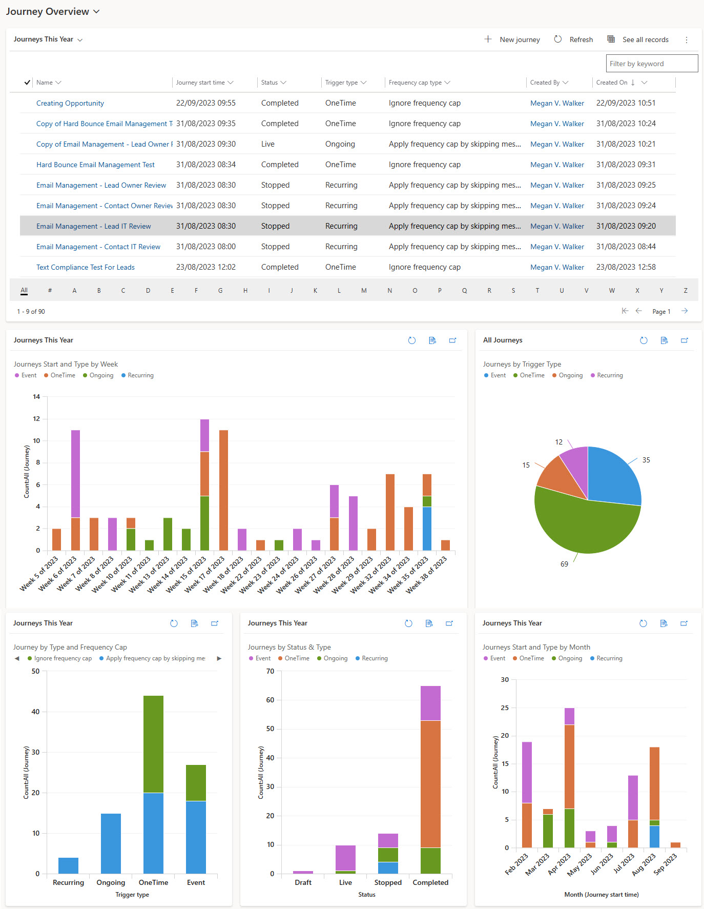
Before you begin, know that you can only create views, charts and dashboards to from data that exists directly in D365 which means this is not an approach to take to show you things like email clicks or opens. For that, we still need to wait for this item to be released to use Power BI reports to be written from that data. For all record types, you have views where you can see a list of records based on filtering and columns being displayed. There is also a Show Chart button at the top of the view.
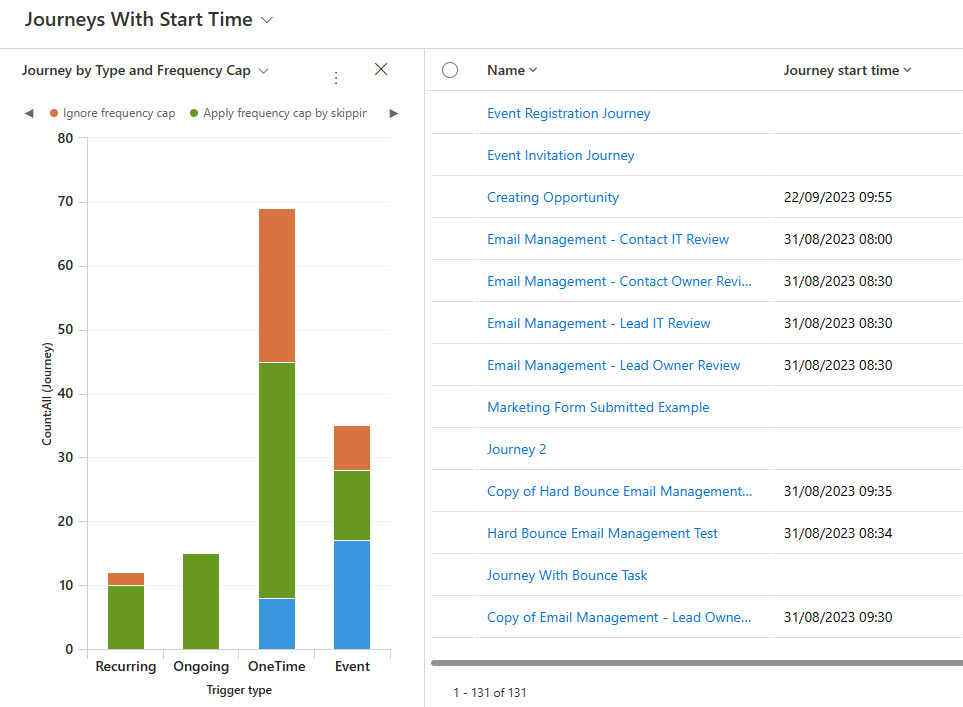
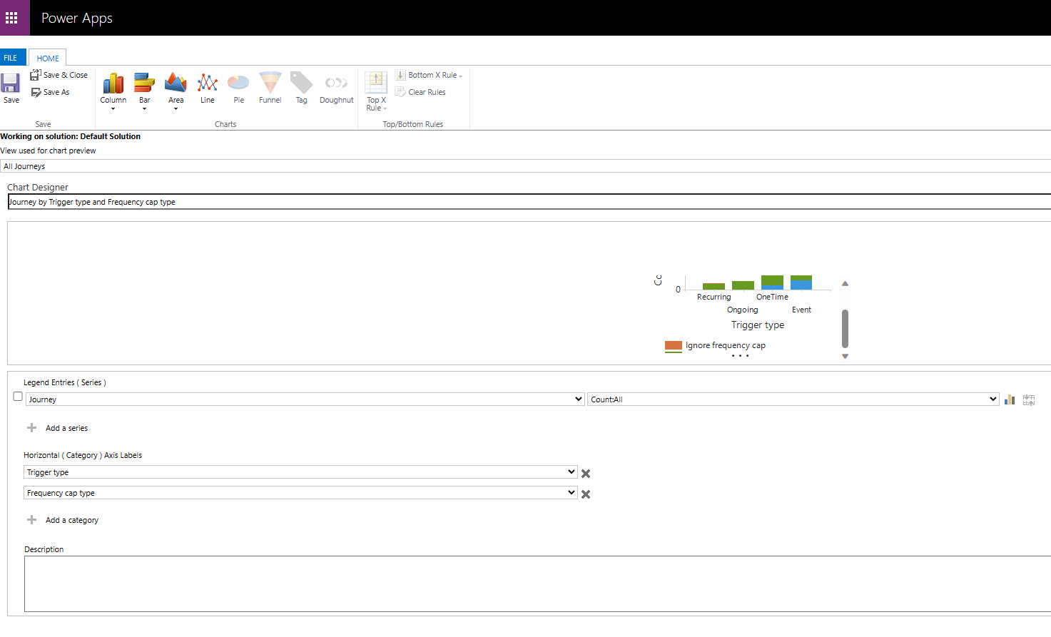
After clicking the Show Chart button, for any of the marketing tables (entities) there aren’t any charts out of the box. However, once charts are created, you can then get an overview of the data in a bar chart, pie chart and other graph options. Here we can see journeys by type and if frequency cap is turned on or being ignored for journeys.
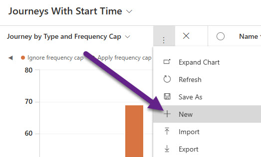
You can create your own personal charts from the three dots in the chart area, then select New. That’s great if you want to create them for yourself, but can also share those with others in your team to help them out.
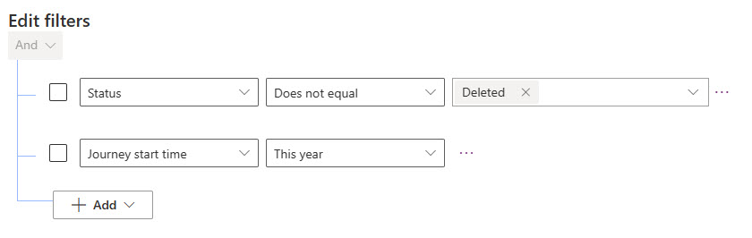
Let’s look at two options for creating a dashboard, one as a system dashboard, and the other as a personal dashboard you can share with others. For system, best practice is to start with a solution and add in your components. This post is not going to give you that level of knowledge, and if you are not sure you should probably get a little training first to understand how to make custom changes. From your solution, add in the tables you want to create charts for. Currently at the time of this post going out, the Email and Email Template tables don’t have the option to add new Charts to them, but we can for Journeys, Triggers and Forms. Start by creating any new views you want to use that might need to be different to the out of the box ones. For example, I have one for Journeys that start this year using just two filters.
Once you have all of your views created, then create a new form. The user interface is still the original old version so feels a little clunky. Pick the view to use at the top, but note this is for preview only, not the final view you might want to use to show data in your dashboard charts. Give the chart a logical name. In this example, the Legend Entries (series) is going to be to count all Journeys. Then I am going to have a stacked bar chart showing the trigger type for the journeys split up by frequency cap type. Save and close the chart.
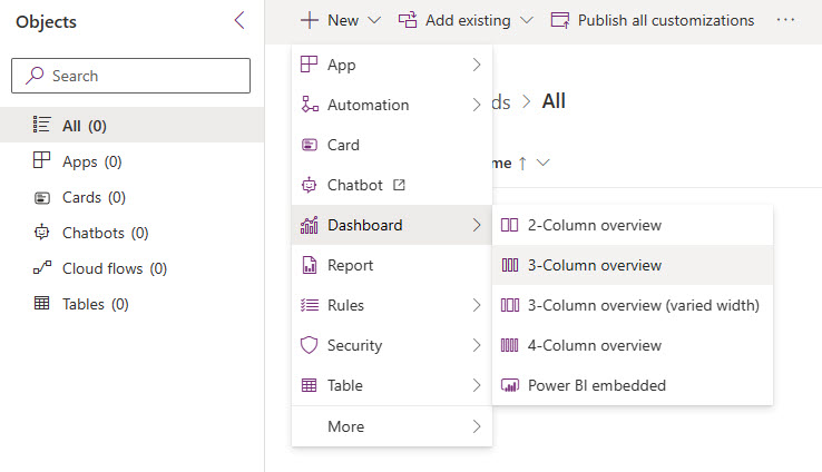
I’ll put the information I used for each of my example charts at the end of the post. Continue on and finish adding all the charts you want to include on your system dashboard. From your solution, select to add a new dashboard and pick the format. I usually go with the 3-column overview and then adjust the layout as I wish.
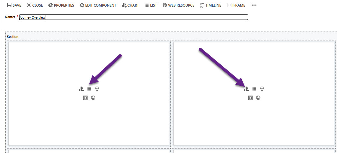
A new tab will open. Give your dashboard a name, then we can get started adding components. There are two options we will use here, the view option and the chart option.
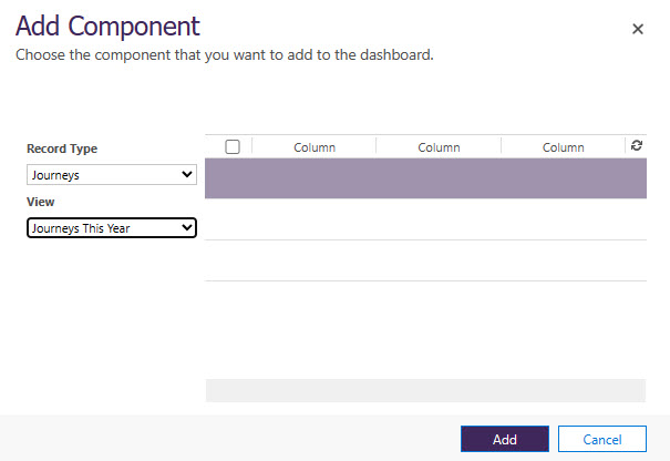
After adding the view option, pick the related record type, then pick from your list of views. Click Add.
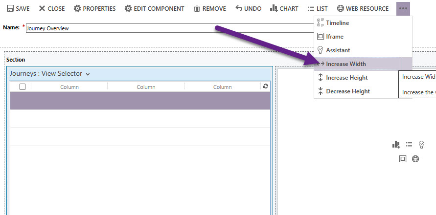
You can now increase the width of that component if you wish. Select the component you just added, then click the three dots at the top and click on increase width to force it to take up more space on your dashboard. For my view, I did this twice to make it the full width. Note that there is no view preview and you won’t see records until you are viewing the completed dashboard in D365.
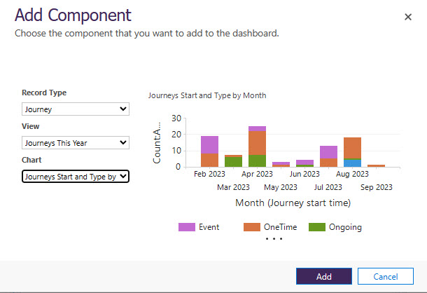
Adding a chart component is similar, but after picking the view, you then pick a chart to add. You can see chart previews while editing the dashboard.
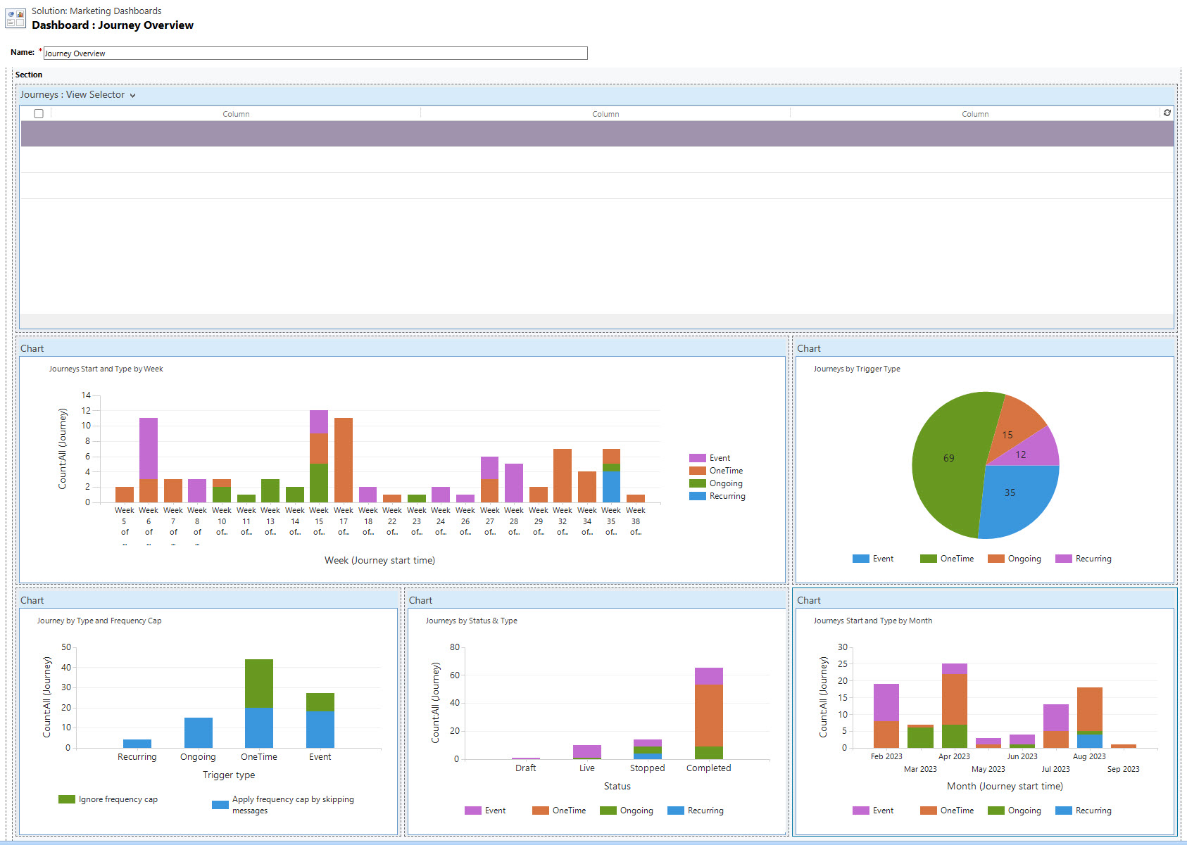
After adding all of your components and resizing and moving them around, you can save and close the dashboard.
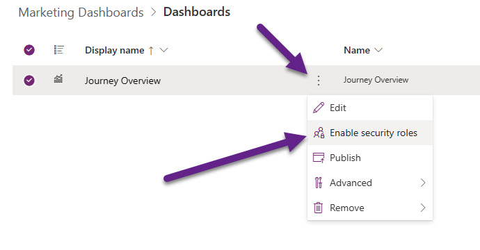
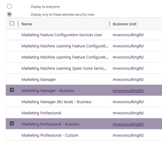
From your solution, click the three dots on the dashboard name and then pick enable security roles.
By default, the dashboard will be displayed to everyone. We can deselect the roles and then pick just the marketing roles (or any custom ones you might have) to determine which users would get to see it. After you’ve made this change, go back to the dashboard in your solution, click the three dots then click Publish.
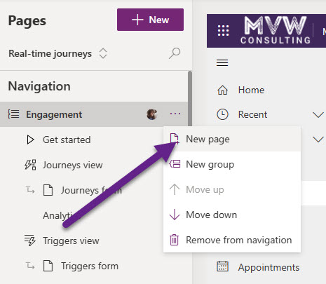
Dashboards don’t exist in Real-time Marketing, so it’s a good idea to add to the app. Add the model-driven app for Marketing to your solution. It will either be called Marketing or Customer Insights – Journeys. Go to the Real-time Journeys section then click New page under the Engagement section.
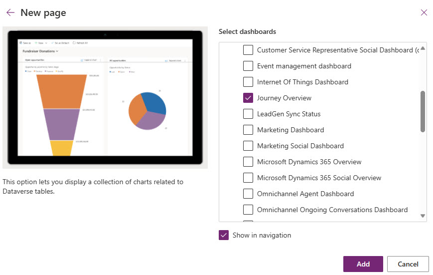
Walk through the screens and pick to add a Dashboard, then select the new one you created. Make sure the Show in navigation option is selected, then click Add.
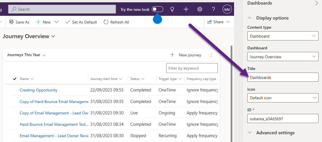
Once it’s added, click where you added it to the navigation. You might want to move it up or down the menu, then change the title so that it shows Dashboards instead of the name of your new dashboard. Now save and Publish the app.
You might need to refresh the app a few times to see it, but all users that have one of the security roles you linked the dashboard to should now see it and be able to access from the Realtime Marketing menu.
So that is a System Dashboard, with System Views and System Charts. There is nothing stopping you from creating a Personal Dashboard with a mixture of Personal and System Views and Charts. You just need to make sure you share anything you create for yourself and NOT view a solution. For example, I mentioned that you can’t create system charts for Emails or Email Templates but you might want to add this information to a dashboard. Navigate to Emails, then click the Show Chart button from the top. Then from the three dots, click New.
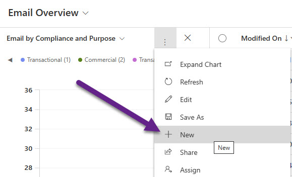
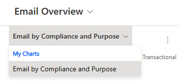
The exact same screen will open for you to create a new Chart so you can pick the type and include the fields you want to use in your pie or bar chart. Once you’ve added it, it will show in a My Charts section in the drop down rather than in System Charts.
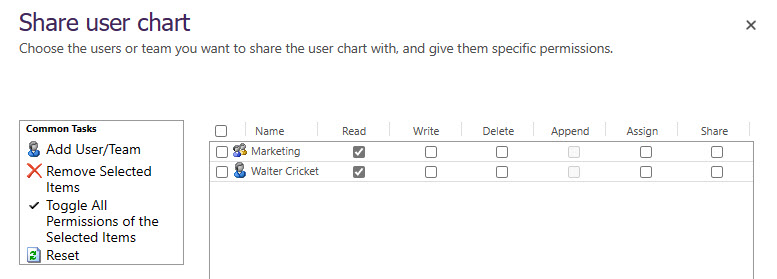
If you want others to see this chart, click on the three dots to get to the menu and then click on Share.
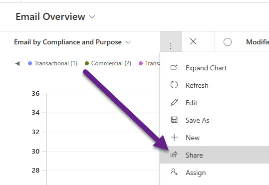
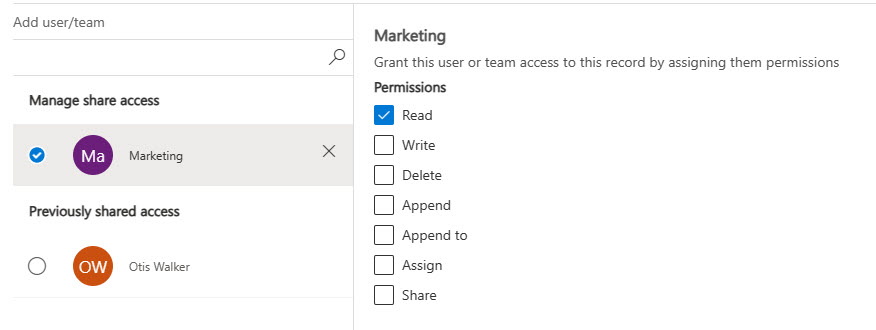
You can then add users and or teams to determine who has Read access. In the scenario below, Walter Cricket has been given access as a user, and anyone who has been added to the Marketing Team in D365 will also have access. Read access is all that is required for them to be able to see it, and Write access would give them access to change the chart so use that permission with caution!
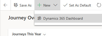
If you want to create a personal dashboard, go back to the Dashboards section in the Marketing app, then click on New > Dynamics 365 Dashboard.
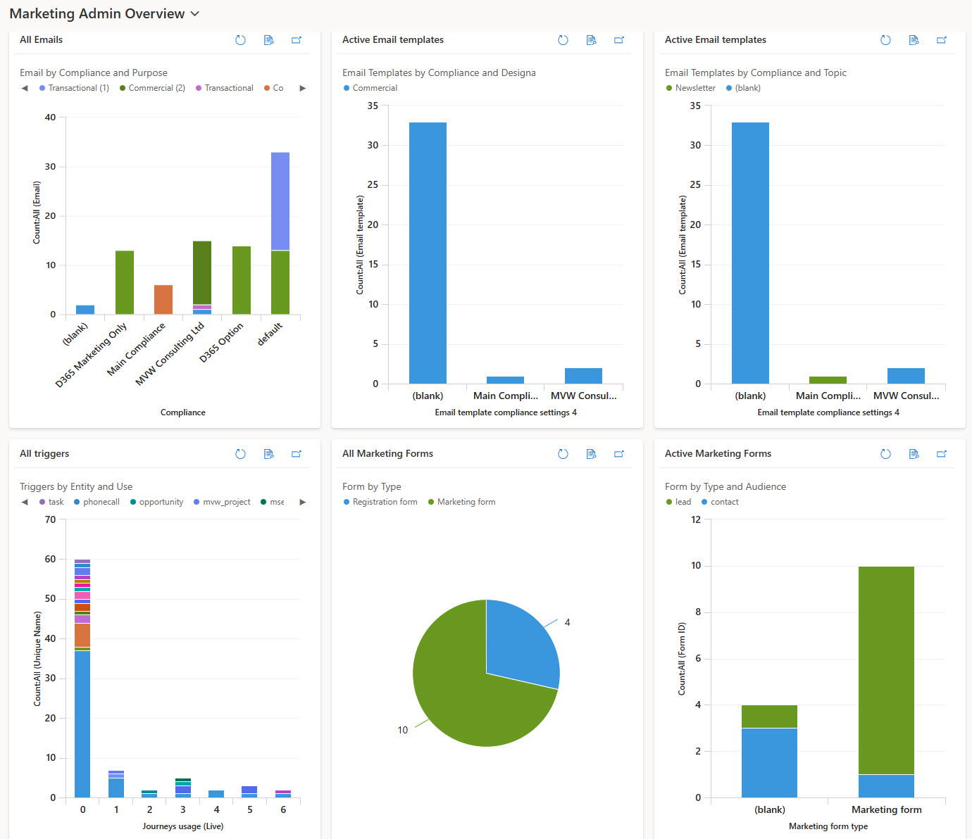
Now you can use a mixture of System and Personal Views and Charts to create your own Dashboard. The example blow has a combination of charts showing information on Emails, Email Templates, Triggers and Forms.
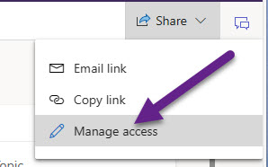
Finally, if you wish to share your personal dashboard, click on Share from the top right of the screen, then Manage access.
Similar to sharing the charts, search for a user or team that you wisht to share the Dashboard with, then click on the result that comes up.
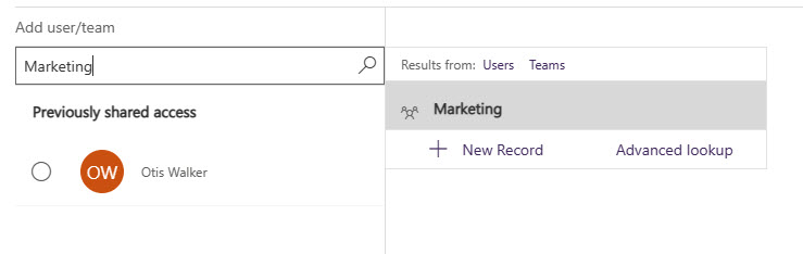
Then click on the new user or team you added and make sure they have Read permissions.
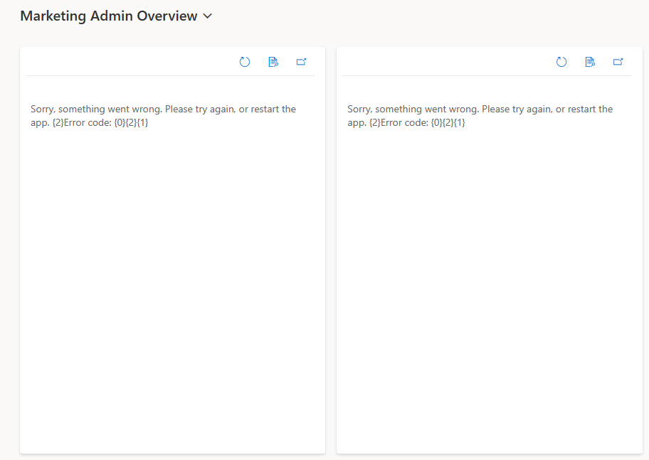
If you shared the Dashboard but forgot to share any of the personal charts, the other users will see errors where the charts should be.
That’s it for the post, but if you want to know what I did for each of the charts, read on below:
Journey Charts – System or Personal
- Journey by Type and Frequency Cap
- Legend Entries Series – Journey – Count All
- Horizontal Axis 1 – Trigger type
- Horizontal Axis 2 – Frequency cap type
- Chart type – Stacked Column
- Journeys by Status & Type
- Legend Entries Series – Journey – Count All
- Horizontal Axis 1 – Status
- Horizontal Axis 2 – Trigger type
- Chart type – Stacked Column
- Journeys by Trigger Type
- Legend Entries Series – Journey – Count All
- Horizontal Axis 1 – Trigger type
- Chart type – Pie
- Journeys Start and Type by Month
- Legend Entries Series – Journey – Count All
- Horizontal Axis 1 – Journey start time – Month
- Horizontal Axis 2 – Trigger type
- Chart type – Stacked Column
- Journeys Start and Type by Week
- Legend Entries Series – Journey – Count All
- Horizontal Axis 1 – Journey start time – Month
- Horizontal Axis 2 – Trigger type
- Chart type – Stacked Column
Trigger Chart – System or Personal
- Triggers by Entity and Use
- Legend Entries Series – Unique Name – Count All
- Horizontal Axis 1 – Journeys usage (Live)
- Horizontal Axis 2 – Source Entity Logical Name
- Chart type – Stacked Bar
Form Charts – System or Personal
- Form by Type
- Legend Entries Series – Form ID – Count All
- Horizontal Axis 1 -Marketing form type
- Chart type – Pie
- Form by Type and Audience
- Legend Entries Series – Form ID – Count All
- Horizontal Axis 1 -Marketing form type
- Horizontal Axis 2 – Audience
- Chart type – Stacked Bar
Email Chart – Personal Only (ATM)
- Email by Compliance and Purpose
- Legend Entries Series – Email – Count All
- Horizontal Axis 1 -Compliance
- Horizontal Axis 2 – Purpose
- Chart type – Stacked Bar
Email Template Charts – Personal Only (ATM)
- Email Templates by Compliance and Designation
- Legend Entries Series – Email template – Count All
- Horizontal Axis 1 -Email template compliance settings 4
- Horizontal Axis 2 – Message designation
- Chart type – Stacked Bar
- Email Templates by Compliance and Topic
- Legend Entries Series – Email template – Count All
- Horizontal Axis 1 – Email template compliance settings 4
- Horizontal Axis 2 – Email template topic
- Chart type – Stacked Bar
Check out the latest post:
Customising Your Compliance Profile Preference Centres
Recommend
-
16
H2O Wave Realtime Web Apps and...
-
8
Tracking D365 Marketing Form Submissions in Google Analytics 2021-12-14 Categories: Dy...
-
9
Managing Email Bounces In D365 Marketing 2021-12-17 Categories: Dynamics Marketing...
-
3
D365 Marketing Chat With Amey Holden – Discussing Marketing Features from Wave 1 2022 2022-01-31 Categories:
-
10
Adding & Using Dynamics Pre-defined Tokens In D365 Marketing 2022-03-14 Categories: Dynamics Marketing I'm aski...
-
7
Update D365 Marketing To The Latest Version 2022-05-25 Categories: Dynamics Marketing ...
-
8
Contact Timeline Adjustments And D365 Marketing Interactions 2022-06-28 Categories: Dynamics Marketing
-
3
Microsoft Teams Chat Collaboration In D365 Marketing 2022-07-04 Categories:
-
12
D365 Marketing Chat With Amey Holden – Discussing Marketing Features from Wave 2 2022 2022-07-17 Categories:
-
6
Create Smarter Forms In D365 Marketing To Capture More Data 2023-01-24 Categories:
About Joyk
Aggregate valuable and interesting links.
Joyk means Joy of geeK