
5

antd 的 InputNumber 输入框添加左右的加减按钮
source link: https://www.xiabingbao.com/post/react/antd-inputnumber-up-down-s2oi8p.html
Go to the source link to view the article. You can view the picture content, updated content and better typesetting reading experience. If the link is broken, please click the button below to view the snapshot at that time.
我们来封装一个有左右切换按钮的数字输入框
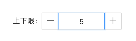
antd 现在提供的 <InputNumber /> 组件只能点击输入内的上下键来修改数值,不过我希望得到下图中的组件:
我们这里来封装下。封装时要注意的几点:
能全部接收
<InputNumber />所有的参数;当数字达到上下限时,需将按钮置灰;
隐藏
<InputNumber />本身内置的上下切换键;点击左右按钮时,能实时调整数值;
1. 接收内置的所有参数
我们可以直接使用 antd 中内置的类型来扩展我们组件的类型:
import type { InputNumberProps } from "antd";

interface NumUpDownProps extends InputNumberProps {
  className?: string;
}

const NumberUpDown = (props: NumUpDownProps) => {};

export default NumberUpDown;
我们在原类型的基础上又扩展了出了自己的字段。
2. 数字达到上下限时,将按钮置灰
假如设置了输入框中数字的上下限,我们就得需要判断当前数值是否达到了下限或者上限,若达到了,则将其中一侧的按钮置灰。
import React, { useMemo } from "react";

const NumberUpDown = (props: NumUpDownProps) => {
  const { minDisabled, maxDisabled } = useMemo(() => {
    const min = props.min ?? Number.MIN_SAFE_INTEGER;
    const max = props.max ?? Number.MAX_SAFE_INTEGER;

    const minDisabled =
      typeof props.value === "number" ? props.value <= min : false;
    const maxDisabled =
      typeof props.value === "number" ? props.value >= max : false;

    return { minDisabled, maxDisabled };
  }, [props.value, props.min, props.max]);
};
若没有设置上下限,我们就认为是无限大和无限小,方便我们统一地判断。
3. 隐藏组件内置的上下切换键
<InputNumber />的属性中,没有可以隐藏上下切换键的属性,我们可以从 CSS 层面,将其隐藏。
.ant-input-number {
  border-top: none;
  border-bottom: none;
  border-radius: 0;

  .ant-input-number-input {
    padding: 0;
    text-align: center;
    height: 32px;
  }
  .ant-input-number-handler-wrap {
    display: none;
  }
}上面代码中的display: none就是用来隐藏切换键的。
4. 点击左右按钮,可实时调整数值
按钮的行为只有两种:增加或者减少。
若没有初始值,则默认是 1;
若没有默认的调整步数 step,则默认是 1;
const handleClick = (type: "plus" | "minus") => {
  const value = Number(props?.value || 0);
  const step = Number(props?.step || 1);
  const newValue = type === "plus" ? value + step : value - step;

  props?.onChange?.(newValue);
};
将调整后的值回传回去。
整体来说,这个组件的封装并不是很难。在表单中调用时:
<Form.Item name="num" label="上下限">
  <NumberUpDown min={1} max={5} />
</Form.Item>
现将完整的代码公布一下。
5.1 React 代码
import { Button, InputNumber } from "antd";
import type { InputNumberProps } from "antd";
import { MinusOutlined, PlusOutlined } from "@ant-design/icons";
import classNames from "classnames";
import React, { useMemo } from "react";
import "./number-up-down.less";

interface NumUpDownProps extends InputNumberProps {
  className?: string;
}

const NumberUpDown = (props: NumUpDownProps) => {
  const { minDisabled, maxDisabled } = useMemo(() => {
    const min = props.min ?? Number.MIN_SAFE_INTEGER;
    const max = props.max ?? Number.MAX_SAFE_INTEGER;

    const minDisabled = typeof props.value === "number" ? props.value <= min : false;
    const maxDisabled = typeof props.value === "number" ? props.value >= max : false;

    return { minDisabled, maxDisabled };
  }, [props.value, props.min, props.max]);

  const handleClick = (type: "plus" | "minus") => {
    const value = Number(props?.value || 0);
    const step = Number(props?.step || 1);
    const newValue = type === "plus" ? value + step : value - step;

    props?.onChange?.(newValue);
  };

  return (
    <div className={classNames("number-up-down-field", props.className)}>
      <Button
        className="change-btn"
        icon={<MinusOutlined />}
        type="text"
        disabled={minDisabled}
        onClick={() => handleClick("minus")}
      ></Button>
      <InputNumber {...props} />
      <Button
        className="change-btn"
        icon={<PlusOutlined />}
        type="text"
        disabled={maxDisabled}
        onClick={() => handleClick("plus")}
      ></Button>
    </div>
  );
};
export default NumberUpDown;
5.2 样式代码
.number-up-down-field {
  display: flex;
  align-items: center;
  border: 1px solid #d9d9d9;
  border-radius: 2px;
  background-color: #ffffff;

  .change-btn {
    border-radius: 0;
  }
  .ant-input-number {
    border-top: none;
    border-bottom: none;
    border-radius: 0;

    .ant-input-number-input {
      padding: 0;
      text-align: center;
      height: 32px;
    }
    .ant-input-number-handler-wrap {
      display: none;
    }
  }
}Recommend
About Joyk
Aggregate valuable and interesting links.
Joyk means Joy of geeK