

The UX of delivering parcels
source link: https://builtformars.com/case-studies/ux-of-parcels?ref=sidebar
Go to the source link to view the article. You can view the picture content, updated content and better typesetting reading experience. If the link is broken, please click the button below to view the snapshot at that time.

The UX of delivering parcels
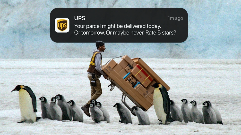
I shipped identical boxes, less than a mile, with 6 different delivery companies.
One was seized by the police—oh, to be a fly on the wall when they opened it.
Shipping and logistics companies aren't just moving goods, they play a key role in the general user experience of eCommerce.
84% of shoppers claim that they'd stop buying items from a retailer after just one poor delivery experience ¹.
And in a separate study, 94% of consumers said that they would actually blame the retailer directly, for any problems ².
That relationship, between retailer, courier and customer, is what makes this industry—where most providers sell essentially identical services—a great example to study.
What we'll cover:
- Why pricing transparency is key
- 5 ideas to make your forms easier to use
- Why we all seek reassurance post-purchase
- The role of communication in UX
- Plus many more UX tips and ideas
Buckle up, the user experience of booking and shipping parcels is probably worse than you realise.
1. Obscure pricing
Let's set the scene with some context.
These are the 6 companies I selected, and how much it cost to ship each of my parcels:
Cost of shipping my 1kg parcel, 0.4 miles
Cost of 1-day delivery, with drop-off
It's not just the disparity in pricing that's surprising—even getting a quote is awkward.
For example, look at this from FedEx:
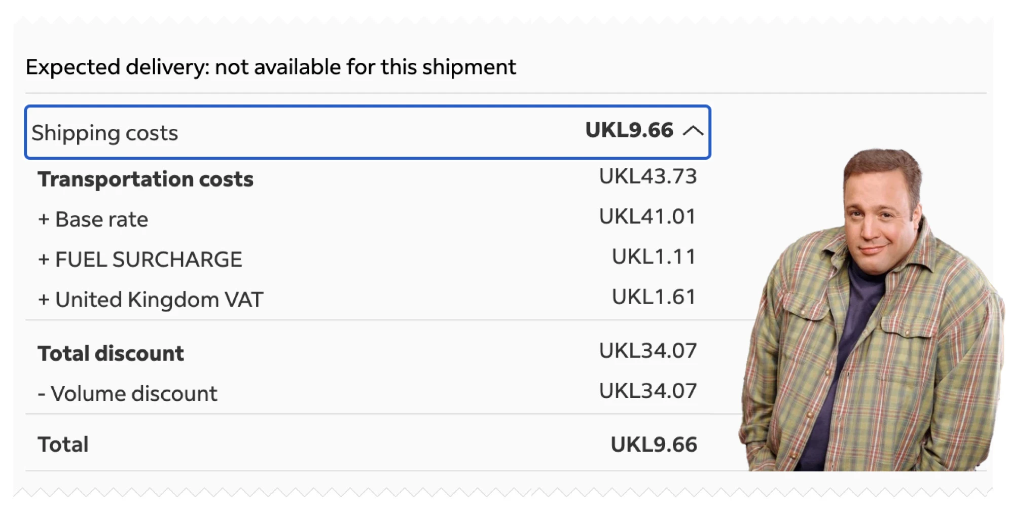
I'm sending a single parcel. How have I been given a volume discount?
Similar to the competition for international payments, as the courier industry becomes more commodotised, price is a key differentiator between providers.
To reel you in, some of the couriers have a separate tool, allowing you to get a price before going through the hassle of completing all of the forms.
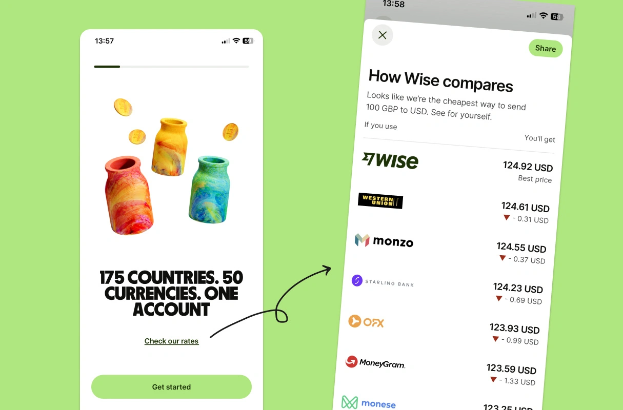
This kind of price transparency is similar in concept to what Wise does (very effectively).
Wise are so transparent with their prices, that they'll link directly to a fee calculator on their splash page (i.e., before you've made any commitment to use the app).
But in most instances it's been executed without finesse.
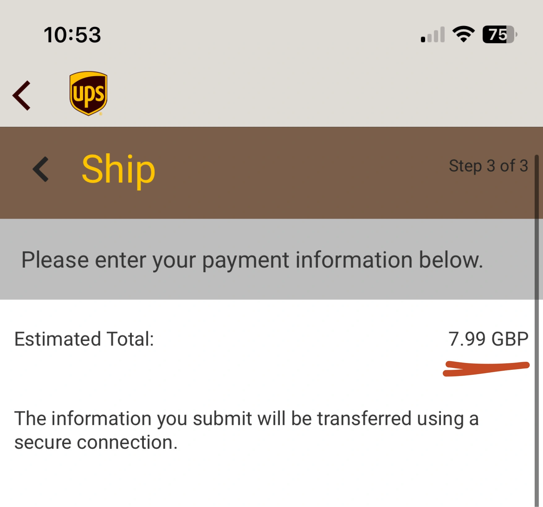
Here are 3 UPS screenshots for identical deliveries, taken within 5 minutes of each other. All with different prices—one is even 10x more expensive.
The quote
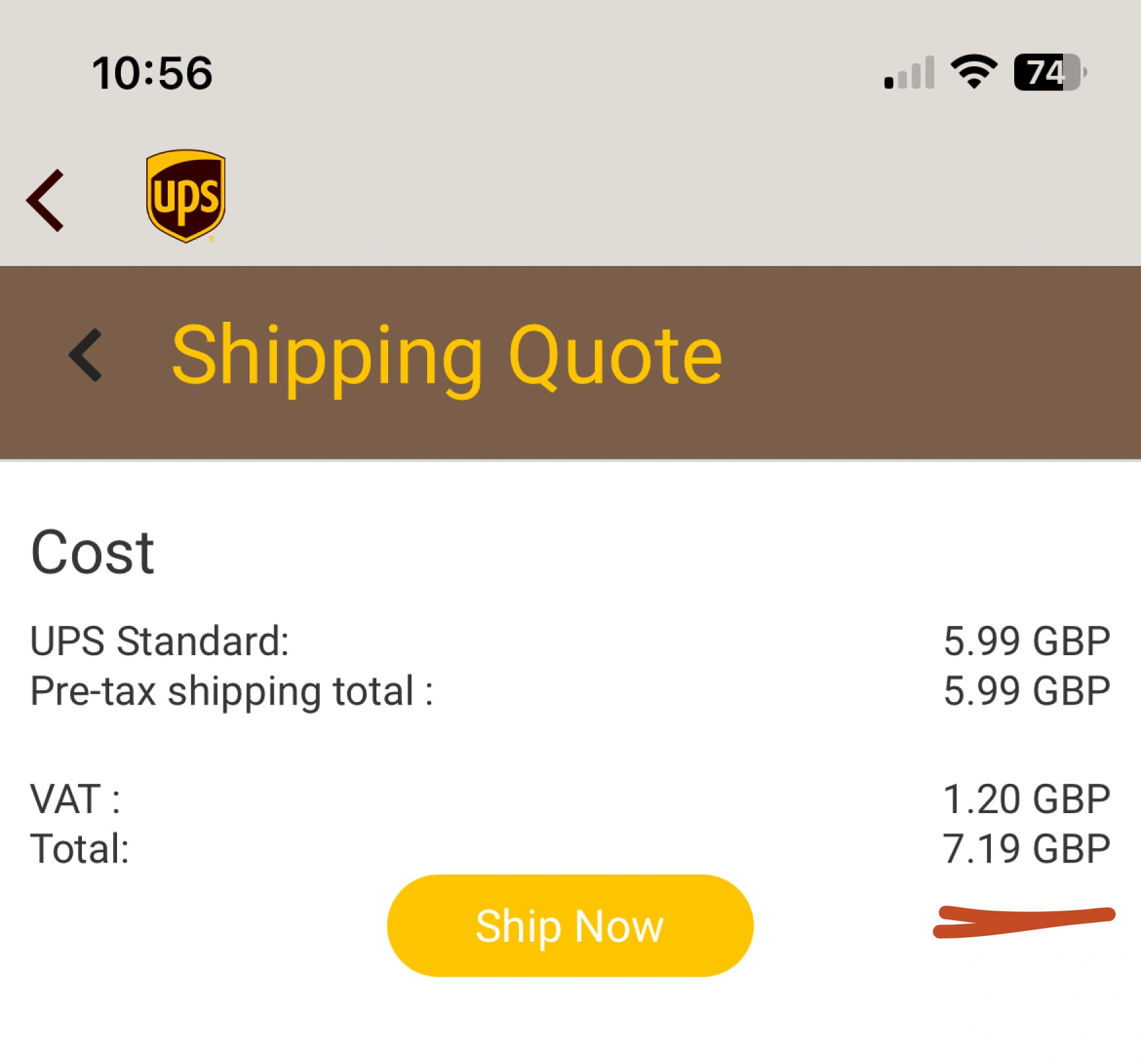
Price #1
Price #2
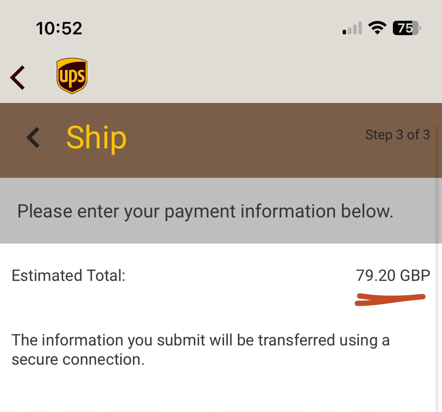
If I can simply refresh a results page, and get shown a materially different price, how can I trust that I'm ever getting a good deal?
2. Inefficient booking flows
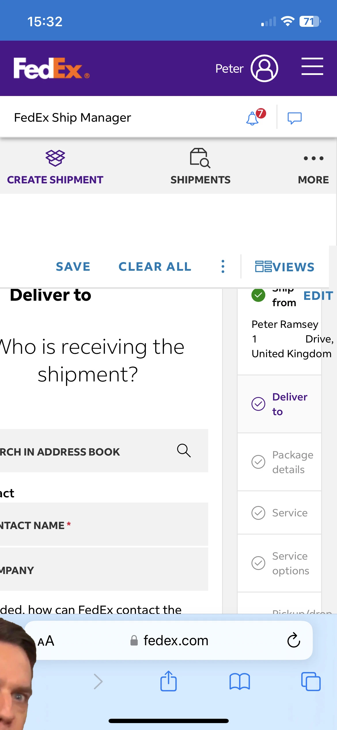
FedEx's set-up process was so convoluted, that after calling customer services 3 times, and more than 200 clicks, I stopped counting and gave up.
On the final call, the app was outright not working. I listened as the guy audibly gave up, let out a sigh, and suggested "maybe just go on fedex.com".
It'd amaze me if small retailers were happy, or even able to, use the interface that I had access to.
But across the board, there's so much low-hanging fruit.
These companies use almost none of the common techniques to reduce effort throughout a form.
5 techniques to improve your form design:
Auto-focus on first field
When the page loads, don't force the user to click into the first field.
Select the right field data types
So that the operating system brings up the most suitable keyboard (e.g., numerical).
Auto-proceed on suitable fields
If you're asking for a 6-digit code, auto-proceed once they've entered the 6th digit.
Suggest sensible default options
For example, if the sender's address is in the UK, default to a UK phone number.
Utilise keyboard 'next' buttons
So it focuses on the next field, rather than just close the keyboard.
As a result, the amount of waste and inefficiency in these flows is truly mind-blowing.
Clicks to create account & send parcel
Clicks
For comparison, this is in some cases, 4x more clicks than it takes to open a real bank account.
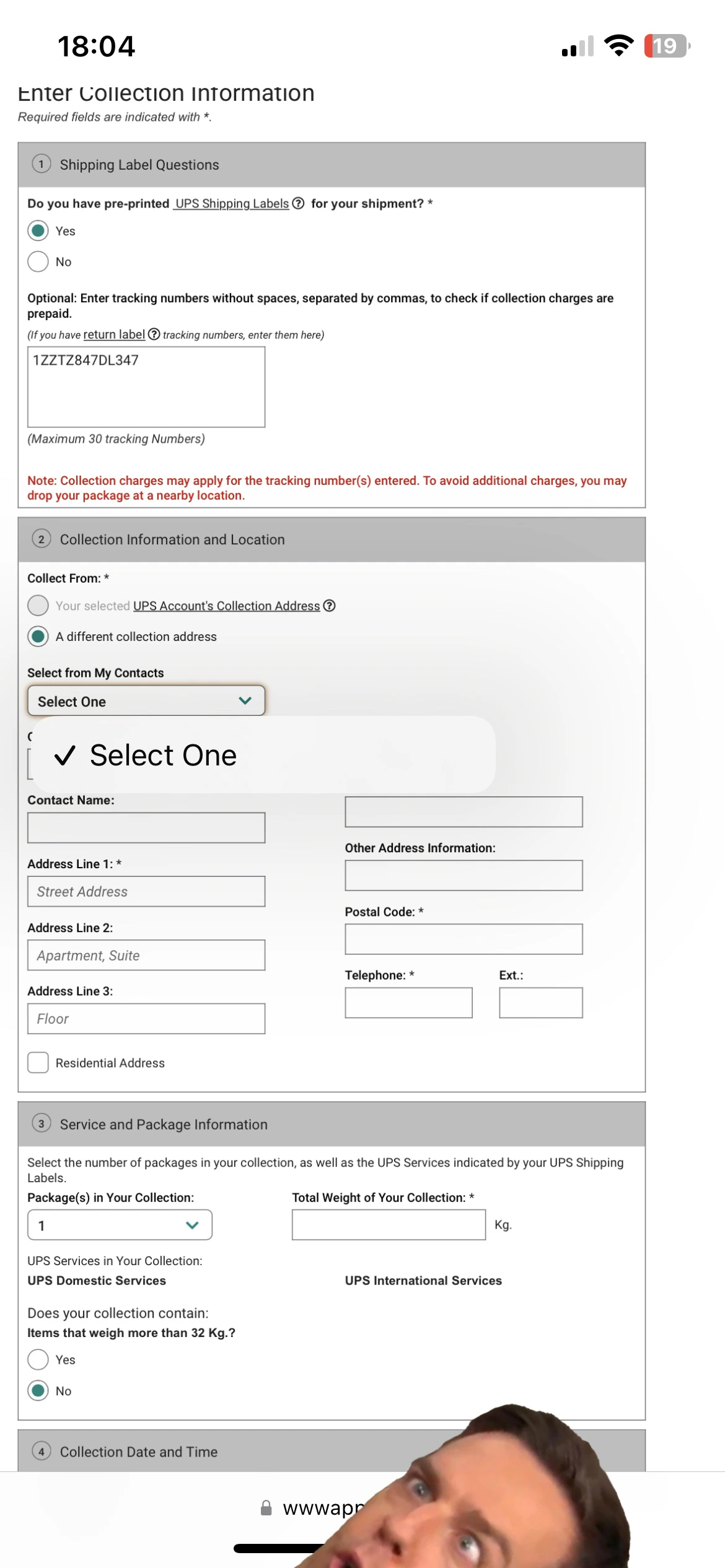
Even worse, most haven't built the functionality to actually let you book a delivery using the app.
FedEx
Parcelforce
Instead you get palmed off onto a non-responsive website, which is clearly designed for desktop use only.
It's why there are no slides for this study—I'd enjoy making the memes, but it'd be an incoherent mess.
FedEx
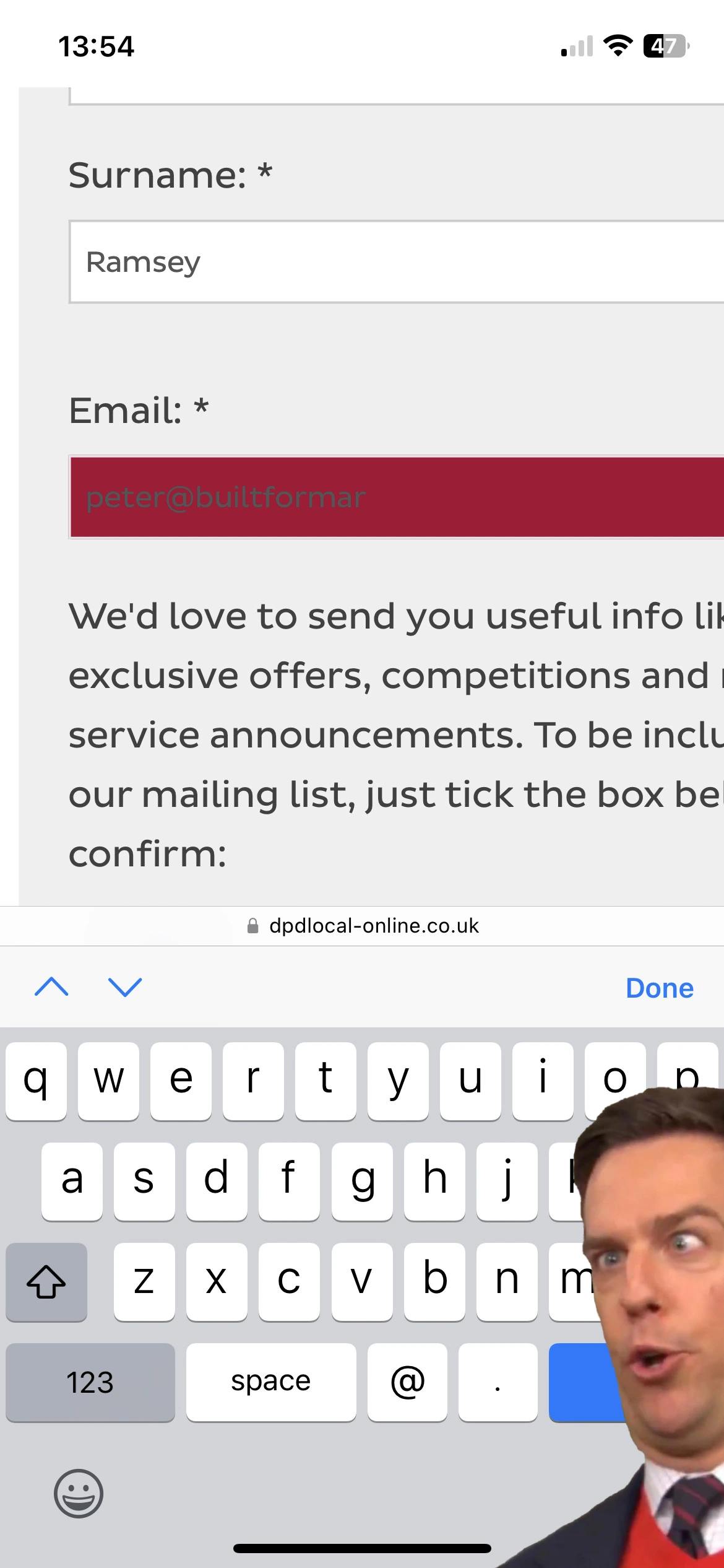
Optimising your form design (i.e., booking flows, purchases and sign-up), can be one of the most impactful ways to improve conversion rates.
And it's usually just a case of listening to and implementing the basic design principles—not an improvement through innovation or new features.
3. Reassurance seeking
Imagine if after booking an Airbnb, you couldn't immediately see that reservation in your account.
I've observed that moment of anxiety across many services and industries. It's an instinctive desire to seek reassurance.
Importantly, this can be true even if you've already seen an "action complete" status at the end of the booking form.
The distinction is that for a purchase without an immediate reward, your task remains incomplete. You still need to drop the parcel off, or wait for it to be collected.
Once the temporary status is off-screen, you crave a place to store the details, and track the progression of that incomplete task.
What I'm describing is a second-order benefit of the tracking number.
This is why it's damaging when the tracking number you've just been given errors, or shows confusing statuses.
Parcelforce
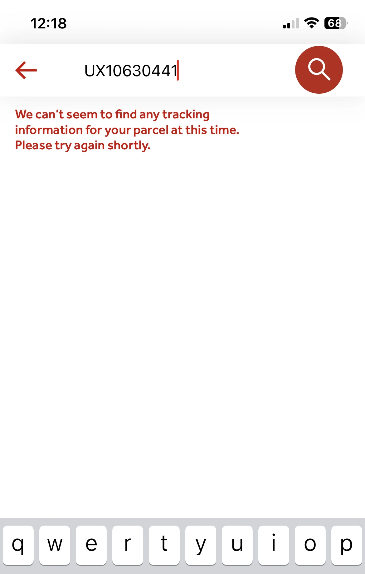
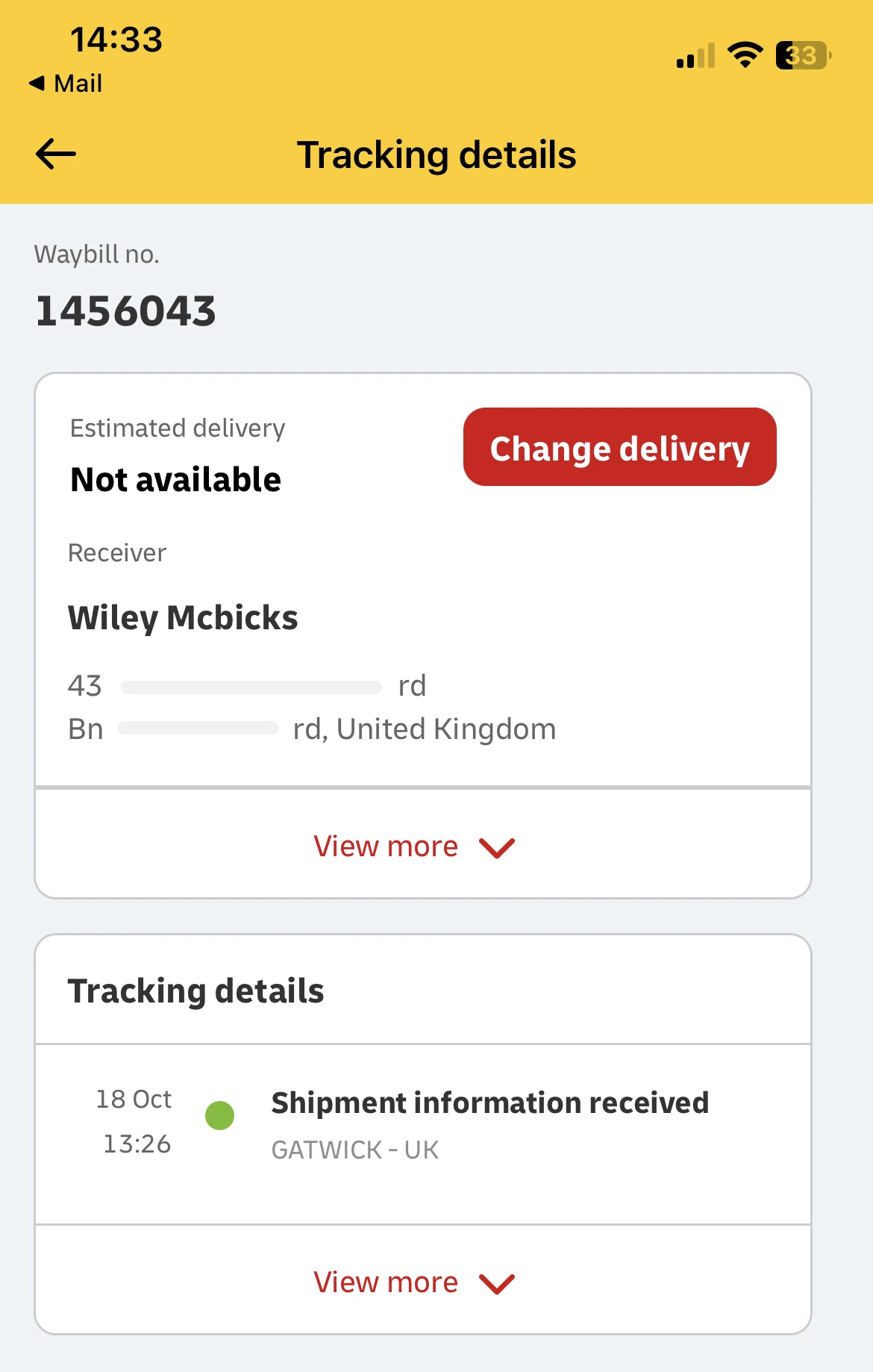
Saying "estimated delivery: not available", entirely ignores this behaviour.
In most cases, the tracking number only started working once the parcel had been collected or dropped off.
I can understand this from a technical perspective, but that leaves hours, if not days, where the user has nowhere to see this booking, or learn about the process.
Take a look at this UX Bite from Revolut, who've tackled this problem excellently.
After ordering a new card on Revolut, you'll see this, which serves both as a reassuring reminder, and a tracking link.
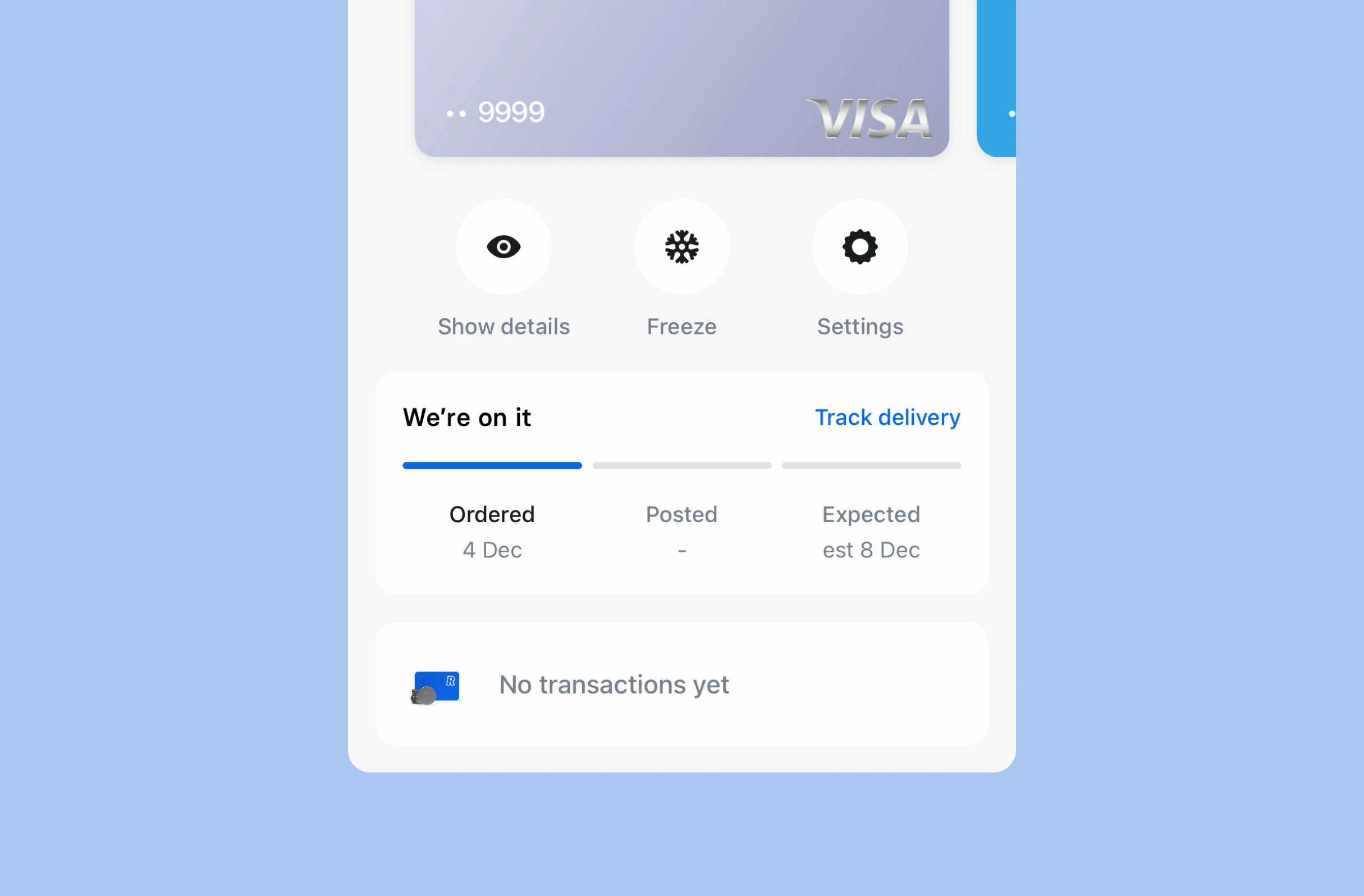
Let's summarise why this is so effective at reducing both anxiety, and the 🧠 Cognitive Load.
1. It shows the current status
i.e., the order is in progress.
2. It explains the process
i.e., the next step is for Revolut to post your card.
3. Gives context about the timeline
i.e., estimated to arrive on the 8th.
4. A status with permanence
i.e., you're reassured that you can always come back here to check the tracking status.
In fact, Revolut might have done this to counter-act the unreliable nature of third party tracking numbers.
4. Receiving a parcel
Using the data from a poll of tens of thousands of UK consumers, it seems like there's a slight correlation (or perhaps causation) between price and customer satisfaction. ³
But given that there's such a broad range of prices (£4.28 → £15.56), and the process of getting a quote is difficult, how is a small retailer supposed to use this data to comfortably make a decision?
How do they not overpay?
Here's that customer satisfaction data, ordered by price.
Customer satisfaction
% who voted "Great" out of Great, Okay, Poor.
Why are some of these services disliked more than others?
At first I assumed that they were just worse at delivering parcels, but the most reliable data I could find suggests that DPD (the best rated by customers) actually has a similar number of failed deliveries as Evri (the worst rated). ⁴
One major differentiating factor here is communication.
UPS didn't send the recipient anything on the day.
Parcelforce texted me, Evri emailed me, but only DPD used time-sensitive notifications.
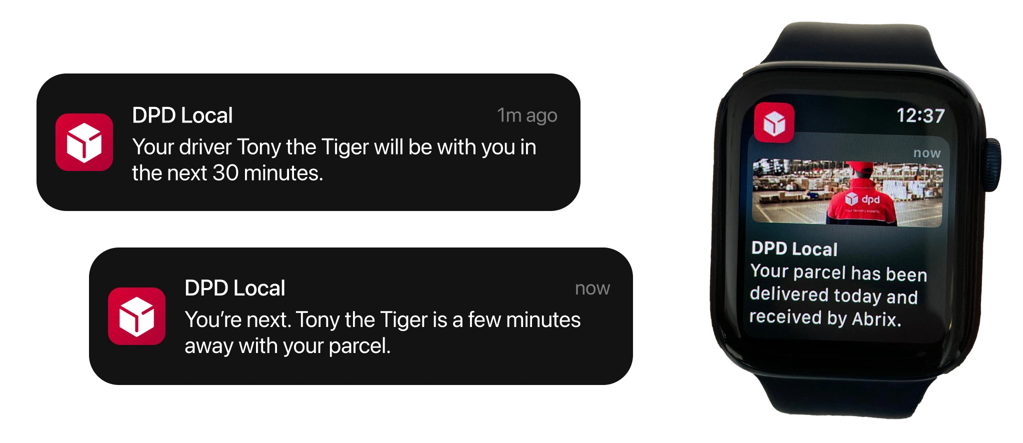
It's executed brilliantly, and may help explain why DPD consistently perform better in customer satisfaction surveys.
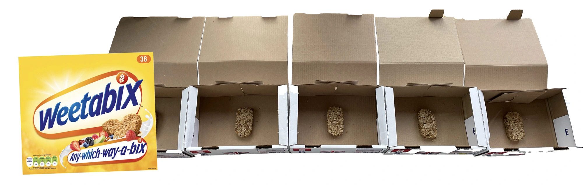
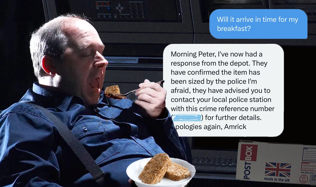
5. Breakfast in a box
Out of the 5 scheduled deliveries, only 4 arrived.
DHL collected my parcel, took it 40 miles away, and through customs for a security check.
At this point they would have been confronted with a very strange sight. In each box, was a single Weetabix.
I contacted customer services 17 times in 49 days, after which they informed me that it'd been seized by the police.
And yet, until the 49th day, I was repeatedly promised that it would still arrive, and there was just a backlog.
It's clearly a common problem, at least in the UK.
34% of UK shoppers claim that they experienced a delivery problem with the most recent parcel they received (or tried to) ⁵.
Even more frustratingly, the interface was as confused as I imagine the customs officials were.
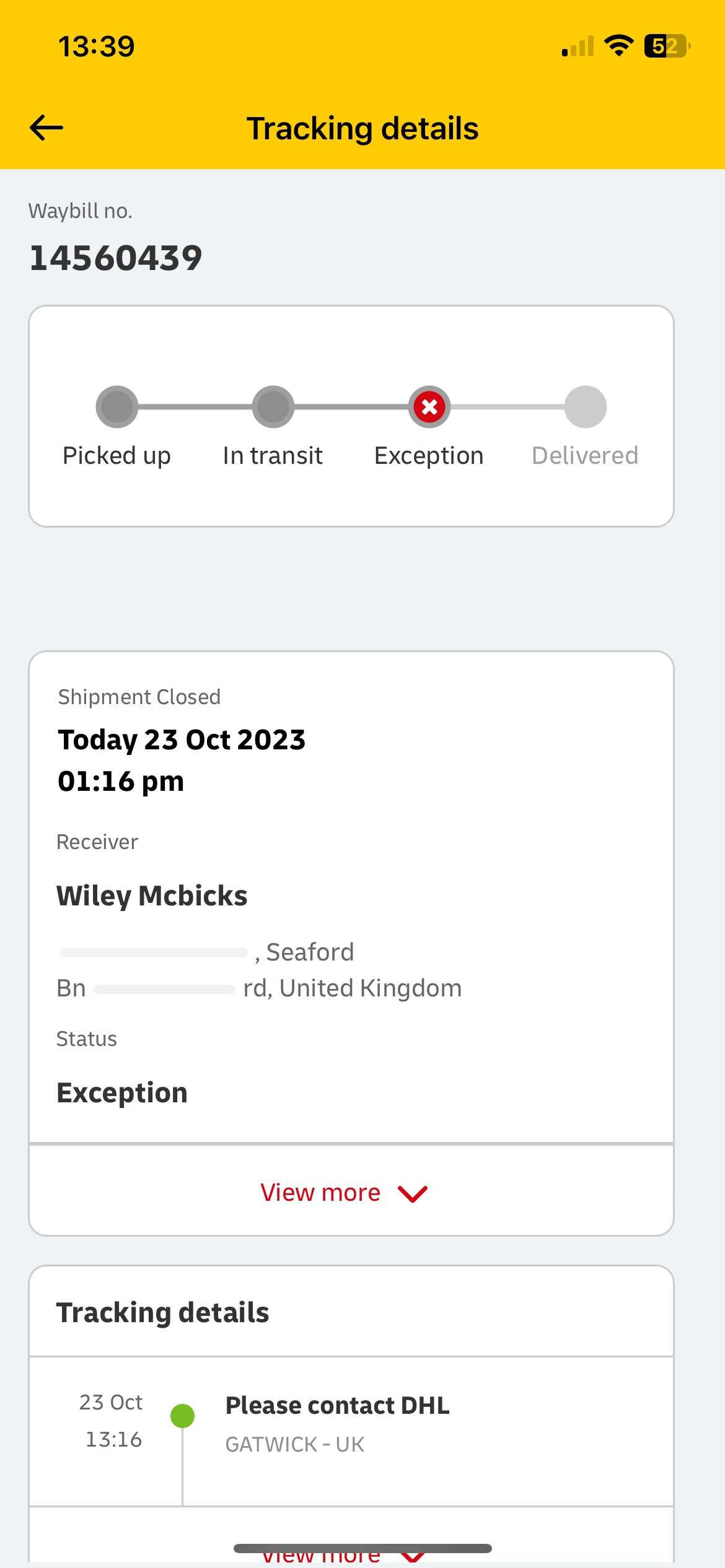

Day 49
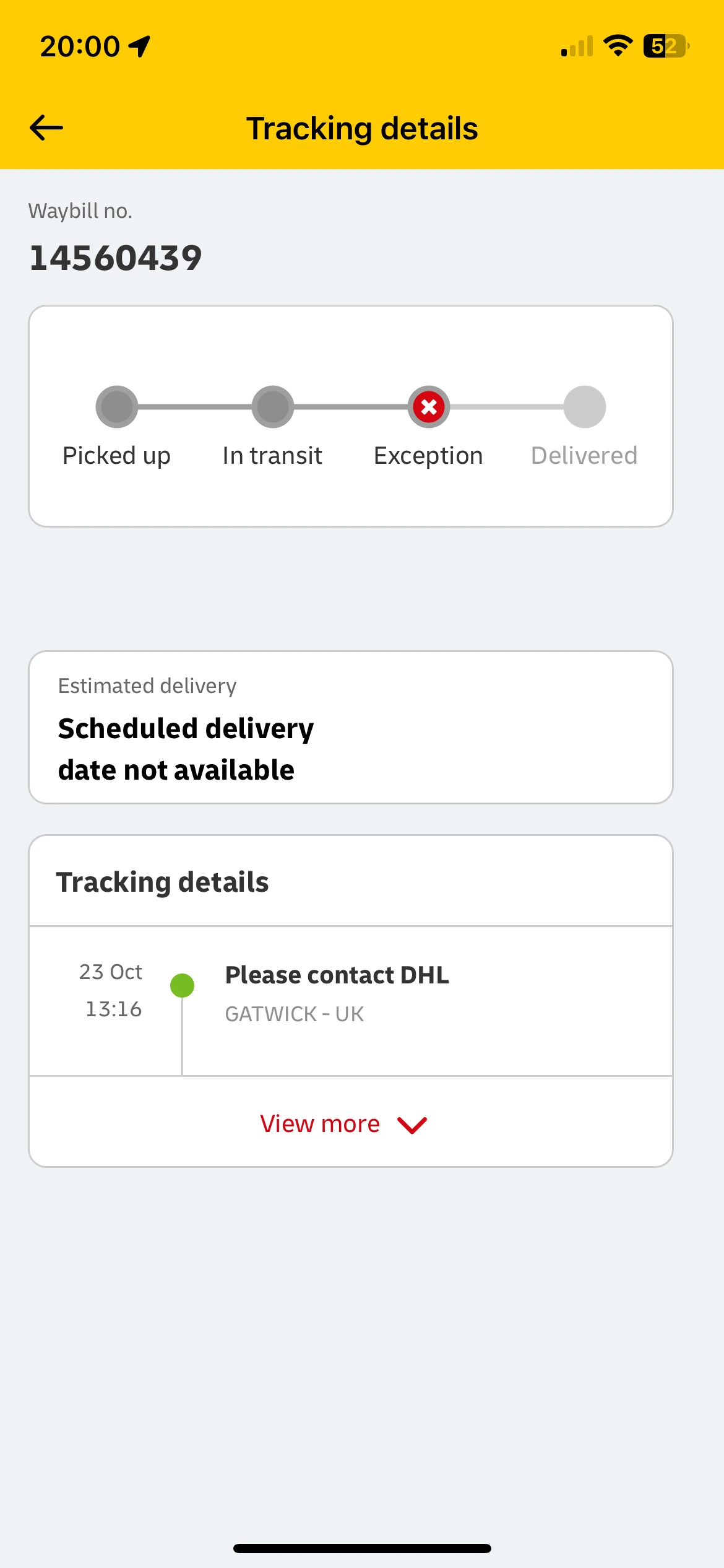
Lets consider the messaging of this for a moment:
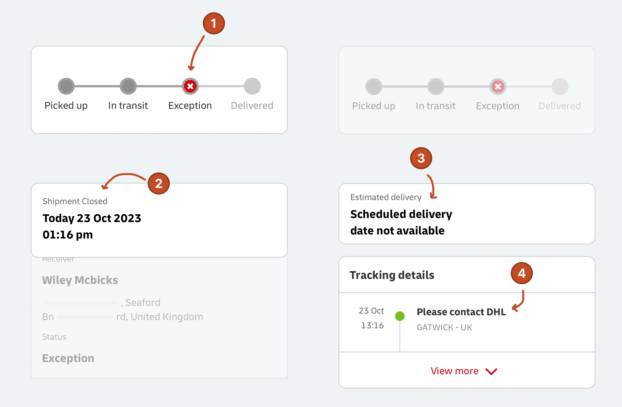
Status of 'exception'
What does this mean? It's an exception to what? It was exceptionally tasty with milk?
Shipment closed
Why's it closed? Is it not arriving then?
Scheduled delivery date not available
This replaced "shipment closed", so is it open again?
Contact DHL
Why can't you contact me? It's been 49 days.
Those statements may be technically correct—likely referring to some functional status.
But no care has gone into contextualising what the user is shown.
In fact, 🐨 Fuzzy Context like this often confuses the user even more.
For example, trying to work out what "shipment closed" means, when customer services will tell you that the parcel is still expected to arrive.
Summary
Most people I've spoken to have visceral opinions on a number of courier services.
Clearly, delivering the parcel safely is the most important factor to consider, and a few bad experiences create an impression that's hard to shift.
But whilst we rightly hold that specific delivery company responsible, the data suggests we usually attribute blame towards the retailer.
Small businesses should view their choice of shipping provider as an extension of their own user experience.
And logistics companies should quickly start leaning into the value that they can provide their customers (retailers), by investing in UX.
Studies referenced:
¹84% of consumers will not come back to shop from you after just one poor delivery experience (Convery, 2022).
² 94% of customers will blame the online retailer for a poor delivery experience (Supply Chain Dive, 2016).
³ MoneySavingExpert poll about customer satisfaction (link).
⁴ Citizens Advice 'annual parcels league table', published November 2023.
⁵ 34% of UK shoppers claim that they experienced a delivery problem with the most recent parcel they received (Citizens Advice, 2023).
Recommend
-
110
Files Permalink Latest commit message Comm...
-
73
Last year Patently Mobile posted an extensive patent report titled "Google invents a Gesture Controls System for Future Smart Garments." Last week the U.S. Patent & Trademark Office published a patent application from Google that reveals the...
-
64
With smartphones becoming more integral in consumers’ lives, Gorilla® Glass 6 provides unprecedented protection against multiple drops
-
9
如何自定义编译zeppelin的parcels与CDH集成标签(空格分隔):大数据运维专栏一:关于zeppelin介绍二:如何自定义CDH的parcels与csd的jar包三:zeppelin与CDH的集成四:关于zeppelin的测试一:关于zepplin的介绍ApacheZeppelin是一个让交互式数据分析变得可行的基...
-
20
Combining parcels in Mathematica does not give the expected result advertisements I'm trying to combine 3 functions graphed on a Plot[]
-
12
Use Parceler to put your parcels on a diet kotlin-parcelize is a great tool. Its simple to use and it helps in avoiding writing a lot of boilerplate code. Th...
-
6
news UPS is testing a new electric mini van for delivering parcels in the US...
-
9
Evri couriers: Wiltshire customers report parcels going missingPublished15 hours ago
-
11
Royal Mail overseas parcels ban 'costing me hundreds of pounds'Published54 minutes ago
-
7
Tuesday, 19 December 2023 12:48 Australia Post to pay about $2.9 million in compensation to businesses for lost or damaged parcels Featured By Gordon Peters
About Joyk
Aggregate valuable and interesting links.
Joyk means Joy of geeK