

The Evernote font: What font does Evernote use?
source link: https://www.designyourway.net/blog/evernote-font/
Go to the source link to view the article. You can view the picture content, updated content and better typesetting reading experience. If the link is broken, please click the button below to view the snapshot at that time.
The Evernote font: What font does Evernote use?
Diving right into it, Evernote – that handy digital notepad we all swear by. You know the one I’m talking about, right? That emerald elephant icon, is always ready to save our random thoughts and important notes.
Here’s the thing – we all use it differently. For some, it’s a digital locker of quick notes. For others, it’s a meticulously organized mind palace. But no matter what, there’s one thing we’ve all messed with at some point – the Evernote font.
But have you ever wondered, why? Why does Evernote look the way it does? Is there a hidden language in its choice of fonts?
Let’s jump down the rabbit hole.
We’ll explore:
- The design philosophy of Evernote fonts across platforms.
- How these choices impact our user experience.
- The reason behind the variation in fonts.
Grab a cup of coffee (or tea, no judgment here), get comfy, and let’s geek out over some typography. Trust me, you’ll never see Evernote – or any app, for that matter – the same way again.
What Font Does Evernote Use
Step into my studio, and let’s talk about the magic of Evernote and its typography choices. Now, here’s the scoop – the font that Evernote uses can actually change based on where you’re using it.
The Evernote Font Landscape
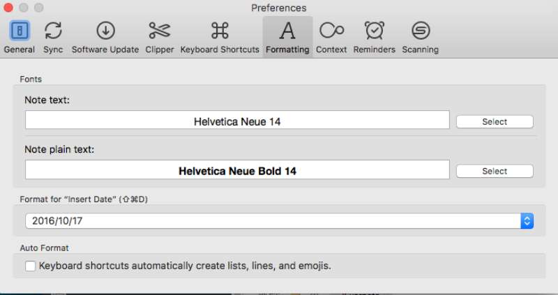
Evernote’s default fonts vary based on the platform you’re using. For instance, on a Windows system, the font for note text defaults to Tahoma 10, while the note title defaults to Segoe UI 10.
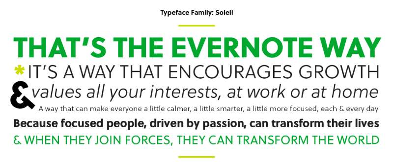
In 2018, Evernote underwent a rebranding in collaboration with DesignStudio, adopting Wolfgang Homola‘s Soleil as the primary typeface for its website, communications, and marketing materials.
This typeface is a contemporary sans-serif font. Additionally, users have the option to customize the default font in Evernote, although the steps to do so differ depending on the platform and device in use.
Why Does This Matter?
Well, in the grand scheme of things, the variation in fonts ensures that the experience is consistent and seamless, no matter what device you’re on. It’s about ensuring the tool is familiar and comfortable, no matter where you are.
What font does Evernote use in its logo?
Over the years, Evernote has employed various fonts for its logo. The company currently features Publico Headline from Commercial Type in its wordmark.
In previous iterations, fonts like Caecilia LTStd-Bold, Soleil, and Sanchez Niu Bold were used.
The typeface Crete Round Font is closely related to the Caecilia LTStd-Bold used in one of the earlier logos.
Alternatives to the Evernote Font
Alright, so you’ve got the gist of the Evernote font story. But what if you want to mix things up a bit? Let’s explore some alternatives.
Customizing Your Evernote
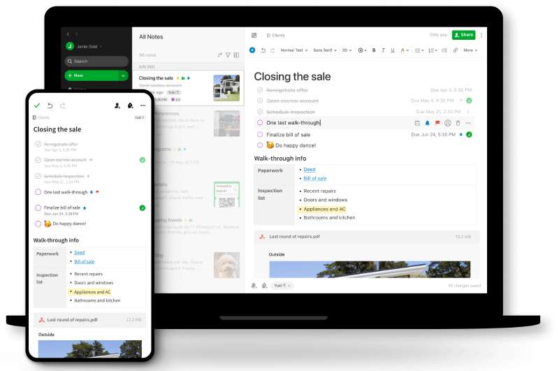
Evernote doesn’t really let you set a default font, but that doesn’t mean you can’t have a little fun. You can change the font style, size, and color for each note individually. So go ahead, make it your own!
Third-Party Apps
Then, there’s the route of using a third-party app or plugin. There’s plenty out there that can allow you to customize the look and feel of your Evernote, including fonts.
Impact of Font Choices on User Experience
Now, let’s dig a little deeper.
Understanding User Experience
When we talk about user experience, we’re talking about how you interact with the app. This includes everything from the app’s layout, to its color scheme, to, yes, its font. All of these aspects come together to make the app pleasant and easy to use.
How Fonts Influence User Experience
Fonts play a major role in user experience. They can affect readability, mood, and even user perception of an app. In the case of Evernote, the chosen font supports readability and consistency across platforms, providing a familiar and pleasant experience to its users.
Evernote and the Art of Typography
Typography in Digital Design
You see, typography is a critical aspect of any digital product design. It’s not just about making things “look pretty”. It’s about conveying information in the most effective, efficient, and aesthetically pleasing manner possible.
Evernote’s Typography Philosophy
Evernote seems to have a clear philosophy when it comes to its typography: simplicity and functionality. It doesn’t use fancy, hard-to-read fonts. Instead, it sticks to clean, easy-to-read fonts that work well across different devices and operating systems.
FAQ about Evernote font
What Font Does Evernote Use?
Ah, the million-dollar question! Evernote cleverly uses different fonts depending on your device. For Apple users, it’s the sleek San Francisco font, while Android folks get the clean Roboto.
On the web or Windows, you’re looking at good old reliable sans-serif fonts like Helvetica or Arial.
Can I Change the Default Font in Evernote?
Well, as it stands now, there’s no option to set a global default font in Evernote. However, you can customize the font for each individual note. So, you can certainly add your personal touch to each note you jot down!
Does Evernote Support Custom Fonts?
Custom fonts, as in the ones you’ve downloaded and installed on your device, don’t have full support in Evernote. Your notes will show the default fonts unless you manually change it for each note.
How Do I Change Font Size in Evernote?
Easy as pie! When you’re creating or editing a note, just highlight the text you want to resize. You’ll see a toolbar pop up, and you can select your desired font size from there. Simple, right?
Why Does Evernote Use Different Fonts on Different Platforms?
Great question! Evernote uses different fonts to ensure the best possible user experience on each platform. They’ve chosen fonts that are native to each operating system, making the app feel familiar and seamless, no matter where you’re using it.
Why Can’t I Set a Default Font in Evernote?
Truthfully, only the folks at Evernote could give a definitive answer. My best guess is that it’s about maintaining consistency across devices and platforms, as well as prioritizing functionality and ease-of-use over customization.
What Impact Do Fonts Have on User Experience in Evernote?
Oh, the impact is huge! Fonts can greatly affect readability and user perception. Evernote’s choice of simple, clean fonts helps make the app easier to use. It’s all about ensuring you can focus on your notes, not deciphering some fancy font.
Does the Evernote Font Choice Affect Its Functionality?
The font choice itself doesn’t directly impact functionality. However, Evernote’s choice of simple, easy-to-read fonts does contribute to a smoother, more enjoyable user experience. It’s a subtle yet significant aspect of the app’s overall design.
How Do I Make Text Bold in Evernote?
You want to emphasize something? Just highlight the text and click on the ‘B’ icon in the toolbar. Or, if you’re a fan of keyboard shortcuts like me, you can just hit Ctrl + B on Windows or Cmd + B on Mac.
Can I Use Italic and Underline in Evernote?
Absolutely! To italicize, highlight your text and click the ‘I’ in the toolbar, or use Ctrl + I or Cmd + I. For underlining, click the ‘U’, or use Ctrl + U or Cmd + U. Evernote gives you all the text formatting tools you need to make your notes just the way you want them.
Ending thoughts on the Evernote font
We’ve journeyed together through the pixelated realms of Evernote font choices and dived deep into the impact they have on our day-to-day digital note-taking adventures.
Sure, on the surface, it might just seem like, “Hey, it’s just a font, right? No big deal.” But when you peel back the layers, you start to see the intention behind each design decision.
It’s not just about looking good. It’s about making the app a tool that’s as comfortable as an old hat, no matter where or how you’re using it.
The takeaway? Embrace the fonts Evernote offers. Don’t fret over the lack of a global font setting. Let’s celebrate the beauty in the design decisions and recognize that fonts are more than just typefaces on a screen – they’re an integral part of our digital experiences.
Who knows, maybe next time you open up Evernote, you’ll take a moment to appreciate the humble typefaces that help us capture, organize, and explore our thoughts.
If you enjoyed reading this article about Evernote font, you should read these as well:
Recommend
About Joyk
Aggregate valuable and interesting links.
Joyk means Joy of geeK