

A customizable skeleton-like loading placeholder for react native projects using...
source link: https://reactnativeexample.com/a-customizable-skeleton-like-loading-placeholder-for-react-native-projects-using-reanimated-v3/
Go to the source link to view the article. You can view the picture content, updated content and better typesetting reading experience. If the link is broken, please click the button below to view the snapshot at that time.
React Native Reanimated Skeleton
React native reanimated skeleton, a simple yet fully customizable component made to achieve loading animation in a Skeleton-style. Works in both iOS and Android.
THIS REPO IS AN UPGRADE FROM REANIMATED V1 to V3 inspired by https://github.com/alexZajac/react-native-skeleton-content
Installation
npm install react-native-reanimated-skeleton
Usage
- Import react-native-reanimated-skeleton:
import Skeleton from 'react-native-reanimated-skeleton';- Once you create the Skeleton, you have two options:
- Child Layout : The component will figure out the layout of its bones with the dimensions of its direct children.
- Custom Layout : You provide a prop
layoutto the component specifying the size of the bones (see the Examples section below). Below is an example with a custom layout. A key prop for each child is optional but highly recommended.
export default function Placeholder() {
  return (
    <Skeleton
      containerStyle={{ flex: 1, width: 300 }}
      isLoading={false}
      layout={[
        { key: 'someId', width: 220, height: 20, marginBottom: 6 },
        { key: 'someOtherId', width: 180, height: 20, marginBottom: 6 }
      ]}
    >
      <Text style={styles.normalText}>Your content</Text>
      <Text style={styles.bigText}>Other content</Text>
    </Skeleton>
  );
}- With children layout example: More info can be found in the example folder
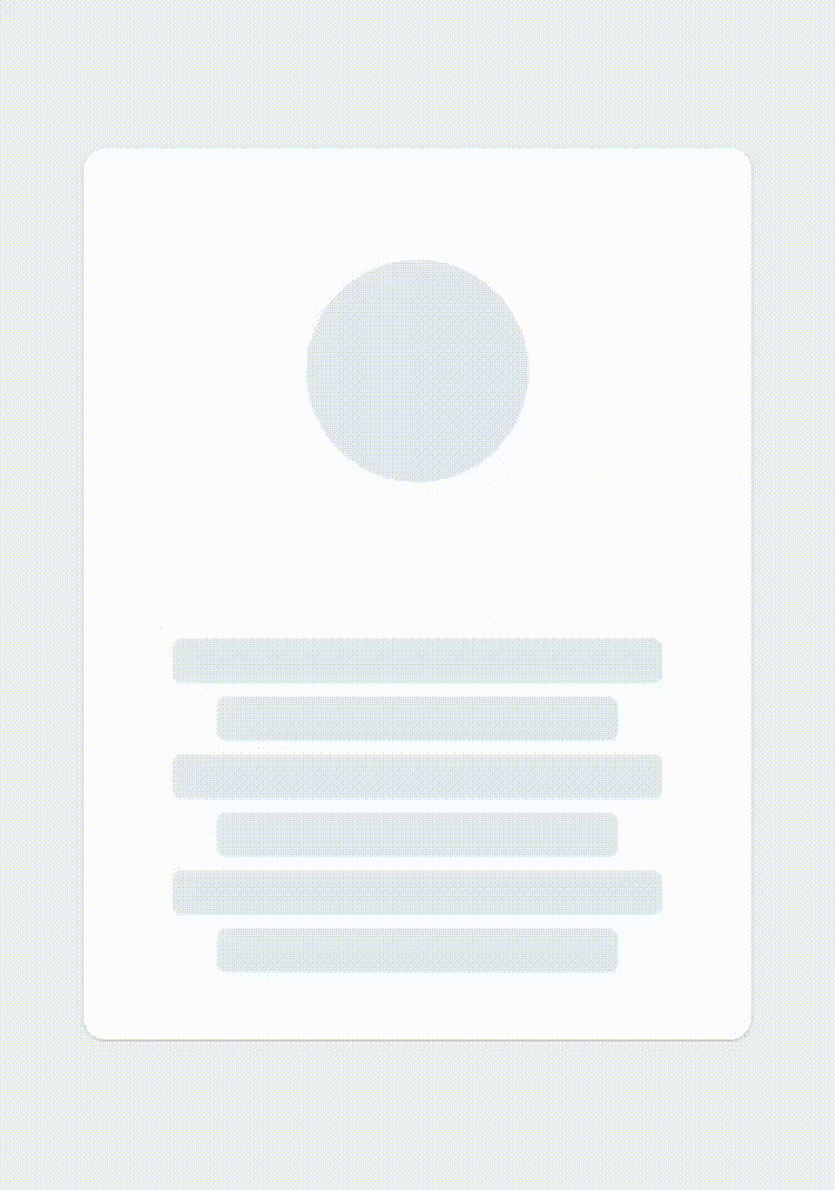
<Skeleton
  isLoading={true}
  containerStyle={styles.container}
  layout={[
    {
      width: 325,
      height: 325,
      borderRadius: 34,
      marginBottom: 16,
    },
    {
      flexDirection: 'column',
      justifyContent: 'center',
      alignItems: 'center',
      children: [
        {
          width: 119,
          height: 19,
          borderRadius: 16,
          marginBottom: 8,
        },
        {
          width: 234,
          height: 42,
          borderRadius: 16,
        },
      ],
    },
  ]}
>
  <>
    <Text style={styles.normalText}>Your content</Text>
    <Text style={styles.bigText}>Other content</Text>
  </>
</Skeleton>- Then simply sync the prop
isLoadingto your state to show/hide the Skeleton when the assets/data are available to the user.
export default function Placeholder () {
  const [loading, setLoading] = useState(true);
  return (
    <Skeleton
       containerStyle={{flex: 1, width: 300}}
        isLoading={isLoading}>
        {...otherProps}
    />
  )
}
Props
| Name | Type | Default | Description |
|---|---|---|---|
| isLoading | bool | required | Shows the Skeleton bones when true |
| layout | array of objects | [] | A custom layout for the Skeleton bones |
| duration | number | 1200 ms | Duration of one cycle of animation |
| containerStyle | object | flex: 1 | The style applied to the View containing the bones |
| easing | Easing | bezier(0.5, 0, 0.25, 1) | Easing of the bones animation |
| animationType | string | “shiver” | The animation to be used for animating the bones (see demos below) |
| animationDirection | string | “horizontalRight” | Used only for shiver animation, describes the direction and end-point (ex: horizontalRight goes on the x-axis from left to right) |
| boneColor | string | “#E1E9EE” | Color of the bones |
| highlightColor | string | “#F2F8FC” | Color of the highlight of the bones |
Note: The Easing type function is the one provided by react-native-reanimated, so if you want to change the default you will have to install it as a dependency.
Examples
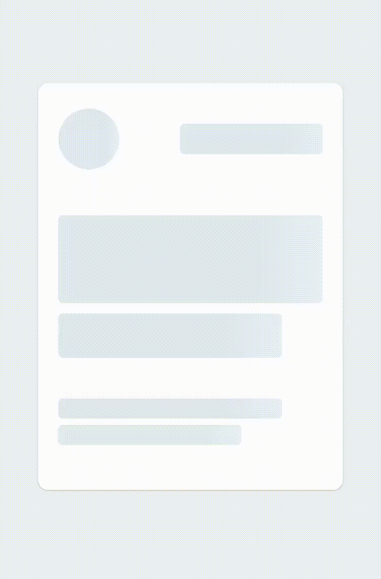
See the playground section to experiment : 1 – Changing the direction of the animation (animationDirection prop) :
export default function Placeholder () {
  return (
    <Skeleton
        containerStyle={{flex: 1, width: 300}}
        animationDirection="horizontalLeft"
        isLoading={true}>
        ...
    />
  )
}
2 – Changing the colors and switching to “pulse” animation (boneColor, highlightColor and animationType prop) :
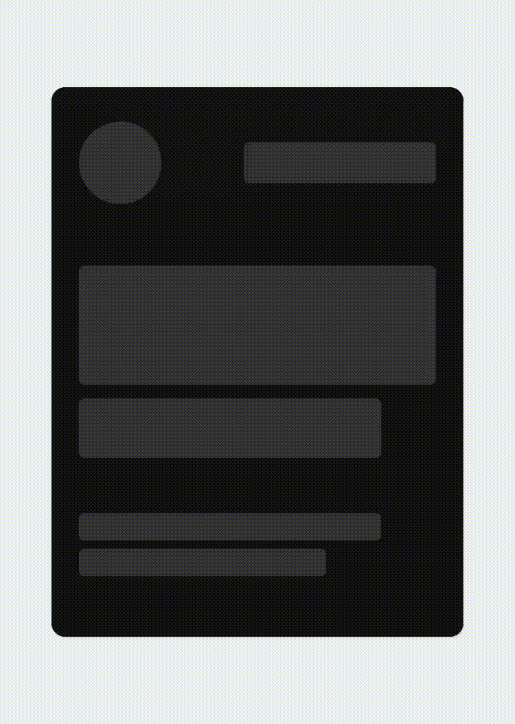
export default function Placeholder () {
return (
<Skeleton
containerStyle={{flex: 1, width: 300}}
boneColor="#121212"
highlightColor="#333333"
animationType="pulse"
isLoading={true}>
...
/>
)
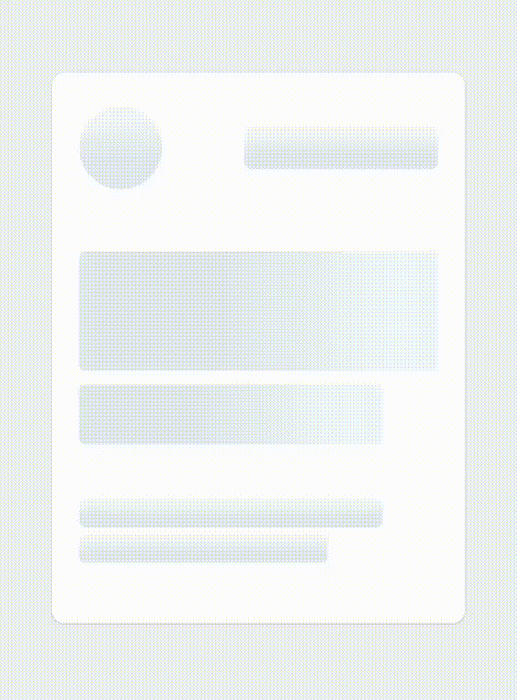
}3 – Customizing the layout of the bones (layout prop) :
export default function Placeholder () {
  return (
    <Skeleton
        containerStyle={{flex: 1, width: 300}}
        animationDirection="horizontalLeft"
        layout={[
        // long line
        { width: 220, height: 20, marginBottom: 6 },
        // short line
        { width: 180, height: 20, marginBottom: 6 },
        ...
        ]}
        isLoading={true}>
        ...
    />
  )
}
Playground
Don’t hesitate to take contact if anything is unclear !
GitHub
Recommend
About Joyk
Aggregate valuable and interesting links.
Joyk means Joy of geeK