

Fonts similar to Raleway that you can use as alternative
source link: https://www.designyourway.net/blog/fonts-similar-to-raleway/
Go to the source link to view the article. You can view the picture content, updated content and better typesetting reading experience. If the link is broken, please click the button below to view the snapshot at that time.

Fonts similar to Raleway that you can use as alternative
- BY Bogdan Sandu
There are many things a powerful font can do for your brand: make it interesting, strong, and personalized. Typefaces are often the core of graphic design. Choosing the right font will therefore require both an understanding of how fonts work, as well as creativity to make the best use of them.
But which is the best font for your design? Difficult question, given that there are more than half a million fonts o the market. And yet, only a handful of those make it to the best websites, which means there is some room left for you to be unique. For instance, let’s give a look at appealing fonts rich in visual elements, as those are the ones that have the strongest psychological effects on readers.
One of the fonts you’ve definitely heard of is Raleway. This is Matt Mclnerney’s most elegant sans-serif design. Other popular designers worked on this font family, among them Pablo Impallari, Igino Marini and Rodrigo Fuenzalida. Since 2016, this font is offered in 9 different weights and italics.
The League of Moveable Type
League is the first open-source font foundry that was offered for free. A group of prominent typographers joined forces to turn this movement into a playing field of professionals.
The goal was not only to enable designers with great and free tools – they are about to revolutionize the way we think of web typography.
Proxima Nova

Proxima Nova was designed by Mark Simonson in 2005. It brings the best features from Akzidenz Grotesque and Futura together – the modern proportions give it a distinctive geometric appearance. This excellent font also has seven different weights, matching italics and small caps. What may discourage you from using it, though, is how often it is applied in web designs.
Kabel

Kabel is also a product of the Bauhaus movement – geometric, clean, and esthetically pleasing. The sans serif was named after the very first trans-Atlantic telephone cable.
Poppins

Poppins is available for free, but you can still use it for commercial purposes. The display sans serif is optimized to work on pretty much any device (Mac, iOS, PC, Android, and Linux). Give its 18 ultra-thin to extra-bold styles a look and choose your favorites.
Gibson

Gibson is signed by Canadian designer Rod McDonald in 2011. The font family is not offered for free, but you can get all four weights and their italic versions for only $48. What McDonald intended here is to make quality humanist sans serifs more available for students. Furthermore, he donates all the revenue to Canada’s Society of Graphic Designers.
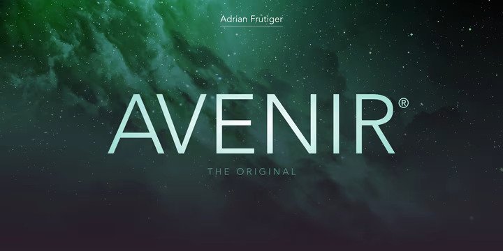
Avenir
Avenir is one of the most popular geometric sans serifs on the market. Its designer is legendary Adrian Frutiger who also signs the mega popular Univers typeface.
Frutiger envisioned a truly modern, geometric design for his font, but till kept a handful of fine features that make the font humanist. For instance, there is the imperfect tail on the ‘a’ and the ‘o’ and oblique styles for all six available weights.
Neuzeit

Neuzeit may stand for ‘New Times’, but it was actually designed in 1928. German designer Wilhelm Pischner wanted to create a timeless typeface that can be universally applied. Nevertheless, there have been numerous interpretations ever since 1960s, such as the more elegant Neuzeit S.
Akzidenz Grotesk
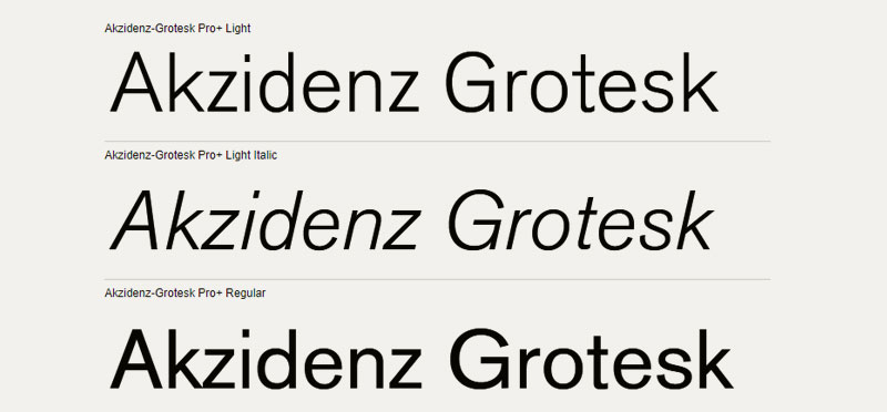
Akzidenz Grotesk belongs to the family of grotesque sans serifs. It was dates back to 1896, and it is one of the very few fonts from that period to be digitally optimized. New and Helvetica-inspired interpretations are all over the internet, famous foremost for their low x height which makes them unique.
Sailec

According to Type Dynamic, Sailec is the most neutral sans serif typeface you could work. Its shapesare geometric enough to distinguish it from both humanist and grotesque fonts. There are seven weights available – black, bold, medium, regular, light, thin, and hairline – and matching italics for each of them.
TT Commons

TT Commons was presented in 2018 by Russian foundry TypeType. The family comes in nine weights and italics, and has low stroke contrasts and tight apertures. You will also be a fan of its perfect geometric proportions.
Recta

Recta is also designed by a top-notch name in the industry, and that name is Aldo Novarese. It followed Univers and Helvetica in the 1950s, and you can see how influenced it was. Its first digital version was published in 2011 by Canada Type and it features five different weights and italics.
Museo Sans
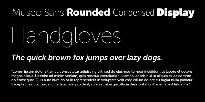
Museo Sans is what designers often describe as a ‘quirky’ sans serif. At first sight, it wll remind you of Proxima Nova. The more you explore it, the more unique traits you will discover, such as its graciously shaped letter ‘k’.
There is plenty to like about Museo Sans: it is highly legible, notably geometric, sturdy appearance and low contrasts. It is the perfect choice ´for any display or text project.
Circular

Circular is the second release of Swiss designer Laurenz Brunner. It consists foremost of clear geometric forms, but the warmth it provides is difficult to find. Regardless which one of the five weights you choose, Circular will make your design easily identifiable. Keep in mind that there is also a corresponding italic for each of the weights.
Relish

If you happen to like the traditional Guildford typeface, think of Relish as its older, even more traditional brother. Relish is very elegant and comes with an easily recognizable round punctuation. It is probably the best elegant and high-quality OpenType font for professionals that you can get on a budget.
Calibre

Calibre is geometric and neo-grotesque at the same time. Kris Sowersby designed it at the same time with his font Metric and made sure the two fonts are interchangeable. The letterfonts are very similar, but Metric’s strokes terminate horizontally instead of vertically. Calibre, on the other hand, offers you seven weights and italics to choose from.
Colfax

Colfax is an oval sans serif with a very refined appearance. Its characters are described as conventional and nearly perfect. You won’t need to measure or to automate them – geometry is simply there.
Thanks to this, Colfax can be easily combined with any typeface or used completely independently. Users will also benefit from case-sensitive arrows and top OpenType features. Make sure you check it out.
Stratos

Production Type presented Yoann Minet’s Stratos in 2016. We are talking about a unique multiplexed font family with ten weights and a single width. The lowercase letters have normal proportions, while the uppercase ones are condensed. This means Stratos is the perfect tool for playful and fun designs.
GT Eesti

GT Eesti is available on the market since 2016, but its designer Reto Moser started working on it in 2009. He was looking mostly at geometric sans serifs used during the 1940s in Soviet-occupied Estonia, which is how the font got its name. There is a display and a text version of the font – they both abandon the conventional rules followed by geometric sans serifs and help you create memorable designs. You will find its prominent ink traps and double-story characters particularly interesting.
Graphik

Graphic brings the best features of modern and classic typefaces together. In such way, it enables both charmante appearance and efficient communication. With it, you will have a variety of expressing possibilities that traditional sans serifs simply can’t offer. A font so elegant and purposeful can be a central design piece on its own, as good as it supports editorial designs with different fonts. You will recognize it by its rational grid that instantly reminds of modernist posters from the mid-twentieth century.
The eight widths and nine weights give it maximal flexibility. If this is what you had envisioned for your next user interface design, look no further.
ATC Harris

ATC Harris was created in 2015 by Avonadle Type Co. designer Quân Ika Vũ. It takes monotype fonts on a completely new level and it offers much more than its main competitors. For instance, there is its unique double-story ‘g’ lowercase character. Better yet, it is offered in five weights and matching italics.
Plain
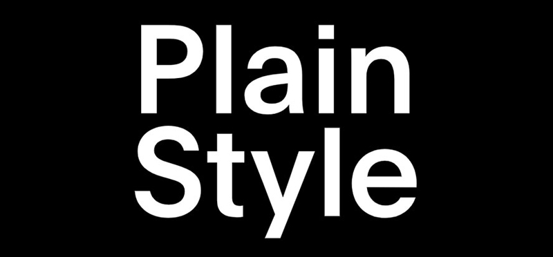
In the Plain case, the name speaks for itself. Designer François Rappo did an excellent job creating a classic geometric font that works well with neo-grotesque models, pretty much the result you would get by combining Univers and Futura. You can count on 12 impressive weights and corresponding italics.
FAQ about fonts similar to Raleway
What alternatives to Raleway can I use?
Well, there are a bunch of fonts that share similarities with Raleway. You could try Montserrat, Lato, or Poppins. All three have a clean, modern look, just like Raleway, and they’re available on Google Fonts. Another option is to explore Nunito or Roboto, which are also quite popular and versatile fonts. Just make sure to select the one that best fits your design style and project.
Is Raleway a good choice for body text?
I’d say it depends on the context of your project. Raleway is a versatile font and can work well for body text. However, if you want a more legible font, you might want to consider alternatives like Roboto, Open Sans, or Avenir. These fonts tend to be easier on the eyes for long stretches of text. Ultimately, the decision is yours, but keep readability in mind when making your choice.
How can I download Raleway and similar fonts for free?
No worries! You can easily download Raleway and many similar fonts for free from Google Fonts. Simply head over to their website, search for the font you like, and click the “Download family” button. Voila! You’ll have the font files ready to install on your computer. Remember, there are many free font resources out there, but Google Fonts is a reliable and extensive source.
What’s the difference between Raleway and other similar fonts?
While Raleway shares similarities with other fonts, it has its own unique characteristics. It’s a sans-serif typeface with a geometric design, making it modern and clean. Some of the key differences you might notice are the widths, letterforms, and weights of Raleway compared to other similar fonts. Each font has its own vibe, so it’s essential to choose the one that aligns with your project’s desired aesthetic.
Can I use Raleway and its alternatives for commercial projects?
Absolutely! Raleway and many of its alternatives on Google Fonts are released under the SIL Open Font License, which allows you to use them for personal and commercial projects without any restrictions. Just make sure to double-check the license before using any font in your project, as some may have specific requirements or limitations.
What font pairings work well with Raleway?
Pairing Raleway with other fonts can create an appealing design. You might want to try combining Raleway with a serif font like Playfair Display, Merriweather, or Lora. This pairing can create a nice contrast and balance in your design. Another option is to pair it with other sans-serif fonts like Roboto or Open Sans for a more cohesive look.
How do I add Raleway or similar fonts to my website?
To add Raleway or similar fonts to your website, you can use Google Fonts. First, find the font you want to use and click the “Select this font” button. Then, copy the provided <link> tag and paste it into your HTML’s <head> section. Finally, include the font-family in your CSS file to apply the font to the desired elements on your site. It’s that simple!
Are there any premium fonts similar to Raleway?
Yes, there are premium fonts that share some characteristics with Raleway. You might want to check out Proxima Nova, Gotham, or Avenir. These are all popular premium fonts with a clean and modern appearance. Keep in mind that premium fonts come with a price, but they can be worth it if you’re looking for a unique and high-quality type.
What are the best font sizes and weights for Raleway?
When using Raleway, you have a wide range of weights to choose from, making it suitable for various purposes. For body text, it’s usually best to stick to font sizes between 14px and 18px, depending on the screen size and content. As for font weights, Regular (400) or Medium (500) tend to work well for body text, while Bold (700) or even Extra-Bold (800) can be used for headings or emphasis.
Is Raleway suitable for print projects, like books or magazines?
Raleway can definitely be used for print projects like books, magazines, and brochures. However, it’s essential to consider the context and the purpose of your project. If you’re working on a more traditional or formal publication, a serif font might be more appropriate. But if your project is modern and clean, Raleway could be a fantastic choice. Just make sure to carefully test it for legibility and aesthetics in the printed form.
If you enjoyed reading this article on Fonts similar to Raleway, you should check out these articles with fonts similar to Gotham, Garamond, Helvetica, Futura, Times New Roman, Lato, Bodoni, Roboto, and Optima.
Recommend
About Joyk
Aggregate valuable and interesting links.
Joyk means Joy of geeK