

用CSS3制作尖角标签按钮样式
source link: https://jiongks.name/blog/css3-tag-buttons
Go to the source link to view the article. You can view the picture content, updated content and better typesetting reading experience. If the link is broken, please click the button below to view the snapshot at that time.
用CSS3制作尖角标签按钮样式
演示地址:https://jiongks.name/demos/css3-tag/
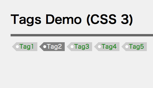
如图的效果。标签有背景色,且左侧有一个三角形,三角形中间有个白色的圆圈。
你一定在想这个效果是背景图切出来的吧——答案是没有用到任何图片
那你会不会在想这个效果的html结构很复杂呢——答案是最简单的html结构
<p>
<a href="#">Tag1</a>
<a href="#">Tag2</a>
<a href="#">Tag3</a>
<a href="#">Tag4</a>
<a href="#">Tag5</a>
</p>
之所以可以达到这样的效果,是因为我们运用了一些比较巧妙的技术。接下来告诉你实现方式:
结构
我们通过a:before和a:after这两个伪元素,通过绝对定位的方式,为<a>标签做了扩展:首先把一个伪元素a:before当做最左侧的三角形,然后再把另外一个伪元素a:after作为中间的小圆点显示到界面中。
a {
    display: inline-block;
    position: relative;
}

a:before,
a:after {
    position: absulote;
    content: " ";
}
左侧的三角形
三角形的实现方式略带技巧性,其实就是把宽高都设为0,边框宽度设为文本高度的一半。然后将其右边框上色border-right-color,其余三面边框颜色全部设为透明tranaparent,就可以了。当然,在设定边框宽度之前,我们需要确定文本的高度,这里有一个非常合适的单位:em。我们将链接的行高设置为1.5em,然后将伪元素的边框设置为0.75em即可。
a {
    background: #ccc;
    color: green;
    line-height: 1.5;
}

a:before {
    border: transparent 0.75em solid;
    border-right-color: #ccc;
    top: 0;
    left: -1.5em;
    height: 0;
    width: 0;
}
左侧三角形中间的小圆点
这个小圆点同样需要用css3实现,相比之下,它的实现略简单,设置背景为白色、宽高均为0.5em、上下边距均为0.5em、圆角半径是0.25em的矩形。这需要合理的坐标计算和尺寸计算。我们同样选择了通过em这个单位来计算。
a:after {
    background: white;
    width: 0.5em;
    height: 0.5em;
    top: 0.5em;
    left: -0.125em;
    border-radius: 0.25em;
}
把这些内容凑在一起,会发现横向的距离会有些不合适,那我们再做一点微调:
a {
    padding: 0px 10px;
    margin-left: 1em;
}
这样看起来样子比较协调了。
鼠标悬停效果
最后,加入:hover效果:
a:hover {
    background: gray;
    color: white;
}

a:hover:before {
    border-right-color: gray;
}
这样,就大功告成了!
demo: https://jiongks.name/demos/css3-tag/
Recommend
About Joyk
Aggregate valuable and interesting links.
Joyk means Joy of geeK