

Why “Cancel” should be a link, and not a button
source link: https://uxdesign.cc/why-cancel-should-be-a-link-and-not-a-button-part-2-your-feedback-e2fef97a41f8
Go to the source link to view the article. You can view the picture content, updated content and better typesetting reading experience. If the link is broken, please click the button below to view the snapshot at that time.
Why “Cancel” should be a link, and not a button
Part 2: your feedback. About SPAs, hyperlinks, dark patterns, and accessibility.
My article (Should “cancel” be a button or a link?) stated that when users are presented with a “cancel” option, this should be a link, and not a button. It received feedback which I talk about in this follow-up.
Why even discuss this subject?
Let’s be clear: most things in life aren’t black or white. I often tell teams when designing UI: "if no user is going to be super confused, then it’s probably just fine". And sure enough, having a button instead of a link where we believe a link improves your usability, will probably not leave your users at a complete loss to ruin their day.
However, by being consistent and predictable in your patterns, users will be empowered while interacting with your solution. This is a good thing as it adds to your user’s confidence as they traverse your solution.
Improve when we can!
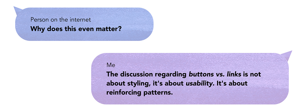
It also doesn’t take away from the fact we should always strive to improve usability when we see an opportunity. At the very least, discuss it. Especially when we believe there is sound reasoning behind it. The discussion regarding buttons vs links is not about styling, it’s about usability; it’s about reinforcing patterns.
uxdworld:
Great user experience (UX) design allows users to understand it and interact with it instantly. It is designed in a way that users can predict their next interaction and its outcome or response.ab11y:
Patterns enable people to learn, relate and engage as their comprehension is built upon all previous interactions with particular products or services.Dr. Ralf Speth wrote:
wrote:
If You Think Good Design is Expensive, You Should Look At The Cost of Bad Design
Design patterns could change over time in terms of user familiarity rather than…
Recommend
About Joyk
Aggregate valuable and interesting links.
Joyk means Joy of geeK