

What font does Airbnb use and what alternatives are out there
source link: https://www.designyourway.net/blog/what-font-does-airbnb-use/
Go to the source link to view the article. You can view the picture content, updated content and better typesetting reading experience. If the link is broken, please click the button below to view the snapshot at that time.
What font does Airbnb use and what alternatives are out there
A popular homestay service, Airbnb is one of the most successful American companies. Over the years, it has expanded its area of influence into most European countries. It also has a presence in Japan and Singapore.
But though Airbnb has won countless awards since its birth, it’s struggled to find the perfect font for its logo. When it was first founded, the company’s logo looked very different. Not only did it read AirBed & Breakfast, but it was also written in blue and pink.
However, the higher-ups were never satisfied with the lengthy logo. Since most businesses used short and to-the-point names, Airbnb wanted to keep up with the time. That’s why it decided to create its very own typeface. Known as Airbnb Cereal, the sans-serif font was created by the company’s in-house design team. The Dalton Maag foundry based in London also contributed to its creation. Today, Airbnb Cereal comes in six unique weights.
What does cereal have to do with a homestay company? The font name is a tribute to the branded cereal that the founders of Airbnb launched. They did so in 2008 to help fund the company’s creation.
Font plays a huge part in establishing the brand’s personality. But while having a lot of options has its perks, it can also be overwhelming. To find the perfect look for your own specific business, you can draw inspiration from other companies.
What font does Airbnb use? In this article, we’re going to take a closer look at the iconic homestay company’s logo.
What font does Airbnb use? Introducing the Cereal font
In 2014, Airbnb wanted to enhance its brand distinction by stabilizing both its online and offline identity. To do this, the company had to find a new font. But after a long time spent searching, it decided no font was suitable for the new logo.
Undeterred, Airbnb reached out to its in-house foundry to create its very own one. The Dalton Maag foundry also contributed to its creation. Although not many people know this, creating a custom font has become something of a trend in recent years. Companies such as BBC, Netflix, and YouTube all use their very own typeface.
The Airbnb Cereal font belongs to the sans-serif family. Interestingly, it resembles a geometric sans-serif font called LL Brown.
But what does the symbol in front of its name mean? The design studio combined four elements to create this unique symbol. These are people, places, love, and Airbnb. Together, these elements form the Belong Together symbol.
If you don’t understand, don’t worry. The idea is hard to imagine without a representation. But when you look at the symbol, it resembles a person’s head and two touching arms. This stands for the people element. It symbol also looks a bit like the red spot marker used by Google Maps, hence the place aspect.
The love element is quite straightforward – the Belong Together sign resembles an inverted heart. And finally, the symbol also looks a bit like the letter ‘A’, representing Airbnb.
The font’s official color is defined as ‘Rausch’, a unique shade of red. It’s placed against a white background to create an inviting and tender feel. You can also stumble upon versions that invert the two colors – the font is white while the background is ‘Rausch’.
Get 300+ freebies in your inbox!
Subscribe to our newsletter and receive 300+ design resources in your first 5 minutes as a subscriber.
The origin of Airbnb Cereal’s unique name
If you own a business, you’ll know that securing the initial capital is no small feat. The original founders Brian Chesky and Joe Gebbia didn’t have it any easier. To raise some money, they decided to sell cereals. They came up with the idea of Obama O’s and Cap’n McCain cereal. These were repackaged versions of Honey O’s and Quaker Puffs, respectively.
The idea was to use the hype surrounding the 2008 US presidential elections to its full potential. The idea represents the company’s creative problem-solving skills. According to the founders, the decision to name the font Airbnb Cereal came naturally.
What fonts resemble Airbnb Cereal?
Since the Airbnb Cereal font belongs to the company, you can’t use it yourself. But while it used this specific fond to carry out its brand continuity project, it doesn’t mean you have no alternatives.
Here is our list of fonts you can use instead:
Google Fonts
Google offers not one but four fonts that resemble Airbnb Cereal. These are Manrope, Montserrat, Inter, and Nunito Sans.
Manrope is a free sans-serif font developed by Mikhail Sharanda. Though it was released in 2018, it became part of Google Fonts in 2020. It comes in seven weights.
Advertisement
Montserrat is a geometric sans-serif font created by Julieta Ulanovsky, a designer from Argentina. She drew inspiration from a historical Buenos Aires neighborhood while designing it. You can also use Montserrat if you’re looking for a font similar to Proxima Nova and Gotham.
Inter is another sans-serif typeface. Designed by Rasmus Andersson, we recommend using it as a User Interface font. Thanks to its large vertical height, it’s very readable on screen. It features nine weights, all of which are available in italics as well.
And lastly, you can opt for Nunito. This sans-serif font was created by Vernon Adams. Jacques Le Bailly later updated it by adding additional weights as well as a non-rounded terminal version called Nunito Sans.
JetBrains Mono
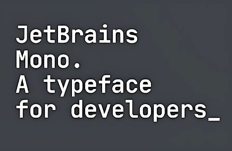
This open-source font was designed with programmers and developers in mind. Thus, it doesn’t feature any complicated or useless details. Though the font’s characters use a normal width, their lowercase letters are optimized for heights. This helps programmers reach the ideal code line length during rendering.
FAQ on the Airbnb font
Which font does Airbnb use for its logo?
Airbnb’s logo font is actually a custom design called Airbnb Cereal. It’s a unique, bespoke typeface designed to meet Airbnb’s specific branding needs.
Why did Airbnb decide to design their own font?
Airbnb created Airbnb Cereal for a more unified, consistent brand voice across different platforms. A custom font also gives them more control over their visual identity and stands out from the crowd.
How does Airbnb Cereal font look?
Airbnb Cereal is a sans-serif typeface with a modern, friendly appeal. It’s readable and versatile, making it suitable for various design contexts from digital interfaces to print materials.
Is Airbnb Cereal available for public use?
Sorry to disappoint, but Airbnb Cereal is proprietary to Airbnb. This means that it’s not freely available for use in other personal or commercial projects.
What’s the feeling that Airbnb Cereal communicates?
Airbnb Cereal was designed to convey a sense of trust, friendliness, and accessibility. It mirrors Airbnb’s mission to create a world where anyone can belong anywhere.
Does Airbnb use Cereal in all of its branding?
Yes, indeed. The font is used in everything from their logo to their website and marketing materials. It helps to create a consistent and recognizable visual identity for the company.
How does Airbnb Cereal perform in different sizes?
Airbnb Cereal was created with scalability in mind. It maintains its readability and charm in a wide range of sizes, from small screen text to large print headings.
Can you compare Airbnb Cereal to a more common font?
Although it’s unique, Airbnb Cereal can be compared to common fonts like Circular or Gotham, due to its geometric, friendly, and modern characteristics.
How does Airbnb Cereal fit into Airbnb’s overall design?
The font is a key component of Airbnb’s visual identity. Its friendly and modern vibe is in line with the company’s ethos of creating a warm, inviting community.
Has the use of Airbnb Cereal evolved since its creation?
Yes, Airbnb has made updates to the Airbnb Cereal font to better accommodate different languages and cultures. This evolution reflects the company’s ongoing commitment to inclusivity and global reach.
What font does Airbnb use? Our final thoughts
Airbnb uses a font called Cereal, named after the founders’ innovative solution to raising funds for their company. The font was designed with the help of an international type foundry Dalton Maag during the brand’s overhaul. The idea was to design a font that could function beautifully online and offline. This means it has to fit both on large billboards and tiny smartphone screens. The company’s unique font achieved just that.
While you can’t use the Airbnb Cereal font because of copyright issues, you can opt for alternatives that come close enough to the legendary logo. We handpicked the alternatives in this article, in hopes they will help you create the logo of your dreams.
If you liked this article on What font does Airbnb use, you should also check out these articles:
Recommend
About Joyk
Aggregate valuable and interesting links.
Joyk means Joy of geeK