

My Tips from our “Figma Like the Pros” talk during Config 2023
source link: https://uxplanet.org/my-tips-from-our-figma-like-the-pros-talk-during-config-2023-af05ccf25831
Go to the source link to view the article. You can view the picture content, updated content and better typesetting reading experience. If the link is broken, please click the button below to view the snapshot at that time.
My Tips from our “Figma Like the Pros” talk during Config 2023
Sharing and Collaboration in Figma

Hi, I’m Christine. I run a learning platform called moonlearning, where I talk and teach about UX, UI, and primarily Figma. My main focus is this magic area where design meets code to improve collaboration. I had the honour to be invited to speak as part of the “Figma like the Pros” during Config 2023 and here is a summary of my favourite tips and tricks I showed during this session:
→ Get my community file with the playground to follow along
Watch the video version:
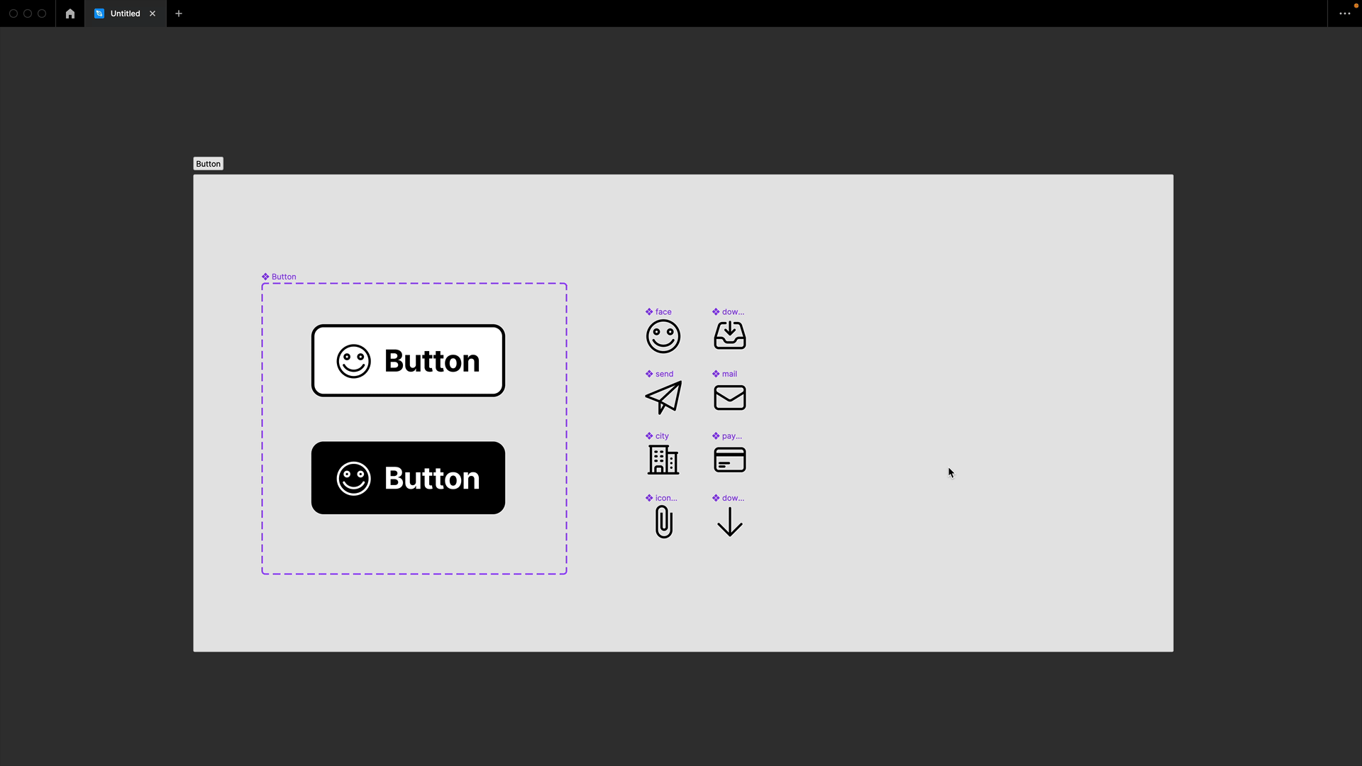
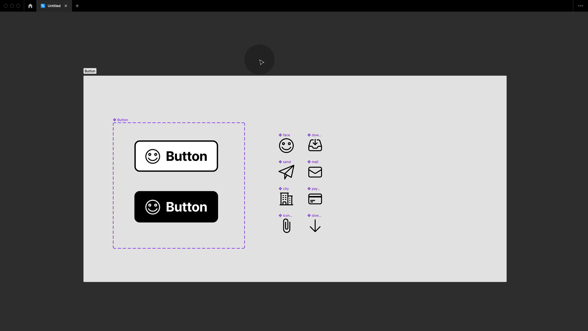
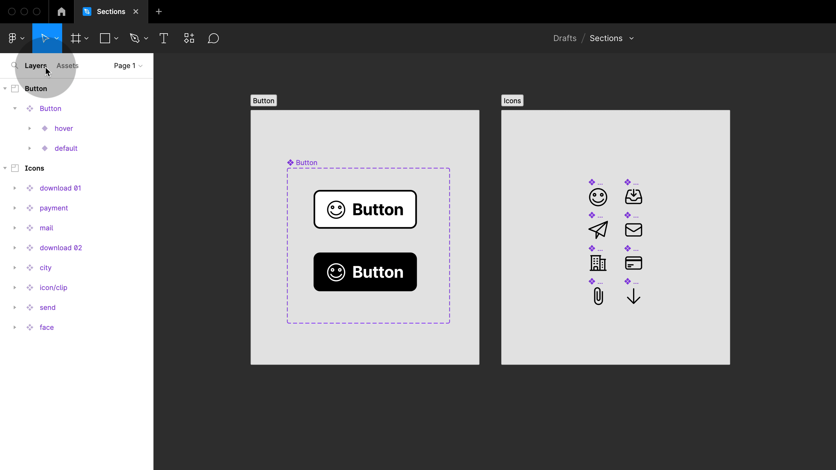
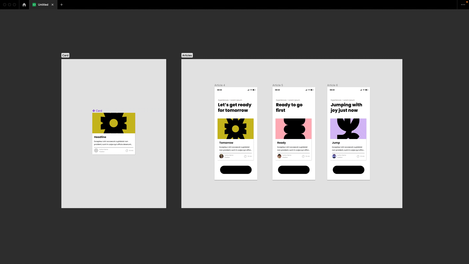
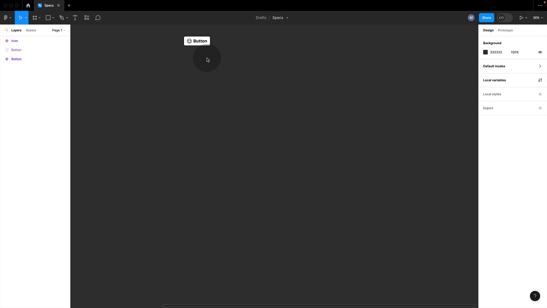
#1 Store Components on Sections
Store your Components in Sections. If you’re unfamiliar with sections, you can find them in the top toolbar below frames. Alternatively, you can use the shortcut SHIFT + S to draw a section on the canvas, similar to how you would create a frame.

#2 Easy identification of components with Sections
One of the key differences between sections and frames is that component symbols continue to appear within sections. This is really helpful because it provides clear orientation for anyone using your files and documentation.
#2 Add frames to sections for more information
You can include frames within sections to provide additional information about your components. For example, you can add an instance of a component to a frame and use it to showcase the behaviour of a button.
💥 Extra: Use the shortcut SHIFT + SPACEBAR to open the new in-file presentation mode for a quick peek.
#3 Sections with components create asset folders
When you place a component on a section, it creates a folder with the section’s name in the assets panel. This helps you keep your components organized easily.
#4 Communicate what is ready for development
Click on the section name, and a little icon will appear to let you mark what is ready for development. Handy part: This will show up as ready to go in dev mode and also in VS code!
💥 Extra: you can share specific section links
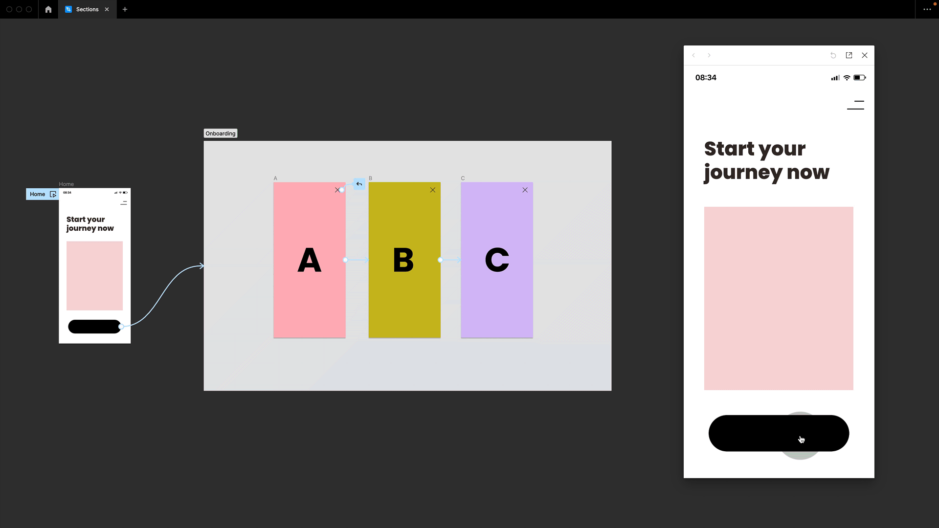
#5 Sections are stateful
Sections are also great for prototyping. When placing frames into sections, the design becomes stateful. Figma remembers which frame in the section was last visited and jumps back there as soon as you enter the section again from any point across your design. It’s super useful when dealing with sign-ups and checkouts.
#6 Change frame to section
But what if you’ve already set up all your documentation with frames? No worries, you can simply right-click any frame and convert it into a section, and this works the other way around as well, by the way.
Alternatively, you can use the frames preset dropdown. Besides jumping between common frame sizes, you can switch from frames to sections and groups back and forth. These are great little hidden features.
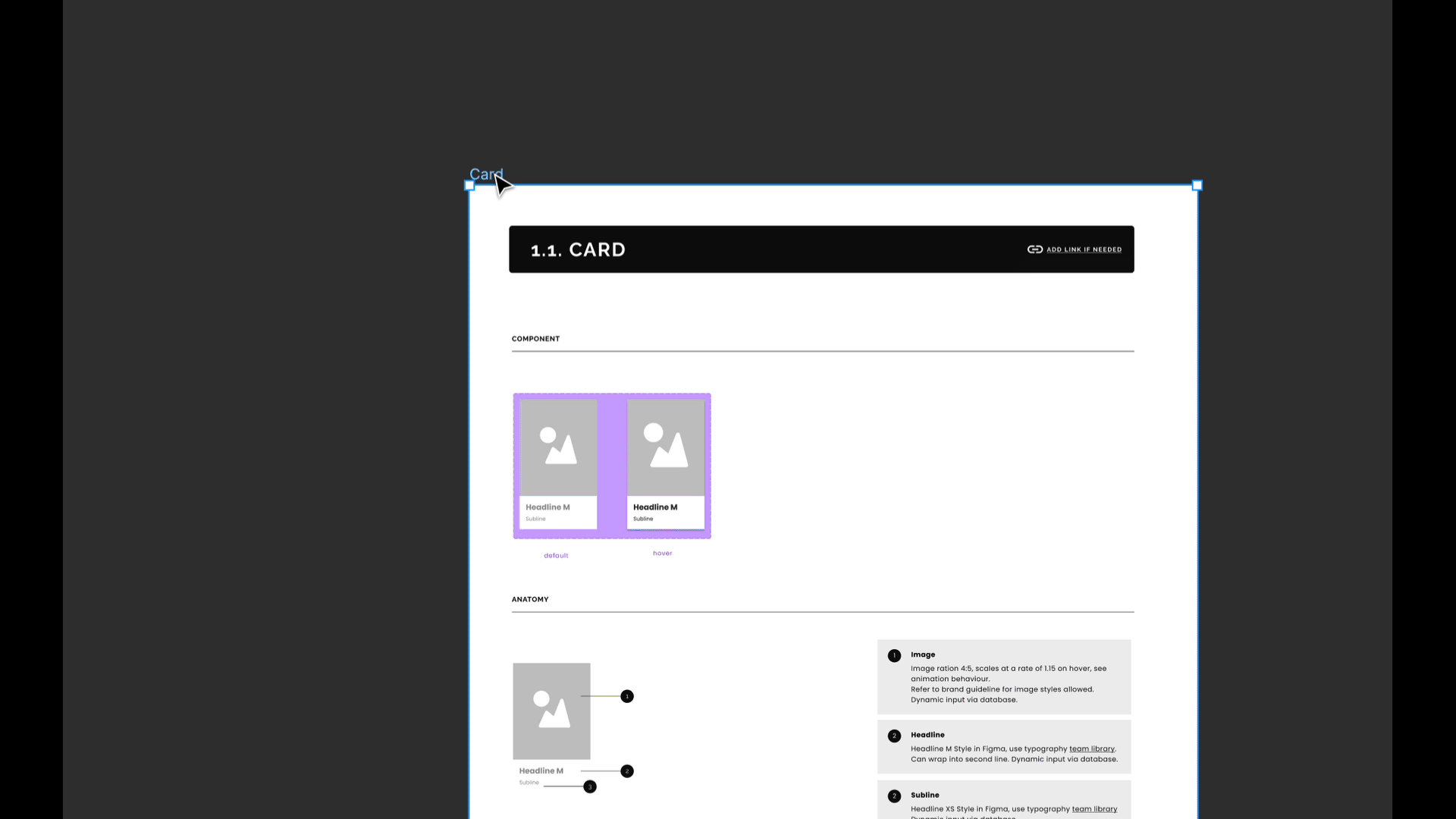
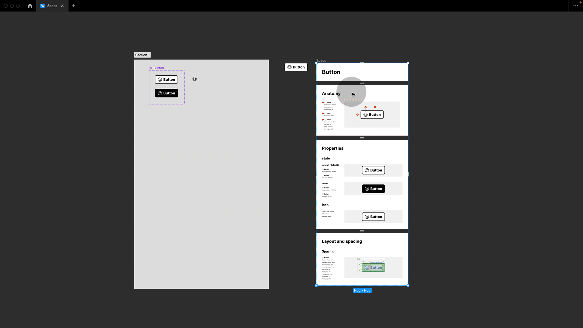
#7 Eight Shapes Specs Plugin
Now setting up component documentation, in general, is a lot of work, and I want to show you one of my favourite real-time saver plugins: the Eight Shapes Specs plugin. Select any instance, run the plugin, and with one click, it will create those beautiful specs for you.
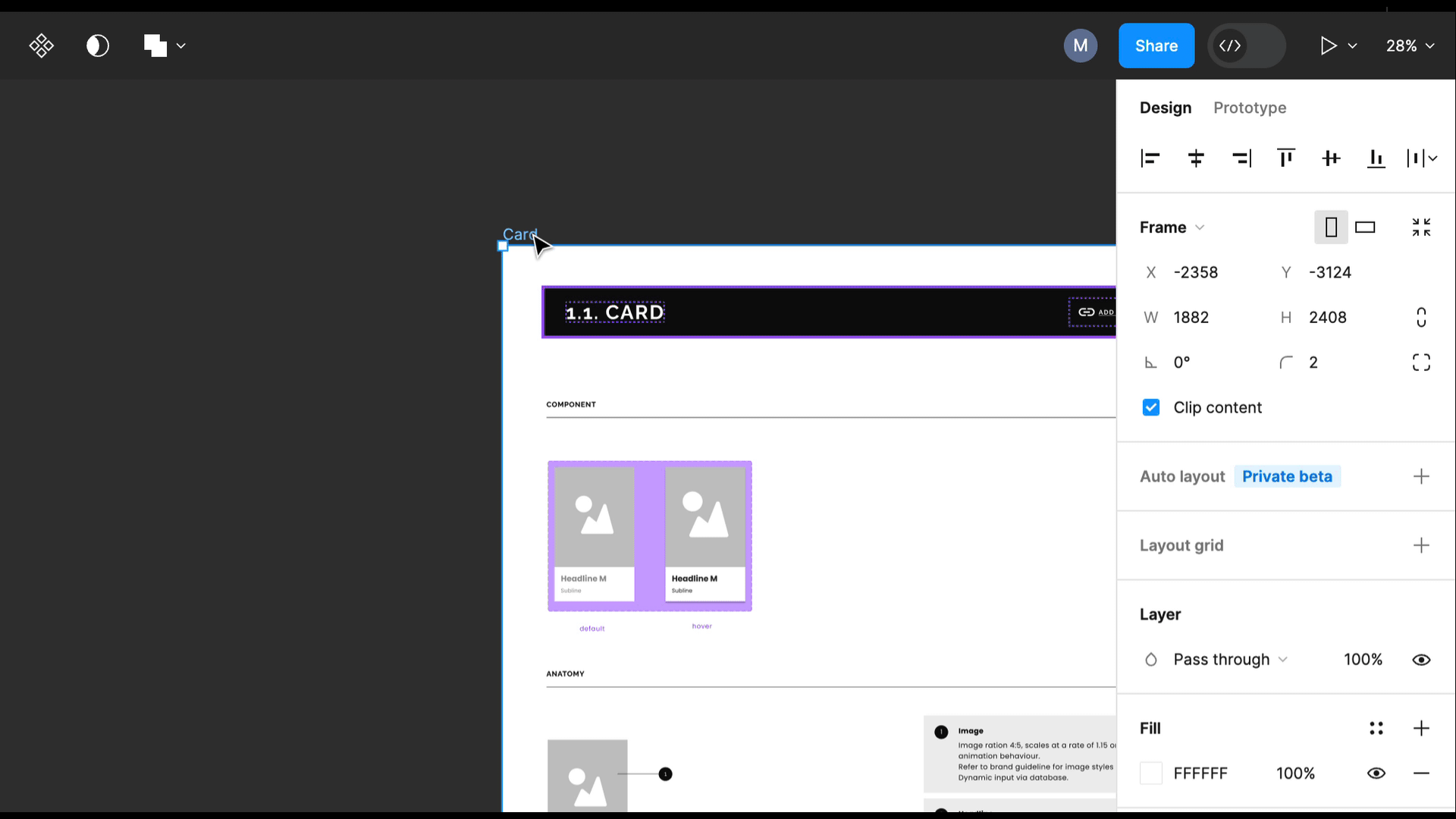
#8 Use the generated specs with your section
I especially like that they are set up as single frames, which I can then easily select and drag onto my section with my component, allowing me to have everything in one place.
#9 Overlay comparison feature
Working with components and documentation is a dynamic process involving changes that need to be communicated across the entire team. Sometimes, those changes can be pretty subtle, which is why I love the overlay comparison feature.
Whenever there is a modification in the main component, you will see an update icon next to the instance in your design file. Click on it and select “Review updated.” You will now get a side-by-side comparison, which you can switch to overlay mode and update single or all instances from there. It’s handy for identifying small padding, spacing, or position changes.
💥 Extra: I have a free video about working with and updating Figma team libraries.
#10 Dev mode overlay
So far, this feature was only available in design mode, but now we also have an overlay in dev mode.
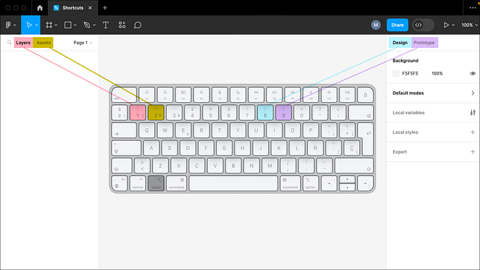
#11 Shortcuts mimic the canvas
In this short demo, we have already jumped between different panels quite a bit. So here are some handy shortcuts: press Alt + 1 for layers, Alt + 2 for assets, Alt + 8 for design, and Alt + 9 for prototyping. Now, if you are anything like me, you may have already forgotten these shortcuts while looking at this screen. However, they are actually positioned in such a way that your keyboard represents the layout of your Figma canvas:
Stay in touch!
I hope you found those tips helpful! Remember to follow me or visit me on moonlearning.io, Twitter, or LinkedIn for more!
More from moonlearning:
Deep Dive: Documenting with Figma
Design-to-development collaboration Not quite sure how to share your designs with development? Dreading that team…
Recommend
About Joyk
Aggregate valuable and interesting links.
Joyk means Joy of geeK