

How to Write UX Documentation Like a Pro
source link: https://uxplanet.org/how-to-write-ux-documentation-like-a-pro-cdeca344f920
Go to the source link to view the article. You can view the picture content, updated content and better typesetting reading experience. If the link is broken, please click the button below to view the snapshot at that time.
How to Write UX Documentation Like a Pro
Guide your team through your design process with clear documentation
Documentation sounds about as exciting as watching paint dry. But trust me, it’s a game-changer in the world of design.
UX documentation keeps you on track throughout the design process, ensuring that you never lose sight of your users’ needs and goals.
This is your chance to document and communicate your design decisions, strategies, and reasoning to the rest of the team. Think of it as your opportunity to shout from the rooftops, “Hey everyone, this is why we designed it this way!”
But why is UX documentation important, you might ask?
Well, it allows you to bring everyone on board, aligning designers, developers, and stakeholders toward a common goal. When you have well-documented UX artifacts, it’s like speaking a universal language that bridges the gaps between different teams.
Imagine a world without UX documentation — design decisions would be lost in a sea of confusion, and the design process would resemble a wild circus act. But clear UX documentation provides structure, guidance, and a clear path to success.
So grab your virtual pen and get ready to craft some stellar documentation. It’s time to communicate, collaborate, and elevate your design game like a true pro.
Tailoring the content for your target audience
Now, before you start scribbling away, let’s take a moment to think about who’s going to be reading your masterpiece. Are you writing for your fellow designers, developers, or maybe even product managers?
Knowing your audience is crucial because it determines how you structure your documentation and what kind of details you include. Designers might want to dive deep into the technical nitty-gritty, while developers prefer clear instructions on how to bring your design to life.
After you’ve figured out who you’re writing for, it’s time to roll up your sleeves and get down to business. You have to tailor your content and presentation to match your readers’ needs like a well-tailored suit.
If you’re dealing with a tech-savvy audience, go ahead and geek out about all the technical specs and details. But if your readers are less familiar with UX, ditch the jargon and focus on providing clear explanations and visual examples that even your grandma would understand.
Remember, your goal is to make the documentation accessible and useful to your specific audience. So put yourself in their shoes and think about what they need to know and how they’ll best absorb the information.
Now let’s talk about some essential elements to include in UX documentation.
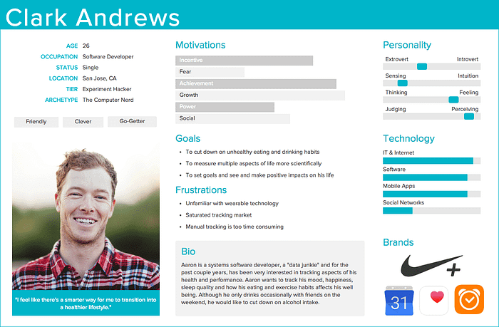
User personas and user journeys
Think of user personas as those imaginary friends who represent your target users. They’re like the characters in a gripping novel, with their own goals, personalities, and pain points.
When creating user personas, don’t just pull them out of thin air. Get out there and do some user research. Talk to real users, observe their behavior, and uncover their deepest desires.
Personas must be grounded in data in order for them to be effective. And don’t forget to sprinkle in some anecdotes or quotes to make those personas come alive!
User journeys are like maps that show you the winding path your users take to achieve their goals.
Picture this: your user, let’s call her Jane, starts by searching for your product, then she enters your website, searches for a few items, adds them to her cart, and checks out. Mission accomplished!
Map out those user journeys by showing the steps, the emotions, and the pain points along the way. You can use flowcharts, storyboards, or even stick figures! The important thing is to give everyone a clear picture of what it’s like to walk in your users’ shoes.
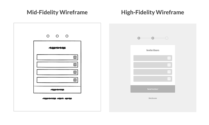
Wireframes and prototypes
Wireframes are like the blueprints of your interface, showing the layout and structure without getting into the nitty-gritty of colors and fancy visuals.
When it comes to wireframes, there are different fidelity levels to consider. The fidelity level of your wireframes depends on the stage of the design process and the purpose of your documentation.
Low-fidelity wireframes are great for exploring ideas and gathering initial feedback, mid-fidelity wireframes help refine the design, and high-fidelity wireframes bring your vision to life.
Now, prototypes take it up a notch. They’re the interactive versions of your design, giving stakeholders a taste of how things will work by allowing them to click through screens as if they were fully functioning. It’s like a sneak peek into the future.
When documenting wireframes and prototypes, don’t just slap a bunch of images on a page and call it a day. Be a storyteller!
Capture screenshots, add annotations, and explain the reasoning behind each design decision. Show the evolution of your design, the “before and after” that’ll make everyone go, “Wow, what a journey!”
Design system components and patterns
Design systems are like the superheroes of efficiency. They’re like a treasure trove of reusable components and design patterns that save you time and headaches.
You have things like buttons, forms, cards, and navigation elements — all neatly organized in one place. It’s like having a toolbox full of shiny tools ready to unleash your creative powers.
So document those design system components and patterns. List them, explain how to use them, how not to use them, and provide examples and code snippets for your fellow designers and developers. Trust me, they’ll thank you for making their lives easier.
Interaction design
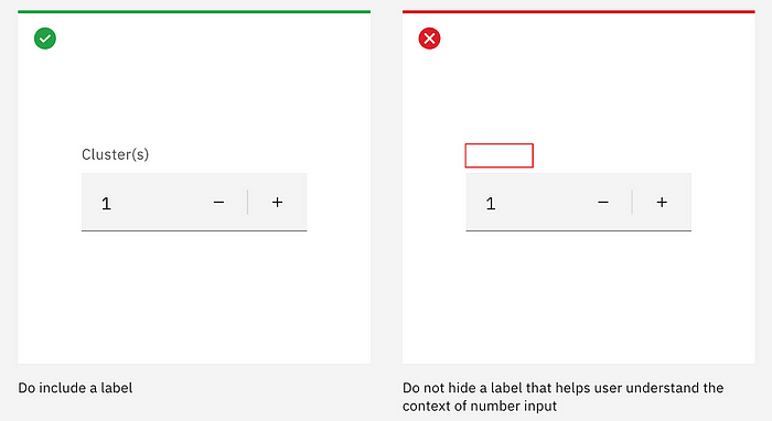
With each component or design pattern comes interaction guidelines. This is where you bring your interface to life!
First things first, you have to understand the principles of interaction design. It’s all about making your interface intuitive, so users don’t end up banging their heads against the keyboard.
Remember affordance, signifiers, and feedback? They’re like the holy trinity of interaction design.
Affordances
Affordances are the possible actions a user can take with an object, such as submitting a form or clicking a button. They imply how an object can be used without exactly telling the user. Think about the handles, buttons, or coin slots of an arcade machine.

Signifiers
Signifiers are visual or auditory cues that indicate the presence of affordances, kind of like hinting to the user what they can do.

Feedback
Feedbackprovides users with a response when they interact with an element, just like how buttons have hover and active states to let you know that it’s working as intended.
Together, these concepts create intuitive and user-friendly experiences, guiding users, and providing confirmation. Users can easily understand how to interact with an interface, where to focus their attention, and receive clear responses to their actions. It’s like dancing with a partner who anticipates your every move.
Accessibility considerations
Accessibility isn’t just a buzzword — it’s a moral obligation. You gotta make sure your product is usable by everyone, regardless of their abilities.
Start by including WCAG compliance requirements in your documentation. Those Web Content Accessibility Guidelines will be your guiding light in creating an inclusive experience.
But don’t stop there. Share some tips and tricks for designing accessible content. Teach everyone how to add alternative text for images, how to make your product keyboard-friendly, and how to check for color contrast.
Remember, accessibility is not an afterthought. It’s a fundamental part of good design. So spread the word and make the world more inclusive — one accessible interface at a time.
Tips for organizing and structuring UX documentation effectively
Using clear and logical headings and subheadings
To structure your documentation like a pro, you should use clear headings and subheadings. None of that vague mumbo-jumbo that leaves everyone scratching their heads.
Break down your documentation into sections and subsections that flow logically. Think of it as a roadmap guiding your readers from Point A to Point B without getting lost in the wilderness. And feel free to add some numbering or bullet points to make it even easier to follow.
Creating separate sections for different aspects of UX
You know what they say: divide and conquer! When it comes to organizing your UX documentation, don’t be afraid to create separate sections for different aspects of UX.
Have some insightful research findings? Slap them in their own section. Got some drool-worthy design assets? Give them their own spotlight. Guidelines and technical specs? Yep, they need their own little corner too.
By organizing your documentation into sections, you make it easier for readers to find the information they need without getting lost in a maze of words. Oh, and don’t forget to add a table of contents or some navigation aids to give everyone a handy map of your document.
Best practices for writing UX documentation
Using plain language and avoiding technical jargon
When it comes to writing UX documentation, don’t go all fancy with the technical jargon. Keep it simple and straightforward like a conversation with your favorite barista.
Use plain language that even your grandma would understand. Explain those complex concepts in a way that doesn’t make everyone’s head spin.
And hey, if you do need to use some technical terms, make sure to provide clear definitions or explanations so everyone’s on the same page.
Keeping sentences and paragraphs short for readability
Long sentences and giant paragraphs? Ain’t nobody got time for that!
Break down your information into bite-sized pieces that are easy to digest. Keep those sentences short and snappy, and paragraphs no longer than a TikTok video.
By keeping things concise, you make it easier for readers to scan your documentation and find the specific nuggets of wisdom they’re looking for.
Including visuals and examples for clarity
Let’s face it. Words can only do so much. Sometimes you gotta let the visuals do the talking. So don’t be afraid to include screenshots, diagrams, and illustrations in your documentation.
Visuals can bring your ideas to life and make them easier to understand. Show examples of good and bad design practices. Tell stories through images that resonate with your readers.
And hey, if you’ve got some funny or embarrassing design fails to share, even better! Everybody loves a good laugh.
Utilizing bullet points and numbered lists for easy scanning
Do you know what’s easier to read than a never-ending wall of text? Bullet points and numbered lists. Break down your information into bite-sized chunks that are as scannable as a menu at your favorite burger joint.
Use bullet points to highlight key points or steps. Numbered lists work great for providing instructions or guiding readers through a process. And if you really want to make an impact, use bold or italics to make those important keywords or phrases pop.
So there you have it — a practical, no-nonsense guide to creating UX documentation that’ll knock everyone’s socks off. Use this template as your secret weapon, and remember, keep it conversational and direct. Now go forth and document your UX design process like a pro!
Recommend
-
6
2013/04/03 Don't be a Jerk: Write Documentation Developers hate writing documentation. And generally, users hate developers who don't write documentation. There's a subset of users who dislike going through...
-
3
PHP Like Documentation for ActionScript Thursday, February 27, 2003 Yesterday I asked about public bugbases, and got a pretty good response. Howe...
-
2
@veedranVedran Cindric Software developer / 18 years of PHP/MYSQL experience / Founder at Treblle
-
1
Write go like a pro September 24, 2018 So you enjoy go and are ready to take your go-application to production standards. Here is a listing of some tricks on how to get your application production-ready. Not all these a...
-
4
VisiCalc started as a reference card. The Nest thermostat started as a press release. AWS, seemingly, started as a 128-word memo. “Writing is a way of finding out,” wrote Kettering University’s Marvin Swift in
-
4
Automate Terraform Documentation Like a Pro Patrons
-
1
Let’s Use AI To Fix Bugs and Write Documentation AI Coding assista...
-
8
Support is great. Feedback is even better."👋 Hey Product Hunt! We're thrilled to launch Write Like a Pro. We'd love to hear your feedback on the product, including what you think about our features, pricing, and overall value. Your i...
-
4
AllWriteWrite like a Pro with AllWriteFree OptionsTransform the way you write with AllWrite - the AI-powered app that creates top-quality content...
-
1
About Joyk
Aggregate valuable and interesting links.
Joyk means Joy of geeK