

Illustrating for accessibility: enhancing digital experiences for colorblind use...
source link: https://uxdesign.cc/illustrating-for-accessibility-enhancing-digital-experiences-for-colorblind-users-62bf4da1d853
Go to the source link to view the article. You can view the picture content, updated content and better typesetting reading experience. If the link is broken, please click the button below to view the snapshot at that time.

Illustrating for accessibility: enhancing digital experiences for colorblind users
9 discoveries and insights from a UX research investigation on illustrations for colorblind
I’ve worked for six years at one of Latin America’s largest education companies, and there I had the privilege of contributing to the maintenance and redesign of the flagship platform for preparatory courses for universities entrance exams. When there was a change in the business model, an opportunity appeared to reimagine the user experience from scratch and, of course, try to focus on accessibility.
Our initial approach was to create a more vibrant and lively environment by incorporating illustrations into the course pages. To validate this concept, we conducted user testing comparing the old platform with an MVP prototype. The results confirmed our hypothesis, but they also highlighted the need to refresh our illustration library, which was outdated and insufficient for the new scenarios we were addressing.
Recognizing this, we embarked on a journey to propose a new set of illustrations, this time with accessibility in mind right from the start. We saw this as a golden opportunity to embrace UX research and uncover valuable insights to guide our design decisions. We were eager to discover what we would learn and how it would shape the future of the platform.
Our top goals
- Understand how far we can go with details in the illustrations, whether we should use outlines or not, which type and style of illustration is more accessible, etc;
- Understand the relation between color blindness and other disabilities, diseases, and visual disorders — how they can prejudice the experience and what we can do to minimize these pains;
- Define a feature proposal for interface color themes and illustrations that makes sense for most cases;
- How to address this issue within the platform and what other details are important to complement the color issue;
Research planning, scope, and development
As there was no previous mapping of the users’ possible disabilities on these platforms, I had a lot of difficulties finding colorblind users. However, as the students’ profile is quite extensive, in general, encompassing many people from different life situations, ages, gender, etc., we decided to invite non-user colorblind people that would match the personas.
We found some colorblind profiles that were different from each other, which was very interesting for the research — most had mild color blindness, but we had medium levels and also a very rare case of monochrome, which only sees black, white, and yellow. And although we’ve searched a lot, we didn’t find colorblind women to participate, after all, it’s a very rare condition on them.
Note: I was leading all the accessibility research but since I had a lot of help from the amazing designers that were working there back then, not only idealizing but taking notes and giving their opinion during the process, you may notice that I’ll use “we” instead of “I” when explaining the process because I believe after all it’s was a teamwork. A huge thanks to everyone that got involved in this research somehow.
“My visual impairment means that I need bigger letters and that the background where the letters are written is not white or very bright.” — Student with visual impairment
Desk research
Previous research was carried out to understand the general context of color blindness and its influences on the experience with digital interfaces. In summary, the main types of color blindness are:
- Dichromacies (Protanopia, Deuteranopia, Tritanopia) — consist of the difficulty in identifying one of the 3 main colors (red, green, and blue)
- Trichromacies — the person has difficulty differentiating some colors;
- Monochromacy — the rarest case in which the person only sees black, shades of gray and white, sometimes seeing a single color, such as yellow;
What WCAG says
While WCAG (Web Content Accessibility Guidelines) serves as my guiding principle, I rely on it as a baseline and complement it with usability tests and insights from articles shared by fellow researchers. However, in accordance with WCAG criteria 1.4.3: Contrast (Minimum), 1.4.6: Contrast (Enhanced), and 1.4.11: Non-text Contrast, illustrative images are not mandated to meet minimum contrast requirements. Instead, the focus is primarily on interactive elements and informative visuals, such as graphics.
Nevertheless, our objective extends beyond adhering to the fundamental rules of accessibility. We strive to enhance the overall experience by providing a wide range of options and empowering students to choose what suits them best in terms of comfort and satisfaction. By going above and beyond, we aim to create an inclusive environment that caters to diverse user preferences.
Interview and dynamics in Figma
We initiated the interview by inquiring about the individual’s personal journey with color blindness, including when they first recognized their condition, their primary challenges, their relation with colors, and the resources they utilize to navigate daily life. We also delved into their experiences and obstacles encountered in a world that often lacks inclusivity.
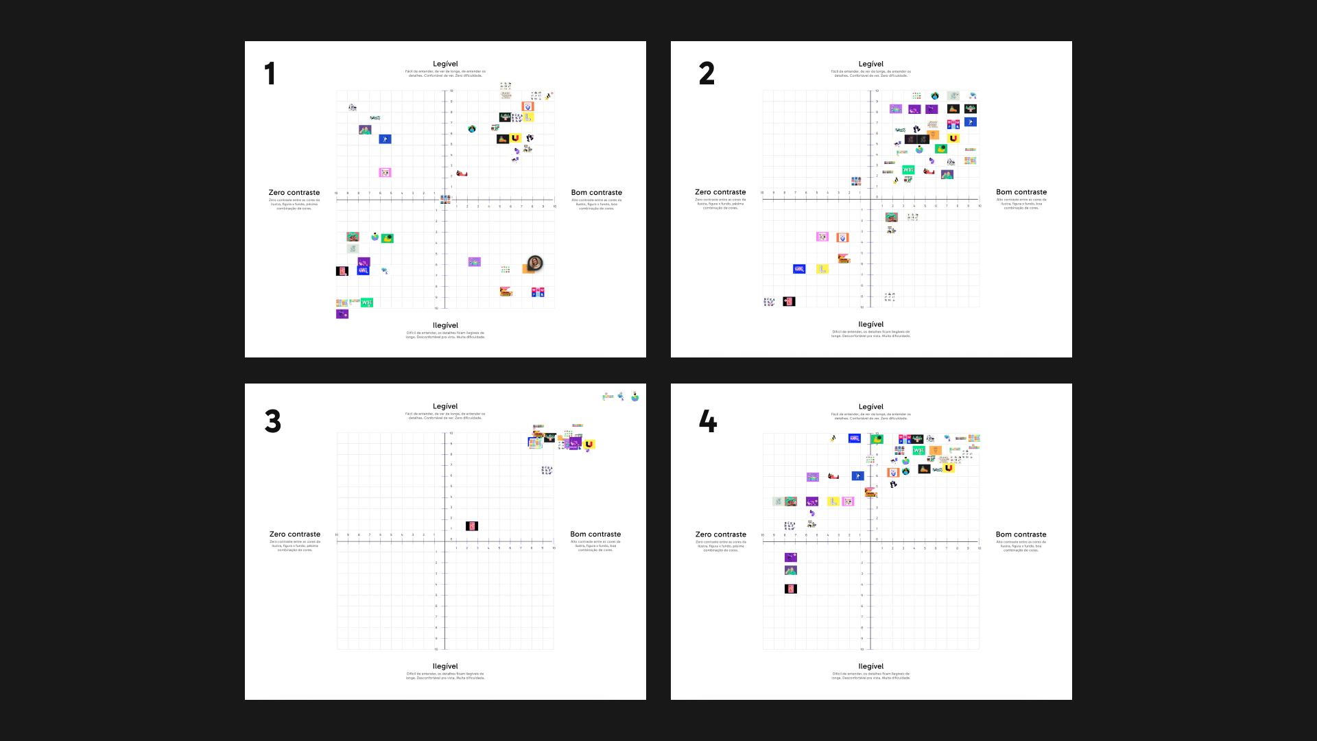
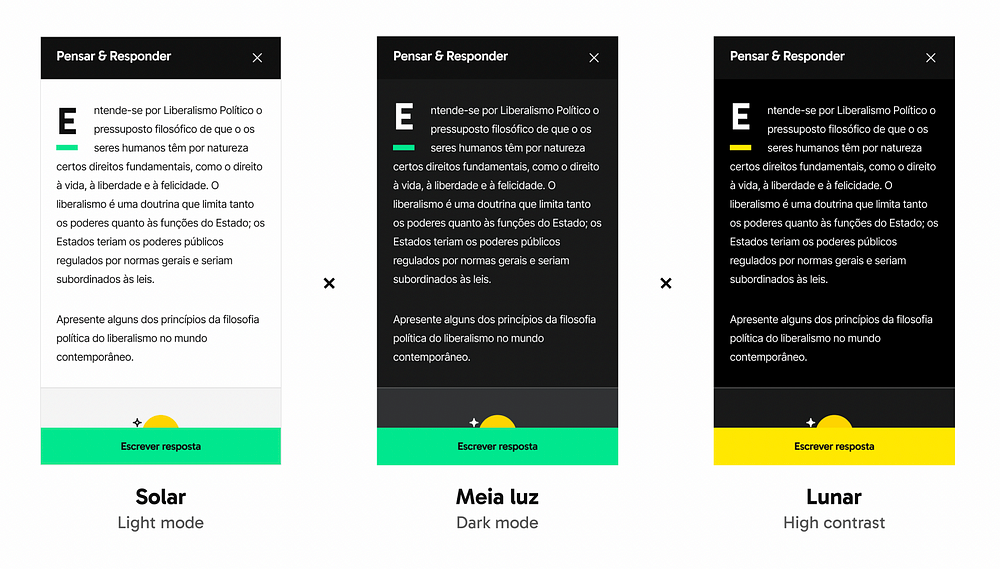
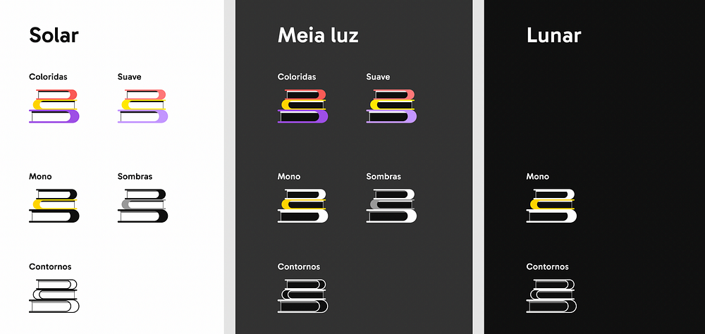
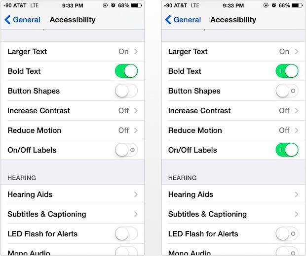
Subsequently, I introduced an engaging exercise in Figma, involving a Cartesian graph ranging from 10 to minus 10, featuring two axes: readability vs. contrast. Each interviewee was presented with a collection of diverse illustrations representing different types and styles. Their task was to position each illustration on the chart based on their perceived levels of readability and contrast.
In the following image, four examples of this exercise are displayed, showcasing fascinating disparities among the participants’ assessments. Chart number 3, for instance, belongs to an individual with mild color blindness, who faced minimal difficulties discerning colors and details. Charts 2 and 4 illustrate varying levels of ease and challenges experienced by different individuals. Conversely, chart 1, created by a user with monochrome vision, exhibits the extreme end of color blindness, with approximately 70% of the illustrations posing significant problems.
This dynamic exercise provided valuable insights into the diverse perspectives and experiences of individuals with color blindness, highlighting the unique challenges they encounter in perceiving and interpreting visual content.
Discoveries and insights
The way people perceive colors can strongly influence the way we see and deal with the world. In one report, we found that some colorblind people may have difficulty eating certain foods because the color is unappetizing, for example. This situation also happens in the digital environment. A platform with too many colors, that don’t contrast with each other or that are simply unpleasant can harm the experience of these users. Let’s delve into some insights that led me to the solution I’ll present later.
1. Be careful with outline illustrations and too many details
When the illustration is done only with outlines, with a hollow background and fills, they tend to be well evaluated in terms of contrast. However, when it comes to readability, it will depend on the level of detail, as the lack of color combined with a high level of elements only separated by lines can end up getting a little confusing. So even if it is a good option for some cases, you also need to pay attention to visual pollution, to ensure that it works well. Less is more.
“The more detail an illustration has, the more it complicates the dynamics of those with visual problems” — A user with colorblindness
2. Be aware when illustrations contain text
When text messages are used in low contrast with the illustration, the text can be confused with the drawing and create difficulty in reading. Just as mixing elements can make one letter confused with another and lead to confusion. It is important to use words only when they are relevant to understanding the image, and always contrast with the background so that it has visibility.
3. Color disabilities can be influenced, heightened, or even induced by external factors
It’s always necessary to take into account the user’s context, or at least the possible contexts. These factors can be not only color blindness itself, but also other vision problems such as myopia, hyperopia, and astigmatism. Keratoconus, for example, is a condition that can benefit from a lower incidence of light, as it causes photosensitivity in the user, requiring a dark interface, such as dark mode.
In addition to external factors such as the environment, light, and time of day: at night, people tend to use the device’s brightness to a minimum and the night mode so as not to harm their sleep and not to hurt their eyes. When there is a barrier to understanding due to the colors, these extra factors add up, increasing the variables and damaging the experience.
4. It’s difficult to predict with high accuracy
Color blindness, or Daltonism, encompasses various types of impairments in perceiving colors accurately. While the most common types affect red, green, and blue color perception, other variations exist, including monochrome vision where individuals perceive no colors at all. The manifestations of color blindness differ among individuals, with some experiencing mixed colors, others missing specific colors, and some perceiving colors in washed-out tones. Furthermore, the severity of color blindness can vary due to genetic variations in the genes responsible for color vision.
Given the diverse nature of color blindness and the extensive range of color palettes used, it is challenging to provide a universal solution that caters to everyone’s needs. However, certain variables have shown effectiveness in accommodating most cases. Opting for monochromatic designs and using outlines instead of intricate color differentiations can reduce cognitive load and simplify visual assimilation.
Digital platforms should offer customization options based on research and studies conducted on color blindness. This approach allows users to choose settings that provide both comfort and aesthetic satisfaction, ensuring an inclusive and personalized experience for all.
5. The level of detail and cognitive load may be critical factors
Some of the interviewees complained when the illustrations had a very high level of detail, because, in addition to impairing the contrast — when the colors no longer contrasted well with each other — it also impaired the legibility and understanding of the message that the illustration conveyed.
In the context of the UX research and the platform we were creating, there was a need to apply future illustrations in different sizes, such as small cards and page covers. So, ideally, illustrations should be cleaner, with less detail, less complexity, and cognitive load, so that they adapt to different scenarios.
6. Fighting the brand book
Sometimes we may find ourselves working on a project, product, or company that isn’t as open to readjusting its brand book to embrace accessibility, maybe because of a lack of accessibility culture. This could be a problem or an opportunity: rather than squirming, we might propose adding to the platform customization what I’m going to call “illustration and visual assets themes”. In this way, we maintain a default option in which the original brand colors are maintained, but at the same time, we allow users to choose color options in illustrations that are more accessible and/or visually appealing to them.
7. While plugins and online tools provide some insight, it is unwise to depend solely on them
There are a bunch of tools that simulate color blindness, such as websites, plugins for Figma, and other programs, etc. These tools are good for getting a sense of contrast and readability, but they aren’t enough to bring the hammer down. This is because we are not considering the usability of the person who sees it differently. What is readable is not necessarily comfortable to use in the long term. The suggestion is to do a first validation with these tools and then test again with users. Here I’ve selected a few ones for you to test:
- Stark, plugin for Figma, Sketch Adobe XD. In addition to checking color contrast, it presents feedback according to WCAG and also simulates color blindness in the free version
- A11y — Color Contrast Checker, a plugin for Figma
- Color Review, tests contrast and simulates applying colors in different font sizes
- Adobe Color, which also simulates color blindness
- Who can use, to test with all types of color blindness
- Colorblind simulator, to simulate colorblind vision in photos
8. Accessibility tweaks help non-disabled people too
Color modes aimed at colorblindness are often used by non-colorblind people as well, as they improve contrast and help usability, especially in digital games. Themes, such as dark mode, are commonly preferred by people who use interfaces at night, because it reduces the light intensity, and also by people who simply don’t like white backgrounds. White background can greatly impair the usability of people with disabilities like keratoconus, astigmatism, and many others. Some people get sick and may even pass out from using an interface like this for many hours. Accessibility settings make the product much more versatile and adaptable to different user profiles, in addition to helping with the health.
9. The brand’s voice tone must be inclusive
People with disability may experience the difficulty of dealing with judgment from others, especially during childhood and even now, which can be emotionally exhausting. One of the interviewees said that he used to decorate the numbering of colored pencils so as not to be mocked at school. However, we can approach this issue in a more user-friendly manner. Instead of framing it solely as a disability, we can create an experience where individuals choose an illustration style for their profile, similar to selecting a theme designed with color blindness in mind for aesthetic reasons. Adopting playful and unique names for color modes, both for the platform and illustrations, adds vibrancy and ensures that users feel a personal connection with the product.
Considering the importance of inclusion beyond diversity, we can handle these issues on the platform naturally, providing customizable options that users can choose based on their preferences, thus breaking down barriers and treating individuals as more than just their disabilities.
Recommendations for the new platform
Illustrations and visual assets should match the interface’s theme
Not only will the illustrations have their new color combinations, but the platform must also contain themes that will carry these new appearances. In addition to the basic light mode and dark mode, I suggest high contrast mode — the latter ensuring minimum WCAG contrast, we keep the interests of the company and the user in common accord.
New illustration and visual assets themes
The feature proposal consists of a combinatorial analysis — with some exceptions. We are working with the three previously mentioned color modes, combined with the following colors for illustrations (temporary names and in Brazilian Portuguese):
- Coloridas, or Colorful, for the happiness of the visual designer who defined the brand’s color palette— consists of the original brand colors;
- Suave, or Soft, are the original colors in pastel versions, as we also understand that very strong colors can be bad for cognitive impairments, while soft colors have less visual load;
- Mono, which stands for monochromatic, is basically black, white, and yellow, for the most extreme Daltonism levels that only see yellow;
- Sombras, or Shadows, in which balance shades of gray;
- Contornos, or Contours, basically outlines.
All of them can be combined with light mode (here called Solar) and dark mode (which we called Meia Luz or Half-shade), while only Mono and Contours can match Lunar (high-contrast mode) since the contrast rules should be applied to it.
As since we’re changing illustration colors to match accessibility
As we commit to redesigning illustrations and rethinking color blindness, it’s important that the rest of the platform behaves in the same way. This means that all its functional elements, such as buttons, links, etc., must also respect the WCAG rules. Therefore, the copies must not contain instructions that depend on vision and the colors must have the minimum contrast ratio to each other.
Another detail that can make a difference is providing an option to add symbols for color differentiation when they are relevant to convey information. Apple created a label to differentiate the binary buttons:
The ColorADD system, which consists of simple symbols such as rectangles and rectangular bars, can also be used to categorize when more than two colors are involved.
How to make it work
You may think that there are too many variables here and that would probably cost a lot to buy illustrations in a lot of different colors to fit the various themes and options (that would be 12 combinations). But we had a good plan.
In order to make it work for both designers and developers, we would only have the principal illustration made by the illustrator, and then, using the SVG Figma plugin, we would export its SVG including class names to all HTML tags — this way, with just one click, we could change its color by changing the theme, therefore automating and facilitating the creation of variables.
And although we went all the way through this path, many reprioritizations on the company and budget redefinition occurred, resulting that we had to use the same old illustrations and there was no room for new accessibility features (story of my life!). But let’s keep our hopes up that one day it’ll happen and we’ll have more learnings to share.
Recommend
About Joyk
Aggregate valuable and interesting links.
Joyk means Joy of geeK