

Slack’s Most Confusing UX Writing
source link: https://uxplanet.org/slacks-most-confusing-ux-writing-edbfa6cc7723
Go to the source link to view the article. You can view the picture content, updated content and better typesetting reading experience. If the link is broken, please click the button below to view the snapshot at that time.
Slack’s Most Confusing UX Writing
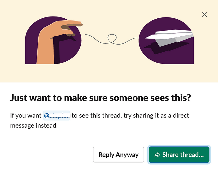
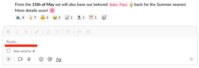
Want to make sure someone sees this? Reply anyway.
“I can’t understand what they want from me,” — says Ed, pensively sipping on his smoothie (yes, we have smoothies at work, but it’s not the point).
By “they,” he means Slack, a widely-known corporate messenger with maybe the best UX writing in the world. They specialize in a clear and witty style; their copy usually sounds delightful. The brand’s voice motto is:
Slack voice is clear, concise and human, like a friendly, intelligent coworker
However, in the case above, I feel writers got too confident and produced a piece confusing enough to be the worst window I’ve ever seen in Slack.
What’s wrong with this UX writing?
Title: Just want to make sure someone sees this?
Subtitle: If you want N to see this thread, try sharing it as a direct message instead.
Buttons: Reply Anyway / Share thread
First of all, can you understand what’s going on in this window without context? I couldn’t. So I reenacted the steps for it to appear:
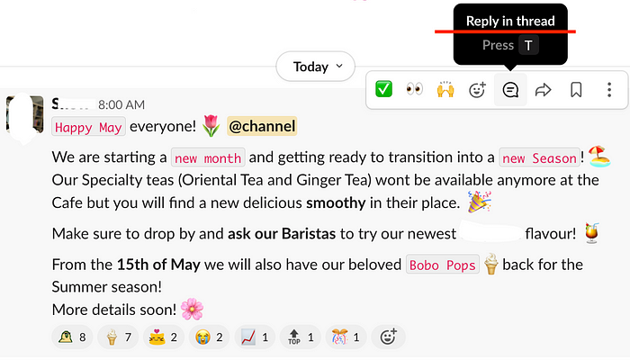
- Go to a thread (choose “Reply in thread” for this):
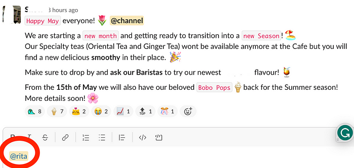
2. Tag someone:
3. Press “Enter” to send the message, and the cursed window will appear!
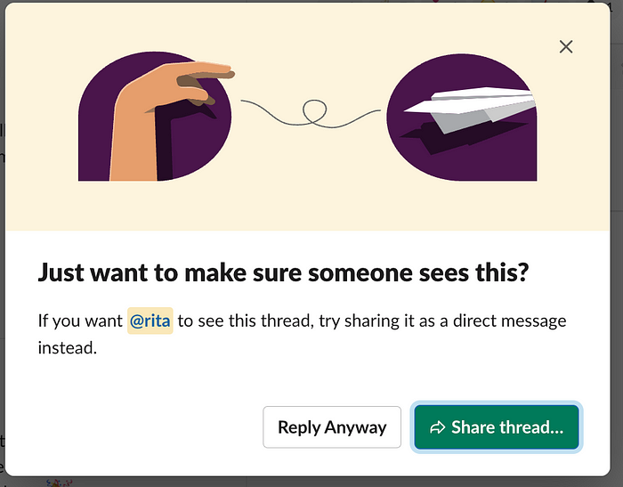
Now, things have become clear. Slack suggests you share this thread as a direct message instead of flooding under a thread. This feature is genius and seeks to replace annoying “FYI,” but… Why do I still feel confused?
Too much of a good thing
We’ve been spoiled in the past with clear UX copy like this popup:
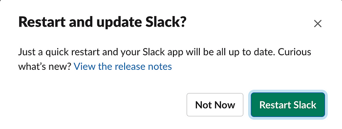
Here the word “restart” is repeated 3 times, and it’s impossible to misinterpret the message. Slack increases readability by putting the same non-vague call-to-action verbs in the button and the title.
What is clarity in UX writing
Writing clear copy means writing so that users have clear expectations for what they will get from this or that part of the UI.
NN/g describes web users as:
…action-oriented, “leaning forward” in the hunt for answers to their current question, rather than leaning back to absorb a good book.
UX writers’ highest priority is crafting the most obvious UI that will provide the answers immediately. And with Slack’s “Share Thread” window, I simply don’t get the answers.
How can Slack make this UX writing less confusing?
These simple tips can improve the scannability of the text and make the message more obvious:
- Remove nonessential words
- Remove unnecessary conversational tone
- Move the keywords to the front of the title
- Get rid of the vague call-to-action verbs
- Be consistent in your capitalization (the “Reply Anyway” in Title Case and “Share thread…” in Sentence Case look so alien together!)
- Add call-to-action words to the button and the title
Let’s try and remake the original UX writing:
Title: Just want to make sure someone sees this?
Subtitle: If you want N to see this thread, try sharing it as a direct message instead.
Buttons: Reply Anyway / Share thread
Into something more comprehensible:
Title: Share thread to make sure someone sees this
Subtitle: If you want N to see this thread, share it as a direct message instead.
Buttons: Reply Anyway / Share Thread…
It’s not ideal — “Reply Anyway” when you just tag someone in a thread isn’t technically “replying”. But that’s how all messages are titled under threads:
But at least it’s clearer! I think.
Recommend
About Joyk
Aggregate valuable and interesting links.
Joyk means Joy of geeK