

Bringing Dark Mode to our News Apps
source link: https://open.nytimes.com/bringing-dark-mode-to-our-news-apps-409266136ed4
Go to the source link to view the article. You can view the picture content, updated content and better typesetting reading experience. If the link is broken, please click the button below to view the snapshot at that time.
Bringing Dark Mode to our News Apps
How teams across The New York Times launched the dark mode feature to our news apps.

Illustration by Eve Liu
By Akasha Archer, Angelique De Castro, Audrey Valbuena, Danielle Zhu, Joseph Kohlmann, Kika Gilbert, Mark Murray, Nate Clancy, Rachel Dixon and Véronique Brossier
The New York Times recently rolled out the long-awaited dark mode functionality for iOS and Android news apps.
For years, the case for dark mode was well-supported by both our business goals and user requests. Launching dark mode would help us achieve our long-term vision of producing a high-quality product that is valuable and worth paying for. Furthermore, our research found that dark mode was identified as a “must-have” feature for both subscribers and non-subscribers, many of whom had been requesting the feature with our Customer Care team. We knew that as a content-forward app, having accessible ways of viewing New York Times journalism was important, and we wanted to consider the high standards of our brand when implementing this feature.
There was no denying dark mode was a priority feature we wanted to make happen for our in-app readers. But as our teams discovered early on, it was easier said than done. The path to dark mode meant two major challenges:
First, creating a set of core colors to use for dark mode. And second, implementing those colors across platforms.
A Survey of Colors
In late 2020, iOS engineers working on the News app team began investigating what it would take to introduce dark mode to the app and drafted a Request for Comment (RFC). They proposed an org-wide color library that would publish to independent libraries for each of the three relevant platforms: Android, iOS, and Hybrid Web.
At the same time, a Design Systems team was organizing, with an early goal of building a design system for our editorial surfaces, including the News app. We realized the design system’s color tokens could be a key to unlocking dark mode implementation across platforms and teams.
The design system’s refreshed set of core color tokens would help to achieve greater consistency, more efficient workflows, and a heightened focus on accessibility. Prior to our design system work, there was little consistency related to color usage throughout our product. Without a core color system, different designers and engineers would ultimately end up using different sets of color values. As a result, users would be exposed to inconsistent colors as they moved through the experience.
After conducting an extensive organization-wide audit, our design team worked to update our palette to a more intentional set of core colors, each with a specific target (e.g. for content, backgrounds, strokes) and a semantic name based on usage or hierarchy (e.g. primary, secondary, accent).
Aside from other requirements we had for our color system, we wanted our colors to be capable of rendering in two different themes: light and dark. Therefore, each color really has two definitions, a light value and a dark value.
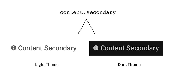
The light theme provides dark content colors for use on light backgrounds, and the dark theme provides light content colors for use on dark backgrounds.
When successful, attaching two different values to each semantic color means that a design system user can trust that the colors they use will convert as an entire group, and retain their intended hierarchical and contrast differences, regardless of theme.
We also solved for a number of edge cases in which the theme we wanted to use wouldn’t be solely dependent on a user’s device setting. This means that when necessary, we can modify colors such that they render sections of a screen in the dark theme, even if a user is in light mode on their device.
When we were finished defining and naming our colors, we published them in various libraries for our designers and engineers to start working with. Our color system will likely continue to evolve, but our current version enabled us to get to the next step of implementing dark mode.
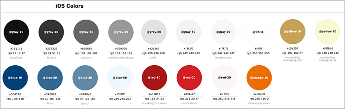
The color palette defined in 2016 when the News app was created.
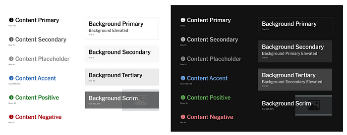
A piece of our simplified and more intentional color palette, with light and dark themes.
A Cross-Organizational Effort
The adaptation of dark mode was fairly straightforward in our iOS and Android native apps after standardizing our palette across our code base using the design system’s color tokens.
However, our apps also adopt a hybrid approach to rendering, with a native shell and webview content. This allows us to more closely match the appearance of news content in-app and on nytimes.com, while also letting us iterate on news content design and features more quickly. Thus, much of what a reader sees in the app — story articles, live blogs, interactives, etc. — is a customized version of our main website.
Thus, we encountered a paradox: To ship dark mode in our native apps, major parts of our web apps needed dark mode support.
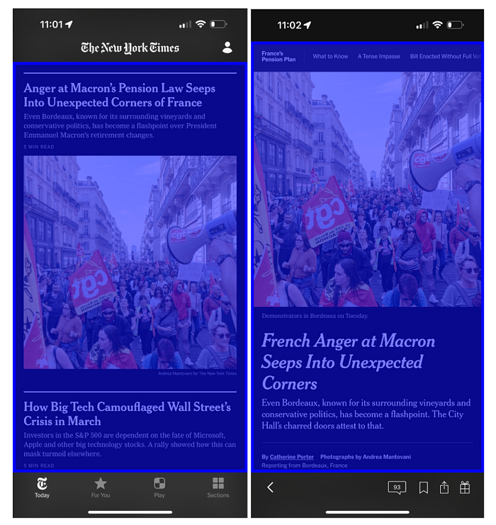
Screenshots of the NYT iOS app’s Today tab and news article view in dark mode. The blue overlay shows which part of the screen is web content. In both screenshots, the blue overlay covers the screen from the status bar and top toolbar to the bottom toolbar.
Which parts of our web apps did we need to update for dark mode? To answer this question, the design systems team audited the colors we use in our web apps. We first looked all over the iOS and Android apps to broadly confirm which web content appears in-app. Then we built a custom source code search tool to find color values within the affected web apps. Then we identified equivalent color tokens for each color while also refining the search tool until its results were representative.
We found that migrating to dark mode compatible color tokens would ultimately span many codebases and teams. Thus, we put together a guide, which identified the existing colors and source files belonging to a given team, plus the recommended tokens to migrate to. We also beefed up our documentation, opened up Slack channels and scheduled open hours meetings to offer support and answer questions about the migration process.
With all of the above in place, different teams across the technology organization began migrating to color tokens. Beyond color token implementation, we also worked with publishing platforms teams and the newsroom to come up with solutions for making graphics and interactive assets compatible for dark mode.
Before launching publicly, we released dark mode as an internal beta to give ourselves the opportunity to test, catch and fix any bugs, as well as get others in the organization familiar with dark mode.
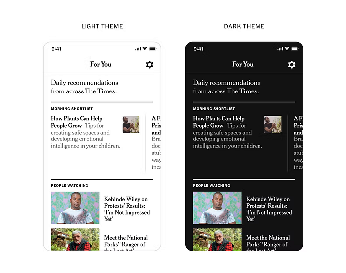
The app in light mode (left) and dark mode (right).
After launching to our users, the impact was immediate, and many readers wrote in thanking us for the feature. What started out as an initiative of one or two teams evolved into a massive effort across the technology organization and the newsroom, involving high collaboration between engineering, design, product, program management, product marketing and more.
Our design systems continue to evolve, and teams continue to build using our color tokens. We’ll also look to make improvements to the feature, ensuring teams on both the business and newsroom sides have the easiest way possible to make content dark mode compatible. Though dark mode is officially out to the public, behind the scenes, our teams continue to work towards making our NYT news apps the best possible experiences for our users.
Recommend
About Joyk
Aggregate valuable and interesting links.
Joyk means Joy of geeK