

Focusing on the polarization: Designing effective charts for the Likert scale
source link: https://uxdesign.cc/focusing-on-the-polarization-designing-effective-charts-for-the-likert-scale-47512f265d90
Go to the source link to view the article. You can view the picture content, updated content and better typesetting reading experience. If the link is broken, please click the button below to view the snapshot at that time.
Focusing on the polarization: Designing effective charts for the Likert scale
#26: 100% Stacked Bars or Diverging Stacked Bars

Created using Freepik graphics
When it comes to visualizing the Likert scale, we have quite a few options. We can use 100% stacked bars, a panel bar chart (or its grouped version), or some variant of the diverging stacked bars depending on the placement of neutral answers. Each one of those charts focuses on slightly different aspects of the data, but the diverging stacked bar with the most antagonist values in the center is the best. The short answer is that they are the most insightful, empower quick data scan, introduce flexibility with placing the neutral responses, and show both total agree/disagree shares and degree of polarization. For a more comprehensive explanation, I recommend Daniel Zvinca’s article. He thoroughly analyzed the diverging stacked bars usage, and I agree with every word there.
This time I redesigned another PEW Research Center chart showing the survey result conducted among adult Americans. The chats show the distributions of respondents who agree and disagree with two statements about how Chinese and American social media companies handle users’ personal data. The first is compliance with privacy policies, and the second is using users’ data in a way that is comfortable for them. I like that both questions are presented as diverging stacked bars, but I believe we can improve this chart.
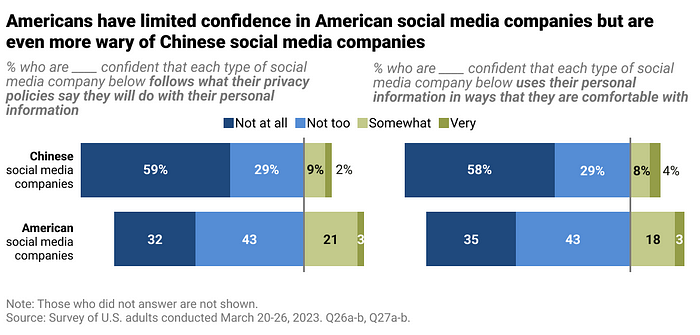
Chart recreated by the author. Source of the original infographic: Americans have limited confidence in American social media companies but are even more wary of Chinese social media companies, PEW Research Center
Good data visualization solutions
Elements that work in this chart
Using the diverging stacked bar
Despite some valid arguments against diverging stacked bar charts, this allows faster data reading. They remove the necessity of looking where the negative answers end and the positive (or neutral, depending on the data) start. With diverging stacked bars, we have two independent sides of the bars, which makes comparison easier.
Horizontally-oriented chart
Using bars instead of columns leaves more space for the labels. In this setup, we can adjust the label area as well as wrap it into two lines that are still coherent. Additionally, we avoid any time connotation by putting one bar above the other.
Using a diverging palette
The purpose of the diverging palette is to show polarity. It usually comes with the neutral point, which can be omitted using the classed (discrete) scale. In our case, because neutral/don’t know answers are not included, we don’t need the neutral point. Using the different variants of the same color helps visually group similar answers. At the same time, the change of color luminosity represents the change in degree. For more details, you can check my other article, where I wrote more about the usage of different palette types here.
Bad data visualization choices
Elements that don’t work in this chart
Two-column layout
Splitting the charts into two columns reduces the comparison possibilities to only cross-category one. On top of that, in the original graph, we don’t have a scale to ease the task. So to compare the two questions, we have to do the math and sum the answers.
Responses order
There are a couple of ways of approaching the diverging stacked bars. We can place neutral responses differently or exclude them; the author chose the latter. We can also pick a different response order — either following the original one or putting the antagonist in the middle. Keeping the original order of categories limits the comparison possibilities only to the total share of those agreeing and disagreeing.
Unintuitive color choice
Blue and green have positive connotations; therefore, we must read the legend carefully to understand the meaning. The categories themselves could be more intuitive. As a person whose English is not a first language, I found “not too” answer hard to understand instantaneously. But as it’s part of the collected data, I didn’t interfere with it.
How to make this visualization better❔
Step-by-step improvements
Material created by the author. Incremental Improvement #26: Step-by-step
Adjusting the layout
Reorganizing the chart and putting bars above one another allows us for cross-category and cross-question comparison. Additionally, it frees a lot of space, which we can fill by stretching bars and making their length easier to compare.
Changing the category order
Reordering the categories and putting the most antagonist in the middle allows focusing on the polarization (sum of those agreeing/disagreeing) and the degree of it (how strong the opinion was). The new order also leaves more possibilities for the placement of neutral answers. We can omit them, present them separately, or glue them to one/both sides of the chart. Including neutrals makes the chart more honest, but in this particular example, neither exceeded 1%. Therefore instead of presenting them visually, I added a comment in the footnote.
Switching to more intuitive colors
While the divergent palette was a good choice, the color selection could have been better. Because the chart presents those agreeing and disagreeing, we should use colors with positive and negative connotations. The combination of blue and red will do. We can also work on the legend’s placement and format. Removing squares and switching to colored text will ease the reading. Putting it close to the data and adjusting it to reflect the category order considers how the user will consume the chart.
Working on formatting
Lastly, we can work on formatting. De-emphasizing less important elements like category names will create a visual hierarchy. Adding the scale and summed-up labels provides additional insights, making cross-question and polarization comparisons easier.
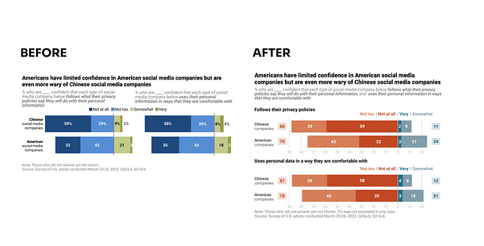
Created by the author. Incremental Improvement #26: Before and After
Recommend
About Joyk
Aggregate valuable and interesting links.
Joyk means Joy of geeK