

I gave myself two hours to redesign the Steam order confirmation page
source link: https://uxplanet.org/i-gave-myself-two-hours-to-redesign-the-steam-order-confirmation-page-352ff68b6935
Go to the source link to view the article. You can view the picture content, updated content and better typesetting reading experience. If the link is broken, please click the button below to view the snapshot at that time.
I gave myself two hours to redesign the Steam order confirmation page
My critique and redesign process
Challenge
Whenever I buy a new game on Steam, the first thing I want to do is play it. So I always search for a button to take me to the game and never find it. I end up stumbling my way to a mostly hidden “Install content” link, which redirects me to my Steam library (where my game may or may not have already started installing) and usually leaves me feeling vaguely like I’ve done something wrong.
As a full-time UX researcher, I don’t spend a lot of time designing in Figma (even though I love it), so I decided to give myself two hours to redesign the Steam order confirmation page to scratch this itch and sharpen my skills.
(Note: I have no affiliation with Steam, just a huge fan!)
Constraints
- Desktop only
- Confirmation page only
- Use the same colors and typography
- Don’t remove anything except copy
- 2 hours start to finish
Original Design (Current State)
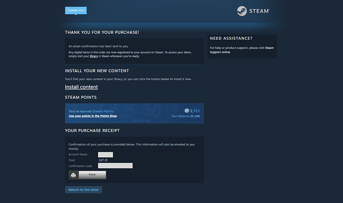
Steam’s order confirmation page on desktop.
Annotations (10 minutes)
Whenever I approach any redesign, the first thing I do is annotate. I take a closer look at what every section is for and make some assumptions about what should be prioritized (and de-prioritized) in the visual hierarchy: What information is most important to the user? What does the user want to do next?
I also analyze the copy and ask: What information is missing? What information is redundant or unnecessary? Where can content be consolidated or otherwise reorganized?

Current state with my annotations, drawing from assumptions about visual hierarchy and best practices.
Competitive Analysis (2 minutes)
I pretty much always use competitive analysis as a starting point. Usually, I’d compare several examples, but given the time constraints, I went straight to Shopify for a pattern.
Then, I quickly analyzed this design and noted what would and wouldn’t work for Steam. The big piece I wanted to take was separating “Customer Information” and the itemized receipt into two columns. Features like shipping would not be relevant for digital purchases, so I knew I’d need to either remove those sections entirely or fill them with other content.

Shopify’s default order confirmation page. Source: ShopStorm
Lo-fidelity Wireframe (20 minutes)
I used Shopify’s two-column pattern for my lo-fidelity wireframe and re-arranged the Steam content to fit like so:
- Combined confirmation and installation instruction copy under the main header
- Consolidated “Customer Information” into a single section and included Steam Points in lieu of shipping information
- Added Payment Method (which was excluded from the original design)
- Downsized and moved the print icon to a more expected location
- Made “Install Now” and “Continue Shopping” primary and secondary CTA buttons at the bottom of the page
- Moved the “Need help?” section above the CTA buttons since it didn’t fit in-line
- Added the itemized game title and taxes in the righthand column (also excluded from the original design)

A lo-fidelity wireframe of the Steam order confirmation page using Shopify’s two-column pattern.
High-fidelity Wireframe (1 hour 28 minutes)
Last, I put everything on a 12-column grid, added color and typography (taken directly from the original), and did as much with spacing and alignment as I could within the time constraints. I found the shades of light blue distracting (and sometimes inaccessible), so I stuck with navy, black, and white with a subtle gradient at the top to maintain some of the original design’s integrity.

Before & After

Conclusion
I found this exercise super satisfying. It did, in fact, scratch the itch in my brain. And designing quickly allowed me to get back into the groove without tiring myself out.
Of course, as a UX researcher, I would want to learn how users currently navigate the page, what information they find most important, and what they usually do right after downloading a game. But I’m pleased with what I was able to accomplish just from being scrappy.
Thank you for reading! I hope you found this informative. :)
Recommend
About Joyk
Aggregate valuable and interesting links.
Joyk means Joy of geeK