

Sparkles aren’t good UX✨
source link: https://uxdesign.cc/sparkles-arent-good-ux-4b8199497c68
Go to the source link to view the article. You can view the picture content, updated content and better typesetting reading experience. If the link is broken, please click the button below to view the snapshot at that time.

Sparkles aren’t good UX✨
Even if they’re aesthetically pleasing, you can’t substitute important information with sparkles.

What does this mean?
I will be the first person to tell you how much I love the sparkle emoji. ✨ I use them constantly, and in most personal projects, I throw them onto my designs like glitter. They give things a little more ✨glitz✨, a little more ✨glam✨, and the four-pointed star cluster is very much in vogue at the moment. Its meaning is almost always positive, so why shouldn’t UX designers use sparkles in their designs?
Origins of the sparkle icon
Retro, 50’s, atomic design is littered with sparkles. Image from Adobe Stock
The four-pointed sparkle motif can be traced to the (becoming popular once more) 1950’s aesthetic. The atomic era slapped stars and boomerang blobs on wallpaper, advertisements, and vinyl diner booths. It’s a design that communicates something beautiful and new, and the stars’ proliferation during this decade perhaps reflects the optimism for new leaps forward in technology at the time. Just look at The Jetsons: this futuristic cartoon family was animated in the early ’60s but was set in the far-off future of 2062. In the cartoon, wherein science fiction borders on outright magic, sparkles stand in for the technical workings of robots and computers.
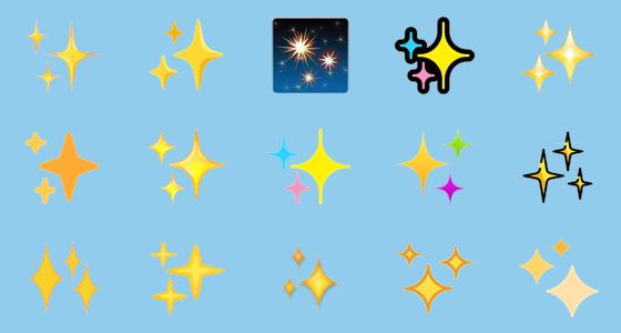
The sparkles emoji have become more homogenous over different operating systems overtime. Image from Emojipedia — https://emojipedia.org/sparkles/
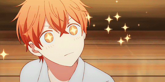
Sparkles came into the 21st century, perhaps by way of Japan. In anime and manga, sparkles are used as emphasis — to show that someone is excited, something if beautiful or lovely, or that someone is happy to have a refreshing glass of milk. Emojis (from the English word “emotion” and the Japanese “ji 字” meaning “character”) also come by way of Japan, and Japanese phone carriers were the first to use these pictograms, including the sparkle emoji, which was described with terms like “sparkling new.”
Behold — ✨✨✨✨✨✨
Why do designers use sparkles?
On social media, sparkles are thrown out all the time a) because they provide a little bit of pretty to every tweet and b) they have gained new meaning, depending on the context. Sparkles can be used for emphasis, for sarcasm, and of course, to represent excitement or congratulations.
On Notion

I can “ask AI” to help me continue writing on Notion.

Not going to lie, the purple sparkles definitely caught my attention — so cute!
More and more, however, sparkles are stepping in to represent something new or even something mysterious, like AI. In Notion, the product which helped me to organize the research for this article, a new AI feature can take over and continue writing, or suggest new ideas for lists. This new and kind of mysterious feature is represented by a cluster of sparkles.
Here on Medium

Member-only ✨
On Medium, you can find the sparkles emoji used in titles of articles that demand excitement, like announcements or proud declarations. More officially, “member-only” articles are denoted with a single sparkle. This shows the exclusive, editor-approved nature of these articles.
In video games

A shiny Gligar is blue, rather than pink. Image from — https://twitter.com/Kelven91/status/1168616458097741831
If you’re a lifelong Pokemon trainer like me, then a cluster of three sparkles makes your heart leap with excitement. In the Pokemon games, “shiny” Pokemon are represented in menus with a sparkle icon. Shiny Pokemon are differently colored variations on the original: a normally blue Gyarados will appear as an angry, red one. While the effect isn’t always so dramatic (shiny Gengar is just a slightly less purple Gengar) the fact of their rarity, crowned with a sparkle effect, makes shinies extremely sought after.

In games, sparkles often represent something good happening, they are a way to congratulate the player. Image from Game Rant — https://gamerant.com/persona-5-royal-how-to-increase-kindness/
In Persona 5, the JRPG that sold over 6.5 million copies worldwide, the protagonist has several stats that they endeavor to raise throughout the game. When he answers a question in class correctly or conquers a burger shop’s eating challenge, their stats raise alongside an animation of musical notes and — you guessed it — four-pointed sparkles.
On Twitter

Twitter’s toggle between the chronological and promoted timeline is represented by a cluster of sparkles Image from Trusted Reviews
Twitter users like Fernando Lins weren’t impressed with the use of the three-sparkle-cluster icon as a representation of the timeline view toggle. Before the toggle was changed to a swipe (after some ire from designers like Lins) users could tap on the sparkles in order to switch between the typical, chronological timeline and Twitter’s algorithmically-curated timeline that highlighted “relevant” tweets.
Lins wrote here on UX Collective that the sparkles icon felt like a purposely bad choice on the part of Twitter. He wrote, “This is, by far, one of the worst choices of icon I’ve seen recently, to the point where I believe it has been chosen to keep users from finding the feature and help Twitter drive more promoted content to everyone’s timelines. It feels like a dark pattern, more than just a bad design decision.”
Why would the sparkle icon be chosen to represent this controversial feature of Twitter?
Sparkles are not magic

Pictured: me talking about how much I love sparkles (despite them being not inherently good UX.)
Considering the range of positive meanings associated with sparkles, why shouldn’t we use them? Sparkles are great, but they don’t have a solid meaning in the same way that a clock or calendar icon has. When tapping on a sparkle, users aren’t entirely sure what might happen next. That’s okay for new things, for features introduced with plenty of explanatory copy, but making a sparkle icon a permanent fixture in a design isn’t the best choice.
Instead, designers should come up with an icon that has a recognizable meaning. In the aforementioned example, Lins recommended that Twitter should have used an icon that communicated the chronological nature of a timeline — use a clock, a calendar, a rising chart, and maybe some items in a row that suggest a timeline. Sparkles are too mysterious. The fact that Twitter wasn’t trying to clearly demonstrate the way users could switch between their chronological timeline and the promoted content feed does indeed feel fishy. As designers, we should strive for transparency and clear communication, otherwise we might lose our users’ trust.
Again, I slap sparkles onto illustrations and branding all the time, but as a functional part of a design, they don’t always make sense. Use icons that have recognizable meanings when you can, and create new ones that can be become recognizable through explanations and continued use. Reserve sparkles for special occasions, to catch attention, or, I suppose, if there’s actual magic in your experience.
What do you think? What have you communicated with sparkles in your designs? Have you seen some good example of sparkles in UI design? Let me know in the comments ✨
</div
Recommend
About Joyk
Aggregate valuable and interesting links.
Joyk means Joy of geeK