

Advanced techniques for writing good interfaces
source link: https://uxdesign.cc/advanced-techniques-for-writing-good-interfaces-c030ae60150
Go to the source link to view the article. You can view the picture content, updated content and better typesetting reading experience. If the link is broken, please click the button below to view the snapshot at that time.
Advanced techniques for writing good interfaces
Feeling stuck? Here’s how to keep moving forward.

Good UX writing takes time. Time to simplify phrasing, make interactions clear, and craft every sentence in the product. But there’s only so much you can do when you’re rewriting. Sometimes good UX writing also involves rethinking.
Is this screen doing what it needs to? Are users clear about that? Do we even need this part of the onboarding that people are gonna want to skip?
I’ve found that rewriting the same thing over and over can be a dead end. If I’m making changes, but things aren’t getting better, it’s time to try fixing something other than the words.
The structure. The type styles. The storytelling on the page.
The next time you’re swirling through endless revisions and need a new idea to get unstuck, here are some techniques you can use.
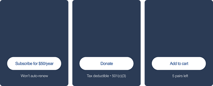
Give CTAs more context.
Calls to action should be short and clear. But sometimes there’s an opportunity to give the user more info. Instead of cramming extra words into a button, add a few words nearby. Maybe there’s an important detail you want to share. Or an explanation about what happens next. And remember: these little snippets of text shouldn’t be written like CTAs. Don’t start with a verb and don’t use the imperative tense. The idea is to complement a button, not compete with it.
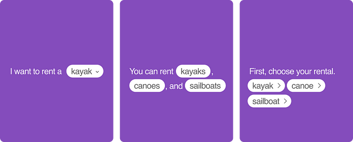
Play with syntax.
The right sentence structure can unlock the right interface. If you’re stuck, try different ways of saying the same thing. Turn a question into a statement. Or write something that uses a fill-in-the-blank technique. There’s only so much you can polish a single sentence. Sometimes you need to start over and find another way in altogether.
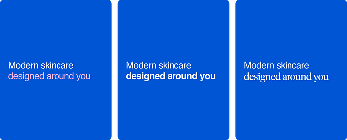
Emphasize important word(s).
There are lots of ways to do this. In a bigger block of text, it’s most commonly done in italics. But in an interface? You can explore changing color, using different weights of the same typeface, and even mixing typefaces. (That last one is hard to do well and won’t work for every brand.) Whatever you choose, make sure the text reads cleanly without an added emphasis. Your writing needs to be accessible, and screenreaders won’t announce color, typeface, or italics.
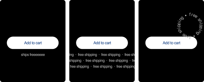
Get creative.
It’s okay to have fun with your writing — and with your layout. Is there something interesting you can do with the architecture of the page? A way to make the design more memorable, unique, unexpected? If it fits the brand and product, go ahead and have fun. You’ll add personality to an otherwise ordinary interface.
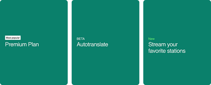
Add short, precise labels.
Sometimes all it takes is a single word or two. Labels add a layer of information without stretching out a headline or cluttering an interface. They’re especially good at highlighting something new or helping people compare options. Next time you’re stuck, add an extra couple words up above.
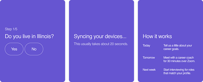
Set clearer expectations.
Have you ever taken a quiz that seemed endless? Or felt lost halfway through a signup flow? These experiences are annoying and avoidable. Good writing should help orient the user. Number the steps or questions. Be honest about how long things take. Explain what happens next.
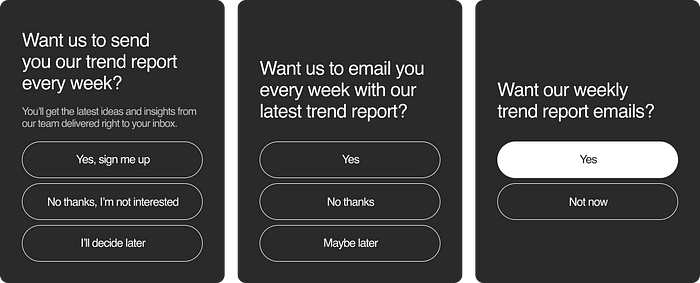
Be more specific.
Especially when you can’t get any simpler. Try writing with a specific voice, tone, or attitude. Or try being more pointed with your input fields to help guide users forward. Shorter pieces of writing can have an outsized impact on the user experience. Even if you’ve only got a few words, there’s always room to explore.
Delete as much as you can.
The best way to simplify an interface is to get rid of things. Reduce type styles, consolidate choices, and, yes, remove information. Maybe you don’t need that extra clarification in the subhead. Maybe three buttons can become two. A good writer revises their writing. A great one knows when to remove it altogether.
Recommend
About Joyk
Aggregate valuable and interesting links.
Joyk means Joy of geeK