

就是这么简单!Pyecharts绘制可视化地图专辑
source link: https://www.51cto.com/article/745892.html
Go to the source link to view the article. You can view the picture content, updated content and better typesetting reading experience. If the link is broken, please click the button below to view the snapshot at that time.

就是这么简单!Pyecharts绘制可视化地图专辑
Pyecharts 是一个用于生成 Echarts 图表的类库。Echarts 是百度开源的一个数据可视化 JS 库。用 Echarts 生成的图可视化效果非常棒,pyecharts 是为了与 Python 进行对接,方便在 Python 中直接使用数据生成图。
首先需要安装python第三方包 -- pyecharts, 目前最新版本为1.8.1。
pip install pyecharts自从 v0.3.2 开始,为了缩减项目本身的体积以及维持 pyecharts项目的轻量化运行,pyecharts将不再自带地图 js 文件。如用户需要用到地图图表,可自行安装对应的地图文件包。下面介绍如何安装。
- 全球国家地图: echarts-countries-pypkg (1.9MB): 世界地图和 213 个国家,包括中国地图
- 中国省级地图: echarts-china-provinces-pypkg (730KB):23 个省,5 个自治区
- 中国市级地图: echarts-china-cities-pypkg (3.8MB):370 个中国城市
- 中国县区级地图: echarts-china-counties-pypkg (4.1MB):2882 个中国县·区
- 中国区域地图: echarts-china-misc-pypkg (148KB):11 个中国区域地图,比如华南、华北
选择自己需要安装地图相关的扩展包。
pip install echarts-countries-pypkg
pip install echarts-china-provinces-pypkg
pip install echarts-china-cities-pypkg
pip install echarts-china-counties-pypkg
pip install echarts-china-misc-pypkg
pip install echarts-united-kingdom-pypkg
可以选择豆瓣源或清华源加速安装。
pip install pyecharts -i http://pypi.douban.com/simple
pip install -i https://pypi.tuna.tsinghua.edu.cn/simple echarts-countries-pypkg
pyecharts版本 v0.5.x 和 v1 间不兼容,v1 是一个全新的版本,语法也有很大不同。
查看pyecharts版本。
import pyecharts
print(pyecharts.__version__)
做好准备后,就可以开始绘图了。如果你是新手,对pyehcarts还有些陌生,可以参见官方5分钟上手: https://pyecharts.org/#/zh-cn/quickstart?id=_5-分钟上手
Pyehcarts共有有四种地理图表,
- Map:地图 (https://pyecharts.org/#/zh-cn/geography_charts?id=map:地图)以此为基础,熟悉绘图基本步骤及各个配置项。
- Geo:地理坐标系 (https://pyecharts.org/#/zh-cn/geography_charts?id=geo:地理坐标系)本文重点介绍
- BMap:百度地图 (https://pyecharts.org/#/zh-cn/geography_charts?id=bmap:百度地图) 百度地图需要申请开发者 AK,(https://lbsyun.baidu.com/)。这里不做细说,大家有兴趣可以去pyecharts官网学习。
- Map3D:三维地图 (https://pyecharts.org/#/zh-cn/3d_charts?id=map3d-三维地图)
一、Map
以星巴克门店在全球的分布为例。本例数据来源Kaggle星巴克数据:https://www.kaggle.com/starbucks/store-locations
也可公众号「数据STUDIO」后台回复【星巴克】获取。
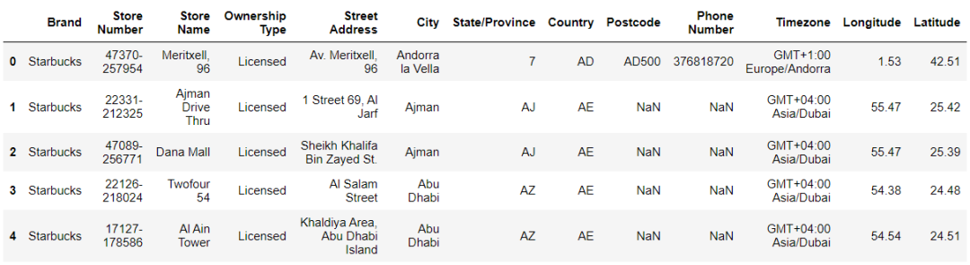
数据样例:
from pyecharts.charts import Map
from pyecharts import options as opts
from pyecharts.globals import ThemeType, CurrentConfig

CurrentConfig.ONLINE_HOST = 'C:/python/pyecharts-assets-master/assets/'
# 参考 https://github.com/pyecharts/pyecharts-assets

df = starbuck['English']
data = df.value_counts()
datas = [(i, int(j)) for i, j in zip(data.index, data.values)]

# 实例化一个Map对象
map_ = Map(init_opts=opts.InitOpts(theme=ThemeType.PURPLE_PASSION))

# 世界地图
map_.add(series_name="门店数量", data_pair=datas, maptype="world")

# 设置系列配置项
map_.set_series_opts(label_opts=opts.LabelOpts(is_show=False))   # 不显示label
# 设置全局配置项
map_.set_global_opts(
     title_opts=opts.TitleOpts(title="星巴克门店数量在全球分布",
                               pos_left='40%',
                               pos_top='10'),   # 调整title位置
     legend_opts=opts.LegendOpts(is_show=False),
     visualmap_opts=opts.VisualMapOpts(
         max_=13608,
         min_=1,
         is_piecewise=True,
       pieces=[{"max": 9, "min": 1, "label": "1-9", "color": "#00FFFF"},
                 {"max": 99, "min": 10, "label": "10-99", "color": "#FF69B4"},
                 {"max": 499, "min": 100, "label": "100-499", "color": "#0000FF"},
                 {"max": 999, "min": 500, "label": "500-999", "color": "#00BFFF"},
                 {"max": 2000, "min": 1000, "label": "1000-2000", "color": "#228B22"},
                 {"max": 3000, "min": 2000, "label": "2000-3000", "color": "#FF0000"},
                 {"max": 20000, "min": 10000, "label": ">=10000", "color": "#FFD700"}
                ] # 分段  添加图例注释和颜色
     )
)
# 渲染在网页上   有交互性
map_.render('星巴克门店在全球的分布.html')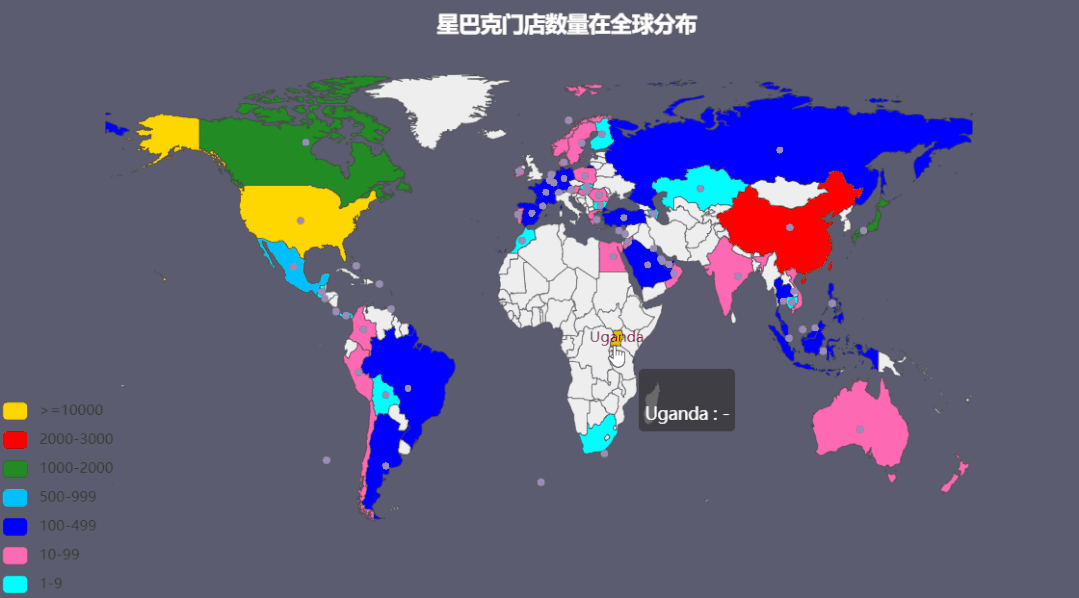
绘图步骤:
1、创建实例
Map(init_opts=opts.InitOpts(theme=ThemeType.PURPLE_PASSION))创建实例并初始化配置。
可配置图表宽度、高度、渲染风格、标题、主题、背景颜色等,详情参见下面连接 https://pyecharts.org/#/zh-cn/global_options?id=initopts:初始化配置项
theme: pyecharts内置提供了10+ 种不同的风格, 参见 https://pyecharts.org/#/zh-cn/themes
2、添加数据
.add()添加了数据。
- series_name: 系列名称,用于 tooltip 的显示,legend 的图例筛选。
- data_pair: 数据项,每个数据项由一个个元组组成:(坐标点名称,坐标点值) 实际上一个是地区名称另一个是对应的数据。pyecharts绘制地图只需导入城市名称和数值即可,因为区县级以上城市的经纬度信息都已经在模块中存在,可以在 https://github.com/pyecharts/pyecharts/blob/master/pyecharts/datasets/city_coordinates.json中找到。本实例中是国家名称与门店数量组成的数据项。
[('United States', 13608),
 ('China', 2734),
 ('Canada', 1468),
 ('Japan', 1237),
 ...
]- **maptype='world'**,这里是指地图类型,默认为china中国。地图类型请参见:https://github.com/pyecharts/pyecharts/blob/master/pyecharts/datasets/map_filename.json
3、设置系列配置项
.set_series_opts()https://pyecharts.org/#/zh-cn/series_options
除了在.add()中设置部分配置项外,就是使用.set_series_opts()配置图元样式、文字样式、标签样式、点线样式等。
4、设置全局配置项
.set_global_opts() 配置标题、动画、坐标轴、图例等。 https://pyecharts.org/#/zh-cn/global_options
本实例中:
- min_: 指定 visualMapPiecewise 组件的最小值。
- max_: 指定 visualMapPiecewise 组件的最大值。
- is_piecewise: 是否为分段型。
- pieces: 自定义的每一段的范围,以及每一段的文字,以及每一段的特别的样式。
5、生成的地图以html格式保存
.render()将生成的地图以html格式保存。
二、Geo
Geo 图类型,使用type_: str = "scatter" 参数控制。
有 scatter, effectScatter, heatmap, lines4 种。
from pyecharts.globals import GeoType
GeoType.GeoType.EFFECT_SCATTER,GeoType.HEATMAP,GeoType.LINES
1、动态涟漪散点图 effectScatter
V1 版本开始支持链式调用,本例数据可「数据STUDIO」后台回复【星巴克】获取。
数据样例:
import pandas as pd
from pyecharts.globals import ThemeType, CurrentConfig, GeoType
from pyecharts import options as opts
from pyecharts.charts import Geo
CurrentConfig.ONLINE_HOST = 'C:/python/pyecharts-assets-master/assets/'
# pandas读取csv文件数据
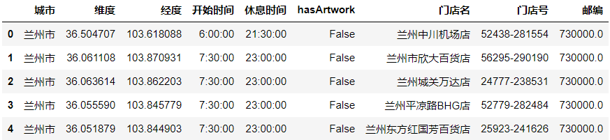
df = pd.read_csv('directory2.csv', encoding='utf-8')['城市']
data = df.value_counts()
#自定义各城市的经纬度
# geo_cities_coords = {df.iloc[i]['城市']:[df.iloc[i]['经度'],df.iloc[i]['纬度']] for i in range(len(df))}
datas = [(i, int(j)) for i, j in zip(data.index, data.values)]
print(datas)
geo = (Geo(init_opts=opts.InitOpts(width='1000px',
height='600px',
theme=ThemeType.PURPLE_PASSION),
is_ignore_nonexistent_coord = True)
.add_schema(maptype='china',
label_opts=opts.LabelOpts(is_show=True)) # 显示label 省名
.add('门店数量',
data_pair=datas,
type_=GeoType.EFFECT_SCATTER,
symbol_size=8,
# geo_cities_coords=geo_cities_coords
)
.set_series_opts(label_opts=opts.LabelOpts(is_show=False))
.set_global_opts(
title_opts=opts.TitleOpts(title='星巴克门店在中国的分布'),
visualmap_opts=opts.VisualMapOpts(max_=550,
is_piecewise=True,
pieces=[
{"max": 50, "min": 0, "label": "0-50", "color": "#708090"},
{"max": 100, "min": 51, "label": "51-100", "color": "#00FFFF"},
{"max": 200, "min": 101, "label": "101-200", "color": "#FF69B4"},
{"max": 400, "min": 201, "label": "201-400", "color": "#FFD700"},
{"max": 800, "min": 600, "label": "600-800", "color": "#FF0000"},])
)
)
geo.render("星巴克门店在中国的分布.html")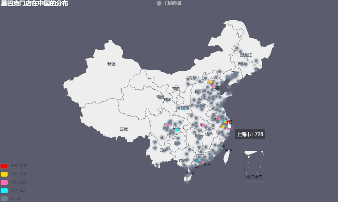
Geo新增坐标点
# 新增一个坐标点
.add_coordinate(
    # 坐标地点名称
    name: str,
    # 经度
    longitude: Numeric,
    # 纬度
    latitude: Numeric, )
# 新增 json 文件格式的坐标数据
.add_coordinate_json(
    # json 文件格式的坐标数据
    # 格式如下
    # {
    #   "阿城": [126.58, 45.32],
    #   "阿克苏": [80.19, 41.09]
    # }
    json_file: str # 坐标文件路径
)
2、热力图heatmap
from pyecharts import options as opts
from pyecharts.charts import Geo
from pyecharts.globals import ChartType
CurrentConfig.ONLINE_HOST = 'C:/python/pyecharts-assets-master/assets/'

# pandas读取csv文件数据
df = pd.read_csv('directory2.csv', encoding='utf-8')['城市']
data = df.value_counts()

datas = [(i, int(j)) for i, j in zip(data.index, data.values)]
print(datas)
geo = (
    Geo(init_opts=opts.InitOpts(width='1000px',
                                height='600px',
                                theme=ThemeType.DARK),
        is_ignore_nonexistent_coord=True)
    .add_schema(maptype="china")                       #maptype选择地图种类
    .add(series_name="门店数量",      # 系列名称
         data_pair=datas,          # 数据项 (坐标点名称,坐标点值)
         blur_size=20,
         symbol_size= 5,
         type_=ChartType.HEATMAP  #类型选为热力图
         )
    .set_series_opts(label_opts=opts.LabelOpts(is_show=False))
    .set_global_opts(
        visualmap_opts=opts.VisualMapOpts(max_=800,is_piecewise=True),
        title_opts=opts.TitleOpts(title="星巴克门店在中国的分布热力图"))
)
geo.render( '星巴克门店在中国的分布热力图.html')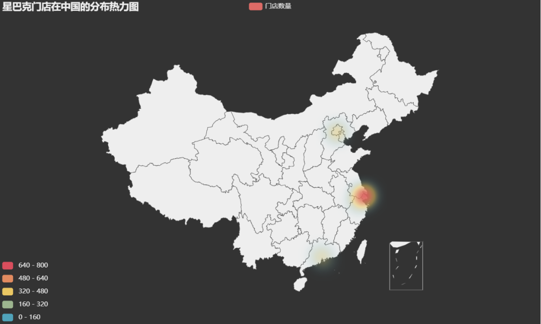
3、动态轨迹图lines
pyecharts可以生成地理空间流动图,用来表示航班数量、人口流动等等。
from pyecharts import options as opts
from pyecharts.charts import Geo
from pyecharts.faker import Faker
from pyecharts.globals import ChartType, SymbolType, CurrentConfig
import  random

datas = []
for _ in range(6):
    datas.append(tuple(random.sample(Faker.provinces, 2)))

CurrentConfig.ONLINE_HOST = 'C:/python/pyecharts-assets-master/assets/'
geo = (
    Geo(init_opts=opts.InitOpts(width='1000px',
                                height='600px',
                                theme=ThemeType.CHALK))
    .add_schema(
        maptype="china",
        itemstyle_opts=opts.ItemStyleOpts(color="#323c48", border_color="#111"),
        label_opts=opts.LabelOpts(is_show=True)
    )
    .add(
        "",
        [list(z) for z in zip(Faker.provinces, Faker.values())],
        type_=ChartType.EFFECT_SCATTER,
        color="white",
    )
    .add(
        "出差",
        data_pair = datas,
        type_=ChartType.LINES,
        effect_opts=opts.EffectOpts(
            symbol=SymbolType.DIAMOND, symbol_size=6, color="blue"
        ),
        linestyle_opts=opts.LineStyleOpts(curve=0.2),
    )
    .set_series_opts(label_opts=opts.LabelOpts(is_show=False))
    .set_global_opts(title_opts=opts.TitleOpts(title="动态轨迹图"))
    .render("动态轨迹图.html")
)
如果需要再添加一个其他类别的动态轨迹,只需在链式中添加:
.add('旅游',
     [('上海','拉萨'),('拉萨','大理'),('大理','成都'),('成都','海口')],
     type_=ChartType.LINES,
     effect_opts=opts.EffectOpts(
         symbol=SymbolType.ARROW, symbol_size=6, color="orange"),
     linestyle_opts=opts.LineStyleOpts(curve=0.5)
    )
输出如下,可以点击图例来筛选类别。
这边用到两个配置项:
- effect_opts= opts.EffectOpts(symbol)涟漪特效配置项https://pyecharts.org/#/zh-cn/series_options?id=effectopts:涟漪特效配置项symbol: 特效图形的标记。ECharts 提供的标记类型包括 'circle', 'rect', 'roundRect', 'triangle', diamond', 'pin', 'arrow', 'none',可以通过 'image://url' 设置为图片,其中 URL 为图片的链接,或者 dataURI。
- linestyle_opts=opts.LineStyleOpts(curve=0.2)线样式配置项https://pyecharts.org/#/zh-cn/series_options?id=linestyleopts:线样式配置项curve: 线的弯曲度,0 表示完全不弯曲。
4、三维地图
from pyecharts import options as opts
from pyecharts.charts import Map3D
from pyecharts.globals import ChartType
from pyecharts.commons.utils import JsCode

c = (
    Map3D(init_opts=opts.InitOpts(width='1000px',
                                height='600px',
                                theme=ThemeType.VINTAGE))
    # 地图类型
    .add_schema(
        itemstyle_opts=opts.ItemStyleOpts( # 图形的颜色
            color="#00BFFF", # 或 'rgb(128, 128, 128)'
            opacity=1, # 图形透明度
            border_width=0.8, # 描边宽度
            border_color="#708090", # 描边颜色
        ),
        # Map3D 的 Label 设置
        map3d_label=opts.Map3DLabelOpts(
            is_show=False,
            formatter=JsCode("function(data){return data.name + " " + data.value[2];}"),
        ),

        # 高亮标签配置项
        emphasis_label_opts=opts.LabelOpts(
            is_show=False,
            color="#fff",
            font_size=10,
            background_color="rgba(0,23,11,0)",
        ),

        # 光照相关的设置。
        light_opts=opts.Map3DLightOpts(
            main_color="#fff",
            main_intensity=1.2,
            main_shadow_quality="high",
            is_main_shadow=False,
            main_beta=10,
            ambient_intensity=0.3,
        ),
    )
    .add(
        series_name="门店数量",
        data_pair=datas,
        # 叠加图的类型
        type_=ChartType.BAR3D,
        bar_size=1,

        # 三维地图中三维图形的着色效果。
        shading="lambert",
        label_opts=opts.LabelOpts(
            is_show=False,
            formatter=JsCode("function(data){return data.name + ' ' + data.value[2];}"),
        ),
    )
    .set_global_opts(title_opts=opts.TitleOpts(title="星巴克门店在中国的分布3D图"))
    .render("map3d_with_bar3d.html")
)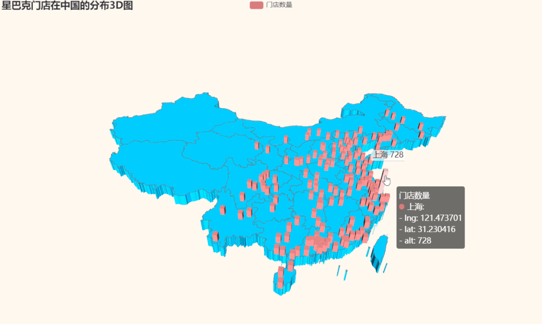
本例中的主要参数说明:
.add_schema()
地图类型设置,参考pyecharts.datasets.map_filenames.json 文件
- itemstyle_opts=opts.ItemStyleOpts( ) 图形的颜色
- map3d_label=opts.Map3DLabelOpts() Map3D 的 Label 设置
- emphasis_label_opts=opts.LabelOpts() 高亮标签配置项参考 series_options.LabelOpts
- light_opts=opts.Map3DLightOpts() 光照相关的设置。在 shading 为 'color' 的时候无效。
.add()
- type_=ChartType.BAR3D, 叠加图的类型(目前只支持Bar3D,Line3D,Lines3D,Scatter3D)
- shading="lambert"三维地图中三维图形的着色效果。ECharts GL 中使用了基于物理的渲染(PBR)来表现真实感材质。echarts-gl 中支持下面三种着色方式:color: 只显示颜色,不受光照等其它因素的影响。lambert: 通过经典的 lambert 着色表现光照带来的明暗。realistic: 真实感渲染,配合 light.ambientCubemap 和 postEffect 使用可以让展示的画面效果和质感有质的提升。
5、Globe地图
数据来源是pyecharts自带的全球人口数据。
import pyecharts.options as opts
from pyecharts.charts import MapGlobe
from pyecharts.faker import POPULATION
from pyecharts.globals import ThemeType

data = [x for _, x in POPULATION[1:]]
low, high = min(data), max(data)

c = (
    MapGlobe(init_opts=opts.InitOpts(theme=ThemeType.DARK))
    .add_schema()
    .add(
        maptype="world",
        series_name="World Population",
        data_pair=POPULATION[1:],
        is_map_symbol_show=False,
        label_opts=opts.LabelOpts(is_show=False),
    )
    .set_global_opts(
        visualmap_opts=opts.VisualMapOpts(
            min_=low,
            max_=high,
            range_text=["max", "min"],
            is_calculable=True,
            range_color=["lightskyblue", "yellow", "orangered"],
        )
    )
    .render("map_globe_base.html")
)
本文到此结束,总体来说Pyecharts地图绘图还是比较友好,在不需要多么炫酷的配置前提下,只需要将输入数据格式和类型弄清楚,其余默认配置即可。
对地图样式有一定要求时,只需要根据官网上的配置信息调整全局配置项和系列配置项即可。
Recommend
-
38
前言 我们都知道python上的一款可视化工具 matplotlib ,而前些阵子做一个Spark项目的时候用到了百度开源的一个可视化JS工具- Echarts ,可视化类型非常多,但是得通过导入js库在Java...
-
35
这是涛哥给你推荐的第40篇好文 来源 :Python与算法之美
-
43
一、pyecharts简介 Echarts是百度开源的数据可视化工具,能够很好的嵌入web端,渲染的图表简洁精美,深受广大开发者喜爱和支持。而pyecharts是Python语言与Echarts的融合,用法简洁开发高效。 pyecharts特性...
-
15
目录 我们都知道python上的一款可视化工具matplotlib,而前些阵子做一个Spark项目的时候用到了百度开源的一个可视化JS工具-Echarts,可视化类型非常多,但是得通过导入js库在Java Web项目上运行,平时用Python比较多,于是就在想有...
-
19
pyecharts绘制复联超级英雄战斗力上海交通大学 计算机应用技术硕士前几天在网上看到有人用 matplotlib 绘制了漫威里几大英雄的战斗力图,赶脚灰常有意思。作为漫威和 python 的双...
-
6
第一章:实例演示 先给大家看下效果图哈。
-
9
[ 系列文章篇 ] 2022 见证中国崛起从 Python 绘制中国地图开始:使用 pyecharts 最新版本绘制中国地图实例详解...
-
5
Pyecharts结合Pandas绘制图表 精选 原创 迷彩编程 2022-11-17 15:31:40...
-
8
[数据分析与可视化] Python绘制数据地图1-GeoPandas入门指北 ...
-
8
[数据分析与可视化] Python绘制数据地图3-GeoPandas使用要点 ...
About Joyk
Aggregate valuable and interesting links.
Joyk means Joy of geeK