

How Wednesday Addams teaches us about design consumerism
source link: https://uxdesign.cc/how-wednesday-addams-teach-us-about-design-consumerism-f60bde742ff6
Go to the source link to view the article. You can view the picture content, updated content and better typesetting reading experience. If the link is broken, please click the button below to view the snapshot at that time.
How Wednesday Addams teaches us about design consumerism
TikTok likes it better when Addams dances to “Bloody Mary.” Non-designers like to do the job of the designer if they can’t meet the demand. Or else…
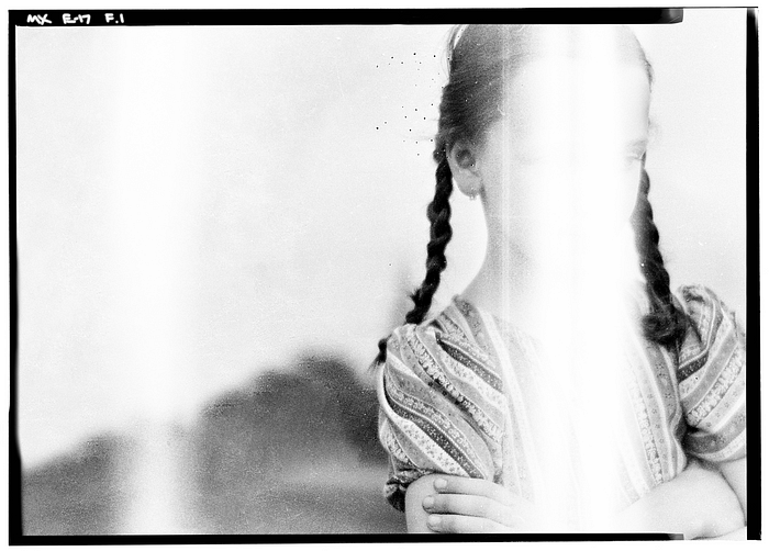
Photo modified under CC BY-SA 3.0 license. Original photo by Kurutz Márton.
The goth-looking girl from the Addams Family has recently been making the rounds on the internet, after a Netflix show dedicated to her character was released on November 23rd, 2022. TikTok users particularly adored her quirky dance, with reuploads of the clip being shared amongst users.
While Jenna Ortega — the actress who plays Wednesday — was originally dancing to the tune of “Goo Goo Muck” by The Cramps, TikTok users collectively decided that the original music wasn’t going to cut it. Instead, a remix of Lady Gaga’s “Bloody Mary” was superimposed onto her choreography, making it more popular among viewers. This effectively cemented the song as part of the show’s music playlist, despite the series never including it in the official soundtrack or in the episodes.
You may be wondering why I brought this up in an essay about designers and non-designers. Like music and dance, this example serves as a reminder of how consumers can exert significant influence on design, altering people’s perception of art and branding to fit their preferred narrative. This can be seen in examples such as the Gap logo revamp, where public opposition led to backtracking of changes.
In 2010, fashion retailer Gap decided to overhaul its logo, replacing its condensed serif font with a bold, neo-grotesque font. The new logo featured the brand name “Gap” in Helvetica, with a blue square at the corner. However, the redesign was met with negative reactions, with many people criticising the new logo for looking “disgusting” and like a “banking institution.” The opposition was so strong that Gap ultimately decided to revert back to its original logo.
In a moment of crisis management, Gap also made a statement on Facebook before the reversal, asking users to share their own versions and ideas of what the logo could be. Although companies asking the public to do free, speculative work is a controversial topic in itself, Gap’s request hints at a new form of a design approach that has become more prevalent in recent years.
Photo modified under CC BY 2.0 license. Original photo by Archives New Zealand.
More is More (and Nothing More?)
A similar situation occurred in 2015 when people found fault with the original Tokyo 2020 logo for being tacky and allegations of plagiarism were made. Unlike Gap, the organisers of the Olympics subsequently opened a contest to find a new logo. Despite receiving 15,000 submissions from all walks of life, this did not fully satisfy the public. Complaints of the new, shortlisted designs being subpar ensued, with concerns that quality was being sacrificed by allowing non-designers to take full control. The American Institute of Graphic Arts (AIGA) also accused the committee of “disrespecting” professional designers.
While it is impossible to please everyone in a sea of varying opinions, companies have not stopped trying to innovate a more flexible and marketable approach to design. In fact, the search for higher quantity while maintaining a higher quality of designs from consumers and businesses has made maximalist designs much more prevalent now. Consider the branding that’s done for Evri, a company offering courier services.
In cooperation with Monotype and design consultant Superunion, Evri’s logo features alphabets that can be combined in 194,481 different ways. This is because every letter has 20 alternate styles, allowing for every van the company owns to have a unique logo. This keeps the company’s brand identity typographically diverse, yet still consistent in overall appearance.
In the music industry, K-Pop group NewJeans made its debut last year with over 12 wordmark logos, using both custom typefaces and standard fonts. They continue to develop more logos for their identity with their newest single album.
This approach to visual identity goes against the traditional belief that consistency is key to creating a strong memory and increasing trust with consumers. While NewJeans benefits from this avant-garde approach, unfortunately, Evri’s branding strategy falls short due to allegations of parcel mishandling, which has led to accusations that the rebranding is an attempt to hide poor business practices.
The Consumer Must Like You First
If we take a look at Wednesday again, what stirred the Bloody Mary dub on TikTok was that the dance and TV series was appealing to the audience. The favourable position in which the Netflix series first put its foot made it easy for fans of the show to create fan art and videos. Similarly, NewJeans was able to achieve what Tokyo 2020 couldn’t in diversifying logo designs, simply because they planned everything better.
NewJeans established a good image at the start with good music. The visual culture in the K-Pop industry has progressively moved towards maximalist designs with the advent of multiple alternate album covers. The designs are handled by a professional team led by an art director, Min Hee Jin. You can even say their branding is consistent with its consistent change. All of these factors made it ripe for consumers to crave and desire a “More is More” approach to design.
While consumers do have a significant influence on design culture, it is important to note that the design industry plays a crucial role in creating an appealing environment that inspires consumers to engage in creative reinterpretations. This is achieved by providing a solid foundation, which allows consumers to evolve the design while also allowing the industry to evolve along with them.
This can be seen in the examples of Wednesday’s gothic style and NewJeans’ Y2K style, which are not entirely new concepts but are given renewed life through the addition of more space for reinterpretation and audience engagement.
Conclusion
Radical designs can seem more rational and organic when viewed in the bigger picture. The process of achieving such designs is done gradually, based on small changes in consumer taste. Over time, such as a decade, these changes can appear drastic. It is interesting to note how the inclusion of Bloody Mary in the show’s music is a small change in the grand scheme, but it contributes to the evolution of the character design of Wednesday Addams.
Likewise, to incorporate radical design in our personal work, it’s important to approach it in a gradual and progressive manner. Trying to change too quickly can cause the design to lose its magic like what Gap did. Similar to a show’s character development, we can introduce a new design landscape by slowly collaborating with and incorporating feedback from our audience. This is how the dynamic of good design evolution can work.
If you want to do something new, take a steady approach and involve your audience in the process. This will help bring them along for the ride. So, let non-designers do (part of) the job for you.
Or else you’ll do the whole job yourself for everyone to leave instead.
Recommend
About Joyk
Aggregate valuable and interesting links.
Joyk means Joy of geeK