

9 Crucial Things Designers Miss in a Web App Design
source link: https://uxplanet.org/9-crucial-things-designers-miss-in-a-web-app-design-74a42b78766e
Go to the source link to view the article. You can view the picture content, updated content and better typesetting reading experience. If the link is broken, please click the button below to view the snapshot at that time.
9 Crucial Things Designers Miss in a Web App Design
Designing a web application is a complex task in itself.
Even if the application itself sounds simple, the plethora of screens and supporting elements ultimately turn it into an investment of several hours, not to mention the hard work needed to chalk out the flow!
And yet, even with the user flow and all other details in hand, designers and developers tend to miss out some vital elements. This is where a seasoned and smart individual or an experienced design agency stands out from the crowd.
Here is a list of some small but essential elements that most UX/UI designers tend to miss out while designing a web application.
1. Empty State
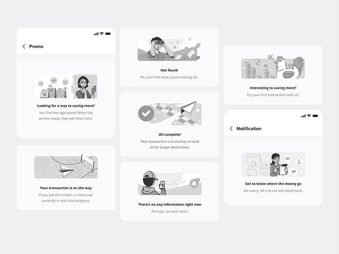
Empty states by Aisha Ahya on Dribbble
An empty state is usually listed as one of the most insignificant requirements for an application design. However “empty” the term might sound, the glorious irony is that the first step of any dashboard begins with an empty state.
So, what should an ideal empty state look like?
Ideally, an empty state should have appropriate call to actions (CTAs) to prompt people to take action.
For example, if it’s an investment application, the ideal prompt would be to ask the user to start investing. But since we cannot expect a person to do exactly what they are told, we can have another subtle CTA for exploring the different investment options available on the app. This should be comparatively low-key.
For, let’s say, a photo or video editor, the ideal prompt would be to upload an image or a video or some clips to edit.
There’s one more thing though. Simply placing a CTA isn’t enough. It’s like bringing home a sofa without the cushions. Even without the cushions, the sofa can still serve its purpose of providing a place to sit. But will it feel or even look good without the cushions?
We both know the answer, don’t we?
In a similar way, any call to action should be accompanied by a nice message that will not only help the user to know exactly what to do but will also trigger the motivation as well as the urge to take the action.
Empty state by Salman Khan on Dribbble
2. Expand and Collapse Options for the Side-Menu
Collapsible side menu by Robert Ligthart
Where there is a large web application, there is usually a long side menu. And where there is a side menu, there is always an expand-collapse function.
Sadly, more often than what can be deemed healthy, product designers tend to miss the expanded menu or, sometimes, the reverse. While these two states of the side-menu are important per se, these are not essential in the overall flow of the app. And that is exactly why creatives — even the ones in the professional field of UX/UI design — tend to miss them out.
But why are we stressing on the importance of the side-menu?
Here’s why:
The side-menu, when in collapsed state, has only icons representing the menu items. Not everyone may be able to decipher every icon. Even though an app designer might take utmost care to use as obvious icons as possible, at least one icon might elude the knowledge of the average user.
More importantly, in the absence of texts, a person with visual disabilities would not be able to take the help of a screen reader to know what’s on the side bar.
On the other hand, if we create only an expanded menu, someone struggling with small screen size would not be able to enjoy the full horizontal expanse of the screen.
3. Supporting Elements like Dropdowns and Pop-ups
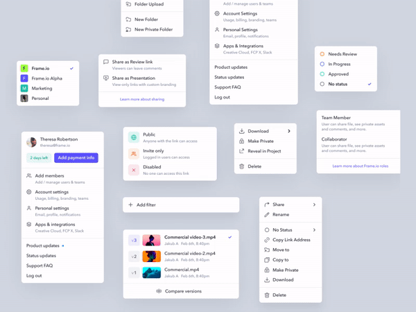
Supporting elements by Jakub Antalik on Dribbble
For a good design agency or individual, the usual process of designing a web application begins with a thoroughly planned out user flow. Eventually, this user flow is interpreted into wireframes and then into designs.
Now, the problem with wireframes and designs is that these focus primarily on the main screens needed for the application to work. And someone with less observation skills tends to forget the small but necessary elements like dropdowns and pop-ups.
And then, it becomes a recurring headache for the developer, the client and the designer as requests keep coming for different missing pieces.
While one good way to solve this problem is to create the supporting elements as the design flows, probably the best way to make sure that nothing is amiss is to create a clickable prototype.
Some prefer to create a prototype at the end of the design. Instead, if a lo-fi prototype is created along with the wireframe, then it will bring all the loose ends into the spotlight!
4. CRUD Function for Every Information
What is CRUD in the first place?
CRUD stands for
Create — Read — Update — Delete
These are the four must have options for any information that the user uploads to the application.
Let’s take the instance of a very simple piece of information: a phone number.
C (Create): If the application demands, you must allow the user to upload their phone number.
R (Read): The user must be able to view the phone number that they have uploaded to the web application.
U (Update): Suppose the user has changed their phone number or wishes to connect the application to a different one; the platform must have the facility to allow the user to update their number to the new one.
D (Delete): There must also be the provision for the user to delete their phone number just in case they decide not to continue the service or to withhold their personal data. In case the application would stop functioning without a phone number (as in the case of Whatsapp), the user is to be notified of the same before deleting their phone number.
CRUD not only gives the freedom to use an application at will, it also instils trust in people. When they know that every change is reversible, they would be willing to further explore the application.
5. Search Option and Search Results Page
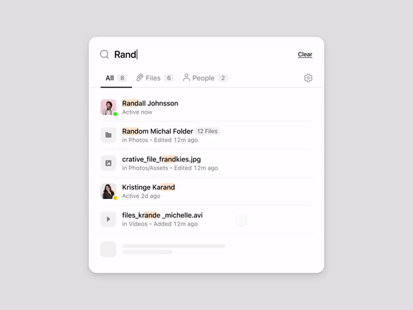
Search results animation by Michal Parulski on Dribbble
First of all, let’s focus on the inevitability of a search option on any website or web application.
A search option is like an enquiry desk at a shopping mall. When you are searching for something particular but are unable to find it, an attendant at the enquiry desk helps you locate it or provides necessary information in case of unavailability of that what you are looking for.
Likewise, a search option helps you explore a web application by allowing you to quickly look for anything and everything that you want within the application. In case what you are looking for is not available on the platform, it guides you to the next best option at hand.
Now, a search option would be incomplete without a search results page. More often than not UX/UI designers include a search option while designing the header of the application but forget about the search results page. Why? Because it is not directly included in the flow.
And this leaves the developer(s) baffled about the UI to be applied to the page. In the end, there comes a page that is absolutely out of sync with the rest of the design.
Hence, it is best to follow the design of a search bar with a note on the artboard about the search results page. This way, one would never forget one of the most important aspects of any web application design.
6. Profile & Account Manager
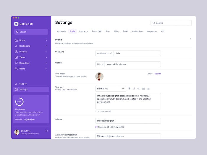
Profile Manager by Jordan Hughes
So, you created the primary and the secondary screens, you created the supporting elements, you took into account every possible twist and turn that the user might encounter in their journey through the web application.
But did you leave room for the user to customise their profile?
A profile manager is an important section that allows a user the freedom to customise the application to their liking, update relevant information, and provide all the information necessary for a smooth user experience.
The golden rule is to create a person’s account using the bare minimum information needed, and eventually prompt them to complete their profile. This is where a profile manager comes into play. Here are a few things that a profile manager can do:
- update user profile
- change any information that users feel is old and no longer relevant
- give users the feasibility to change certain aspects of the application to cater to their convenience and personality
- show their journey with the app that, in turn, helps them to evaluate their actions
Most importantly, by allowing flexibility, it shows that you care about the user. And that, my dear reader, is one of the most vital things to remember while designing any web application.
7. Passwordless Authentication
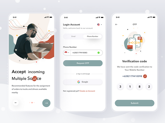
Application design by Sulton handaya
Oh, imagine all the weight that would have melted down had the brain been freed from all the passwords and PINs it has to remember!
Not sure about others but you can certainly make your contribution to the relaxation of the brains of your users. How? Well, in this particular context, you can release people from the not-so-glorious burden of remembering passwords by introducing passwordless authentication.
Passwordless authentications have incurred quite the fan-following since the past few years. It is undeniable that most individuals have at least two (if not more) email addresses in use at any given moment. And when it comes to logging in to a used-once-upon-a-time application, one can get quite the headache trying to figure out which email address had been used for registration and what the latest password was.
Instead of using emails and passwords for logging into a web application, if you request only the phone number, and send an OTP for authentication, then the entire process becomes breezy for the user. For registration, you may request an email address and a password, but for further sign-ins, give the user the option to avoid using a password.
8. Onboarding
Onboarding screen design by Yehor Haiduk
Now, now! You may not launch a new product without providing a manual with it. After all, you receive a user manual for every product that you buy from a store, don’t you? A user manual is not provided because the customers are lazy or dense. It is packed along with a product because the customers are ignorant of the wonderful ideas and schemes of the designers and the architects. To introduce them to the nitty-gritties of the fascinating architecture of the product, one must be guided through it, and this is where the user manual comes in handy.
In a similar way, it is in this exact scenario that an onboarding process comes into play in case of a digital product. Your target users may or may not be accustomed with the different features of the product. To keep your users from fumbling around the web application, it is best to assume that they are novices in the field, and to include an onboarding process.
An onboarding process can be in any form. It can either be a short video or a series of screens or messages in a screen, or a series of several tooltips. One may use their creativity to introduce other formats as well like… a comic strip!
The idea is to keep people engaged while delivering the message in a clear and crisp way. The format you choose also depends a lot on the application, and the personality of the brand.
Whichever format you choose, just make sure that your users can access these tips and tricks whenever they might need them.
9. Billing Details & Payment Methods
What if you encountered an application that did not allow you to edit your card number or your payment method that you had once used for purchase via that app? Ugh! Gives me the shivers!
Billing details are one of those sets of information that designers usually forget and users usually remember with a shock! These sets of screens are vital to any application where transactions are included. People generally tend to use more than one mode of payment at different times. It is not just a matter of choice but also of convenience. It may happen that one particular bank account doesn’t have sufficient funds at the moment. There may also be server issues from a bank’s side on a particular day.
So, it is critical that users be given a choice to change their billing details or choose any payment method as necessary.
While there may be several other miniscule things that your UX/UI designer might be missing during your web application design process, these are the primary ones that you may include in your checklist. Make sure to ask them to cross-check with this list for a hassle-free application design and development process.
Recommend
-
7
Cryptocurrencies...
-
4
The trend of the modern web is mobile content presentation. In current practice, a designer becomes a psychologist, a researcher, and a usability specialist. In mobile applications, these skills are more important than anywhere else. Below yo...
-
5
WordPress ...
-
1
Site ColorhexText ColorAd ColorhexText Color
-
2
Things We Miss From Web 1.0 Websites & What We Did About It Missing Web 1.0? So were we. We are not huge fans of where the web has been going the last couple of years. We are looking at Web 3.0, and we are not exactly sure...
-
2
Why Web Designers Should Design for Social Media and Other Platforms ...
-
5
Don't miss these 10 Black Friday 2022 Deals for Designers and Agencies There’s more than a little truth to the notion that this is the best time of the year to invest in certain assets. There are going...
-
2
4 Things Web Designers Can Do to Ensure Brand Consistency
-
7
Looking for NVMe? You shouldn't miss the Crucial P5 Plus SSD deal, Samsung 980 Pro drops too...
-
4
Why designers are crucial in the age of AIFrom visual storytelling to corporate sustainability roadmaps, honing the right design mindset will help us to thrive in the era of artificial intelli...
About Joyk
Aggregate valuable and interesting links.
Joyk means Joy of geeK