

The Window Trick of Las Vegas Hotels
source link: https://www.schedium.net/2023/01/the-window-trick-of-las-vegas-hotels.html
Go to the source link to view the article. You can view the picture content, updated content and better typesetting reading experience. If the link is broken, please click the button below to view the snapshot at that time.
The Window Trick of Las Vegas Hotels
When I lived in Hong Kong I often passed by a residential apartment complex commonly known as the "monster building".
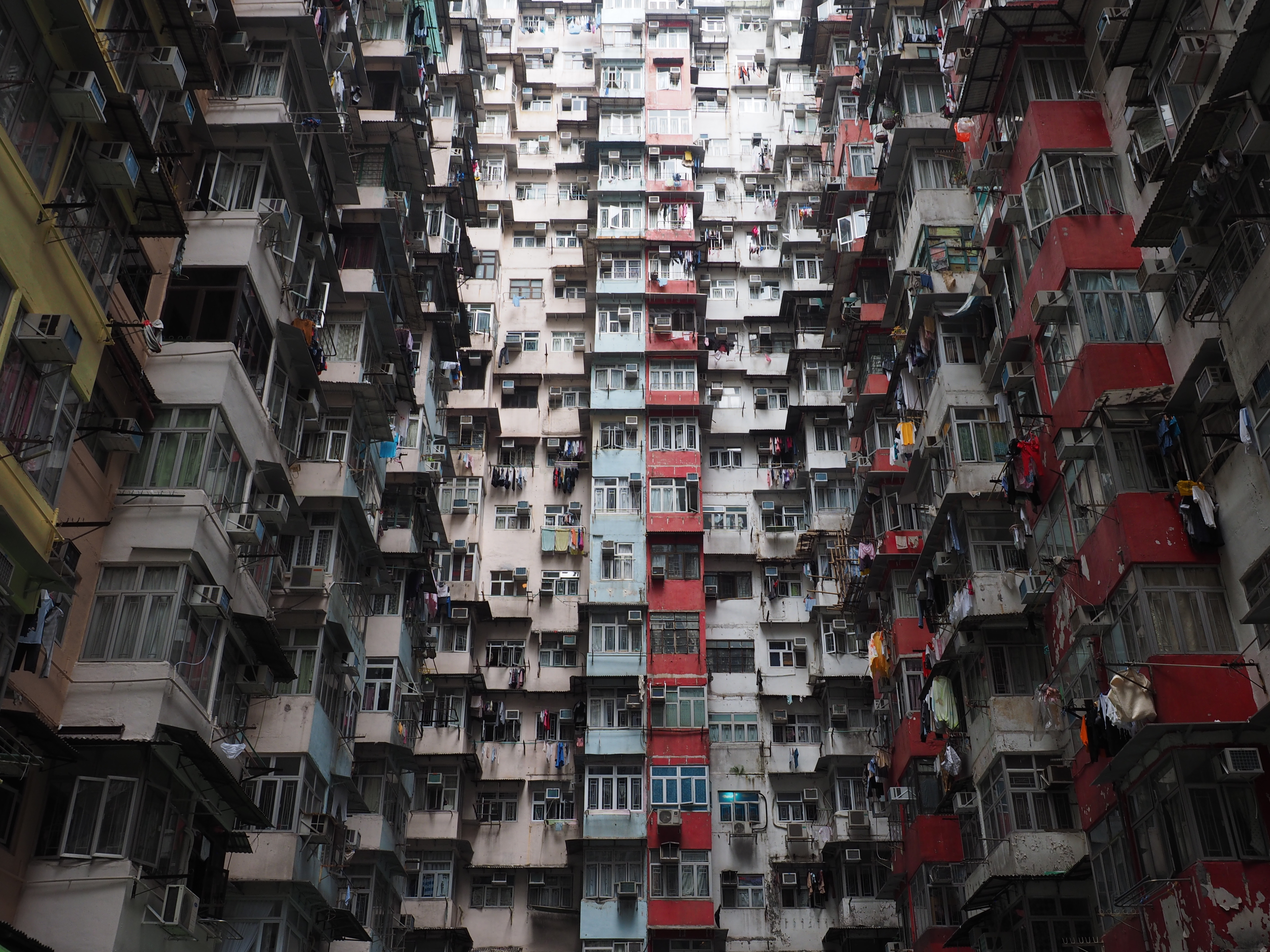 |
| "Interior of the Yick Cheong Building November 2016" by Nick-D is licensed under CC BY-SA 4.0. |
This housing estate, originally built in the 1960s, actually consists of five separate buildings: the Fook Cheong Building, the Montane Mansion, the Oceanic Mansion, the Yick Cheong Building, and the Yick Fat Building.
It has become a tourist attraction because of its very unique and - some might say - "dystopian" look.
Obviously, beauty is in the eye of the beholder, so maybe you think that these buildings are pretty. In that case, good on you. But I guess there are also a lot of people who find them quite ugly.
One of the façades stood out to me in particular as being a massive, colossal mess.
Although this is an extreme example, there are plenty of "monster buildings" in Hong Kong, usually housing estates constructed in the 1960s and 1970s. They have a very specific aesthetic: they look large, thick and heavy, with grubby, boring façades cluttered with protruding AC units.
The 1960s and 1970s were the era of residential buildings that are, let's say, controversial. Some examples include the Unité d'Habitation by Le Corbusier, and the Trellick Tower in the UK.
 |
| "Unite d' Habitation (Marseille)" by denisesakov is licensed under CC BY-NC-SA 2.0. |
I often wondered what makes these buildings so ugly and distressing (unless you like them, I'm not questioning anyone's personal taste), and whether there was beauty in them which I am not capable of seeing, maybe because of my own biases. And that's certainly possible.
But a few days ago I stumbled upon a video that seemed to me to explain why these buildings make such a negative impression on me.
In a lecture about the universal characteristics of classical architecture, professor Nathaniel Walker argued that human beings crave two things: order and variety. If there's too much order, it's boring and oppressive. If there's too much variety, it's chaotic and unpleasant. In his view, classical architecture all over the world aims at creating a "delicate balance between order and variety."
This makes a lot of sense to me. Because order and variety is what we experience in nature. For example, trees and mountains follow recognizable patterns, they have shapes that allow us to categorize them. Yet each tree and mountain is different and unique. The human body, as well, has forms common to all, it has symmetry and proportion, yet each individual is different.
What makes these monster buildings so unsettling is that instead of a delicate balance of order and variety, they have too much of both. The moster building has too much order - it's a box with long rows of windows. But the façade also has way too much variety because of the AC units and the mishmash of colours and window frames.
What does all of this have to do with Las Vegas hotels, you may rightly ask?
Some Las Vegas hotels are truly massive structures. And maybe you don't find them attractive, either. But there's something interesting about their façades, which I find quite fascinating, and which maybe contains a lesson for residential architecture. It's the so-called "window trick".
In order to make the buildings look smaller, less intimidating and messy, architects have come up with a "four or six windows in one" solution. This means they grouped several windows (usually four or six) together and made them look like one window. This creates the visual effect of "shrinking" the building, of making it more orderly and symmetrical.
Here is one example: the Bellagio
 |
| "Bellagio, Las Vegas" by gamillos is licensed under CC BY-SA 2.0. |
 |
| "The Bellagio" by Studio Sarah Lou is licensed under CC BY 2.0. |
_____
From a distance, you just see regular windows. But if you look closer, you notice that what appears like one window is actually four or six windows grouped together. The Bellagio has 32 stories. But the highest of Hong Kong's monster buildings has only 18 stories. Which one looks more massive, disorderly and intimidating?
Here are two more examples: the Treasure Island and the Caesar's Palace:
.jpg) |
| "DSC07105, Treasure Island, Las Vegas, Nevada" by jimg944 is licensed under CC BY 2.0. |
 |
| "Caesar's Palace Tower" by purpletwinkie is licensed under CC BY-NC-ND 2.0. |
Another window trick is what the Wynn uses: one stripe per two stories.
 |
| "Wynn Las Vegas" by Michael McDonough is licensed under CC BY-NC-ND 2.0. |
The Monte Carlo (now Park MGM, as a reader pointed out in the comments) in Las Vegas doesn't use any window trick, and the building looks massive. Although it is more orderly and pleasant than the monster building thanks to its symmetry and some decorative patterns.
 |
| "Monte Carlo Hotel Las Vegas" by hmerinomx is licensed under CC BY-NC-SA 2.0. |
I am not saying that Las Vegas hotels look beautiful. This type of architecture is made for casinos and nearby hotels, so I'd expect it to be kitschy.
But I think this kind of visual trick could find application in high-rise residential buildings to make façades look nicer and gentler.
_____
Thanks for reading this post! If you enjoyed it, consider supporting. Thank you!
Recommend
About Joyk
Aggregate valuable and interesting links.
Joyk means Joy of geeK