

Headless design systems in Figma
source link: https://uxdesign.cc/headless-design-systems-in-figma-df141768929a
Go to the source link to view the article. You can view the picture content, updated content and better typesetting reading experience. If the link is broken, please click the button below to view the snapshot at that time.
Headless design systems in Figma
How to use Tokens Studio to create flexible component libraries
Imagine having a personal chef who can work with any recipe you ask. You only need to provide the ingredients.
Are you in for something savoury and delicious? Try a pizza with tangy tomato sauce, gooey melted cheese and a variety of toppings. Pepperoni, mushroom, shrimp, truffle, or even pineapple. No judgement here ;) Are you craving something sweet and indulgent? Look no further than the delicious chocolate cake! Each bite melts in your mouth, revealing a rich flavour that lingers on your taste buds. Your life is complete ;)
Headless design systems are just like enjoying the services of a Michelin 3‑star chef. And design tokens are his secret ingredient.
Design tokens
In headless design systems, the visual representation of components decouples from the logic required for their creation. Your building blocks gain UI after you apply tokens to them.
Design tokens are reusable atomic pieces of information about visual design properties. This concept was originally created at Salesforce during works on their Lightning Design System.
Colours, elevation, spacing, and typography scale are examples of tokens. They help build and maintain flexible and scalable systems.
Figma offers basic styles for paints, colours, text, effects and layout grids. All items that are using those styles are affected when you update them. Unfortunately, it is not possible to reference each other in their definitions. For example, you can create a drop shadow style, but cannot link previously defined colours. However, a handy plugin called Tokens Studio can manage all that and more.
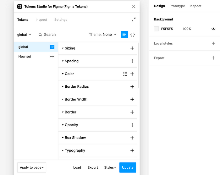
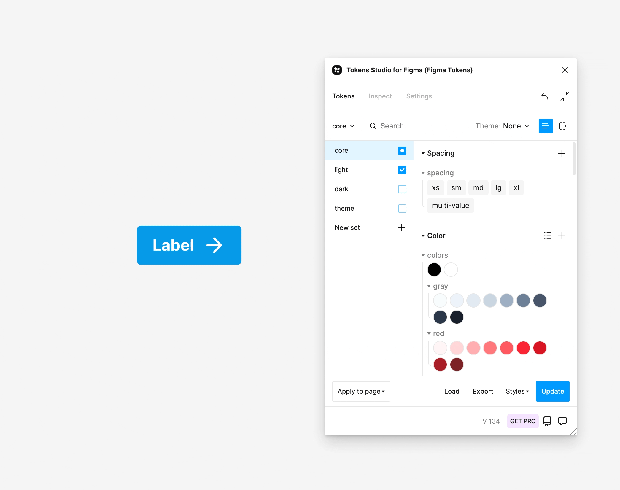
Tokens Studio for Figma
Types of tokens
There are three main types of tokens in Tokens Studio for Figma: global, alias and component-specific.
Global tokens store the values with context-agnostic names. Looking at these key-value pairs tells you nothing about possible applications. Think about the items in your colour palette or dimensions.
Alias tokens inherit properties from core tokens and are bound to a specific context.
Component-specific tokens have names that refer to explicit components. They often inherit from alias tokens.
Working with tokens
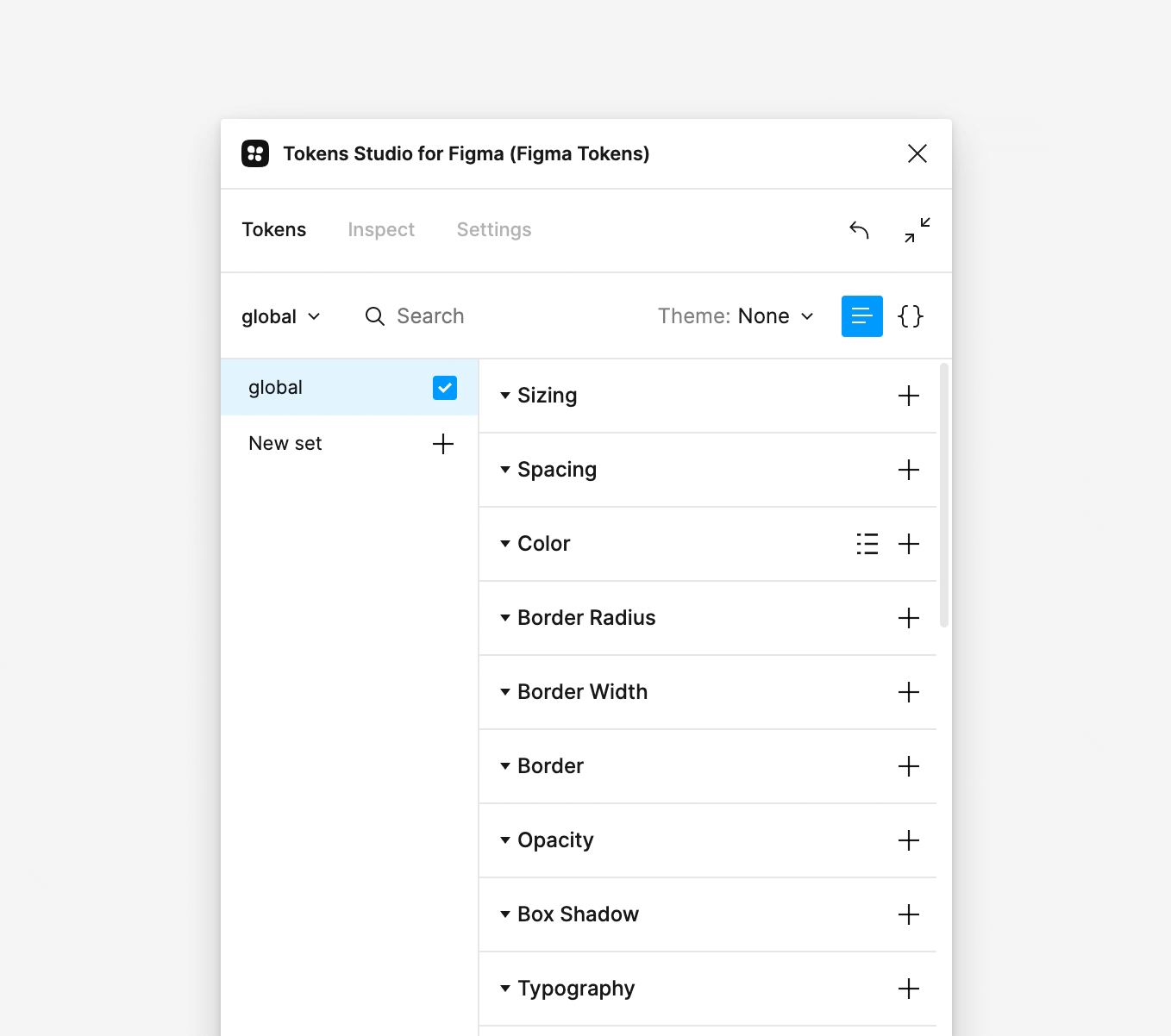
Creating tokens
Tokens Studio comes with plenty of properties you can set. You have colours, spacing, dimensions, borders, shadows, and typography.
To create a new token, scroll to the appropriate section and press the “+” icon next to the section name. Then in the modal window, label it with a unique name and assign a value. Use dot notation to nest tokens and keep them organised.
Creating new token
Referencing tokens
You can reference existing tokens to create aliases. Aliases are easy to spot because the linked property name is in the curly braces. In the value field, type “{“ to trigger a drop-down list with all the available tokens. Select one and press “Confirm”.
Creating alias token
Using math
You can also use basic mathematical operations to assign values to your tokens. It is tremendously convenient when you work with typography. You reference the precedent and multiply it by a scale factor. The scale can be a numeric value or a global token as well.
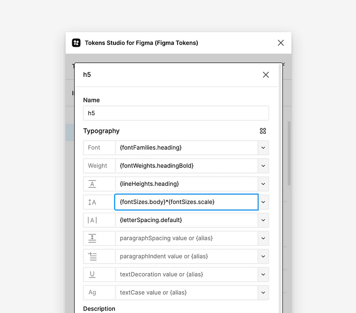
Using typography scale
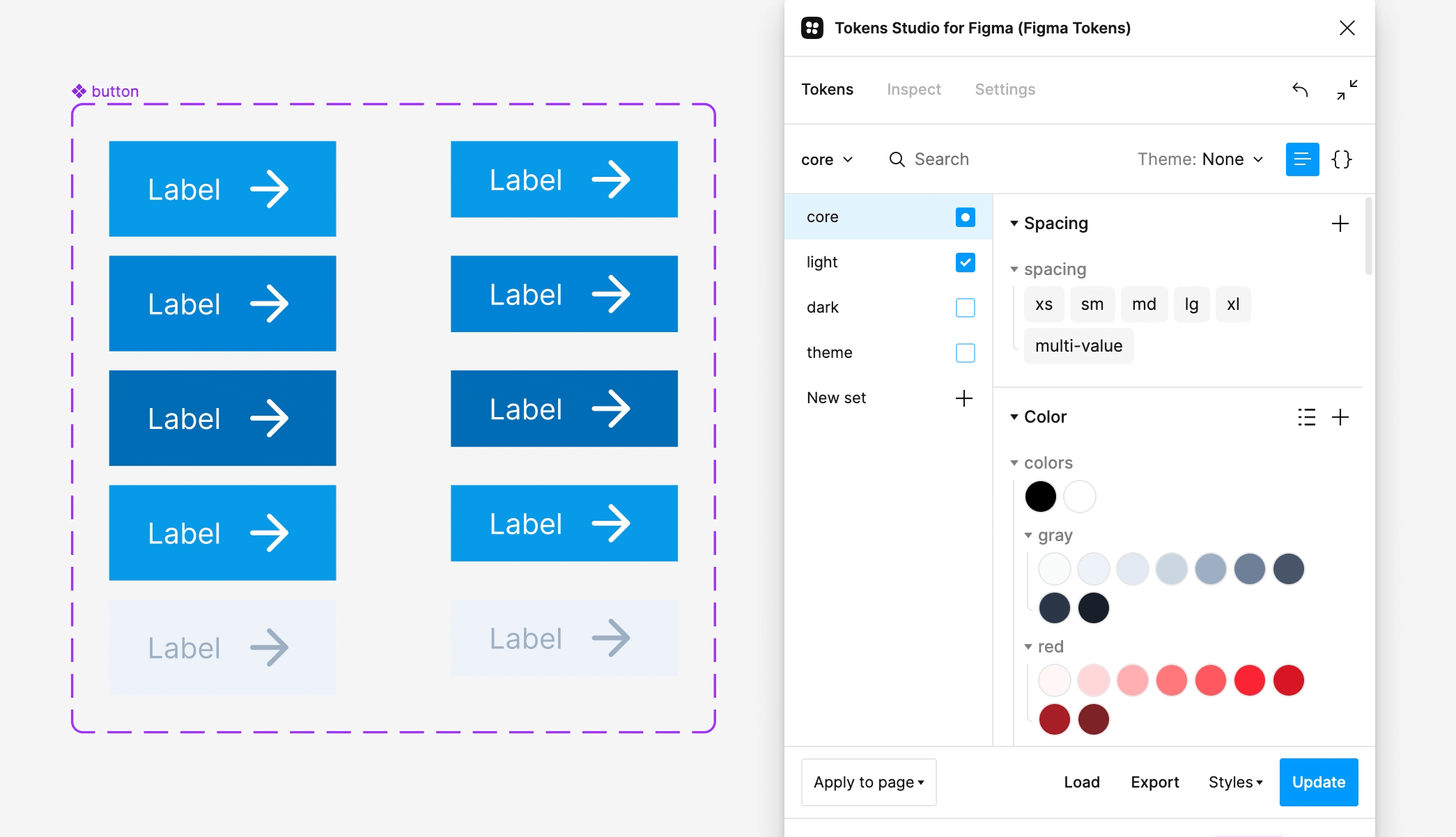
Applying tokens
First, select an object on the canvas. Then left-click on the preferred token to apply its default behaviour. It would be the auto layout gap for spacing attributes. For radius, it would refer to all border radii. For more control, use the right mouse button. Respectively, it will allow you to change padding or individual corners.
Applying tokens
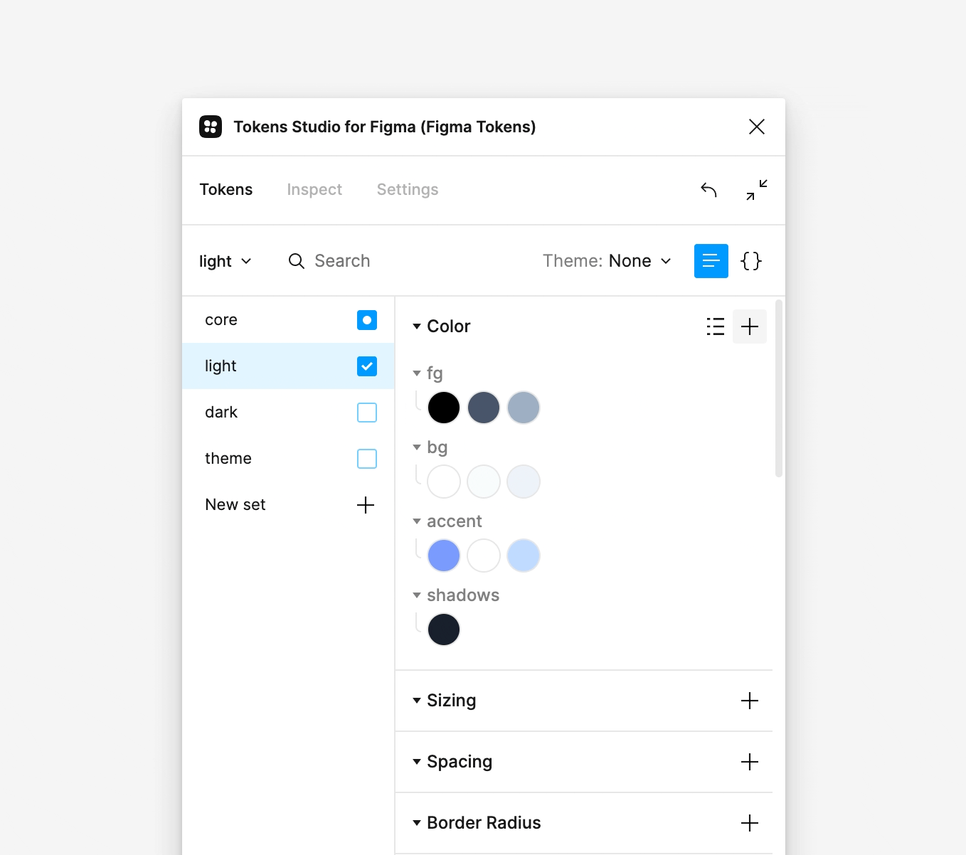
Token sets
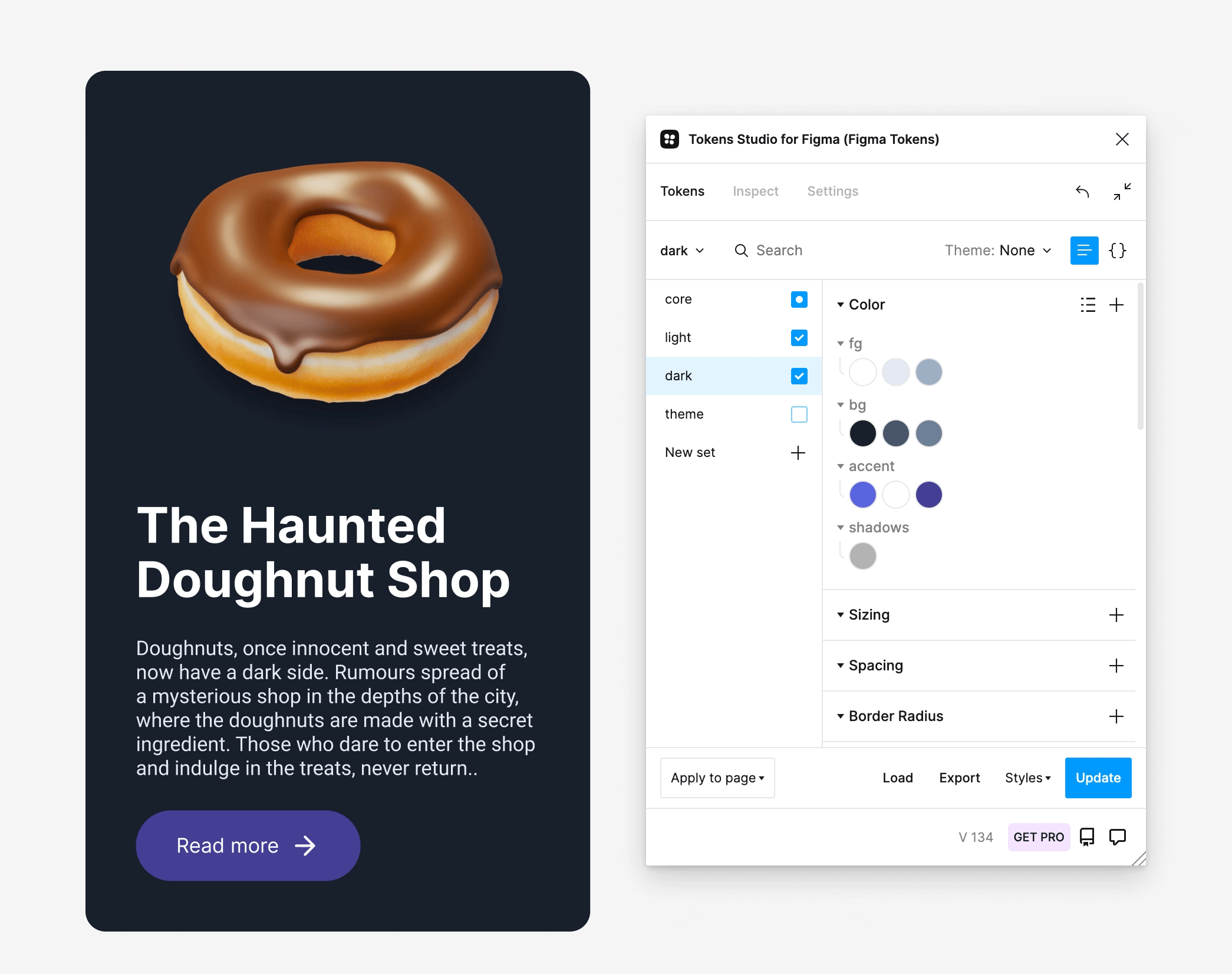
You can organise your tokens into sets. This way, they can be split semantically and used when needed. Think about light and dark themes or different branding options.
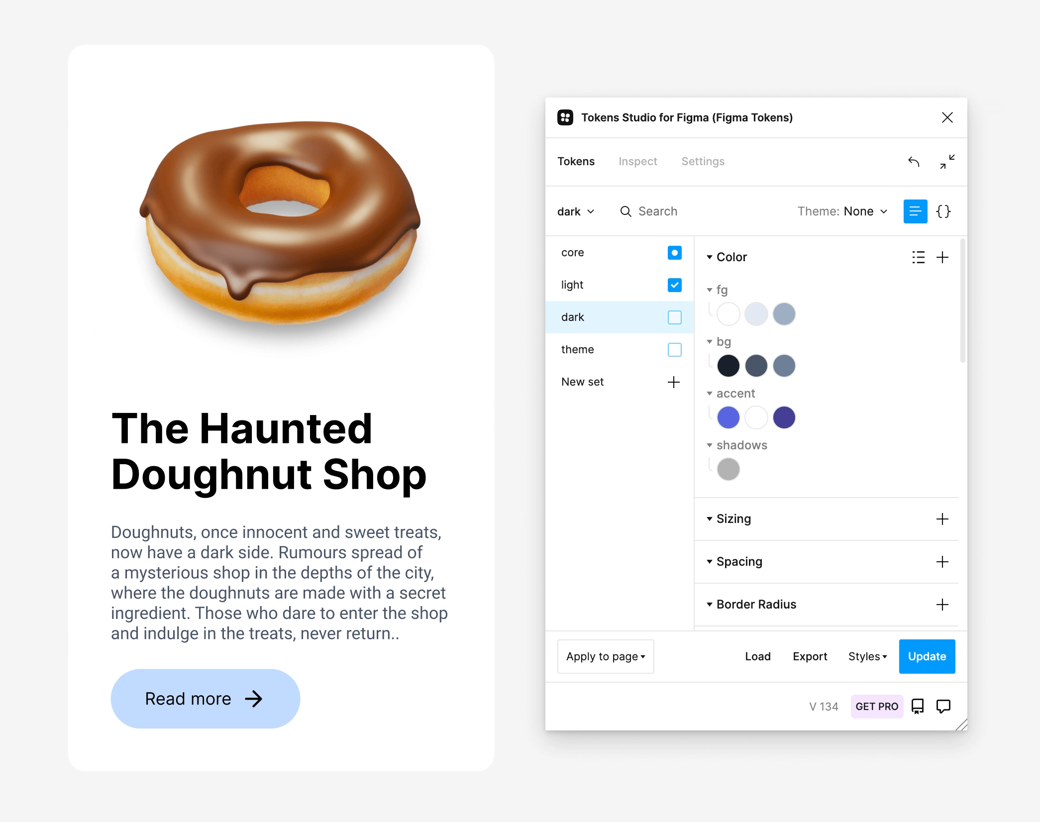
Previewing design with different token sets
You can also choose a source set used as a reference. This set is disregarded upon export to Figma styles. Likewise, all tokens with names starting with an underscore are ignored.
Design handoff
Inspecting
Anyone can go through your design with a fine-tooth comb to pin down all the tokens used. They show up in the Inspect panel for the active layer. Selecting the “Deep inspect” option exposes additional properties for the nested elements. At this point, you may also remap the attributes.
Inspecting design
Annotating design
Since we are working with a plugin, there is no way to inspect its data as a viewer. So developer teams have to either use the plugin or rely on redlining technique.
Fortunately, the annotation feature is available to help create design specifications. First, open the Inspect panel. Disable the “Deep inspect” option. Next, select an individual layer to see all applicable tokens. Then switch to the Debug & Annotate view and choose the placement of your annotation. Remember that the documentation does not update automatically, so any changes have to be adjusted manually.
Annotating component properties
Storing tokens
Headless design systems allow multidisciplinary teams to rely on a single source of truth. With Tokens Studio, there are several ways to sync your tokens. By default, they are stored locally. However, it will not do when you work with separate Figma files.
In this case, you can use one of the sync providers. In the Settings panel, you can choose between GitHub, Gitlab, Azure DevOps, JSONBin.io, and Generic Versioned Storage.
Conclusion
A headless design system can still generate a user interface without having its own. It allows for greater flexibility and scalability in the design process and aligns it better with code.
Like in cooking, design tokens are your secret ingredients. Those ingredients help create well-balanced dishes, just like design tokens allow to create cohesive and consistent designs.
Recommend
About Joyk
Aggregate valuable and interesting links.
Joyk means Joy of geeK