|
|
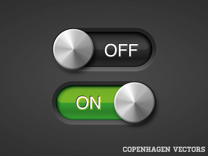
My pet peeve is the labeling of these things. 1)I'm going to give you an easy one to start. You see a toggle switch. It is set to on (probably - the little colour bar in the switch is coloured in). It is labeled "Disable fnurbification". Okay now what? Does "on" mean I'm going to be fnurbified? Does switching the switch disable the fnurbification so I actually have to switch it to "off"? No that's crazy. "on" means "disabled", cognative dissonance aside. 2) You see a toggle switch. It is set to on like before. It is labeled "Disable fnurbification". We learned before that "on" meant "disabled", but that filled us with a vague sense of unease. For whatever reason we try toggling the switch. The text changes to just "Fnurbification" Okay really now what? Is my fnurbification on? You try flicking the switch back. The colour fills in and the label changes to "Disable fnurbification" again. Okay what are we supposed to do? What's happened is the designer has read a post on medium about accessibility and that screen readers don't read out the colour of the filled in part of a toggle switch, and has decided to help by changing the label when the state of the switch changes. The problem is now the label could either be describing the current state or be describing what happens when you flip the switch. And there's really no way of knowing. I've seen this very often with the UX for boolean selectors where they use things like buttons rather than toggle switches. Does pressing the button do the thing it says on the label or does the label describe where we are now and pressing the button will reverse that? No way to be sure. Postscript: Notice that whatever you decide is correct in the second case could change what you would do in the first case if the first type of selector is one that would change label when you toggle it.
|
|
 |
|
This should be just Fnurbification [ON|off]
or Fnurbification [X]
Maybe add some indication which is the default. Bonus points for actual context of the function when you hover over it. Checkbox is fine, toggle switch is also fine as meaning is clear in both cases. Every other solution should lead to whoever responsible for it being fired
|
|
|
|
> Fnurbification [X] Actually, that should be: [x] Fnurbification
|
|
|
|
Why? It feels better on the right, imo. It’s more natural, I see what it is, and then decide at the end to select or deselect. If it’s on the left, I now have to return to the beginning of the word. It’s not very natural.
|
|
|
|
I think it looks nicer if you have few elements with varying width: [x] bla [ ] this is a very long label [ ] lorem ipsum
|
|
|
|
Yes, it’s the same reason why bullet lists have the bullet on the left side.
|
|
|
|
|
|
This can lead to additional problems. Say Fnurbification is a setting in code wrapped in an if block. Great, on or off is easy to follow. Now say the Disable Fnurbification is what is actually in code. Now, when someone has a problem with Fnurbification, you have to map state back and see that the inverse was coded for the IU and follow that down the stack. Don't even get me started on defaults. There is no good/easy answer here.
|
|
|
|
There is an easy answer: "Disable Fnurbification" is not what should be in the code. Present the right interface to the user, and fix the code when practical. Presenting something backwards to the user only makes it harder to fix later.
|
|
|
|
This depends on whether the goal is transparency and clarity, or tricking users into enabling yet more “telemetry” surely?
|
|
|
|
This UX headache turns into an evil dark pattern real quick when it’s combined with privacy toggles that are conveniently never defaulted to the way you would want them. The less cynical take is that you only ever interact with privacy controls when they’re wrong, and the subset of those which are confusing are the most salient.
|
|
|
|
Just the other day I've encountered a cookie modal, where the enabled option was grayed out and when disabled it was colored. Only noticed this because the required cookies toggle was obviously on (though gray in color). For someone in a hurry (like we are all when dismissing those modals), you would expect to gray those out, which would actually make you opt-in to all those advertising cookies. Talk about dark patterns.
|
|
|
|
> Just the other day I've encountered a cookie modal, where the enabled option was grayed out and when disabled it was colored. Only noticed this because the required cookies toggle was obviously on (though gray in color). For someone in a hurry (like we are all when dismissing those modals), you would expect to gray those out, which would actually make you opt-in to all those advertising cookies. Talk about dark patterns. I realized the same pattern but in reverse in my phone provider's app. When you're making a payment with your credit/debit card, there is a toggle that you can turn on for them to tokenize your card. By default, the toggle is to the left side and it's colored light blue. When you toggle it to the right it become gray. I believe they have done it on purpose to confuse prople who don't want their card tokenized.
|
|
|
|
|
Also curious. The only thing I can imagine is wanting to call customer service and have them say “you paid your last bill with the CC ending in 1234” and knowing which of your card that is? Seems like a stretch.
|
|
|
|
Do you remember what site that was on? I’d like to blog about that one.
|
|
|
|
> privacy toggles that are conveniently never defaulted to the way you would want themOr conveniently defaulted the way you want them, but with wording and other visual clues twisted in such a way to make you question that and maybe accidentally opt in.
|
|
|
|
I've been winding down my Facebook over the past year or so. Unliking things, unfriending friends, and deleting posts. If you try to unfollow a page on Facebook, the "Unfollow this page" button is turned off, and you must turn it on/check the button (which changes it from gray to blue) to UNfollow the page. One of the many reasons I've been winding down my Facebook.
|
|
|
|
Bethesda (e.g. Fallout) are masters of the label as current state versus label as next state paradox. On Fallout 76's "PIP Boy" UI, button tips for things that toggle or rotate settings like "(X) Allow Friends Only" arbitrarily mix states and actions, in the same UI! That particular option is on the Private World creator and the only way to figure out which it is is to create a world and see who can join. There are many such examples with several buttons/action/states listed where some work one way and others the other. It's so bananas it's almost endearing.
|
|
|
|
There are two conflicting schools of thought that I suspect will never reconcile. the people who think the button should show what state it is in. and the people who think the button should show what state it will change to when activated.
|
|
|
|
I think a nicer framing is Should this show the state or the action? This gets messiest imo when it's a toggleable button like thing, or an unclear link. Buttons seem good candidates for "trigger an action", checkboxes instead suit "this is the state".
|
|
|
|
I think checkboxes is 'the state to be if I click save'. I don't generally expect checkbox to change the state instantly if I don't click 'submit' or something similar.
|
|
|
|
I'm also always looking for save button after I check some checkbox. Maybe that's why people move to toggles for changes that are immediate. However when I make textual change and there's no save button I'm still confused. There's no standard how to indicate imediate change in textbox.
|
|
|
|
I remembered that some sites use a small spinner on the edge of textarea or something similar to indicate "I am uploading your text to cloud / I am saving your text to disk". I think it's a good design that tell users your changes are persisted "now" ? And this can be probably applied to all options that take effects instantly.
|
|
|
|
Interesting, I don't look at the same way - which is another reminder to me why good UX design is hard as my own interpretation of something as simple as a checkbox isn't universal. On a similar note, I find it hard when I don't know if I need to save or submit.
|
|
|
|
Simple solution: change the label on action. "Flubber enabled" [toggle ON] "Flubber disabled" [toggle OFF]
|
|
|
|
Flubber enabled [X] Flubber disabled [ ] <-- Does that mean that flubber is not disabled ? Never touch the label, and never tell state outside of the checkbox: Flubber [X] <-- Clearly, flubber is enabled. Flubber [ ] <-- Obviously, there's no flubber.
|
|
|
|
This is the worst possible solution because you're now showing the state and the action simultaneously, arguably making it less clear about the meaning of the toggle. The ARIA guidelines for switches even have a big warning about not doing this[1]. [1] https://w3c.github.io/aria-practices/#switch
|
|
|
|
|
I really like that. Do you know of a site that does this today?
|
|
|
|
I don't really like this as it's not clear to me until I use it that I see it's a changing label. I don't want to have to interact to discover what will happen if I do. The toggle being off means it looks like "Flubber disabled: off" or "Flubber disabled: no" but it means "Flubber disabled: yes"
|
|
|
|
If I saw "Flubber Disabled" with a toggle next to it that was "off", I'd turn it "on" to enable the "Flubber Disabled" feature.
|
|
|
|
Most comments are in favour of the former, but we've been trained by every media player UI to understand that a button with a pause symbol means that the media is currently playing.
|
|
|
|
It's worth noting that physical media players (VCRs, CD players, Tape players) usually have separate play and pause buttons. The Winamp default skin did also. Most of us were trained to expect that before contemporary media players started showing up. I think it's also worth noting that it is usually very obvious what state a media player is in, so it makes sense we would have different expectations from that UI vs one where we aren't sure of the current state.
|
|
|
|
Tape players have it because buttons were used to physically actuate controls of the deck. It was easier to have "stop" be mechanics to disengage head, "play" to engage head" and "pause" being just on/off switch for the motor than trying to merge play/pause into 1. > Most of us were trained to expect that before contemporary media players started showing up. CD players started getting play/pause precisely because they didn't need to. Most VCRs also had digital controls (coz moving mechanisms via push of button would be harder with big tapes and heads) and they also did often have play/pause integrated. Some opted for copying tape 1:1, some merged play/pause into one button, it certainly wasnt that all of them had separate pause.
|
|
|
|
> It's worth noting that physical media players (VCRs, CD players, Tape players) usually have separate play and pause buttons. Anecdotally (in UK&EU) every old tape, CD, or VCR player I ever had combined play and pause on a single button, even devices where there was no screen to show current state it was just the norm that the same button toggles the current state.
|
|
|
|
If it's a switch, I don't understand why it can't be represented as a switch: Fnurbification disabled
O
|
Fnurbification enabled
Of course, UX design metaphors based on actual mechanical devices aren't cool anymore, but a brave enough soul can ignore coolness in favour of functionality.
|
|
|
|
Even better: Fnurbification enabled
|
O
Fnurbification disabled
:)
|
|
|
|
I think the way it's done in aerospace is FNURB
NORM c- ALTN
or else FNURB
[ ] < normally blank
[ ] < shows ALTN when selected
|
|
|
|
It would probably have TEST as 3rd option
|
|
|
|
Light switches are on when they're in the down position.
|
|
|
|
> Light switches are on when they're in the down position. This really depends on the part of the world you are living in. When I was living in Central Europe the light switches were on when they were in the up position. Edit: Even all my Canadian switches are like this. Up is on.
|
|
|
|
The UK and many ex-colonies that also maintain plug/outlet switches seem to generally use down for on, while the US/Canada/Central Europe often use up for on. Especially annoying are the posh toggles, unnecessarily popular in some European countries (e.g. CH) that don’t have any physical indicator of on-off status.
|
|
|
|
This becomes confounded if you have multiple switches for the same light though.
|
|
|
|
|
The lack of any affordance whatsoever on buttons, switches and appliances in Switzerland drives me absolutely insane
|
|
|
|
And in other places (e.g. Japan), the switches are left/right. I think right is On.
|
|
|
|
Sometimes it can even be either way, because there are two switches and toggling one of them toggles the light in any case; they essentially act as a XOR circuit and are most commonly seen in corridors.
|
|
|
|
Or when you cheaped out on workforce you could get some of them up, some of them down :D
|
|
|
|
Central europe here as well: We have light switches that are press to toggle and spring back in our home.
|
|
|
|
The apartment I live in has switches that turn the light on in its down position in some rooms and switches that turn the light of in its up position in other rooms. Fun!
|
|
|
|
You can fix it quite easily by pulling out the whole switch and setting it in the box the other way.
|
|
|
|
But by now I've gotten so used to it that I don't want to :)
|
|
|
|
Unless you have two switches for the same light so the on position depends on what position the other switch is in too
|
|
|
|
luckily all light switches have a light indicator show the current status.
|
|
|
|
|
Both switches should be turned 90 degrees and move horizontally.
|
|
|
|
|
|
Yeah, I've lived with dual switches my whole life. Hallway in my childhood home, the two entrances to my kitchen now. Also my bathroom switch is left/right. I had no idea "up is on/off" was even a thing until someone referenced it a few years ago (in my 30s).
|
|
|
|
It depends entirely on how they were mounted/wired and if the person doing it cared. Where I live the inconsistency is real, even inside a single home, though most people seem to not care. In my own home I fixed everything which was in the subjectively wrong position, it was trivial to do.
|
|
|
|
Yes. An electrician re-wiring my kitchen had three adjacent switches differently up / down when all off. He happily redid them when asked, but clearly himself didn't care about the consistency.
|
|
|
|
The analogous case being a horizontal circuit laying on a table with the crossbar switch up in the air causing an open circuit & being down closing it.
|
|
|
|
enabled should be the top (vertically) choice
|
|
|
|
First, checkboxes and toggles are not buttons, so that's a slightly deceptive way to describe it. If you use "checkbox" instead, it's immediately clear who's right: > and the people who think the [checkbox/toggle] should show what state it will change to when activated These people are wrong. The simplest thing should be the default and this adds extra indirection (projecting future state from current state), therefore it's not the simplest, therefore it's wrong. Unless of course you mean something strange by "activated".
|
|
|
|
It's very easy to reconcile. If you have to have inverse logic in UI (which is wrong, but designers gonna design despise logic or usability), you can just have "Enable"/"Disable" but use other hint showing the current state, say paint the disabled ones red and enabled ones green . Non-default state should also be indicated
|
|
|
|
|
Not for me, labels like that confuse me even more. I rather have just "X" with a checkbox next to it. The root issue are negations like "disable X".
|
|
|
|
As a user who switches between apps and there isn’t consensus on this… it’s confusing as hell.
|
|
|
|
Truly the pro-skub and anti-skub of this profession.
|
|
|
|
|
Glad the latter does not design rockets, planes and cars.
|
|
|
|
Not sure if you are being sarcastic, but they do design cars. Aren't tesla menus full of those kind of toggles?
|
|
|
|
Yes they are, but the labels don't change when the setting is toggled. It says what it is, and the toggle says if it's on or off. The toggle is just a visual, it can be tapped just like a checkbox.
|
|
|
|
Oh there is a special kind of hell reserved for the latter crowd.
|
|
|
|
Yes, a hell where all the switches show the current state.
|
|
|
|
|
|
It's very common for developers to make accessibility worse by doing things like this. I have seen things where the two states to a screen reader are something like: "disable foo toggle button pressed" and "enable foo toggle button not pressed". Why not just a checkbox labeled "foo"?
|
|
|
|
|
I think it shouldn't include the redundant semantic in the label. [ ] fnurbification
[x] fnurbification
or [*enabled* | disabled] fnurbification
[enabled | *disabled*] fnurbification
Light up the active one.
|
|
|
|
You mean: ( ) enable fnurbification
(o) disable fnurbification
|
|
|
|
There are many instances where the default is set at enable fnurbifucation with white text on a black background. Disable is shown as black text on a white background. When you change the state the text and background color inverts. There is no way of knowing for certain what position is on and what is off without assuming that the first displayed state is on. I believe recently I setup a nest with this issue. There is no way of knowing what is specifically selected unless there are three options. With three exclusive options you can compare to determine what the current state is because two of them will look the same thus must be off. Ti-89 93... calculator settings can have this issue but some of the options have 3+ states and once you see the schema it's quite easy to deal with.
|
|
|
|
|
It's not when desirability of fnurbification negatively correlates to other items, i.e. when following is normal config: [X] perform deconbinaturation
[X] disable fnurbification
[X] enable entrapollation
... in this case there is a reason to make it a "positive-disable".
|
|
|
|
Nope, just mark which config is default and add tooltip explaining to user why it might need to be changed. Aiming for all options to be "on" or "off" is some pedantic nightmare that makes settings harder to navigate
|
|
|
|
> Aiming for all options to be "on" or "off" is some pedantic nightmare that makes settings harder to navigateThis probably stems from config files or in-app defaults where a feature is default-on and so the existence of a value means something is disabled. And then some dev comes along and mindlessly transcribes a bunch of boolean flags into a settings menu and here we are.
|
|
|
|
|
|
I think rectangle switch with active light on one end is good. I believe the confused one people talking about is the rounded slide toggle whose body color is used as status (the bolt head left right is equivalent to meaning nothing)
|
|
|
|
To make matters worse, a disabled checkbox is one you can't toggle.
|
|
|
|
Not sure we are on the same page, the two lines is only for demonstration, the real ui is going to have that one line at a time. And the latter is custom radio button, I think it's up to 5 short name items before consider making it a dropdown.
|
|
|
|
200%. I find them "cute" so tried to use them in some internal tools with React. And.... I confused myself on this very exact issue you describe so I changed to a regular checkbox.
|
|
|
|
Isn't the 'easy' fix to have the label read "Fnurbification is on" and "Fnurbification is off"? Clarification: the label should toggle when the GUI toggle switch is toggled.
|
|
|
|
For sure, there are ways to not have it ambiguous. That said, people use this UX pattern all over the place, and sometimes I'm sure on purpose. Istr one iteration of facebook's data privacy and sharing dialogue used to have it. There was a switch called something like "Enable privacy protection" and you see it set to "off". So you switch it "on" and the label changes to "Disable privacy protection". So which one gives me the privacy protection?
|
|
|
|
IMO labels should never change state. If you need explanatory text about what state the user is in, stick it below the checkbox. Privacy protection [ o-- ] Privacy protection is disabled. Other users can blah blah blah Privacy protection [ --o ] Privacy protection is enabled. Other users cannot blah blah blah
|
|
|
|
It can be ambiguous as to whether the label describes the current state, or the future effect of pushing the toggle.
|
|
|
|
No, the label should always say what the toggle or checkbox does when it is enabled. If you want to make it extra extra clear (because so many apps have muddied the water by doing it wrong) you should probably put additional small text nearby that changes. Like this: [ ] Foo
*Foo is disabled*
[X] Foo
*Foo is enabled*
Also you should not have double-negative check boxes ("disable foo"). I'm not a UI designer but I think this is pretty obvious to anyone that has used bad checkboxes (like OP). (I don't think the problem is unique to slide toggles; I've definitely seen similarly bad checkboxes.)
|
|
|
|
>you should not have double-negative // Hmm, I'd like it if that always made sense, but sometimes the default state, with nothing active, is for Foo to be on. So "Disable Foo" is doing something not normally required, or something most people don't want. Sometimes it does make sense that _not_ performing a reduction in Baz is default, and that default is off. You could probably solve it by renaming a feature to used an antonym, but not everything has an antonym [that people know, or that makes sense].
|
|
|
|
I’m puzzled why you equate “default state” with “nothing active”. If the default should be that thing the button says is on, then have the button default to being in the active state. The language even for discussing this is tiring to read…
|
|
|
|
> Hmm, I'd like it if that always made sense, but sometimes the default state, with nothing active, is for Foo to be on. Then foo will be checked on by default. That's not a problem. [X] Send notifications
Is perfectly unambiguous. What I'd like to see with every option like that is something showing whether it is in default state or not so user can easily glance what was changed from default. "reset to defaults" per page of settings is also appreciated.
|
|
|
|
The better solution to "is this the default" is to just have some mechanism for indicating whether the value has been changed, and a way to reset it to its default. This is quite common in UIs. It also has the benefit of working for all controls, not just checkboxes.
|
|
|
|
Too verbose. I personally prefer a balloon that says "x is on" that appears when you toggle the switch.
|
|
|
|
For me, it’s quite clear in the reading, though. You have to read as it presented (label + switch). For example: vSync ==> [On]
vSync [Off] <==
I honestly can’t think to read it otherwise. For the negative labeling, it’s of course unfortunate. But it’s in general the case for all negation. Thus, I try to avoid using negation when ever possible.
|
|
|
|
Imagining a meme of the sweating button push guy, only this time it's a single (lit) button and it's marked 'disable self-destruct'
|
|
|
|
Good design is always hard to find, my personal solution would be a drop-down with the title: "fnurbification" and the options "Enabled" and "Disabled". More systems ought to be built like this, ambiguity is a black check for later economic loss.
|
|
|
| fnurbification [X]
is not ambiguous. Drop downs for on/off is pure waste
|
|
|
|
Ditto. IMO toggles are the best option to simplify small dropdowns.
|
|
|
|
You're mixing two different concepts. One is how to design a graphical gadget, which is a problem for front-end art work. Another is how a boolean variable should be implemented, a problem for your back-end logic. Computer-engineering ancient wisdom says always use positive logic. If you have a choice, never label a boolean something as 'disable', always 'enable'. Use positive logic, avoid negative logic.
|
|
|
|
Of course. I’m not saying it’s good I’m describing stuff that I see widely in apps and sites I use. 3) You see a toggle switch. It is labeled “Fnurbification”. It is set to “off”. You want fnurbification. Do you flip the switch? As we’ve established in 1 & 2 if you know that flipping the switch won’t change the label then clearly the label describes the thing so you should flip it. If on the other hand flipping the switch is going to change the label then we’ve established that the label probably describes the current state. Flipping it would probably change the label to something like “Disable Fnurbification” and turn it off. So you should leave it off so fnurbification remains on. But this is your first time using this app. How do you know whether or not the label is going to change? You could toggle the switch, but what happens if the action of toggling the switch is expensive or safety-critical? 4) Let’s raise the stakes. You see a switch. It is set to off. It says “Nuclear reactor safety protocol”. You want a safe nuclear reactor don’t you? Do you switch on or leave it off?
|
|
|
|
For the second case the play-pause button has the same problem: what does the 'play' button mean? That it's currently playing, or that when you click it, it will play? Same with paused. Is it paused now or does it pause when I click it?
|
|
|
|
That one wouldn't be confusing if people didn't attempt to save space by making it one button. The tape recorders, vcr and dvd players I've seen mostly have them on two different buttons: pause which stops the current recording or playback and separate play and record buttons. There is nothing confusing to PLAY / RECORD / STOP. Although I guess sometimes you have a joint pause play button especially on tv remotes and those ARE confusing. ETA: apparently HN doesn't like the pause button emoji so i had to use text.
|
|
|
|
In 2000's the "is playing" would be just "button looks pressed in", and same for "is paused", but today designers hate usability.
|
|
|
|
I honestly always test this with with video chat Mute buttons. I feel like it is only recently that UX designers designed a way to show that you are muted that is different from the Mute switch, which is a complete guess as to what state you are in.
|
|
|
|
Video chat mute is one of the worst offenders. If I recall correctly MS Teams behaves the exact opposite of zoom using the same ux.
|
|
|
|
Consider the UI design from the perspective of someone whose goal is to make it less obvious for how the user can disable cookies, sorry, fnurbification, while still technically providing the user with the option to do so.
|
|
|
|
A checkbox could have the same issues. Both just represent binary state
|
|
|
|
A checkbox could have the same issues. Both ust represent binary state
|
|
|
|
Good point. Knowing how it ended is killing me, quick question, at the end did you got fnurbificated or not?
|
|
|
|
Thank you for putting this into words! It gets worse when it is for handling destructive actions. And it is not clear which way it is or it isn't destroying things. Actual nightmare material.
|
|
|
|
|
Another version of hell is a checkbox being replaced by 2 radio boxes. But on page load none is selected, so UX changed 2-state piece for 3-state one (a small win is if they are at least grouped together so only 1 can be selected).
|
|
|
|
This is kind of embarrassing to admit, but I couldn’t figure out how to change the state of a toggle switch for a really long time. I kept trying to slide the switch left or right. Sometimes it worked, but often it didn’t. It wasn’t until I had been using an iPhone for a couple years that I discovered you’re just supposed to press it, not slide it. What a stupid design.
|
|
|
|
I happily confirmed that the settings app in GNOME Shell 42 implements sliding correctly, it works fine.. so I tried slide, slide, slide and a little bit more and the gnome-shell process crashed :)
|
|
|
|
|
Because it’s 2023 and we can’t get basic UI that works properly?
|
|
|
|
Crashing is funny. In this case, it's hopefully because of the thing it toggled and not the UI. (I was toggling "allow overamplification" in the sound settings). Maybe this is the relevant line of the crash log: Object Gio.DBusProxy (0x55e4d0f30a90), has been already deallocated
|
|
|
|
|
Well, they took 42 versions to fuck up basic shit, it is hilariously incompetent
|
|
|
|
Naw I wanted to share this without it turning into that kind of mudslinging. Something about desktops that never get complaints vs desktops that people actually use.
|
|
|
|
> It wasn’t until I had been using an iPhone for a couple years that I discovered you’re just supposed to press it, not slide it. Huh? On the iPhone you've always been able to slide it. I blame this on all the other implementation which copied the switch design, but didn't bother to implement sliding…
|
|
|
|
I have an iPad. There seem to be two kinds of toggle switches in the native apple apps; one of them slides and animates, but the other one can only be pressed and it doesn't animate the transition. The latter is less common, but I've seen both in the same app before (settings I think). It's likely a strange bug, but I think it's relevant since you can't _always_ slide it.
|
|
|
|
I’ve always liked Apple’s implementation because the slider has a temporal state. Airplane mode used to take a a couple seconds to enable so the toggle felt “stickier” to toggle. When you tapped on the toggle, the round button elongated and stayed in the middle for a split second before hitting the right side boundary of the toggle.
|
|
|
|
Just confirmed, on 16.3 still slides, you can even do it partially/slowly. Readily accessible one is settings airplane mode, first setting in settings. Absence of verb in label makes it clear what it is. Meanwhile, on Kindle, it shows a black airplane in a white circle labeled "Off" and a white airplane in a black circle labeled "On". This is a recent update from before where the first was an airplane with a slash through it for Off. In both cases, Cell/WiFi is on when labeled Off, network+radios are on when icon was airplane with a slash through it labeled off.
|
|
|
|
Years ago I built a cms using these sliders, and one of the users was having problems. I double checked and it worked fine. So I said I'd watch him use it to see what was wrong. He clicked the slider and dragged it to the other side. My jQuery code was listening for 'click' events, which was the source of the bug. Since then I'm careful to use them "properly".
|
|
|
|
On iOS, you can either press it or slide it. The problem is that a lot of websites have started using them and only implement the click/tap event, not the mouse press and move event, or the slide event. So they end up being quite misleading.
|
|
|
|
The problem is the popular toggle switch should be like a extension socket switch, not the slide body color as status. The head of each end should be lighted up, not the body.
|
|
|
|
Similar. In my defense, lock screens on phones used to have a toggle switch you needed to slide.
|
|
|
|
|
And UIs started using sliding latch icon for toggles, which is the point of contention here
|
|
|
|
|
I suspect one reason why toggle switches became widespread, aside from touch interface cargo-culting, is that in contexts like the iOS Settings app, they can fit the pattern of label-on-the-left, control-on-the-right, whereas checkboxes (and radio buttons) need to be on the left of the label, unlike other controls. (Or on the right for RTL languages, I suppose.) Checkboxes can thus require a little more consideration in how to layout a dialog. I still believe that checkboxes are the better control, because they can be toggled with a single click/tap without having the conceptual disconnect that a physical sliding toggle implies that you would need to drag it across, and because the checkbox state is visually unambiguous regardless of coloring (and 1/0 labelling). With checkboxes, there is also the general convention that clicking on the label (and anywhere between the checkbox and the label) toggles the checkbox, meaning a larger click target (this is one thing that <label for=…> achieves in HTML, by the way), whereas for sliding toggles this is not a common convention, making them less convenient to use with a pointing device. Another benefit of checkboxes is that the label is always directly adjacent to the checkbox, meaning you don’t need any extra visual aids (horizontal lines, more vertical whitespace) to prevent confusion about which control goes with which label, which can be an issue when there’s a lot of horizontal whitespace between label and control in a list of controls.
|
|
|
|
> checkboxes (and radio buttons) need to be on the left of the label Does it though? What about a checkbox makes it NEED to be on the left?
|
|
|
|
It’s a convention taken over from paper forms, and the reason is likely the adjacency benefit I mentioned. Consider the analogous radio buttons, which work like a bullet list in terms of layout. A bullet list with the bullets on the right would be weird (in LTR languages). Also compare with todo lists (todo apps), or selecting items from a listing. The check control is always on the left. For example in iOS Mail: https://support.apple.com/en-us/HT208661
Or checklists in iOS Notes: https://support.apple.com/en-us/HT209365 Furthermore, checkboxes can have subordinate controls, like in this example: https://learn.microsoft.com/en-us/windows/win32/uxguide/imag...
Having the checkbox at the beginning of what you enable/disable just makes sense.
|
|
|
|
Apple used sliding checkboxes. Then everyone copied Apple. It's an annoying industry trend but in terms of clarity I don't think it matters at all in this case. For a while people also used push buttons with "lights" indicating on/off but those have been phased out almost entirely now. I don't think there's much of a difference between a checkbox and a toggle if you size them right. Toggles are easier to size up to touch screen size so on touch screens they make sense. On desktop, in non-touch mode, the oversized control kind of irks me, though. "On" versus "off" is always clear, but the question "did I set it correctly" depends on the phrasing of the checkbox labels. What does "FizzBuzz enabled when widgeting" being on or checked mean? Design wise, I think generally the toggles are reserved for cases when you turn on a feature or service, and checkboxes just modify that feature's/service's behaviour. "VPN" is a toggle, but "auto-connect VPN" is a checkbox. "Accessibility" is a toggle, but "always overlay mouse cursor" is a checkbox. On touch screens the bigger toggle buttons make more sense so I think on Android/iOS you'll always see them in the place of a checkbox.
|
|
|
|
I agree that toggles make much more sense on touch-screens (which is why Apple used them). Apple ones also light up green (or dark background) when "on" and grey (or light background) when "off" - which seems pretty clear to me.
|
|
|
|
iOS used to only have light/dark. How the heck am I supposed to know which one is on? I believe you when you say that dark is on, but for the physical toggle I use most (i.e. a light switch) dark is off. Green is fine now, because I'm fortunately not red-green colourblind.
|
|
|
|
Apple ones can also show 0 or 1 labels if you turn the option on in Accessibility. :)
|
|
|
|
> toggles are reserved for cases when you turn on a feature or service, and checkboxes just modify Oh wow. I've never thought about this before but that is very intuitive. Toggles have a physical, analog equivalent, like a switch or lever. Checkboxes don't really map to meatspace; they're strictly a logical construct. Makes sense that toggles do big changes and checkboxes tweak.
|
|
|
|
Checkboxes map into meatspace, they copy checkboxes/tickboxes in paper forms. The things they make you tick to confirm that they can phone you, or the thing you fill out when voting on a paper ballot or in a multiple choice test. Admittedly not as physical as buttons, but they were designed as a copy of an existing thing.
|
|
|
|
The world fell apart when flat minimilasm removed all the indicators that the "on" side was 'on', leaving the grand mistery "does "on" mean "it is on", or "push this button to turn it on"?
|
|
|
|
As others have pointed out, that ambiguity comes from putting a verb in the text next to the toggle. "Disable Feature" next to a switch in the ON state is weird because it indicates the feature is disabled when the switch is on. Putting "Feature" as the text and the toggle as the only indicator of on/off enabled/disabled clears it up.
|
|
|
|
To me, the semantic difference between the two is that I expect a toggle to cause an immediate effect whereas a checkbox merely holds the value to be applied later. Applied to a client/server web application, I would expect a toggle to immediately cause a request to the backend. I’d expect a checkbox to be used in a form which is sent as a whole on submit.
|
|
|
|
While I think that's somewhat true to a degree, I think that might be largely because where checkboxes are used (on desktop), there are normally OK or Apply buttons which do the actual action, whereas where toggles are used, things are normally "live", and so they don't have OK or Apply buttons...
|
|
|
|
I'd expect it to work on submission only if I saw actual submit button, regardless of what else is in config. I also strongly dislike apps that do the instant thing, coz there is no way to undo something if I made a mistake (say removed some value that I shouldn't)
|
|
|
|
I don't have that expectation. What caused you to have it?
|
|
|
|
I'm guessing that historically toggle switches would (immediately) close some electric circuit, whereas checkboxes were used to mark things as done on some paper list.
|
|
|
|
|
Checkboxes were used to indicate a request in a <form> that you later <submit>
|
|
|
|
|
I do have (or at least understand) that expectation. Historically (90's, early 00's) in Windows, which had 95% of market share, almost any settings screen would only apply the settings you changed after you pressed the "Apply" button (apply the settings and stay in the screen) or "Save" (apply the settings and close the screen). I'm not sure how Mac OS X fared in that regard. But, for some older people, "click an option and it's immediately active" is not how it was in the past.
|
|
|
|
I think that might be the underlying… misattribution(?). Almost no macOS screens have ever worked like that. Their interface guidelines have always recommended against it. > ...all changes that a user enters in a dialog box should appear to take effect immediately whenever possible. — macOS 9 guidelines: http://interface.free.fr/Archives/Apple_HIGuidelines.pdf Following Apple’s sensibilities will get you both toggle switches and instant changes, though I’m not sure there's a connection within any single interface.
|
|
|
|
|
It is the metaphors that they apply, a toggle mimics a switch (e.g. a light switch) while a checkbox mimics it’s own paper counterpart.
|
|
|
|
Yeah, UI design often rely on familiarity and it's going to confuse some % of minority because people's experience are different (been trained with different environment and situation in life, plus arbitrary brain chemical etc)
|
|
|
|
Storing the mechanical action is an added expense. Pure Latin character based mark additions (& reversals) could include o -> p, or q along with font dependent n to m, V to W, F to E; l or I to B, D, E, F, H, K, L, M, P, t or T.
|
|
|
|
It's cultural, check boxes come from boring and usually not greatly designed universe of Windows and Linux desktops, toggles come from immediacy of iOS devices.
|
|
|
|
I know I'm old but I still see light switches all around me. Doesn't anyone flip them anymore? It's cultural but this has nothing to do with Windows, Linux, and iOS. You flip a switch, the light comes on immediately. This is about the immediacy of switches, not iOS devices.
|
|
|
|
|
I mostly agree, but just to be the devil's advocate: When a toggle switch is 'off', it still looks like a toggle switch. When a checkbox is 'off', it's a square.
|
|
|
|
I often get left and right confused, so I'm not really a fan of using left/right as code. It takes maybe 2 seconds max to think about it, but it's annoying. Worse is the labeling. When something says "On" it's not clear whether you mean it is on, or the button turns it on. As far as I'm concerned there is no correct choice, because it's not fully unambiguous. The aesthetics, however, are pretty great, there's a reason designers don't seem to like checkboxes. Checkboxes feel kinda odd. On paper they are used to denote membership in a set more than general boolean status. When the question is a boolean, like "Did you feel sad today?" there's usually one box for yes and one for no. The aesthetics are good enough I'd say it's even worth adding an unambiguous state indicator like (Disabled) to clear the doubt. But, radio buttons with separate on/off boxes can also be very familiar and aesthetic, and I'd probably go with those more often.
|
|
|
|
I wonder if the issue with checkboxes is that real checkboxes can not be unchecked. "Check all that apply" makes sense when the boxes are all empty. It's doesn't feel the same when it's a list of cookies that are all checked by default.
|
|
|
|
In the 90s I used 3 different desktop OSes where the UI followed a style guide, and that style guide evolved gradually over years, allowing you to glance at a control and be familiar with its possibilities. Now even on one device, the user sees 10 kinds of different controls and new ones that are thrown at them all the time. The problem is surely that you can't rely on the user _recognising_ the control you've built. You have to design as if every user might be parsing it for the first time.
|
|
|
|
Usability has taken a nosedive with the rise of web apps. Every company wants to have their own special branding in the form of a "design system", and there's a whole industry of designers coming up with different non-standard ways to do things.
|
|
|
|
They are only used in places where confusion benefits the user. It has to be deliberate so people accidentally opt in. I've assumed it's a dark pattern.
|
|
|
|
Because everything just gets worse as you age. Sure, my dad said it too back then, but they just didn't get how the world moved on and improved. This time around though it's real, everything gets more stupid and dumb and I hate it.
|
|
|
|
1. Anything that is in the world when you’re born is normal and ordinary and is just a natural part of the way the world works. 2. Anything that's invented between when you’re fifteen and thirty-five is new and exciting and revolutionary and you can probably get a career in it. 3. Anything invented after you're thirty-five is against the natural order of things. Douglas Adams
|
|
|
|
To be entirely fair invent -> improve -> cost cut often leads to worse UIs. Like when car manufacturers decided that knobs are bad and on top of people hating it it was proved to cause more distractions to the drivers https://www.vibilagare.se/english/physical-buttons-outperfor... Part of that is trying to have "one size fits all", why waste time perfecting design for multiple cases where you can just shove touch screen oriented design to desktop OS and "just" waste some space ?
|
|
|
|
I'm early- to mid- 30s (<35), and I hate basically every UI shenanigan that was invented in the past 15 years or so. Which is to say, Douglas Adams might need to adjust the time window in #2 a bit.
|
|
|
|
I'm a member of Generation Y, because that's what we were before all this weird sh*t happened.
|
|
|
|
Or maybe some things get worse and some things get better and we should stop pretending that it's impossible for things to get worse in tech. It reminds me of when I see old photos and everyone is dressed up so much more nicely than today. And people either respond with "akshually hoodies are just as nice as pin stripe suits" (come on, you know they're not) or "oh what you want to go back to leaded petrol and no personal computers and smoking everywhere and drink driving?" (no, just the clothes). Nuance people, jeez. You can pick and choose things in the past that were better or weren't.
|
|
|
|
It's a two steps forward, one step backwards thing. The things you are noticing really are a step backwards, but that doesn't mean progress overall is going backwards.
|
|
|
|
I wonder when you understand your dad was right all along.
|
|
|
|
I'm glad that you know the right is on.. but I don't. I live in a country with a right to left language system. Things locally, done in the local language are right side is off. Things internationally behave the way you've mentioned. Checkboxes are infinitely better, because they're not language dependent. This is an incredible source of frustration - and one that comes up often. As a native speaker of multiple languages, I always pause and do a double-take in order to actually "see" the language, given that I usually don't notice.
|
|
|
|
I thought the color/highlight was the only hint, it wasn't clear to me if left or right is on.
|
|
|
|
The choice of using a toggle switch or a checkbox depends on the context. Toggles, switches and checkboxes are all components used to switch between states, often on or off, but not always (in toggles you can also have multiple states) UI and UX studies suggest how they would be best used to aid readability A toggle switch is best used for actions or options that have an immediate effect on the user interface and do not have to be confirmed or reviewed.
A checkbox is more suitable when there are further changes, are within a form or need to be revised before continuing. When designing forms, it is important to focus on the context of use rather than the function of the controls... I recommend watching this video
https://www.youtube.com/watch?v=wFWbdxicvK0
This research shows six different ways of using the mobile phone screen to control devices with only two states (on/off). There are buttons, sliders and rockers. The ways that require sliding are safer because they avoid problems caused by accidental touches. For this reason, the iPhone uses a slider to unlock the phone
|
|
|
|
I like sliders for a three state: NULL | On | Off. This can be useful in a search area where I want both an explicit yes/no, but also have an option for either yes or no.
|
|
|
|
Honestly, I think it is just a trend. It started with the iOS settings UI, everybody copied it and is still copying it almost 15 years later. Look at the settings in Windows, Android, macOS (Ventura), Gnome. List/Detail view, and the detail pane is itself a list of mostly switches. One downside is as you mentioned the confusion whether it is on or off (although nowadays most UIs make it double clear with color and some with additional text). But also because the switch is on the right hand side, it is further away from the text, and is visually inconsistent with radio boxes. And it is part of this "iOS settings" design language which itself is problematic, because it doesn't try to have specialized panes for each setting but crams everything into lists. (This is not the fault of the toggle, but how it is used.) One point in defense of the toggle is maybe that it is not clear to everybody that you can usually click the text on a checkbox, making the click target rather small. But you generally can't click the text on a toggle, so it is moot.
|
|
|
|
I don't get it either. I never know which side is on and/or which background color means on, unless they're using green/red. You say "right side is on", but I never even realized this until now.
|
|
|
|
I've encountered sliders that were colored red/gray, where the ON state was to the left and red was on. It was a cookie consent thing, and I was confused. I guess that was the purpose.
|
|
|
|
Be careful, red/green colourblindness is the most common kind of colourblindness.
|
|
|
|
Also colour associations are cultural, not universal
|
|
|
|
As are left and right positions of a button. Really, the only thing I can think of that clearly indicates the state of these buttons is the ⏽ vs ⭘ distinction because those glyphs have been made specifically for this purpose.
|
|
|
|
I know ⏽ means on, but if I see ⏽, does that mean it's currently on, or that it will be on if I move the toggle to the location of the ⏽? Off ( ▢) On
(⏽▢)
(⭘▢)
|
|
|
|
Checkboxes come from older mouse/cursor UI’s, toggles come from newer touchscreen UI’s.
|
|
|
|
Checkboxes are just as usable as toggles on touchscreen. It doesn't have to do with the tech, it's just that toggles are newer.
|
|
|
|
I wouldn’t dare make comments on what’s more or less usable in an HN thread since everyone here is such an expert on these things. Toggles came along with iOS when the UI was skeumorphic ca. 2008. Don’t know whether it has to do with tech, but that’s when we first got those. As far as actual evidence, I do UX testing of a touchscreen/cursor application and we have both scattered throughout. I haven’t ever seen anyone have any difficulty understanding, using or differentiating between either. In our results this simply isn’t a problem with investigating.
|
|
|
|
> I haven’t ever seen anyone have any difficulty understanding, using or differentiating between either. In our results this simply isn’t a problem with investigating. I'm not sure if this was meant as reassuring, but for me it only reinforces my view that UI/UX folks don't have a clue what they're doing.
|
|
|
|
Checkboxes are slightly problematic in touch UIs because they are generally scaled to a similar size as text and small enough that they are occluded by a fingertip. Sliders leak information about their state while you touch them.
|
|
|
|
Checkboxes can be just as usable but they're often smaller and often more tightly spaced, which can be a pain to navigate on a touchscreen. I'm not saying that's a good reason, but it is a reason besides being newer.
|
|
|
|
Then why has macOS Ventura toggles all over the place, even though it's pointer-driven? (it's actually a wild mix of toggles and checkboxes in the new Settings UI) There seems to be some logic behind it though: Toggles are often used alone to switch things on/off (for instance Wifi or Bluetooth), while checkboxes are often used in groups for "less important things". But maybe I'm just imagining that there's an actual reason behind it ;)
|
|
|
|
From https://developer.apple.com/design/human-interface-guideline...Switches -------- Avoid using a switch to control a single detail or a minor setting. A switch has more visual weight than a checkbox, so it looks better when it controls more functionality than a checkbox typically does. For example, you might use a switch to let people turn on or off a group of settings, instead of just one setting. In general, don't replace a checkbox with a switch. If you're already using a checkbox in your interface, it's probably best to keep using it. Checkboxes ---------- A checkbox is a small square button that’s empty when the button is off, contains a checkmark when the button is on, and can contain a dash when the button’s state is mixed. Unless a checkbox appears in a checklist, a descriptive label follows the button. Use a checkbox instead of a switch if you need to present a hierarchy of settings. The visual style of checkboxes helps them align well and communicate grouping. By using alignment — generally along the leading edge of the checkboxes — and indentation, you can show dependencies, such as when the state of a checkbox governs the state of subordinate checkboxes.
|
|
|
|
> In general, don't replace a checkbox with a switch. Someone tell Apple's Settings team
|
|
|
|
Someone fire Apple's UI/UX team, and bring back the people from the Leopard era who actually understood the value of an understated, predictable and standardized UI.
|
|
|
|
Because we have to phone-ify everything, whether it makes sense or not. (Narrator: it never does)
|
|
|
|
|
I've never understood what that state is supposed to indicate. It only makes sense when the checkbox has nested checkboxes underneath and an indeterminate state only indicates that the user has some of the children selected. But as a user I'd never be able to select this indeterminate state, since, by definition, it is indeterminate. for such scenarios, I'm not sure what is good design.
|
|
|
|
Food ordering screen: [ ] Add sauces to my food [ ] Mayonnaise
[ ] Ketchup
[ ] XO Sauce
If I want all sauces I click the first box: [v] Add sauces to my food [v] Mayonnaise
[v] Ketchup
[v] XO Sauce
If I only want Ketchup and click that: [-] Add sauces to my food [ ] Mayonnaise
[v] Ketchup
[ ] XO Sauce
|
|
|
|
Better ordering screen: Extra sauces (1 selected):
  [ ] Mayonnaise

  [v] Ketchup

  [ ] XO Sauce
I understand what indeterminate checkboxes are, but I don't remember them ever actually making sense anywhere I found them.
|
|
|
|
When well implemented the clicking [-] would unselect all and clicking again select all. It does not matter with 3 options and 1 selected, but its nice if its 20 options and 7 random ones selected.
|
|
|
|
the left-right slidey things were an Apple affectation, no doubt introduced just to be different, after all, Apples were for the rest of us. We're different. they have much less usability what stinks about them is you can never quite figure out or remember if you're supposed to just tap, only tap on the "other end", or actually slide the slider.
|
|
|
|
FWIW, the ones on iOS have always been something you could drag. As far as I have ever understood, all of the UI controls on iOS were designed to be skeuomorphic in a way that directly made sense for someone futzing with their fingers: you push buttons, you scroll a WHEEL to work with selection boxes, and flip switches to toggle options (which also, notably and at the time almost specifically on Apple products, take place immediately with no concept of "Apply", and aren't part of a "form" metaphor).
|
|
|
|
I recently wanted to unsubscribe from one of those corporate emails. When you click to unsub, the web site brings up "Notifications: " and a toggle next to it. It is not clear which way does what.
|
|
|
|
Mobile usability that can be performed with a single hand/finger is my guess. Creating a UI that is both web & mobile friendly.
|
|
|
|
Not a guess, this is "the" answer - toggles came around as mobile UI.
|
|
|
|
I'm not a fan of toggles, but they might be better because they usually have an extra text saying "On" or "Enabled" in addition to the label. For example: The label [ *] On
A checkbox with a good label [1] is fine, and it's better in the sense that it has a third state (for indeterminate). [1] https://blog.uidrafter.com/guidelines-for-checkboxes
|
|
|
|
On/Off labels confuse me. I often click on ‘On’ when I want to enable something (this is how you do with a mechanical switch) only to discover that I likely disabled the thing. Old school checkbox is less confusing and doesn’t require additional words.
|
|
|
|
The completely ambiguous: Enable the label [O @]
Is becoming more popular.
|
|
|
|
Is it? Dark mode/light mode toggles are very new and are now everywhere. It's a single image of either a sun or a moon with no text whatsoever. Half the sites show the sun when light mode is on and half the sites show the moon when light mode is on. Is the toggle supposed to reflect the current state? Or is it supposed to tell you what's going to happen when it gets clicked?
|
|
|
|
To me, the paradigm only works if both sides are labeled in both states. Light [* ] Dark
This is essentially how a physical switch would be labeled, and is the best way to prevent ambiguity - the current state is the label that the switch is closest to. But most implementations don’t do that. And I can understand why, because the following… Show Notifications Yes [* ] No
…is a bit awkward looking.
|
|
|
|
Isn't the need for extra text a sign of flawed design though?
|
|
|
|
Three state checkboxes are available nearly everywhere, not sure what is better about that in toggles.
|
|
|
|
Is that really so? I cannot recall seeing any of them with such an extra text.
|
|
|
|
|
Ah, right, thanks, I do recall that now. Is the disappearance of the additional "On/Off" label perhaps another trend layered on top of the toggle switch trend?
|
|
|
|
Ask the people at YouTube who still think "outline-no outline" on a black and white theme is the best idea to indicate whether you have liked a video or not. Apparently they tested it with aliens because i, as a mere human, keep being confused and often unlike vids by mistake
|
|
|
|
Good UX patterns are generally those which are recognisable and intuitive to the user. Checkbox's in the real world are used more in confirmation, or a yes/no pattern. In the real world you can check a checkbox if it applies, but you don't uncheck a checkbox when something doesn't apply. You also don't expect some state change to occur from merely checking a checkbox. Checkboxes are still used everywhere they make sense. "I accept these T&Cs" for example would almost certainly use a checkbox, not a slider for the reasons I mentioned. For on / off patterns though checkboxes are less intuitive. When you slide a physical toggle switch in the real world you're typically switching a device from one state to another state - and you typically have the ability to switch back and forth. Checkboxes are not used in this way in the real world so it's less intuitive to use them like this in digital UIs. I don't think the issue you have with sliders is universal. If you design a slider well it should be very clear what the state is. For on / off patterns changing the colour of the slider from green to red can provide a clear visual hint about the active state.
|
|
|
|
The ones I hate the most is the ones that also change the label, because both description and indicator changes, it's just confuzing.. I like the "positive description: [ ]" pattern. Ghosts can breathe fire [ ] Radians are better [X] There's no doubt what the state is.
|
|
|
|
|
Touch requires a bigger target area and big checkboxes look terrible.
|
|
|
|
the checkbox itself doesn't have to be as big as its hitbox.
|
|
|
|
You see them used because they are skeumorphic, and there is a general trend in user interfaces to go skeumorphic across successive generations.
|
|
|
|
radio buttons are skeuomorphic and much easier to understand how to operate and get the result you want. Slider toggles are pure fashion and skeuomorphic only in that they are as difficult to use as some recessed sliders are, but without a skeuomorphic fingernail to grab them. There are physical things that are difficult to operate irl, and there's no reason to skeuomorph difficult things to use. but even better, what's wrong with letting me choose what I want? You can have whatever UI you like, it doesn't need to affect me. That's the whole idea behind a personal computer, it's my slave, it's my servant, it does what I want, to make my life the way I want it. Software is the first human technology to offer this promise, it's only the weak of mind, ego and will who see it as a way to impose their stunted vision on other people.
|
|
|
|
As long as its clearly marked "Mode Execute Ready"…
|
|
|
|
I think toggle switch has a different connotation from checkboxes. Checkboxes were primarily designed for questions where a user wants to choose a subset of related options for the same topic. (e.g. Which colors are acceptable to you? Red yes/no, Blue yes/no, Green yes/no) The toggle switch connotes an A/B answer to a single question. (e.g. Dark theme? yes/no)
|
|
|
|
When I was much younger, I had trouble understanding checkboxes - in particular the ones with an X in them because at the time I thought X means no. So I would assume checkboxes with an X meant that you were deselecting them. Is it possible it's really all just what we're used to?
|
|
|
|
This was also a problem with the Playstation controller. The controller has ○ and × buttons, and in Japan "×" can mean no/incorrect and "○" can mean yes/correct, so in the menus you press ○ to confirm and × to deny. When they localized it for the west, they flipped the meaning so that × means yes as in "check the box" and ○ means no as in "zero" (like on a power switch with 1 and 0) So when you play games from another region, what controls you use in menus changes.
|
|
|
|
I'm still annoyed the big 3 all have different position for usual OK/cancel
|
|
|
|
You're not going crazy. I think it's revealing that these elements are common in the cookie consent forms, where if don't click the big green "I give up, give me all your cookies" button you have to try to understand: - which way means "on" (because the UI element isn't clear) - whether "on" means "no cookies" or "actually I would like the cookies after all" (because the label is poorly worded)
|
|
|
|
I saw a cookie opt-out a couple of days ago where right was off.
|
|
|
|
|
Designers like how they look better than a checkbox.
|
|
|
|
People older than 30 grew up filling in paper forms for everything and know check boxes well. Younger people are less familiar with check boxes, so the best real world analogy is light switches. They are also expecting changes to happen instantly.
|
|
|
|
I don't think light switches are a good analogy. My light switches don't turn green or red when I flip them and I don't need to slide them either. Furthermore, many light switches only toggle the state of the light because it's common enough to have multiple switches hooked up to the same light source. The only analogy I can think of is the physical slider built into some smartphones for sound on/off. I don't think toggle sliders are common at all these days.
|
|
|
|
>Younger people are less familiar with check boxes I get that people fill out paper forms less than they used to, but give the younger generation some credit here. It's not like we live in a Star Trek future world where paper is an antique curiosity. It's still alive and well in schools, for example, lockdowns notwithstanding. I'm 100% sure they still know how to tick a box, be it by pen or by mouseclick or tapping a touchscreen. For my part, I only recently learned that "radio buttons" were named after an actual kind of button that existed on old fashioned radios. I never encountered such radios as a kid, but I had no trouble at all using radio buttons in computer UIs. There are only so many ways to make a button.
|
|
|
|
I think it's just because Apple did it and people got used to it. There are a lot of things I personally hate about the functional aspects of Apple's UI components, even though they look very pretty.
|
|
|
|
The short delay in a toggle switch turning on, as opposed to a checkbox, is also irritating. Like, if it's used to expose an additional menu option, for example. That stutter of waiting breaks the flow.
|
|
|
|
"the right side is on" – i'm afraid to bring up, is it so in RTL locales too?
|
|
|
|
Randomly checking one of my apps, the answer is "no" (i.e. the left side is on), but if you are looking at some random website that appears to have been localized, there isn't really any way of judging if they decided to switch the toggle direction or not.
|
|
|


