

The storytelling power of simple design solutions
source link: https://uxdesign.cc/the-storytelling-power-of-simple-design-solutions-5cffb45806f5
Go to the source link to view the article. You can view the picture content, updated content and better typesetting reading experience. If the link is broken, please click the button below to view the snapshot at that time.

The storytelling power of simple design solutions
How designers communicate a lot with a little

Photo by Tyler Lastovich
Designers often focus on visual problems, with solutions that are creatively visualized through rapid idea generation. And most of us know that initial ideas are usually anything but simple.
The ideation process works best when you let your mind run wild and table judgment for later. But once you’ve had a chance to reflect, and to refine, your ideas — validating which ones are worthy and which ones are garbage — you want to perfect the “yeses” and the “maybes” into the most powerful solutions possible before taking any one of them to the finish line.
Designers should never take for granted that they can often communicate a lot with a little. Take Roger Kastel’s 1975 poster for the film Jaws as an example of perfectly achieved simplicity in visual storytelling.
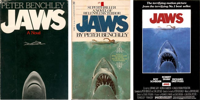
His poster was heavily influenced by the original book jacket, which was designed by Paul Bacon — one of the foremost cover illustrators of the 20th century — a year prior, and eventually replaced by Kastel’s updated design. Image credit.
Most of you can likely picture this image: A nude woman swims in calm water as a great white shark — razor-sharp teeth on display — approaches her from beneath. A simple title in blood-red block letters completes the scene. It’s a composition that communicates thematically, tonally, and emotionally with only five visual elements: Woman, shark, water, sky, and title.
Like any good movie poster (or book cover), it tells you exactly what the story is about while also making you want to see (or read) more.
“Perfection is achieved not when there is nothing more to add, but when there is nothing left to take away.” –Antoine de Saint-Exupery
Achieving simplicity requires continuous review
Achieving simplicity of any design solution requires you to follow both a deductive and a reductive process, reviewing and removing detail and complexities until you’ve communicated that idea in the simplest way possible, with just the right amount of information.
In visual design, this means letting go of redundant details. When designing a product or service the people will use, it means letting go of redundant steps or processes. If you have to explain to anyone what a finished design solution means, that solution will likely fail.
The story of the redesign of London’s Underground Map can teach us a lot about the importance of reducing complexities in design to achieve clarity and usability.

London Underground Map before (left) and after (right)
The original map — created in 1908 — contained lots of real-world details. Rivers, trees, bodies of water all cluttered the map amongst the train stations. Though it was an authentic representation (from a geographical point of view), it was a mess for passengers to use.
In the early 1930s, English technical draughtsman (and frequent “tube” patron) Henry Charles Beck took a shot at revising the overly detailed map based on a pretty simple theory: Train passengers only needed to know where to get on and where to get off. They didn’t care what was happening above ground; they just wanted to get from points A to B.
The London Underground map: The design that shaped a city
The first section of the London Underground opened in 1863. Over the following decades, a number of Tube maps - showing…
Beck’s redesigned map focused only on stations and routes, simplifying the organic lines of the railways to only three directions: Vertical, horizontal, and diagonal. The result was no longer a 1:1 physical representation of the geographic area and train routes. It wasn’t, as we would say, “accurate.” But it had something much better going for it: It was a map that people could actually understand — and use — because it eliminated all of the unnecessary information and detail. Today, Beck’s map has been in use — and gone virtually unchanged — since its release in 1933.
“Simplicity is about subtracting the obvious and adding the meaningful.” –John Maeda
Eliminating complexities
Simpler designs are often easier for people to use. Especially ones that feel familiar.
That is one of the main reasons Google launched their Material Design system — a visual component library and the guidelines for using it — to help interface designers worldwide design products that people can understand by employing familiarity. Design systems — like Material Design or Apple’s Human Interface Guidelines — allow designers to easily pull common elements (and patterns) to design and develop products and experiences, rather than reinventing the wheel with each new design solution. And they are subject to constant review to help them grow and evolve.
But the concept of standardizing design libraries isn’t new.
The work of German industrial designer Dieter Rams had a profound impact on a generation of designers who, today, value simple aesthetics. Through his work with consumer products company Braun, Rams believed that design’s role was to elevate the essential functions of a product, not to overshadow them. At Braun, Rams developed a concise visual language for all of the brand’s industrial products that reflected his mantra: “Simplicity is the key to excellence.”
Particularly, Rams was troubled by the variety of styles and colors found in most products — designed by his contemporaries — in the 1970s. In “The World of Dieter Rams: Less is More,” he recalled the simple decision to color the = button on his famous Braun ET66 Calculator yellow while using black and brown muted tones for the rest of the product design.

Apple’s original design tribute to the Braun calculator. Image credit.
“Design should not dominate things, not dominate people,” he said. “It should help people.” With this simple, restrained design choice, he made the whole product more colorful without actually making the whole product more colorful.
It’s also easy to see the influence Rams had on Jony Ive — Former Chief Design Officer of Apple — in products like the iPhone, the MacBook, etc. Without Dieter Rams, the products we use today would likely look very different (and be more complicated).
The Simplicity Index
Each year, Siegel+Gale publishes The Simplicity Index, a ranking of brands with the least complex experiences, otherwise known as “The World’s Simplest Brands.” According to their website: “Since 2009, a stock portfolio comprised of the publicly traded simplest brands in our global Top 10 has outperformed the major indexes by 679%.”
#SimplicityPays
In this era of transition, simplicity pays. In its ninth edition, Siegel+Gale's study reveals the World's Simplest…
It’s tough to ignore data like that.
The Simplicity Index seeks to showcase that people are more likely to recommend and pay more for brands with uncomplicated experiences. And it’s no surprise that people are also more likely to enjoy simpler experiences.
The companies most commonly at the top of The Simplicity Index — Google, Amazon, Netflix, and others — help spotlight how easy-to-use products and services for all result in higher adoption, user satisfaction, and brand loyalty, while also leading to higher performance and a greater return on investment for brands. But the inverse is just as true: Poor and complicated design execution can kill a brand and alienate customers.
Our goal, as designers, should always be to design something that is instantly understood or easily navigable, not leave the viewer or user with more questions. The people that interact with the products, screens, and experiences we design should be able to say instantly, “I get it.”
So keep it simple.
Recommend
-
15
It’s easy to call out bad design – there’s a lot of it. But finding and appreciating examples of good design can feel challenging. We encounter good designs every day, yet they’re easier to miss because they work. Such design...
-
11
How to use storytelling to design and sustain productsAdding humanistic qualities to our design practice.Storytelling has been an ancient art of passing information from one gen...
-
6
The Power of Storytelling in Building ProductsSnippets from my Storytelling workshop
-
7
The Memorable Power of Agile Storytelling The best way to make...
-
10
-
7
The Power of Storytelling in Architecture: How Narratives and Themes Can Enhance Your Designs The role of storytelling in architecture refers to the idea that architecture has the power...
-
10
Smashing Podcast Episode 59 With Chiara Aliotta: What Is Design Storytelling?In this episode of The Smashing Podcast, we take a look at design storytelling. What is it, and how can...
-
6
LEADERSHIPBlog Series: The Power of Storytelli...
-
6
Transcript Jeff Bullas 00:00:04 - 00:01:20 Hi everyone, thanks for dialing in from all around the world and today we have Jake Hurwitz with us. Now, Jake started his first business when he was eight. That was a couple o...
-
8
Communication Skills Unlock the power of storytelling and tell better stories
About Joyk
Aggregate valuable and interesting links.
Joyk means Joy of geeK