

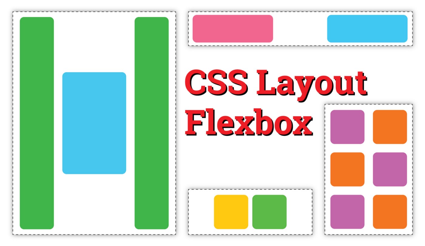
使用flex弹性布局来为微信小程序写自适应页面
source link: https://v3u.cn/a_id_109
Go to the source link to view the article. You can view the picture content, updated content and better typesetting reading experience. If the link is broken, please click the button below to view the snapshot at that time.

使用flex弹性布局来为微信小程序写自适应页面
我们知道,写习惯了前端的人,一般切图后布局页面的话,上手最习惯的是基于盒子模型的浮动布局,依赖 display 属性 + position属性 + float属性,但是浮动布局有一些致命的小问题,比如垂直居中比较费劲,比如著名的float坍塌问题,另外有些极端情况下,还得使用模型+clear:both来手动清除浮动,比较麻烦。
于是,W3C 提出了一种新的方案----Flex 布局,可以简便、完整、响应式地实现各种页面布局。目前,它已经得到了所有浏览器的支持,这意味着,现在就能很安全地使用这项功能,本人在微信小程序页面中尝试了一下弹性布局,个人感觉是:简直太好用了。
Flex 是 Flexible Box 的缩写,意为"弹性布局",用来为盒状模型提供最大的灵活性。
任何一个容器都可以指定为 Flex 布局。
.box{
  display: flex;
}
不过需要注意一点,就是设为 Flex 布局以后,子元素的float、clear和vertical-align属性将失效。也就是说浮动布局和弹性布局不可共存,二者必居其一。
其实flex布局原理很简单,采用 Flex 布局的元素,称为 Flex 容器(flex container),简称"容器"。它的所有子元素自动成为容器成员,称为 Flex 项目(flex item),简称"项目"。
容器默认存在两根轴:水平的主轴(main axis)和垂直的交叉轴(cross axis)。主轴的开始位置(与边框的交叉点)叫做main start,结束位置叫做main end;交叉轴的开始位置叫做cross start,结束位置叫做cross end。
项目默认沿主轴排列。单个项目占据的主轴空间叫做main size,占据的交叉轴空间叫做cross size。

弹性布局的容器可以设置下面这些属性:
flex-direction
flex-direction属性决定主轴的方向(即项目的排列方向)。
.box {
  flex-direction: row | row-reverse | column | column-reverse;
}

flex-wrap
默认情况下,项目都排在一条线(又称"轴线")上。flex-wrap属性定义,如果一条轴线排不下,如何换行。
.box{
  flex-wrap: nowrap | wrap | wrap-reverse;
}

flex-flow
flex-flow属性是flex-direction属性和flex-wrap属性的简写形式,默认值为row nowrap。
.box {
  flex-flow: <flex-direction> || <flex-wrap>;
}


justify-content
justify-content属性定义了项目在主轴上的对齐方式。
.box {
  justify-content: flex-start | flex-end | center | space-between | space-around;
}


align-items
align-items属性定义项目在交叉轴上如何对齐。
.box {
  align-items: flex-start | flex-end | center | baseline | stretch;
}

align-content
align-content属性定义了多根轴线的对齐方式。如果项目只有一根轴线,该属性不起作用。
.box {
  align-content: flex-start | flex-end | center | space-between | space-around | stretch;
}
说了这么多,都是理论,我们来用弹性布局实战一下,比如我们要模仿瑞辛咖啡小程序中的,首行单列,换行双列,并且自适应整个手机页面的布局

页面部分:
<template>


        <div class="container1">

            <div class="item11">
            1
            </div>

           <div class="item12">

              <div class="item1">
                  3
                  </div>


                  <div class="item1">
                      3
                      </div>

          </div>

            <div class="item12">

                <div class="item1">
                    3
                    </div>


                    <div class="item1">
                        3
                        </div>


            </div>


    </div>
    </template>
css部分:
.container1{
  height: 100%;
  width:100%;
  background-color:beige;
  display:flex;
  flex-flow:column;
}


.item11{
  height:300rpx;
  background-color:cyan;
  border: 1px solid #fff
}

.item12{
  height:300rpx;
  background-color:cyan;
  border: 1px solid #fff;
  display:flex;
}

.item1{
  height:300rpx;
  width: 50%;
  background-color:cyan;
  border: 1px solid #fff
}

轻松搞定,代码量比浮动布局少了很多,简直完美。
</div
Recommend
About Joyk
Aggregate valuable and interesting links.
Joyk means Joy of geeK