

Data binding in React: how to work with forms in React
source link: https://www.joshwcomeau.com/react/data-binding/?ref=sidebar
Go to the source link to view the article. You can view the picture content, updated content and better typesetting reading experience. If the link is broken, please click the button below to view the snapshot at that time.
Introduction
So you have a bit of state in React, and you want to sync it with a form field. How do you do it?
Well, it depends on the type of form control: text inputs, selects, checkboxes, and radio buttons all work a little bit differently.
The good news is that while the details vary, they all share the same fundamental mechanism. There's a consistent philosophy in React when it comes to data binding.
In this tutorial, we'll first learn how React approaches data binding, and then I'll show you how each form field works, one by one. We'll look at complete, real-world examples. I'll also share some tips I've learned over the years, and some “gotchas” to watch out for!
Intended audience
This article is intended for beginner-to-intermediate React developers. You don't need a ton of React experience, but I do assume you're already familiar with state, event handlers, things like that.
So let's start with the core mechanism React uses for data binding.
Say we render an <input>:
By default, React takes a very “hands off” approach. It creates the <input> DOM node for us and then leaves it alone. This is known as an uncontrolled element, since React isn't actively managing it.
Alternatively, however, we can choose to let React manage the form field for us. For text inputs, we opt in using the value attribute:
Code Playground
import React from 'react';

function App() {
  return (
    <input value="Hello World" />
  );
}

export default App;
Try and edit the text in the input. It doesn't work!
This is known as a controlled element. React is on guard, making sure that the input always displays the string "Hello World".
Now, it's not super useful to lock the value to a static string like this! I'm doing it here purely to illustrate how controlled elements work: React “locks” the input so that it always contains the value we passed in.
The real magic happens when we pass a dynamic value. Let's look at another example:
Code Playground
import React from 'react';

function App() {
  const [count, setCount] = React.useState(0);

  return (
    <>
      <input value={count} />

      <button onClick={() => setCount(count + 1)}>
        Increment
      </button>
    </>
  );
}

export default App;
Try clicking the “Increment” button, and notice what happens to the text input. 😮
Instead of binding the input to a static string, we've bound the input to a state variable, count. When we click the "Increment" button, that state variable changes from 0 to 1. React re-renders this component, and updates the value in the <input> to reflect this new reality.
We still can't type in the text input, though! React is keeping the input locked to the value of the count state variable.
In data-binding lingo, this is known as "one-way" data binding. The input updates when the state changes, but the state doesn't update when the input is edited:
To complete the loop, we need two-way data binding. Here's how we accomplish it:
Code Playground
import React from 'react';

function App() {
  const [state, setState] = React.useState('Hello World');

  return (
    <>
      <input
        value={state}
        onChange={(event) => {
          setState(event.target.value);
        }}
      />
      <p>
        <strong>Current value:</strong>
        {state}
      </p>
    </>
  );
}

export default App;
We attach an event listener with the onChange attribute. When the user edits the text input, this function is invoked, and the event object is passed in.
event.target is a reference to the DOM node that triggered the event: in this case, it's the text input. That text input has a value attribute, and this represents the value that the user has just tried to enter into the input.
We update our React state so that it holds this new value. React re-renders, and pushes that new value into the input. The cycle is complete!
This is the fundamental idea behind data binding in React. The two ingredients are:
- A “controlled” field that locks the input to a piece of React state.
- An
onChangehandler that updates the state variable when the user edits the input.
With this wired up, we have proper two-way data binding.
One of the core philosophies in React is that the UI is derived from state. When the state changes, the UI is redrawn to match. Controlled elements are a natural extension of this idea. By specifying a value for a text input, for example, we're saying that the input's content is also derived from React state.
Alright, let's look at how this pattern is applied across different input types.
Here's a more complete example of a text input bound to React state:
Code Playground
import React from 'react';

function App() {
  const [name, setName] = React.useState('');

  return (
    <>
      <form>
        <label htmlFor="name-field">
          Name:
        </label>
        <input
          id="name-field"
          value={name}
          onChange={event => {
            setName(event.target.value);
          }}
        />
      </form>

      <p>
        <strong>Current value:</strong>
        {name || '(empty)'}
      </p>
    </>
  );
}

export default App;
The two key attributes here are value and onChange:
value“locks” the input, forcing it to always display the current value of our state variable.onChangeis fired when the user edits the input, and updates the state.
I'm also providing an id. This isn't required for data binding, but it's an important usability and accessibility requirement. IDs need to be globally-unique; later, we'll learn how to generate them automatically using a new React hook.
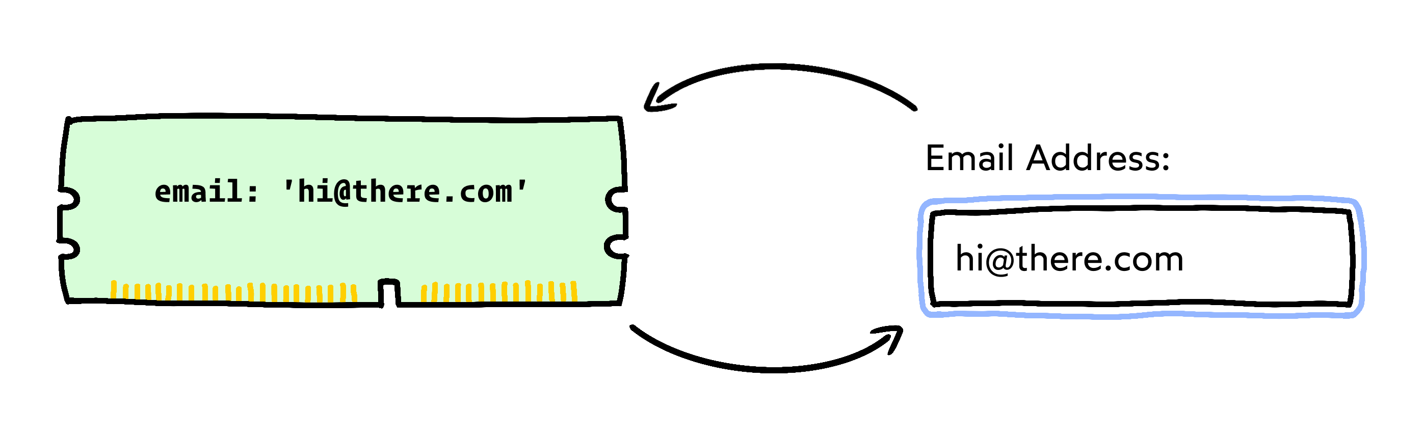
In addition to plain text inputs, we can pick from different “formatted” text inputs, for things like email addresses, phone numbers, and passwords.
Here's the good news: These variants all work the same way, as far as data binding is concerned.
For example, here's how we'd bind a password input:
In addition to text input variants, the <input> tag can also shape-shift into entirely separate form controls. Later in this blog post, we'll talk about radio buttons, checkboxes, and specialty inputs like sliders and color pickers.
When working with text inputs, be sure to use an empty string ('') as the initial state:
Why is this necessary?
When I first learned about this requirement, it seemed really arbitrary to me. Why do we need to specify an empty string as the initial value??
This requires a bit of a deep dive explanation. Read on if you're curious!
In React, <textarea> elements work exactly like text inputs. We use the same combo of value + onChange:
Code Playground
import React from 'react';

function App() {
  const [comment, setComment] = React.useState('');

  return (
    <>
      <form>
        <label htmlFor="comment-field">
          Share your experiences:
        </label>
        <textarea
          id="comment-field"
          value={comment}
          onChange={event => {
            setComment(
              event.target.value
            );
          }}
        />
      </form>

      <p>
        <strong>Current value:</strong>
        {comment || '(empty)'}
      </p>
    </>
  );
}

export default App;As with inputs, be sure to use an empty string ('') as the initial value for the state variable:
Things are a bit different when it comes to radio buttons!
Let's start with an example:
Code Playground
import React from 'react';

function App() {
  const [hasAgreed, setHasAgreed] = React.useState();

  return (
    <>
      <form>
        <fieldset>
          <legend>
            Do you agree?
          </legend>

          <input
            type="radio"
            name="agreed-to-terms"
            id="agree-yes"
            value="yes"
            checked={hasAgreed === "yes"}
            onChange={event => {
              setHasAgreed(event.target.value)
            }}
          />
          <label htmlFor="agree-yes">
            Yes
          </label>
          <br />

          <input
            type="radio"
            name="agreed-to-terms"
            id="agree-no"
            value="no"
            checked={hasAgreed === "no"}
            onChange={event => {
              setHasAgreed(event.target.value)
            }}
          />
          <label htmlFor="agree-no">
            No
          </label>
        </fieldset>
      </form>

      <p>
        <strong>Has agreed:</strong>
        {hasAgreed || "undefined"}
      </p>
    </>
  );
}

export default App;
Phew, that's a lot of attributes! We'll break them down shortly, but first, I want to explain how our “controlled field” strategy applies here.
With text inputs, there's a 1:1 relationship between our state and our form control. A single piece of state is bound to a single <input> tag.
With radio buttons, there are multiple inputs being bound to a single piece of state! It's a 1:many relationship. And this distinction is why things look so different.
In the example above, our state will always be equal to one of three possible values:
undefined(no option selected)"yes"(thevalueof the first radio button)"no"(thevalueof the second radio button)
Instead of tracking the value of a specific input, our state variable tracks which option is ticked.
We can see this at work in the onChange handler:
When the user ticks this particular input (which represents the “yes” option), we copy that “yes” value into state.
For true two-way data-binding, we need to make this a controlled input. In React, radio buttons are controlled with the checked attribute:
By specifying a boolean value for checked, React will actively manage this radio button, ticking or unticking the DOM node based on the hasAgreed === "yes" expression.
It's unfortunate that text inputs and radio buttons rely on different attributes for establishing a controlled input (value vs. checked). This leads to a lot of confusion.
But it sorta makes sense when we consider what React is actually controlling:
- For a text input, React controls the freeform text that the user has entered (specified with
value). - For a radio button, React controls whether or not the user has selected this particular option or not (specified with
checked).
What about all of those other attributes? Here's a table showing what each attribute is responsible for:
| Attribute | Type | Explanation |
|---|---|---|
| id | string | A globally-unique identifier for this radio button, used to improve accessibility and usability. |
| name | string | Groups a set of radio buttons together, so that only one can be selected at a time. Must be the same value for all radio buttons in the group. |
| value | string | Specifies the “thing” that this radio button represents. This is what will be captured/stored if this particular option is selected. |
| checked | boolean | Controls whether the radio button is checked or not. By passing a boolean value, React will make this a “controlled” input. |
| onChange | function | Like other form controls, this function will be invoked when the user changes the selected option. We use this function to update our state. |
Because radio buttons require so many dang attributes, it's often much nicer to generate them dynamically, using iteration. That way, we only have to write all this stuff once!
Also, in many cases, the options themselves will be dynamic (eg. fetched from our backend API). In these cases, we'll need to generate them with iteration.
Here's what that looks like:
Code Playground
import React from 'react';

function App() {
  const [
    language,
    setLanguage
  ] = React.useState('english');

  return (
    <>
      <form>
        <fieldset>
          <legend>
            Select language:
          </legend>

          {OPTIONS.map(option => (
            <div key={option}>
              <input
                type="radio"
                name="current-language"
                id={option}
                value={option}
                checked={option === language}
                onChange={event => {
                  setLanguage(event.target.value);
                }}
              />
              <label htmlFor={option}>
                {option}
              </label>
            </div>
          ))}
        </fieldset>
      </form>

      <p>
        <strong>Selected language:</strong>
        {language || "undefined"}
      </p>
    </>
  );
}

const OPTIONS = [
  'mandarin',
  'spanish',
  'english',
  'hindi',
  'arabic',
  'portugese',
];

export default App;
This might look quite a bit more complex, but ultimately, all of the attributes are being used in exactly the same way.
When using iteration to dynamically create radio buttons, we need to be careful not to accidentally “re-use” a variable name used by our state variable.
Avoid doing this:
In our .map() call, we're naming the map parameter language, but that name is already taken! Our state variable is also called language.
This is known as “shadowing”, and it essentially means that we've lost access to the outer language value. This is a problem, because we need it to accurately set the checked attribute!
For this reason, I like to use the generic option name when iterating over possible options:
Checkboxes are very similar to radio buttons, though they do come with their own complexities.
Our strategy will depend on whether we're talking about a single checkbox, or a group of checkboxes.
Let's start with a basic example, using only a single checkbox:
Code Playground
import React from 'react';

function App() {
  const [optIn, setOptIn] = React.useState(false);

  return (
    <>
      <form>
        <input
          type="checkbox"
          id="opt-in-checkbox"
          checked={optIn}
          onChange={event => {
            setOptIn(event.target.checked);
          }}
        />
        <label htmlFor="opt-in-checkbox">
          <strong>Yes,</strong> I would like to join the newsletter.
        </label>
      </form>
      <p>
        <strong>Opt in:</strong> {optIn.toString()}
      </p>
    </>
  );
}

export default App;
As with radio buttons, we specify that this should be a controlled input with the checked property. This allows us to sync whether or not the checkbox is ticked with our optIn state variable. When the user toggles the checkbox, we update the optIn state using the familiar onChange pattern.
Things get a lot more dicey when we have multiple checkboxes that we want to control with React state.
Let's look at an example. See if you can work out what's happening here, by ticking different checkboxes and seeing how it affects the resulting state:
Code Playground
import React from 'react';

const initialToppings = {
  anchovies: false,
  chicken: false,
  tomatoes: false,
}

function App() {
  const [
    pizzaToppings,
    setPizzaToppings
  ] = React.useState(initialToppings);

  // Get a list of all toppings.
  // ['anchovies', 'chicken', 'tomato'];
  const toppingsList = Object.keys(initialToppings);

  return (
    <>
      <form>
        <fieldset>
          <legend>
            Select toppings:
          </legend>

          {/*
            Iterate over those toppings, and
            create a checkbox for each one:
          */}
          {toppingsList.map(option => (
            <div key={option}>
              <input
                type="checkbox"
                id={option}
                value={option}
                checked={pizzaToppings[option] === true}
                onChange={event => {
                  setPizzaToppings({
                    ...pizzaToppings,
                    [option]: event.target.checked,
                  })
                }}
              />
              <label htmlFor={option}>
                {option}
              </label>
            </div>
          ))}
        </fieldset>
      </form>
      <p>
        <strong>Stored state:</strong>
      </p>
      <p className="output">
        {JSON.stringify(pizzaToppings, null, 2)}
      </p>
    </>
  );
}

export default App;
In terms of the HTML attributes, things look quite similar to our iterative radio button approach… But what the heck is going on with our React state? Why is it an object?!
Unlike with radio buttons, multiple checkboxes can be ticked. This changes things when it comes to our state variable.
With radio buttons, we can fit everything we need to know into a single string: the value of the selected option. But with checkboxes, we need to store more data, since the user can select multiple options.
There are lots of ways we could do this. My favourite approach is to use an object that holds a boolean value for each option:
In the JSX, we map over the keys from this object, and render a checkbox for each one. In the iteration, we look up whether this particular option is selected, and use it to control the checkbox with the checked attribute.
We also pass a function to onChange that will flip the value of the checkbox in question. Because React state needs to be immutable, we solve this by creating a near-identical new object, with the option in question flipped between true/false.
Here's a table showing each attribute's purpose:
| Attribute | Type | Explanation |
|---|---|---|
| id | string | A globally-unique identifier for this checkbox, used to improve accessibility and usability. |
| value | string | Specifies the “thing” that we're ticking off and on with this checkbox. |
| checked | boolean | Controls whether the checkbox is checked or not. |
| onChange | function | Like other form controls, this function will be invoked when the user ticks or unticks the checkbox. We use this function to update our state. |
(We can also specify a name, as with radio buttons, though this isn't strictly necessary when working with controlled inputs.)
Like radio buttons, the <select> tag lets the user select one option from a group of possible values. We generally use <select> in situations where there are too many options to display comfortably using radio buttons.
Here's an example showing how to bind it to a state variable:
Code Playground
import React from 'react';

function App() {
  const [age, setAge] = React.useState('0-18');

  return (
    <>
      <form>
        <label htmlFor="age-select">
          How old are you?
        </label>

        <select
          id="age-select"
          value={age}
          onChange={event => {
            setAge(event.target.value)
          }}
        >
          <option value="0-18">
            18 and under
          </option>
          <option value="19-39">
            19 to 39
          </option>
          <option value="40-64">
            40 to 64
          </option>
          <option value="65-infinity">
            65 and over
          </option>
        </select>
      </form>

      <p>
        <strong>Selected value:</strong>
        {age}
      </p>
    </>
  );
}

export default App;
In React, <select> tags are very similar to text inputs. We use the same value + onChange combo. Even the onChange callback is identical!
If you've worked with <select> tags in vanilla JS, this probably seems a bit wild. Typically, we'd need to dynamically set the selected attribute on the appropriate <option> child. The React team has taken a lot of liberties with <select>, sanding off the rough edges, and letting us use our familiar value + onChange combo to bind this form field to some React state.
That said, we still need to create the <option> children, and specify appropriate values for each one. These are the strings that will be set into state, when the user selects a different option.
As with text inputs, we need to initialize the state to a valid value. This means that our state variable's initial value must match one of the options:
This is a smelly fish. One small typo, and we risk running into some very confusing bugs.
To avoid this potential footgun, I prefer to generate the <option> tags dynamically, using a single source of truth:
Code Playground
import React from 'react';

// The source of truth!
const OPTIONS = [
  {
    label: '18 and under',
    value: '0-18'
  },
  {
    label: '19 to 39',
    value: '19-39'
  },
  {
    label: '40 to 64',
    value: '40-64'
  },
  {
    label: '65 and over',
    value: '65-infinity'
  },
];

function App() {
  // Grab the first option from the array.
  // Set its value into state:
  const [age, setAge] = React.useState(OPTIONS[0].value);

  return (
    <>
      <form>
        <label htmlFor="age-select">
          How old are you?
        </label>

        <select
          id="age-select"
          value={age}
          onChange={event => {
            setAge(event.target.value)
          }}
        >
          {/*
            Iterate over that array, to create
            the <option> tags dynamically:
          */}
          {OPTIONS.map(option => (
            <option
              key={option.value}
              value={option.value}
            >
              {option.label}
            </option>
          ))}
        </select>
      </form>

      <p>
        <strong>Selected value:</strong>
        {age}
      </p>
    </>
  );
}

export default App;As we've seen, the <input> HTML tag can take many different forms. Depending on the type attribute, it can be a text input, a password input, a checkbox, a radio button…
In fact, MDN lists 22 different valid values for the type attribute. Some of these are “special”, and have a unique appearance:
- Sliders (with
type="range") - Date pickers (with
type="date") - Color pickers (with
type="color")
Fortunately, they all follow the same pattern as text inputs. We use value to lock the input to the state's value, and onChange to update that value when the input is edited.
Here's an example using <input type="range">:
Code Playground
import React from 'react';

function App() {
  const [volume, setVolume] = React.useState(50);

  return (
    <>
      <form>
        <label htmlFor="volume-slider">
          Audio volume:
        </label>
        <input
          type="range"
          id="volume-slider"
          min={0}
          max={100}
          value={volume}
          onChange={event => {
            setVolume(event.target.value);
          }}
        />
      </form>

      <p>
        <strong>Current value:</strong>
        {volume}
      </p>
    </>
  );
}

export default App;
Here's another example, with <input type="color">:
Code Playground
import React from 'react';

function App() {
  const [color, setColor] = React.useState('#FF0000');

  return (
    <>
      <form>
        <label htmlFor="color-picker">
          Select a color:
        </label>
        <input
          type="color"
          id="color-picker"
          value={color}
          onChange={event => {
            setColor(event.target.value);
          }}
        />
      </form>

      <p>
        <strong>Current value:</strong>
        {color}
      </p>
    </>
  );
}

export default App;In each of the examples we've seen, our form fields have been given an id attribute. This ID uniquely identifies the field, and we use it to wire up a <label> tag, linked using htmlFor (React's version of the “for” attribute).
This is important for two reasons:
- Accessibility. Form fields require labels; without them, how would the user know what to enter? For folks who use screen readers?, proper wiring is required to make sure they're aware of the label for every given form field.
- Usability. Wiring up a label allows the user to click the text to focus / trigger the form control. This is especialy handy for radio buttons and checkboxes, which are often too small to easily click.
For everything to work property, id attributes should be globally unique. We're not allowed to have multiple form fields with the same ID.
But! One of the core principles in React is reusability. We might want to render a component containing form fields multiple times on the same page!
To help us square this circle, the React team recently unveiled a new hook: useId. Here's what it looks like:
Code Playground
import React from 'react';

function LoginForm() {
  const [username, setUsername] = React.useState('');
  const [password, setPassword] = React.useState('');

  const id = React.useId();
  const usernameId = `${id}-username`;
  const passwordId = `${id}-password`;

  return (
    <>
      <form>
        <div>
          <label htmlFor={usernameId}>
            Username:
          </label>
          <input
            id={usernameId}
            value={username}
            onChange={event => {
              setUsername(event.target.value);
            }}
          />
        </div>
        <div>
          <label htmlFor={passwordId}>
            Password:
          </label>
          <input
            id={passwordId}
            type="password"
            value={password}
            onChange={event => {
              setPassword(event.target.value);
            }}
          />
        </div>
        <button>
          Login
        </button>
      </form>
    </>
  );
}

export default LoginForm;
Whenever we render this LoginForm component, React will generate a new, guaranteed-unique ID. You can learn much more about this hook over on the new React docs.
Solving using nesting instead?
Instead of supplying a unique ID, it's also possible to link a label and a form field with nesting:
I'm not an accessibility expert, but I've heard that this structure doesn't work for all screen readers. The established best practice is to wire it up using an ID.
It's definitely a bit less convenient, but the useId hook removes most of the friction!
Over the past year, I've been working full-time on a comprehensive React course. It's called The Joy of React.
I started using React professionally back in 2015, and I've been working with it ever since. Over the years, I've been building my mental model one piece at a time. These days, I feel very comfortable with the tool, and as a result, it's an absolute joy to use.
I've tried a bunch of other front-end libraries: Angular, Vue, Svelte. Ultimately, though, I just really enjoy building web applications with React!
My goal with The Joy of React is to help you build that robust mental model, to teach you how the tool truly works, so you can avoid all of the common stumbling blocks. I'll show you how to build some really cool stuff, and we'll have a lot of fun along the way!
The course will be released on January 23rd. You can learn much more about it on the course homepage:
Last Updated
January 10th, 2023
Recommend
About Joyk
Aggregate valuable and interesting links.
Joyk means Joy of geeK