

How a Logo Design Genius Made Me Cringe at My Portfolio
source link: https://uxplanet.org/how-a-logo-design-genius-made-me-cringe-at-my-portfolio-8933aad34cac
Go to the source link to view the article. You can view the picture content, updated content and better typesetting reading experience. If the link is broken, please click the button below to view the snapshot at that time.

SAGI HAVIV | LOGO | DESIGN | BRANDING | PORTFOLIO
How a Logo Design Genius Made Me Cringe at My Portfolio
Four golden rules I wish I had applied on my logo design earlier.
Photo by Ivan Siarbolin on Pexels
A farm fresh designer, un-controllably confident, filled to the brim with an entrepreneurial courage, ready to take on the market by storm with my design game.
That dopamine and adrenaline rush was just spot on!
And then my imaginary megalith got smashed faster than a burger king’s patty.
Photo by Sarah Kilian on Unsplash
During this time, I was quite happy with my work but these problems were persistent.
- Zero acknowledgement
- Unhappy clients
- A weak portfolio
- Broken finances
And the list goes on and on.
It was totally fair, just see for yourself.
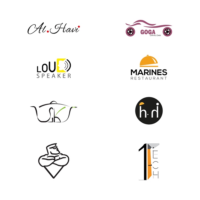
Image By Author
Ignorance is the worst enemy of a designer. As the saying goes
Accepting what you don’t know is half of the wisdom.
You see, I was going in the right direction with my logo design game. Or at least I believed so. But it all changed that one fine day.
When I became the victim of another witty YouTube thumbnail with a perfectly crafted hook ready to suck me in.

Photo by Sander Sammy on Unsplash
Inside was
’s podcast with a graphic designer, who he described as a logo design prodigy! The intro caught my absolute attention.
A logo must be appropriate, distinctive, memorable and simple.
Wait! What? My megalith was smashed even harder because my logos were none of the above. But, wait a minute.
- Who is this mumbo jumbo?
- What has he achieved?
- Why should I even care?
But I crushed my self centered, egoistic thoughts! That courageous act my friends was going to change my logo design thinking forever. Period. Now back to the podcast.
So, I listened to this logo design prodigy, Sagi Haviv — a partner at one of the most prestigious design firms, Chermayeff & Geismar & Haviv, with identity programs, including those for the US Open Tennis Championships, Harvard University Press, Discovery+.
Plus, how can I forget that iconic rectangle logo of National Geographic? It is just a plain rectangle!
Now try to sell that to your client, unbelievable.
He summed up the characteristics of a good logo in this simple sentence which made me look back at my work and cringe on it!
Seriously, what was I doing?
These overly complex logos, having every meaning crammed literally into them were making me question my design knowledge. It was time to change my course of action.
Let’s dive into how I applied these 4 rules to my logo designs. Which allowed me to charge a north of $10,000 for a logo and you can too.
1) Appropriate — A fish can never climb a tree
A brand is like a tribe, centered upon a shared set of values. Every tribe is different and so is every brand. Hence, a logo must resonate with the brand values.
You cannot have a funky penguin as the logo of a Real Estate business targeting an elite audience.
An appropriate logo clearly reflects what the brand is about. Which in return helps people find it relatable and connect with it.
But let’s stop with the academia, we all have enough of it :D
So, I got commissioned to create the logo for a real estate company providing land for farmhouses in the mountains. Now, every other brand in this niche was using that same style by putting a house or door in the logo.
I mean come on, you guys!
I saw my chance to zag here and went with an approach that highlighted what a viewer sees when he opens a window of a peaceful farmhouse!
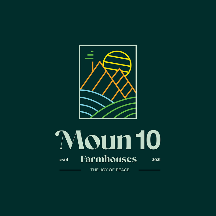
Image By Author
Moun10 — a short and clever name play of mountain. Clever, appropriate and memorable, isn’t it? The client loved the name and logo to the core and demanded no revision.
2) Distinctive — Find a purple cow
To stand out, you need to zag from what everyone is doing. Otherwise, you’ll just blend in the background.
Let me explain.
What type of business comes to your mind when you think of the color red?
My mind says food! And rightfully so, because red makes you hungry.
With numerous food brands using this color, it has become associated to some, particularly McDonalds, right?
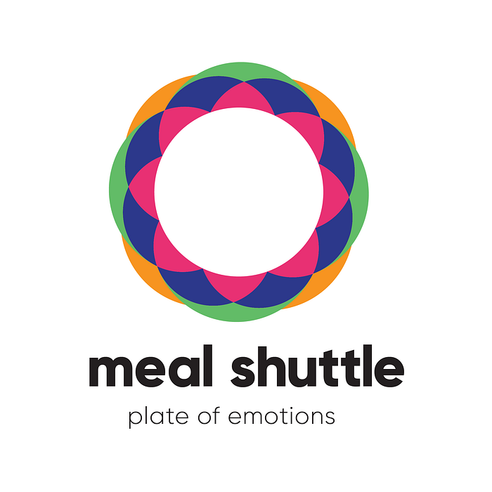
When I was asked to create a logo for a food brand, I didn’t use the color red. Instead, I connected the brand with the emotions humans feel when they eat food.
- Celebration
- Happiness
- Excitement
Then I used colors that screamed these emotions in the logo. Plus, why traditional food is always represented in such a boring way in Pakistan?
Why not make the food look exciting and lively like music? So, after 15 days of hardcore, aimless procrastination, I came up with the idea of combining sound wave pattern with rich colors.
3) Memorable — Else, nobody cares!
During the day, people encounter many posts on social media. But how many do they actually remember?
Two. Maybe three.
Now why do people remember those two or three posts? It may be one of the following reasons:
- People found it relatable.
- It was funny.
- It negated a popular opinion.
That’s the power of memorability!
Before Sagi Haviv, I was mindlessly applying the old school methods for creating my logos.
It changed when I
- learned to break the rules
- used the negative space technique
to make my logos stick in people’s minds. To give the viewer something to explore. Because I believe that if you figure out something on your own, it never leaves your mind whatsoever.
So, I came up with the idea of hiding a bottle between the negative space of “M” and “Ⅱ” where “j” acts as a straw.
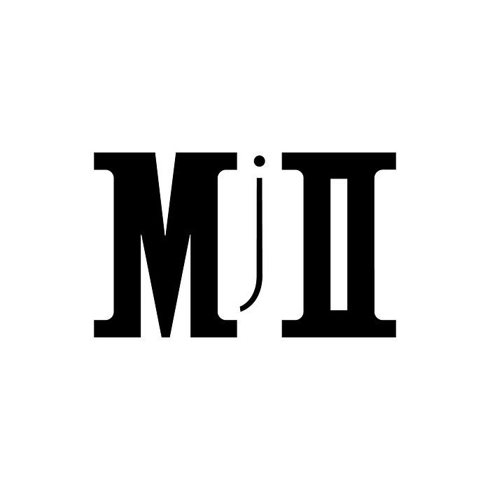
Image By Author
4) Simple — Leave the black holes for NASA
This one is connected to the previous point.
You cannot expect a logo to be memorable if it isn’t simple.
Logos that are too crammed may convey the values of a business, but they won’t make you stand out.
Although they are the most memorable, a simple logo doesn’t have to be an abstract shape.
You can achieve a simple logo by
- keeping plenty of white space
- using simple shapes

Image By Author
I made this abstract logo for a media production house that prides itself in breaking barriers. Plus, it’s inspired from a camera lens and a photo frame.
Do you see the two concepts in the logo?
Recommend
-
10
10 Cringe PR Outreach #FAILS Shared by Journalists on TwitterMay 20th 2021 new story3
-
5
13 cringe-worthy martech dad jokes that are even worse than last year’s Last year, we celebrate...
-
10
News and Trends Cringe-Worthy Video of an Employee Forgetting to Mute Herself on Conference Call Has the Internet Crying: 'I Would Just Quit...
-
13
The Shrink Next Door takes an ugly turn toward cringe comedy [Apple TV+ review]Ike (played by Paul Rudd, left) can't stop taking advantage of his patient, Marty (Will Ferrell).Apple TV+ comedy The Shrink Next Door t...
-
4
Hey, thanks for subscribing to SatPost.Today, we’ll breakdown a question everyone has asked at least once in their life: why is the LinkedIn newsfeed so cringe?PLUS:How to actually use Li...
-
5
"For Humans" makes me cringe March 13, 2016 14:49 / python
-
7
Sex Workers Banned from Banks Turn to CryptoSome say cryptocurrency is a lifeline for sex workers who are discriminated against by banks, while others remain skeptical.April 7, 2022, 1:00pm
-
9
A Novelist and an AI Cowrote Your Next Cringe-ReadThe new novel Amor Cringe bills itself as “deepfake autofiction.” WIRED talked to its coauthors, writer K. Allado-McDowell and the artificial i...
-
5
Metaverse, you’re cringe (right now)We’re going to start with The Canned-Food Phenomenon. Yeah I made that up. But bear with me.When processed, preserved,
-
9
What if Apple made Jon Stewart work at the Genius Bar? News ...
About Joyk
Aggregate valuable and interesting links.
Joyk means Joy of geeK