

Learn UI Design Series: Contrast
source link: https://uxplanet.org/learn-ui-design-series-contrast-d14143251543
Go to the source link to view the article. You can view the picture content, updated content and better typesetting reading experience. If the link is broken, please click the button below to view the snapshot at that time.

Learn UI Design Series: Contrast
Part 5 of 7
It’s not only about making websites and applications seem nice when you learn how to use contrast in design. Your ability to design may have a big impact on a client’s success.
But, in all seriousness, you may learn to manipulate behavior through contrast. You may feel okay about quietly influencing viewers as long as your designs are also appealing.
If you don’t know, then let me tell you that I have already started a 66-day “Learn UI Design Series” on Twitter.
I am going to share one topic or lesson each day for the next 66 days.
And the next 9 days are:
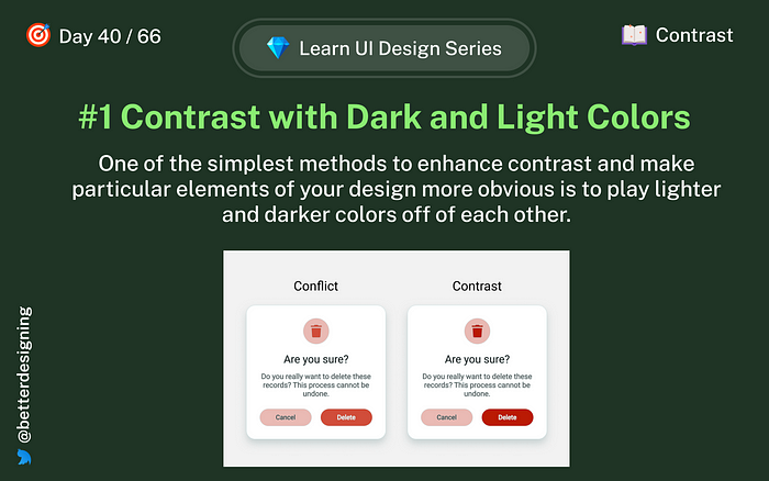
Day 40: Dark and light colors
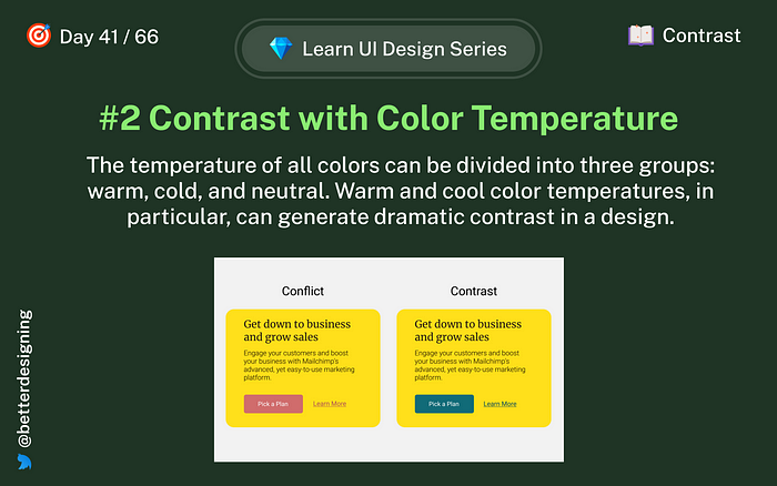
Day 41: Color temperature
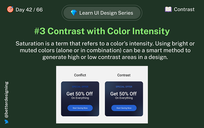
Day 42: Color intensity
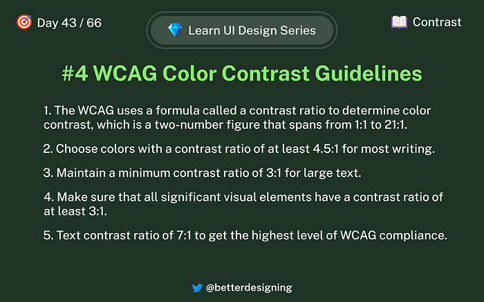
Day 43: Contrast Guidelines
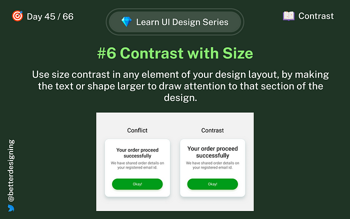
Day 45: Size
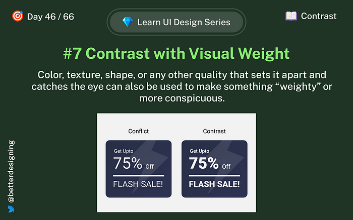
Day 46: Visual Weight
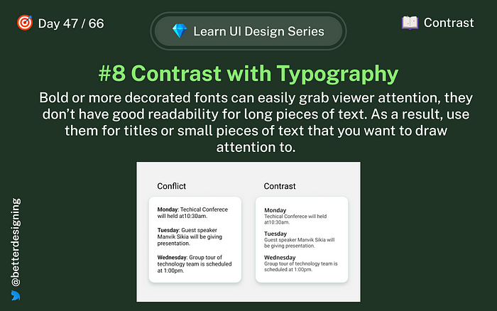
Day 47: Typography
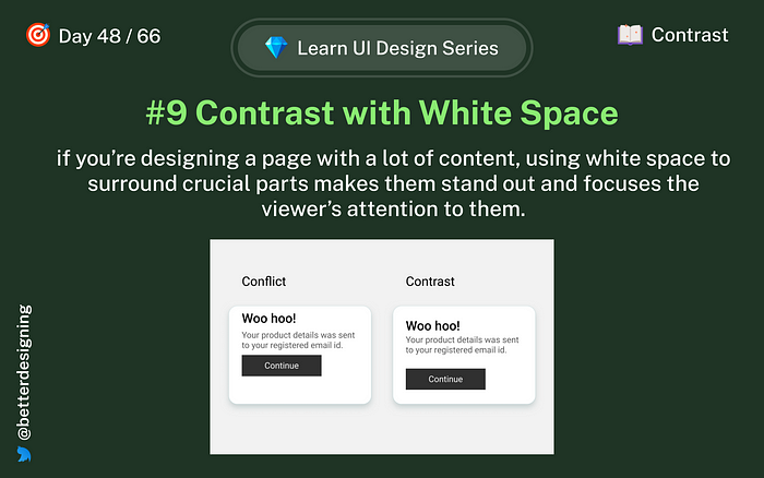
Day 48: White space
If you want to stay up to date or don’t want to miss any, follow me on Twitter for quick and insightful design tweets.
We are at day 56 👇
Thanks for reading, and I am open to feedback.
Subscribe here to get new articles delivered right to your inbox!
Recommend
-
15
Best Ways to Evaluate Your Design for Color Contrast
-
9
Image by Jason LeungSpotlight on Contrast: A deep dive into this design principleThe principles of design are a set of fundamental guidelines that help designers create beautifu...
-
6
The color contrast should support easy-to-read and distinguishable text over the background and make the useful information stand out effectively. Learn More To learn more on how to design better experienc...
-
10
Manage Accessible Design System Themes With CSS Color-Contrast()Quick summary ↬ Developing accessible products can be challenging, especially when some of the requirements are bey...
-
5
Testing Web Design Color ContrastAn overview of three tools and techniques for testing and verifying accessible color contrast of your design.Sep 22, 2022Say you have some text on a light ba...
-
8
Learn UI Design Series: ColorPart 1 of 7
-
8
Learn UI Design Series: TypographyPart 2 of 7
-
10
Creating A High-Contrast Design System With CSS Custom PropertiesManaging our colors can truly help people to access our content. In this article, Brecht de Ruyte takes a deep dive...
-
5
What is Contrast in Web Design? [+7 Tips How to Use it]
-
5
TypographyFix Color Contrast – Web Accessibility for Text & UI Design You know what’s important with type? That you c...
About Joyk
Aggregate valuable and interesting links.
Joyk means Joy of geeK