

Developer onboarding Guide for Figma
source link: https://www.figma.com/best-practices/guide-to-developer-handoff/components-styles-and-documentation/
Go to the source link to view the article. You can view the picture content, updated content and better typesetting reading experience. If the link is broken, please click the button below to view the snapshot at that time.
Components, Styles, and documentation
The Team Library, a feature that makes Figma so uniquely powerful for teams who closely collaborate, is a way for designers to create, maintain, and share Components and Styles across all of their designs. The concept of components is nothing new to developers, as it's a framework that's existed within engineering for some time now as a way to build interfaces. However, for many of us designers, components are still a fairly new way of thinking. Many of us are still working to learn best practices for not only creating and using components but also sharing their function with developers.
To begin to understand more about what it looks like when developers are inside of Figma files, I couldn't imagine better people to talk with than Lauren LoPrete, Natalie Annin, and Ben Munge from Expedia. Lauren and Natalie are both designers and work closely with Ben, a Senior Software Engineer who is working on the company's iOS applications. Lauren has spent much of her time at Expedia working on design systems and documentation within Figma and Natalie most recently designed and implemented dark mode component variants for the team's library.
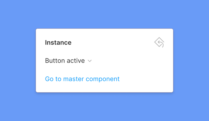
Because developers at Expedia have access to in-progress design files, it's more important than ever to communicate how reusable components in designs are being used. One way to relay this information, and a feature that the team relies on, is Figma's ability to navigate to the master component's location from an instance.
When a component instance is selected, inside of the properties panel on the right is an option to "go to master component," which when clicked, will open the file where the component originated from. Lauren shared with me that having access to where these components were created makes it really easy for developers at Expedia to understand more about them, such as whether or not the component is a part of the larger design system or if it was created specifically for the project. The ability to view the master component also makes it possible to understand, which, if any, overrides were applied by the designer who used the component.
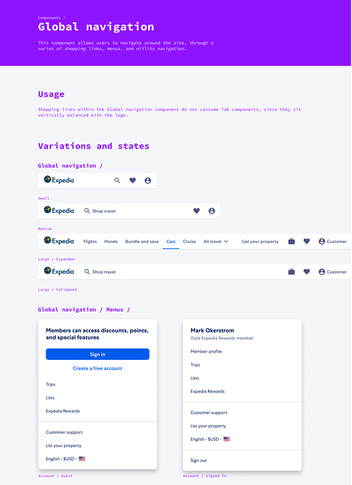
Inside of one of their many design system files, for each major set of components, Lauren and the team have created a frame, where the component name, description, usage instructions, variants, and states all exist. This means that when a developer clicks on "go to master component," they're taken immediately to the source of truth, with all of the accompanying component documentation they might need.
Tip: Just make sure to also invite developers into the libraries which hold your team's master components. Otherwise, they'll likely receive a 404 error.
Below is an example of one of Expedia's Global Navigation components, which shows off their system well.
Naming Styles give work more context
Along with Components, each of the three design teams relies on Styles within Figma to keep their interfaces consistent. Taking the time to assign relevant names to color, type, and effect styles, such token or variable names, can make it easy for the developers you partner with to better match what's in Figma with what's in code.
Natalie shared that at Expedia, designers and developers rely on both light and dark versions of their interface elements, depending on which mode the user has enabled. With a canvas full of bright components, the project of beginning to convert from light to dark quickly took off. Because Style names can be viewed in the code panel, which is accessible inside of any file for both Editors and Viewers, in many cases, it becomes possible to implement variables instead of those non-scalable, hand-coded values, convenient when working with different color themes. Just as with Components, Styles can also contain descriptions, which provides even more context on when and how they should be used. I've even seen teams include accessibility contrast guidance within descriptions, which is really pretty clever!
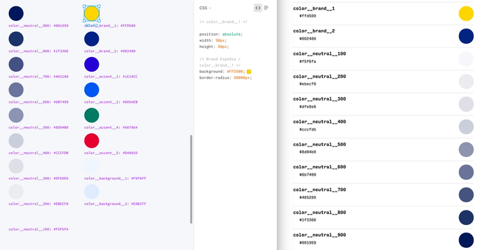
Using Styles within Figma makes it easy to match those in code.
The Code Panel
Inside of a file, developers have access to the code panel, where helpful information about the designs they're inspecting can be found. Developers can choose to switch between viewing code for CSS, iOS (Swift), and Android (XML) and any descriptions that are added to components will also appear here. Designers might choose to include actual component names from the team's codebase, relevant hyperlinks, or usage documentation to help provide even more context for developers on the team. Viewers also have the ability to export any assets within the file, created either by the designer or themselves. Read more on Figma's Code Panel.
Recommend
About Joyk
Aggregate valuable and interesting links.
Joyk means Joy of geeK