

How Fonts Secretly Influence Your Thoughts
source link: https://uxplanet.org/how-fonts-secretly-influence-your-thoughts-91ac0357b7c2
Go to the source link to view the article. You can view the picture content, updated content and better typesetting reading experience. If the link is broken, please click the button below to view the snapshot at that time.
How Fonts Secretly Influence Your Thoughts
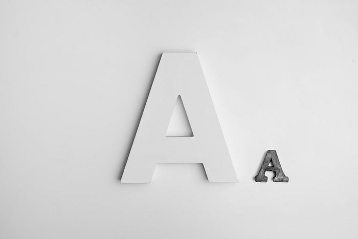
Our visual perception of the world completely dictates our thoughts, there’s no denying that, but most don’t seem to think this applies to the smaller details like fonts. Just like colour, fonts find themselves high up on the hierarchy, and immediately transform the way we feel — In this article we’ll explore why they have this power over us, and how it can be utilised.
Emotional Responses
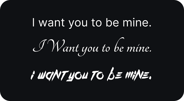
There’s a stark difference in your emotional response when reading each of the 3 fonts, right?
Humans have a tendency to anthropomorphise non-human objects, giving them characteristics and emotions where they would otherwise not belong, case in point a font that looks angry. It’s just text, how could it possibly be angry, right?
Because we react to visual stimulus in primarily an emotional fashion, the ability for designs to affect our psychological becomes possible — And this is why the Psychology of Design is becoming so prevalent in modern marketing and experience design!
Influence
Fonts are as high up on the hierarchy of design as colours are, so they elicit the first emotional response out of everything on the page. This makes them an excellent vehicle for influence, even more so due to the Picture Superiority Effect,which tells us that images are more likely to be remembered than words.
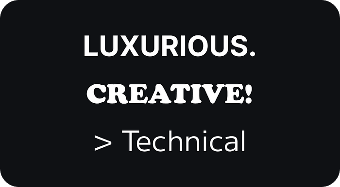
Every font inside the 6 Typefaces falls into an Emotion, be it Strength, Creativity, Entertainment, or Stability — There’s a font for every human emotion.
This means that marketers and designers have a breadth of options when trying to provoke a specific feeling in their audience, for example a Government subsidiary might use a Condensed Sans-Serif to display stability and authority, whilst a Vintage Watch Dealer might use a Classic Serif Font to exude Timelessness and Wealthy feeling.
Desireable Difficulty Effect
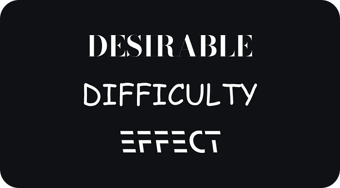
Who knew that Comic Sans actually had a use? Well, the Desirable Difficulty Effect says that it does — According to studies, hard-to-read fonts are better for retaining information compared to others!
Though this seems like something that would be counterintuitive, the idea behind it is that when people had to increase their cognitive focus and mental processing faculties, their level of attention also rose, which then led to an increase in information retention.
In 2018, a font with purely the idea of Desirable Difficulty was created by RMIT University, called Sans Forgetica (The third font in the image above), made to help students recall short answers, phrases and prompts!
In Summary
Fonts are a sub-facet of design that can be explored so much further in depth, both in terms of psychology and art. Fonts are able to shape the way we interact and feel about a product, and hopefully after this article you’ve gained some insight in the world of typography!
🎨 By becoming a Medium Member, you get unlimited article access & Support Creators Like Myself!
📧 Check out my UX email newsletter, with Digestible Knowledge Every Wednesday.
🗃️ You can find all my links and resources here at my UX Masterlist.
If you enjoyed my content, Follow me, it keeps me writing! Much Love!
Recommend
About Joyk
Aggregate valuable and interesting links.
Joyk means Joy of geeK