

The heuristics of Neurodesign
source link: https://uxdesign.cc/the-heuristics-of-neurodesign-a62714f18f31
Go to the source link to view the article. You can view the picture content, updated content and better typesetting reading experience. If the link is broken, please click the button below to view the snapshot at that time.
The heuristics of Neurodesign
A guide to design for the brain with intention and results.
Exactly how the mind works is still largely a mystery. And as with most mysteries, there are clues that give resolution to the interworking of how we think. How we think involves a swarm of highly interrelated mental processes including attention, memory, and thinking.
This article introduces a set of heuristics that, when used with intention, can improve usability, emote joy, and drive action.
Neurodesign is an emerging field of design practice that accounts for how our brains are wired to create designs that promote simplicity, emote joy, and drive action. Since humans are visually dominant, how we perceive and attend visual stimuli should be particularly interesting to user experience designers. This is why neurodesign is important. To understand neurodesign, we must first understand a couple of major things about the brain.
What the heck is a heuristic?
A general strategy for solving a problem based on past experience. While it may not be perfect or apply to all situations, a “heuristic” is generally considered “good enough” to the job done satisfactorily.
On the shoulders of giants
These neurodesign heuristics are meant to be additive (not a replacement) to all the good work done by these giants. And there’s been a ton done here by legends like Jacob Neilsen, Jill Gerdhart-Powals, and Ben Shneidermen among many. Their work is similar in nature and elemental to our practice. Their work can generally be summarized to the following guidelines:
- Be consistent
- Don’t make users have to remember information
- Don’t make users have to “figure out” your interface
- Give users shortcuts
- Give users the ability to back out of decisions
- Be true to the system(s) your interface will be used on
- Keep it simple
- Provide help that focuses on efficiently solving users’ problems
- Write for the user, not the system or yourself
- Visual design should enhance, not obscure
- Always consider the user’s context
- Users will do things you don’t anticipate. Don’t let their actions break the system.
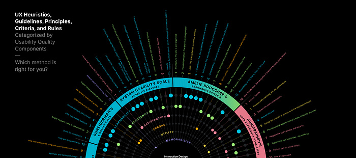
For an incredibly comprehensive chronicle of most ux heuristics, guidelines, principles, criteria, and rules, check this exceptional article by a former MICA UX Grad student, Michael Kritsch.
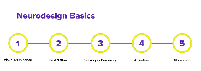
Here is the most summarized version of what we need to know about neurodesign to know in order to fully understand what it can do to elevate our work.
Visual Dominance: come hell or high water, we favor visual stimuli over all other types of signal. Don’t believe it? Watch this as many times as you have to until you do.
Evidence of Visual DominanceFast and Slow Processing: In the Behaviour and Information Technology Journal, cognitive psychology researchers at Carleton University reported that people make a “like” or “no-like” decision about a web page design in as fast as 50 milliseconds (Lindgaard et al., 2006). That’s due to our limbic system (fast processing) and how it takes on most of the decisions we encounter. The slow processing system is more effortful, deliberate, and…er… slow. The idea with neurodesign is to appeal to the fast processing system and to do so quickly.
Sensing vs. Perceiving: The brain gets bombarded with far more stimuli than it can and wants to process. And since the brain has a limited capacity and we are visually dominant, then it behooves us to critically mange how much visual stimuli we lather on our designs.
Attention: Capturing and retaining attention is the name of the game. But what if everyone is also playing the same game? Good, god! Know the eye and how the visual context works to create more effective interfaces.
Motivation: Finally, there is no action until there is motivation. How can you create interfaces that motivate people to take action? How can you stimulate the release of neurotransmitters such as dopamine?
Ok, now for the heuristics of neurodesign
Noise
Present only information pertinent to the task. We sense a lot more than we perceive due to our limited capacity.
- What can the page do without?
- Are there competing colors, luminosity, textures?
- Can the copy be cut down to shorter paragraphs and bullet points?
- Is there strong visual hierarchy?
Faces
Use images of human faces to direct attention and elicit emotion. We’re wired to see faces first. The face’s emotion transfers to the viewer. And we’ll gaze in the direction they gaze.
- Are you using images of people?
- Are the people’s emotions appropriate for the brand and intent?
- Are they looking at CTA or other critical information?
Bright
Use brightness to convey relevance. Bright green will pull the eye more than dull red. Luminosity, not hue, is what’s most important to acquire gaze.
- Are there bright elements that don’t need to be bright (unimportant)
- Are there competing bright elements?
- Are the CTA’s brighter than other elements in the design?
Gestalt
Group data to quickly establish relationships between visible elements. Is related content and functionality clustered together?
- Are visual vocabularies consistently used?
- Is there a clear foreground and background?
- Are related design objects visually and uniformly connected?
- Are common regions used to group information together?
- Is symmetry used to unify elements? Is dissymmetry used to create focal points?
Users see movement first, but overuse can mute its effect.
- Does the design have a few minimal microinteractions to pull the eye
- Are microinteractions competing with each other or the design?
- Do the microinteraction communicate feedback or intent of function?
Feedback
Use timely, concise, positive, incremental feedback to motivate users to persist. We’ll feel bad twice as hard as we feel good.
- Is real time validation used?
- Is feedback helpful?
- Is feedback negative or terse?
The bigger picture: neurodesign
All of this rolls up to Neurodesign. There is a lot more to this emerging field than what you’ll find here. Many neurology and neurophysiology research is actively conducted while designers (like me) find ways to translate those insights to create designs that emote joy, project simplicity, and drive action.
Recommend
About Joyk
Aggregate valuable and interesting links.
Joyk means Joy of geeK