

Mo Bus Redesign — Helping people commute with ease — UX/UI Case Study
source link: https://uxplanet.org/mo-bus-redesign-helping-people-commute-with-ease-ux-ui-case-study-15895ef81598
Go to the source link to view the article. You can view the picture content, updated content and better typesetting reading experience. If the link is broken, please click the button below to view the snapshot at that time.
Mo Bus Redesign — Helping people commute with ease — UX/UI Case Study
In this article, I’ll explain my approach towards redesigning the whole experience of the Mo bus app — Odisha’s Leading Public transport.
Disclaimer
This is a personal project. I am in no way associated with Mo Bus or C.R.U.T at the time of working on this project.
Why did I choose Mo bus
I have been studying in Bhubaneshwar, Odisha for over 3 years now. And I have been a keen user of the Mo Bus Services.
Mo bus serves thousands of people every day with its affordable bus service. But their app is a lot confusing and hard to understand for a lot of people.
So, I decided to Redesign the whole experience of the app from ground up.
Problem Statement 😕
Evaluate the flow of the Mo bus app and find the pain points faced by the users. And redesign the experience for first-time users with the intention to reduce confusion & frustration around search, journey planning and booking flows.
Understanding the Business & Problem Statement 🤔
About MoBus🚍
Mo Bus is a smart bus transportation system introduced by CRUT (Capital Region Urban Transport) under the Odisha government to provide reliable and safe transportation connecting neighborhoods.
Understanding the Problem Statement
This is an evaluative problem statement where I am trying to evaluate the existing flow of the app and try to make it better.
I mapped down the flow by taking screenshots of the app and did a heuristic evaluation based on the 10 Usability Heuristics for User Interface Design
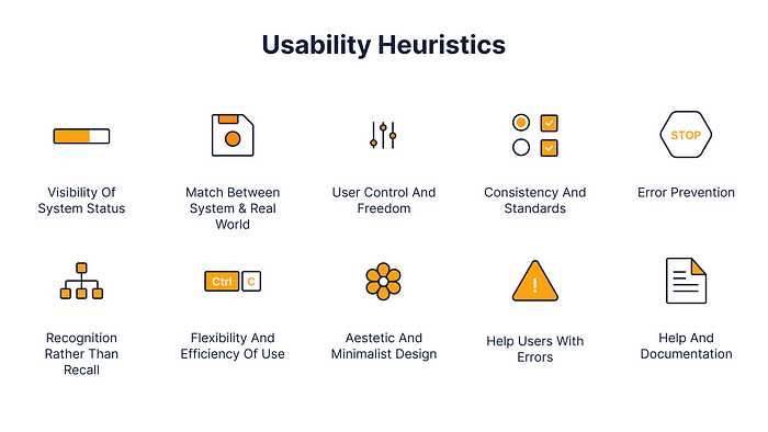
Jakob Nielsen’s 10 Design Heuristics. | UX Booth
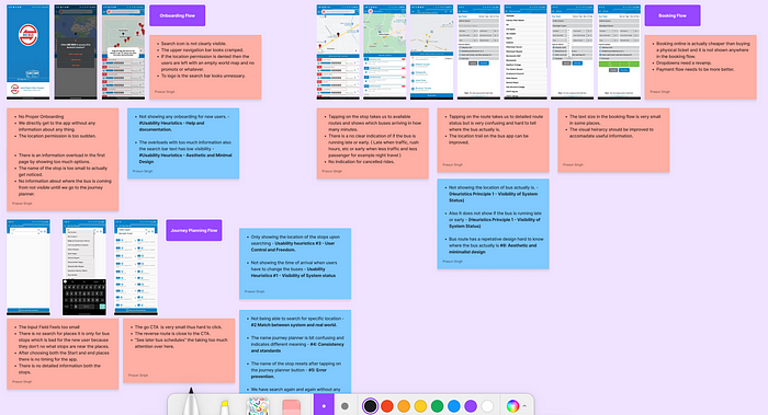
I also note down some design problems that can be improved (Based on my Intuition).
Based on this heuristic evaluation, I made some assumptions and hypothesis statements.
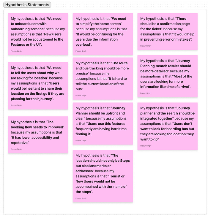
Hypothesis and Assumption around different flows.
Research🔬
Once I was ready, I wanted to test my Hypothesis & Assumption on whether these are actual problems or not.
Usability Testing🧪
I went ahead and tested the app with 8 users (out of which most of them were my friends and classmates) who were frequent users of Mo bus as well as those who were using it for the first time.
Using this I validated some of my assumptions and noted down the pain points they faced:
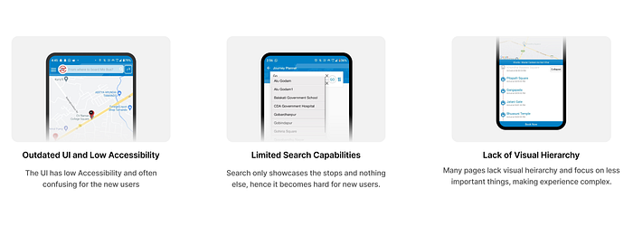
Problems Found in the App
Some of my assumptions were also confirmed by testing the app with users and analyzing reviews based on play store and app — store.
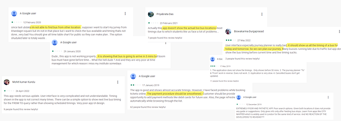
Analyzing Play Store Reviews
Using these insights, some of my assumptions were validated and I was ready to proceed further on to secondary research
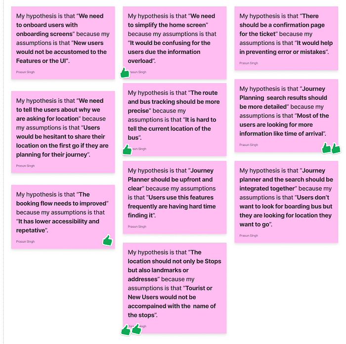
Assumptions validated in Primary Research
Secondary Research & Wireframing📝
I then proceeded with the secondary research and did competitive analysis with referring to 5 of the competitors in a similar product market.
In this step I analyzed the flows, design patterns and took inspiration from them to decide a good flow for the current app.
In this step, I also made user personas and flows which I will be showing as we dive into the made designs.
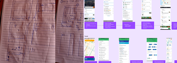
Competitive Analysis and Wireframing
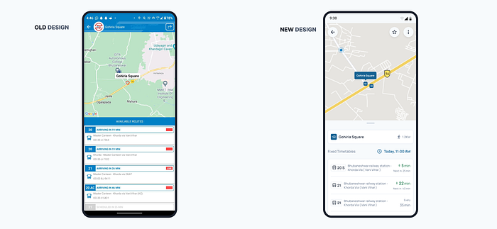
Nearby Stops / Homepage
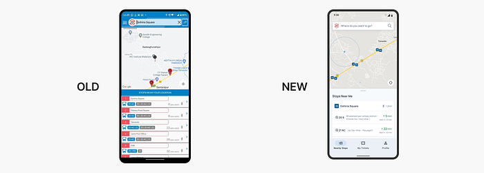
Comparison Between Old and New Homescreen
Pain Points in the old design were:
- Search bar was not clearly visible, and users can only search for stops from which they can board the bus.
- The Second problem with the old design is that it only shows one stop for both sides of the road. Confusing users with the same number buses running on both sides.
- Less visual hierarchy, and not showing the time and name of the arriving bus.
Here is my solution:
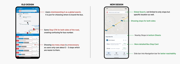
- Changed the choosing where to board option into a global search with proper visibility to show more detailed searches. Also reduced the clutter in the top bar.
- Added diameter showing range in KMs (Walking Distance).
- Added two bus stop icons to show the stops at both end of the road.
- Made a detailed card for the stops.
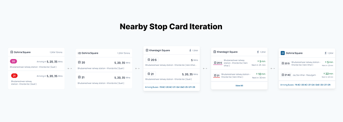
Nearby Stops Card Iteration
Earlier in the iteration, I used route color to show route numbers (Similar to Metro Lines System) but decided to remove them and use a simple version. This is because Firstly I tested the route color version and users seem to associate it with different meaning like route status.
And secondly there was too many routes (22 Routes) of different colors which was also adding to information overload.
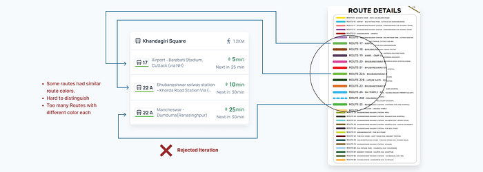
Rejected Iteration: Explanation
Improving the Journey Planner Flow
The second problem I wanted to work upon was the journey planner flow, Journey planner is basically to find out the routes between Location A to Location B via different bus changes.
In the old design, I felt that it was bit restricting and not providing enough freedom and information to the users.
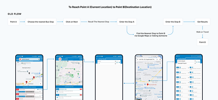
Old Flow with Old Design
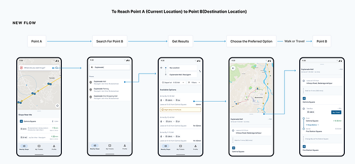
New Flow with Redesign
Now I am going to break it down and explain this flow using each page and their improvements.
Journey Planner CTA
In the old design, there was a search bar (for choosing where to board the bus) + a CTA for Journey Planner.
In the new design, I have combined both of them together because in user testing many users were getting confused by that as a global search itself.
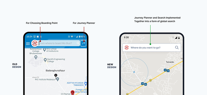
Journey Planner CTA changes
Search Improvements
Seach was the major problem in the old design, not providing option to search efficiently.
The Major Problem in Search was that it was only restricted to bus stop name only. This led new users looking for stops near the location they want to go via google maps and then trying out different stop names.
For example: If someone has to go to the esplanade mall, they have to look for a stop which is closer, which in this case is ‘rasulgarh square’.
Solution
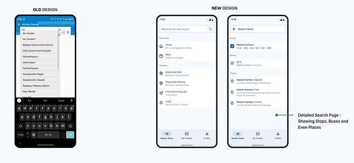
Old and New Seach Design Comparison
In the new design, I have elaborated the search menu to have multiple types of search suggestions.
The highlight of the new search page is that now we can search for following things in it:
- Bus Stops
- Buses
- Places
Also, in the initial phase when the search bar is not active, it shows saved locations such as home and work, Plus the recent searches, and journeys.
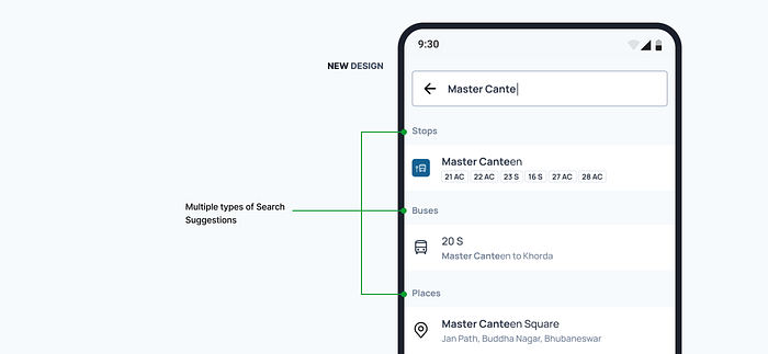
Multiple types of search suggestions
Search Results
The idea of search results is to show quick option to travel from one location to another, but the previous design definitely needed a redesign because it did not provide enough information that was required for the users.
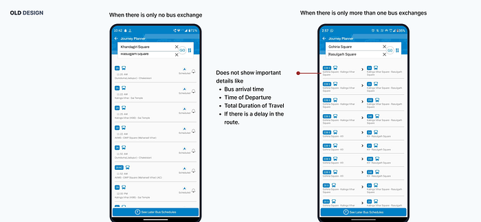
Problems in the old Search Results
The old design only provided the details of which bus to board and where to leave for exchange. But it did not provide information about when to board the bus, how much time would it take for the full journey and many more, which led to users getting confused about how much time they have to wait at the stop.
In the usability testing, users also seem to tap the results to get more information regarding the route but there was no further detailed page after the search results.
Solution
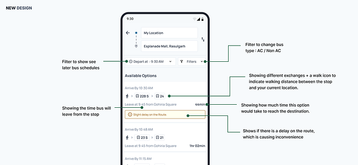
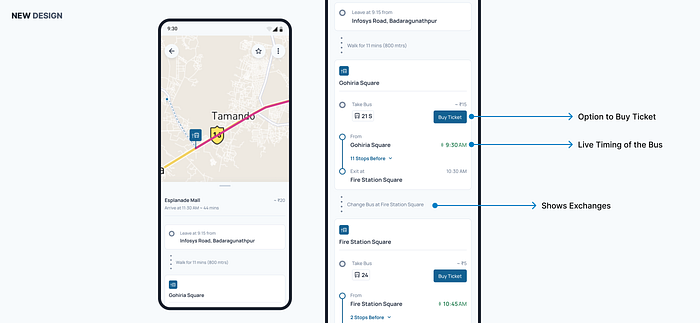
New Search Results Nomenclature
As you can see in the new design, I have given multiple information required for users to make a quick decision about which options they should pick.
As for this I have also considered my personal experience with this feature. Previously it was unclear when the bus was coming and when to leave to reach the stop.
Through this design I tried to solve that issue by providing the detailed duration of the journey, when to reach the stop, different exchanges, when will you arrive at your destination and inconvenience around the routes.
Detailed Journey Page
As I noticed in the usability testing most of users who are new to the city or were first time using the app was tapping on the results to get more information about the route.
That’s why I thought that a proper detailed journey page was required. So that a new user would be able to travel without the help of anyone.
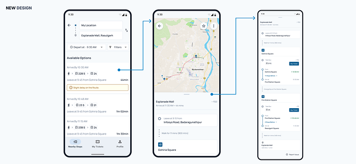
Detailed Journey Flow
As you can see in the above image, the way to reach your destination is presented in a step-by-step manner to help new commuters reach their desired location.
Detailed Journey Page
Bus Route Page
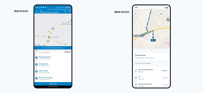
Old and Bus Route Page
You can clearly see the difference between the new design and the old design. In the old design the location of the bus wasn’t clear at a glance.
So, I decided to fix that in my current iteration showing the time and the location of the bus clearly in the map as well in the bottom sheet.
And as one thing that users had pointed out is that this bus timing was not clear or updated accordingly. Some were running early, some were running late, and it didn’t get updated in the app which led to many missing the bus.
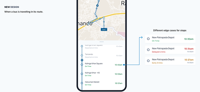
Edge Cases for Bus Travelling in the route
The idea was to solve this by giving information to the users about the route and if the bus is running slow or late. Also showing the reason for the delay.
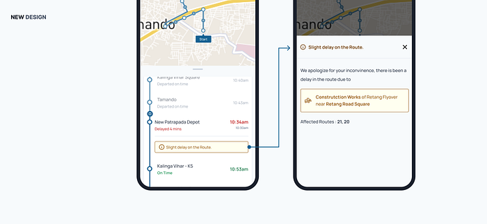
Edge Case for Delay on Route
Bus Stop Page
The next page was the bus stop page, this page shows the buses coming at a stop and their timings. Nothing much to see here, just some visual improvements and an option to check buses for different times of the day.
Comparison Between Old and New Stop Page
Making booking tickets easier and accessible
One of my initial goals was to improve its online ticket booking flow and make it more accessible.
During my initial research and my time with the app, I noticed that it is actually cheaper to buy an online ticket than to buy an offline ticket because the company offered several discounts for card holders and digital wallet payments.
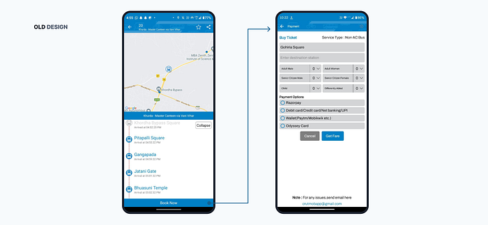
Flow for booking a ticket (OLD)
This was the only way to access the ticket booking system in the old design. Firstly, we need to find the bus that was on route then we have to tap on the Book Now CTA to proceed.
During my research and iteration, I found out that there could be multiple instances where ticket book flow was needed and for different types of users.
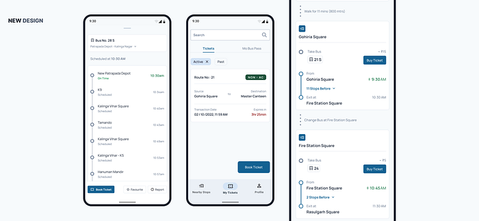
More places to book Tickets L to R 1) Bus Details Page 2) Ticket and Pass 3) Detailed Journey Page
Book Tickets Page
The page which was really important for revenue through this app was its ticket booking page. But the booking page lacked certain information which was necessary for users to know and also had some usability issues.
Problems in the previous design were:
- Elements were cramped together, increasing the number of mis-clicks.
- Bus service offered several concessions for kids, senior citizens and differently abled, but users weren’t educated or informed about this anywhere in the app. Also, even after adding differently abled status the price was not updating.
- The service also provided a certain percentage of concession to companions of differently abled persons. But there was no option for adding companions as well.
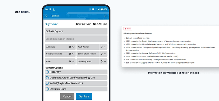
Old Ticket Booking with Fare Concessions
Solution
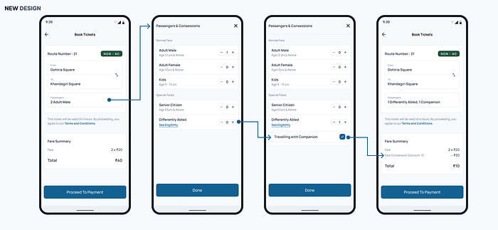
New Booking Ticket Design
In the new design I tried to reduce some clutter and break down the screen in journey details and payments both into different pages.
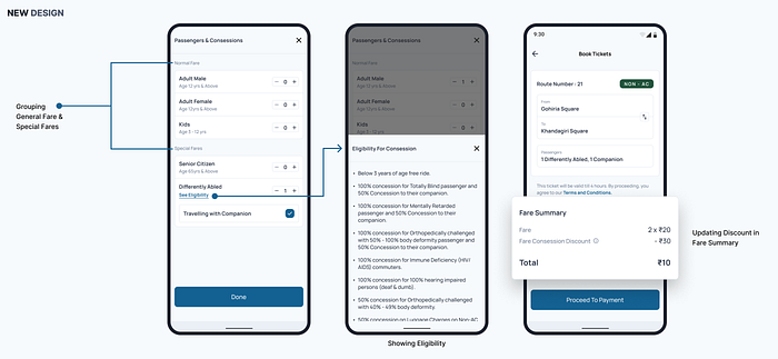
Also, I tried to educate users about the concessions using three ways,
- Grouping Concession groups under ‘special fare’ header.
- Showing eligibility for different types of differently abled criteria.
- Lastly by showing a discount in the fee summary.
Different Ways to Show Concessions
As for the companion for differently abled is concerned, I’ve added a checkbox which appears as soon as the Differently abled option counter increases.
Tickets Page & Ticket Iteration
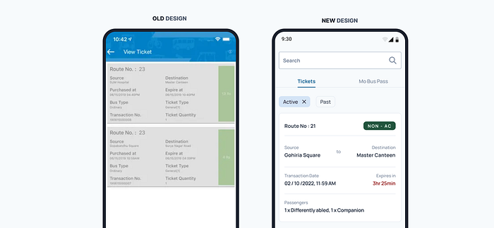
Old and New Ticket Page
So, the next page was the tickets page where the tickets get stored. Old design lacked visual hierarchy. So, I tried to improve that visual hierarchy on this screen.
I went over and did lots of iteration for the ticket design.
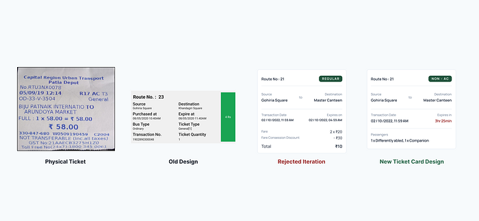
Evolution Of Ticket Design
I also did take inspiration from the real physical ticket to structure my design accordingly, but I got some insights which were stating the differences between users who were buying physical tickets and those who were buying virtual or online tickets.
Some Insights were:
- Online tickets have expiries while physical tickets don’t. So, showing expiry information on online tickets is necessary.
- Online tickets are verified using a QR code, which was further down in the flow.
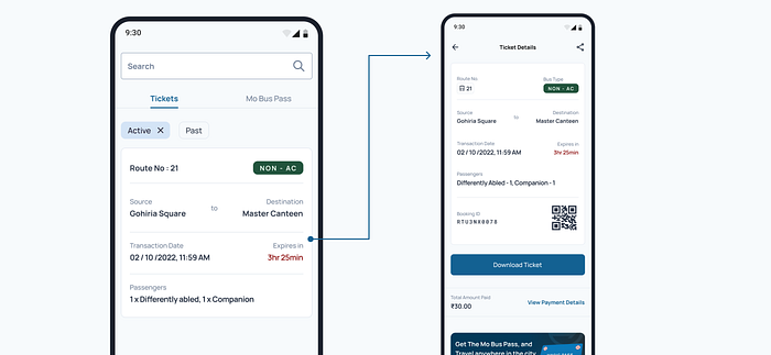
Ticket Details Page
So, I added all the necessary information in the initial card. And shifted secondary information in the ticket details page.
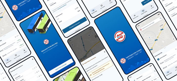
Onboarding
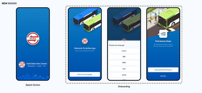
Splash Screen with Onboarding
Lastly, the onboarding screen to greet new users to the app. This just have a simple 3 step onboarding process.
First one being selection of language, I thought that as more and more people will start using the app — the need for regional languages will be required more to make the app feel more own.
And second being the location usage permission and stating clearly why location permission is required.
Recommend
About Joyk
Aggregate valuable and interesting links.
Joyk means Joy of geeK