
Branding: Wise’s Card Packaging Design Patterns
source link: https://blog.prototypr.io/branding-wises-card-packaging-design-patterns-dac69c78392c
Go to the source link to view the article. You can view the picture content, updated content and better typesetting reading experience. If the link is broken, please click the button below to view the snapshot at that time.

Branding: Wise’s Card Packaging Design Patterns
How neobanks like Wise are beating big banks
I find it absurd that even at the end of 2022, big banks like DBS, Citigroup, HDFC, Standard Chartered, and others cannot compete with neo-banking solutions like Wise, Monzo, and Revolut. The packaging of any card from one of these big traditional banks makes me want to tear it to pieces. They belong in the trash. The same is true of the debit cards and credit cards they give me. I use their cards only when I’m in a bind because their apps are so poorly designed. In contrast, I carefully open a package from Wise and keep the card in my mobile wallet, which allows me to use it anywhere since the transaction appears instantly in my app, and the exchange and transfer rates are always transparent.
Cards, card digital & physical designs, and card packaging are great places for fintech companies to display their branding skills. If you use Wise’s mobile app after switching from DBS, you will instantly feel the difference. You will notice the clean app, uncluttered layout design, and smooth animations that are neatly peppered all across the app.
Card Design
Let’s start with the green. If you are wondering why a product that is branded blue has a green card, then you should read this article by
. In short, that is because there is a long list of companies that have blue cards. And
wanted to make the card different, noteworthy, and inspiring.
“If something is familiar, make it surprising.”
— Raymond Loewy
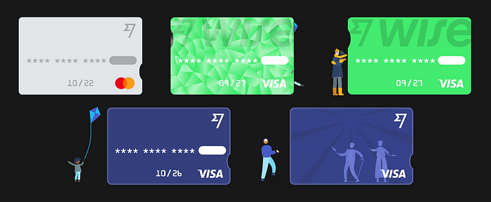
Additionally, for the card design UI. There are a bunch of states that the design team at Wise has packed into its mobile app. A card toggles between active, frosted (blocked), expired/deactivated, and visual states. Even though a visual card is a different card altogether, I am still considering it as a card design state regardless of whether it is a physical or a digital card.

All Wise’s cards states starting from Left to Right to Bottom expired, frozen, active, virtual active, virtual upcoming
The digital card is meant for online shopping primarily. It provides a safe way for consumers to shop online and deactivate the card and get a new card if they feel their credentials have gotten stolen. For fintech apps on my mobile, I have unfortunately not seen this flexibility in experience ever. Not even for neobanks. Traditional banks for this scenario are far behind.
made a green prepaid card to stand out from the rest, distinct, noteworthy, and inspiring.
Fact: Wise displays a user’s prepaid card in a fun way. It’s done by showing illustrations of dancing people coming out of the card and walking in again. By doing this, the user who looks at the card can also feel an equal sense of excitement.
Packaging Design

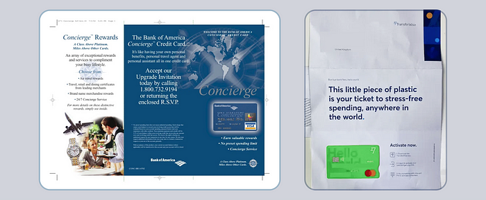
Bank of America card brochure vs Wise’s
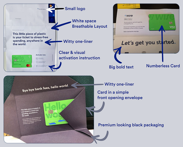
Compare the one above and tell me which one is concise, clear, and promotes happiness. Hint: It’s the one on the right side. I don’t know how much of the traditional bank’s decisions are weighted down by legal teams and hierarchical decisions but this example just shows that it is never late to change those boring practices that the fintech industry has come to learn. Wise’s card packaging is dead simple and it doesn’t leave a lot on the table to get confused with. You ordered a card, you got it, and here are your card activation details. Nothing more, nothing less. Let’s break down the patterns that this uber-simple card packaging has.

A breakdown of all the patterns that Wise’s card packaging uses
While we are on the topic of card packaging, I am seeing neo-banking companies increasingly shifting to using a Burgopak for embedding their prepaid cards in a cool-looking package. The packaging is simple and is more fun to see the card reveal itself as compared to tearing an envelope with a tri-folded letter inside it. Other companies like Monzo, GrabPay, and Up are also pushing the boundaries for card packaging design.
That’s the end of this short yet hopefully insightful read. Thanks for making it to the end. I hope you gained something from it.
👨🏻💻 Join my content verse or slide into my DMs on LinkedIn, Twitter,Figma, Dribbble, and Substack. 💭 Comment your thoughts and feedback, or start a conversation!
Recommend
About Joyk
Aggregate valuable and interesting links.
Joyk means Joy of geeK