

How We Recreated the Dixie Wildfire’s Plume from Radar and Satellite Data
source link: https://open.nytimes.com/how-we-recreated-the-dixie-wildfires-plume-from-radar-and-satellite-data-d6e829a727cd
Go to the source link to view the article. You can view the picture content, updated content and better typesetting reading experience. If the link is broken, please click the button below to view the snapshot at that time.
How We Recreated the Dixie Wildfire’s Plume from Radar and Satellite Data
New York Times Graphics and R&D engineers worked with wildfire experts to visualize how fires create their own weather patterns. An engineer describes the process behind this data driven graphic.
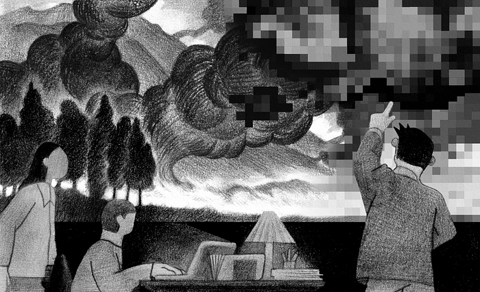
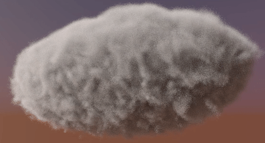
Illustration by Jeffrey Kam
By Nick Bartzokas
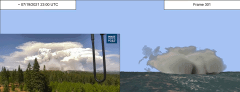
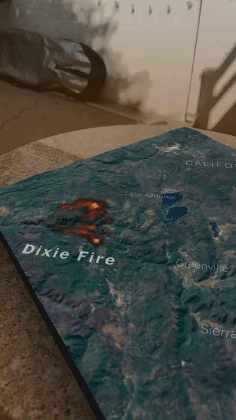
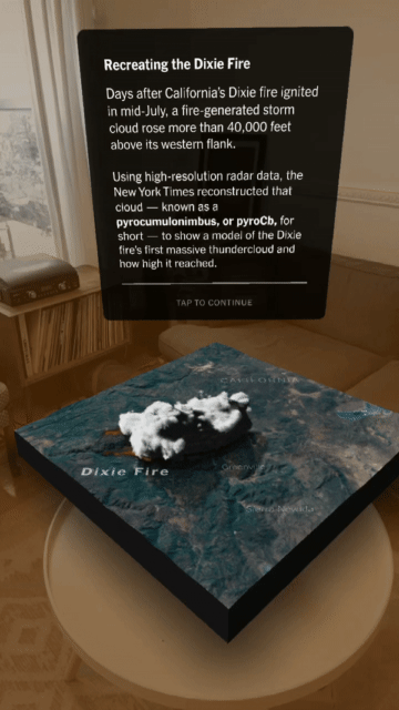
In mid-July, 2021, the Dixie fire ignited in California. Days later, it began to exhibit an increasingly common and concerning behavior. It created its own weather, producing storm clouds, winds, and lightning. In October of that year, The New York Times published a visual recreation of the fire’s activity.
This coverage took a team of diverse talents. This article highlights the technical work, specifically that of Evan Grothjan, Daniel Mangosing, Scott Reinhard and myself. To learn more about the inspiration and reporting that went into this piece, check out this Times Insider article for some perspective from our teammates Noah Pisner, Nadja Popovich, and Karthik Patanjali.
The Goal
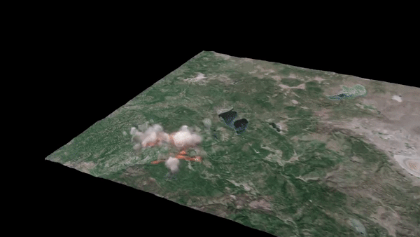
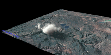
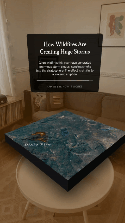
Neil Lareau, an atmospheric scientist who studies wildfires, advised us on this project. He popularized a technique for creating 3D animations of wildfire plumes from radar data. We decided to adapt that technique for an interactive web article and an AR story on Instagram. Our newsroom’s graphics editors in collaboration with software engineers in R&D assembled radar, satellite, and other weather data into an animated, 3D illustration giving readers an up-close look at the phenomenon of fire-driven weather. Here’s a flythrough of the final result.
Setting the Stage with Ground Level Data
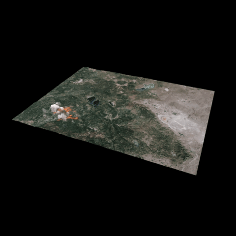
Let’s first focus on the ground level datasets we used: terrain color and height, the position and timing of lightning strikes, and the coverage of the fire itself. The scientific software community provides a wealth of open source tools we can use to work with these types of data.
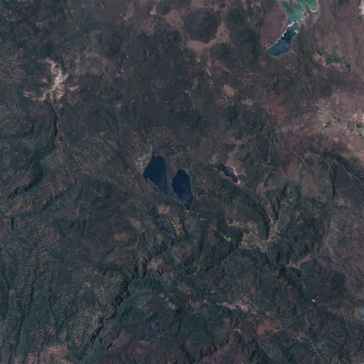
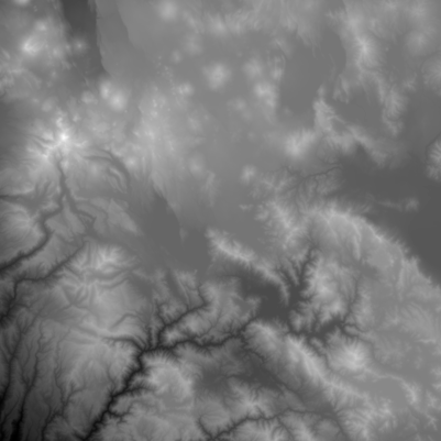
For the California terrain that sits below our smoke plume, we gathered high resolution (10 meter) imagery from the Sentinel 2 satellite’s L1C product using the sentinelhub-py library which lets you specify a range of dates to composite together into a cloudless image of the Earth’s surface. To add a height dimension, we retrieved a grayscale digital elevation model (DEM) from 3DEP using the py3dep library, as this example demonstrates.
We received lightning strike data from Vaisala, a company that monitors global weather and environmental conditions. Using geopandas, we generated an image sequence indicating the locations where lightning struck the ground as small dots. Evan Grothjan aligned these reference images to the terrain in his scene, designed realistic lightning bolts, and positioned them above each of the dots.
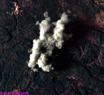
Scott Reinhard worked on one of the most crucial components, a visual representation of the fire spreading over the land. He sourced burn area and intensity data from GOES and VIIRS, and perimeter data from CalFIRE. Using gdal and other tools, he created an animation of the fire’s intensity and behavior on the ground.
After laying the groundwork for the plume visualization, Scott developed the visual language and iconography used to call attention to the plume’s behaviors, and mapped the extent of the fire in a 2D graphic later in the article.
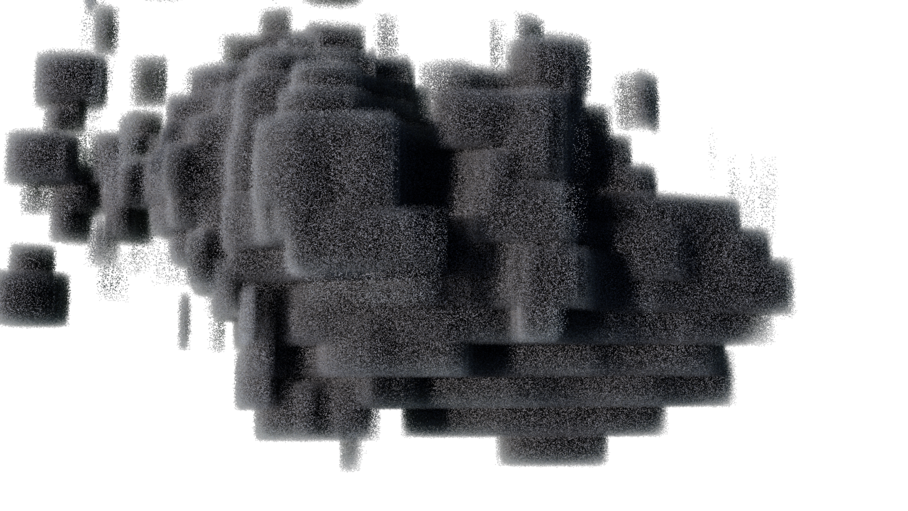
What Radar Can “See”
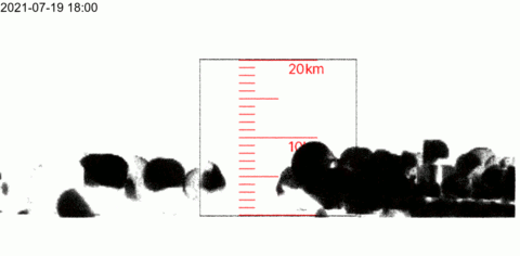
Having constructed the ground-level part of our scene, we now turn our attention to visualizing the fire’s plume in 3D. Data for this visualization came from three NEXRAD radar stations in California and Nevada. Each recorded the Dixie fire’s activity roughly every 10 minutes. We previewed and selected datasets using NOAA’s Weather and Climate Toolkit (WCT).
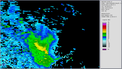
Radar stations emit pulses of radio waves and observe what gets reflected back. Denser stuff in the air, like water droplets in clouds and large ash particles in smoke plumes, reflect the radar pulse more powerfully. The power of the returning signal, called “reflectivity”, approximates the density of airborne matter. The time it takes for the reflection to return indicates the distance of that substance. The radar makes many such observations, sweeping 360 degrees for several vertical angles.
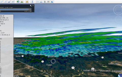
Plume Pre-visualization
As we began to assemble data for this project, we didn’t know what area and what times to visualize. And since the fire was ongoing, we needed quick access to up-to-date data in 3D. To solve these problems, we created an automated pipeline allowing us to specify a date range and map region and quickly preview what the plume looked like then and there. As the project evolved, we added steps to process and refine the data, focusing on features that were central to the story. Fast transformations from data to visuals enabled us to pivot quickly when new examples of relevant behavior happened in real time. Here’s how we built that pipeline.
NOAA hosts its NEXRAD data online where we retrieved it using the Siphon library. We then used Py-ART, a powerful python tool for working with radar observations, to merge the datasets of multiple radar stations, conform them to a regular cartesian grid, and apply spatial interpolation with algorithms tailored to the nuances of radar data. Already, we were able to quickly visualize 3D atmospheric data from any time and space observed by NEXRAD.
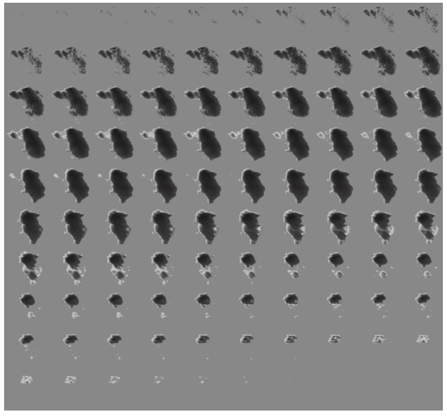
To target a time range for our story, we periodically rendered a low resolution timelapse of the entire dataset. This way we could quickly scan hundreds of hours of data and hone in on particularly active days. As we looked closer at the most eventful time periods, we found that all of the key behaviors of interest to the story occurred on July 19 between 11:00 a.m. and 11:00 p.m, Pacific Daylight Time.
With the data selected and normalized, our next task was to export files for our graphics artists to animate. NEXRAD data is stored as NetCDF files. This format encodes multi-dimensional datasets flexibly and is commonly used across many scientific disciplines. However, we needed this data in a format compatible with CG software. For that we used OpenVDB. It is widely compatible and has its own python library. We exported our radar data as a time-series of OpenVDB volumes, and brought them into Houdini.
Refining the Plume
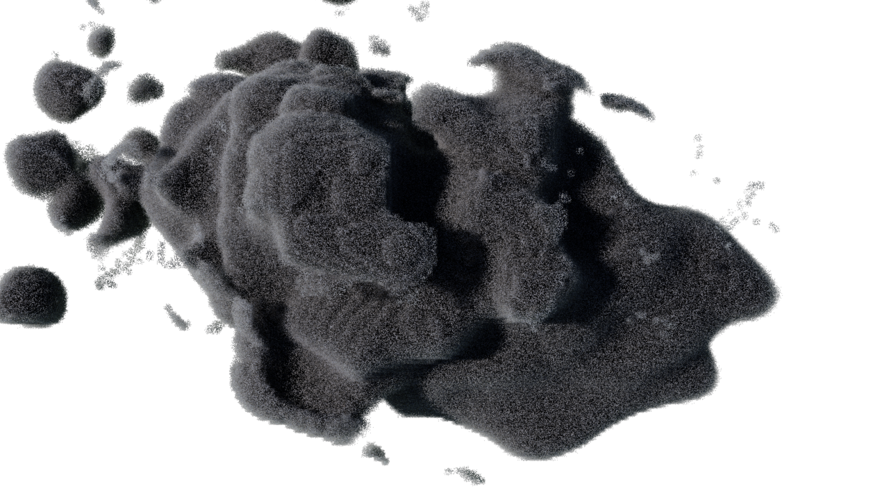
Airborne material may reflect radar beams, but that doesn’t guarantee it will be visible to the naked eye. Reflectivity isn’t the same as visible opacity. So we needed to find an appropriate reflectivity threshold that would define the edges of Dixie’s plume. Thankfully, Alert Wildfire recorded time lapse footage of Dixie. By comparing this footage with our renders side-by-side, we ensured that we were representing the visible plume as faithfully as possible.
From time to time we needed to render the data in a new way so that a characteristic could be observed visually. For example, the maximum height of the fire plume was an important point discussed in the story. We acquired the height observed in the field from our interviews with experts and wanted to find that moment in our data. Since there is noise in radar data, a simple max of the sample values would not suffice as it might pick up one of the noisy pops. Instead, we rendered an orthographic visual test to spot the plume’s highest moment.
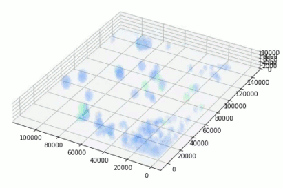
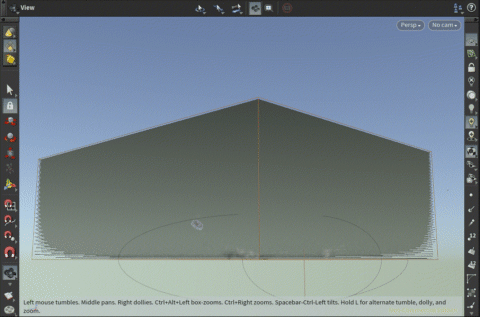
Since our data had passed through a number of processing steps, when it arrived in Houdini, we wanted to check the integrity of the entire dataset, even the interior which was never shown in the article’s graphics. We rendered nested isosurfaces to check that the plume’s core remained intact and matched the expectations of our collaborating scientists.
Our layers of data were all combined in Houdini for further production and needed to be aligned exactly. GIS software understands geospatial data and projections, but most CG apps and formats do not. To ensure accurate alignment, all outputs from python conformed to a common projection and bounding box. That meant that aligning layers in Houdini was as easy as snapping their edges. We rendered top-down orthographic tests to confirm that all our data layers lined up properly.
Styling and Animating the Plume
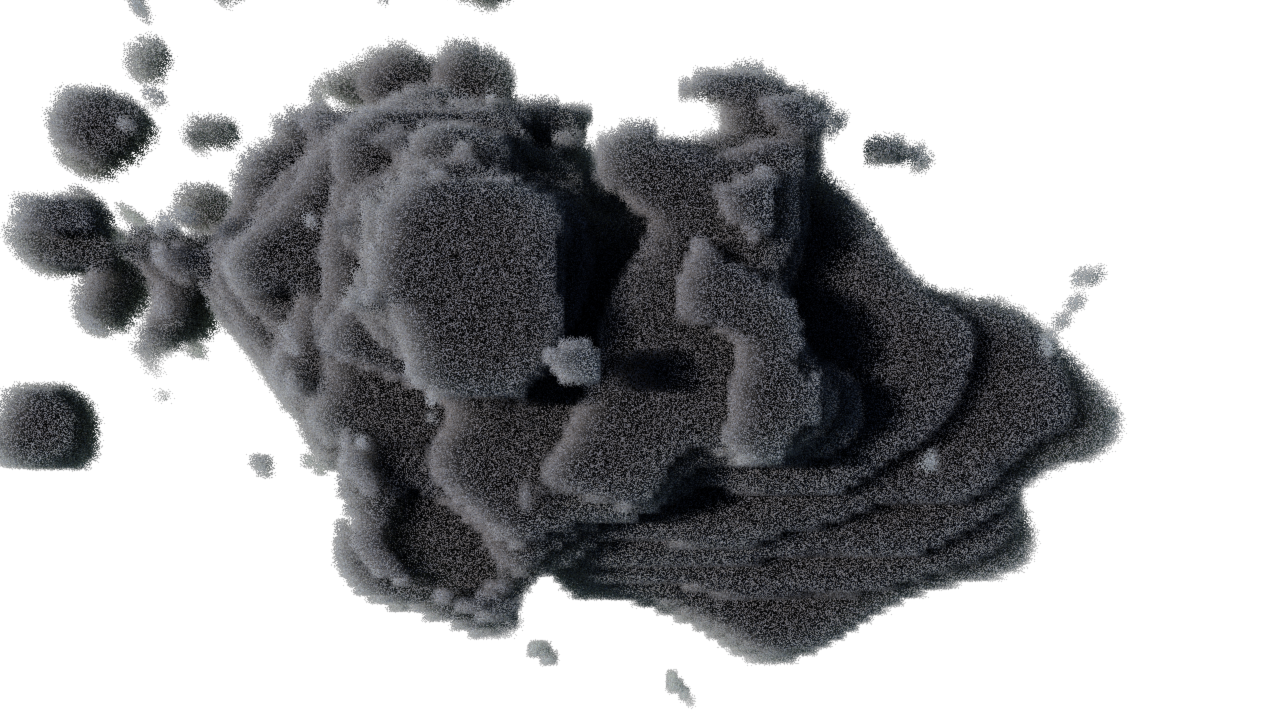
At this point, our plume visualization was detailed enough to demonstrate the large-scale behaviors central to the article but they lacked surface detail, small-scale undulations without which the plume appeared deceptively small and calm.
Referencing time lapse footage, Daniel Mangosing used Houdini’s Cloud Noise and Volume Wrangle nodes to churn the surface and give our illustration an appropriate sense of scale and activity. This work was done carefully, however, as we did not want to affect any of the large-scale behaviors on which we relied for the story. So while he developed the look of these noise patterns, he tested them on smooth blimp-like shapes, making sure the new undulations remained minor, in a shallow layer on the surface.
As mentioned earlier, NEXRAD radar stations record observations roughly every 10 minutes. But a fire plume changes much faster than that. In order to create a smooth animation through time, we needed to improve our temporal resolution. For this step Daniel used Houdini’s Retime node which can interpolate in-between frames for volumes.
Finally, Evan Grothjan and Scott Reinhard developed the look of our final renders. Our goal was to signal to the reader that this is a representation of the event, but not the event itself. Removing the sky was one simple but effective way to do this. Using Cinema 4D and the Redshift renderer, Evan tweaked the plume’s color and material properties, scene lighting, camera work and rendering. Evan and Scott explored a number of visual effects in the scene, ultimately selecting a design that balanced our visual priorities: clarity where our visuals supported the story, and an aesthetic that evoked scientific illustration.
Here again is the full animation from the article.
Augmented Reality
In addition to our coverage on the web and in our app, we published an augmented reality experience on Instagram using the Spark AR platform. This presented a unique challenge. For our web article, we rendered a video through which a reader progresses by scrolling. In AR, the user is free to look at the plume from any angle, so we couldn’t pre-render the content. It had to be rendered in real-time on the mobile device. That would prove difficult since Spark effects are limited to 4 MB, and the platform doesn’t support rendering volumes yet. Luckily these are problems that graphics programmers have had to solve before. In fact we had already used a time-tested technique, rendering a volume as slices, in our work visualizing volumetric data for the article Why Opening Windows Is a Key to Reopening Schools and its accompanying augmented reality experience.
To get Houdini VDBs into AR, we used a process analogous to medical CT scanning. We captured many cross sections of the plume and exported those slices as sprite sheets using the Volume Texture Export node. We also generated geometry on which to render that imagery, a stack of planes. With enough slices tightly packed together, the gaps aren’t noticeable. The layers combine together to create what looks like a solid volume.
CG software renders volumes in a rich environment of lighting and reflections. Converting volumes to a stack of cards rules out the option of natural lighting. Luckily, Houdini provides a way to bake the effects of lighting into the color of a volume, effectively rendering lighting effects before the export, using the Bake Volume node. Using this node, we baked in sunlight, shadows, and a red glow from the underlying fire.
With our fire plume rendered in augmented reality as a stack of cards, some creative options opened up to us. We could reveal the plume from top to bottom in an animation sequence and tint a subset of slices to draw attention to which layers of atmosphere they occupied. These ended up being useful devices for storytelling in AR.
Conclusion
This project is one of many efforts to visualize 3D data sets. Some of the techniques developed in our coverage of the Dixie fire helped us tell the story of The Chain of Failures That Left 17 Dead in a Bronx Apartment Fire. Our work visualizing data continues in the hope that insights drawn from these graphics will help our readers and the world make better, more informed decisions in the future.
Recommend
About Joyk
Aggregate valuable and interesting links.
Joyk means Joy of geeK