

How to change a Tab Bar item color in SwiftUI
source link: https://sarunw.com/posts/swiftui-tabbaritem-color/
Go to the source link to view the article. You can view the picture content, updated content and better typesetting reading experience. If the link is broken, please click the button below to view the snapshot at that time.
How to change a Tab Bar item color in SwiftUI
Table of Contents
By default, the selected tab bar item will use the iOS default blue color.
Here is an example of a tab bar.
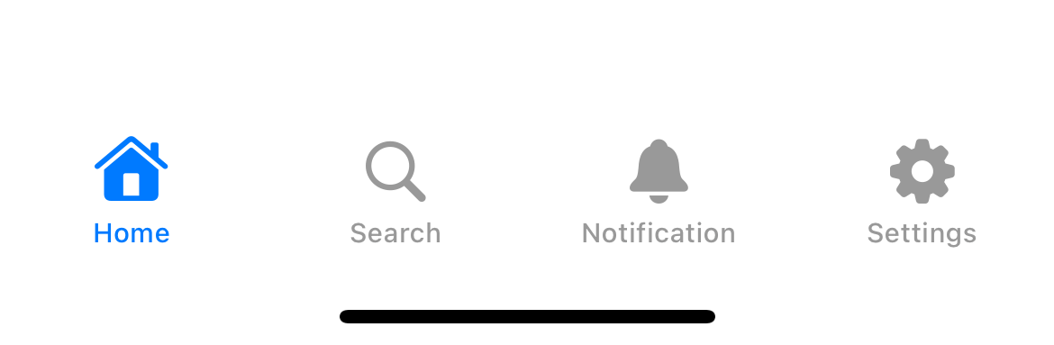
The selected tab bar item is highlighted with the default blue color.
There are two ways to change a tab bar selected color in SwiftUI.
Each method means to be used in different circumstances. Let's learn what the difference is.
You can easily support sarunw.com by checking out this sponsor.

Sponsor sarunw.com and reach thousands of iOS developers.
Change tab bar item using accentColor
SwiftUI app uses accent color as a color for active tab bar item. If we don't specify one, iOS will use the default blue color you usually see.
To change the selected tab bar item color, you need to change the app's accent color. Here is how you do it.
- Click on the project Asset Catalog (The default one named
Assets.xcassets). - Click on the
AccentColorcolor set. This is the color that will be used as the app accent color.
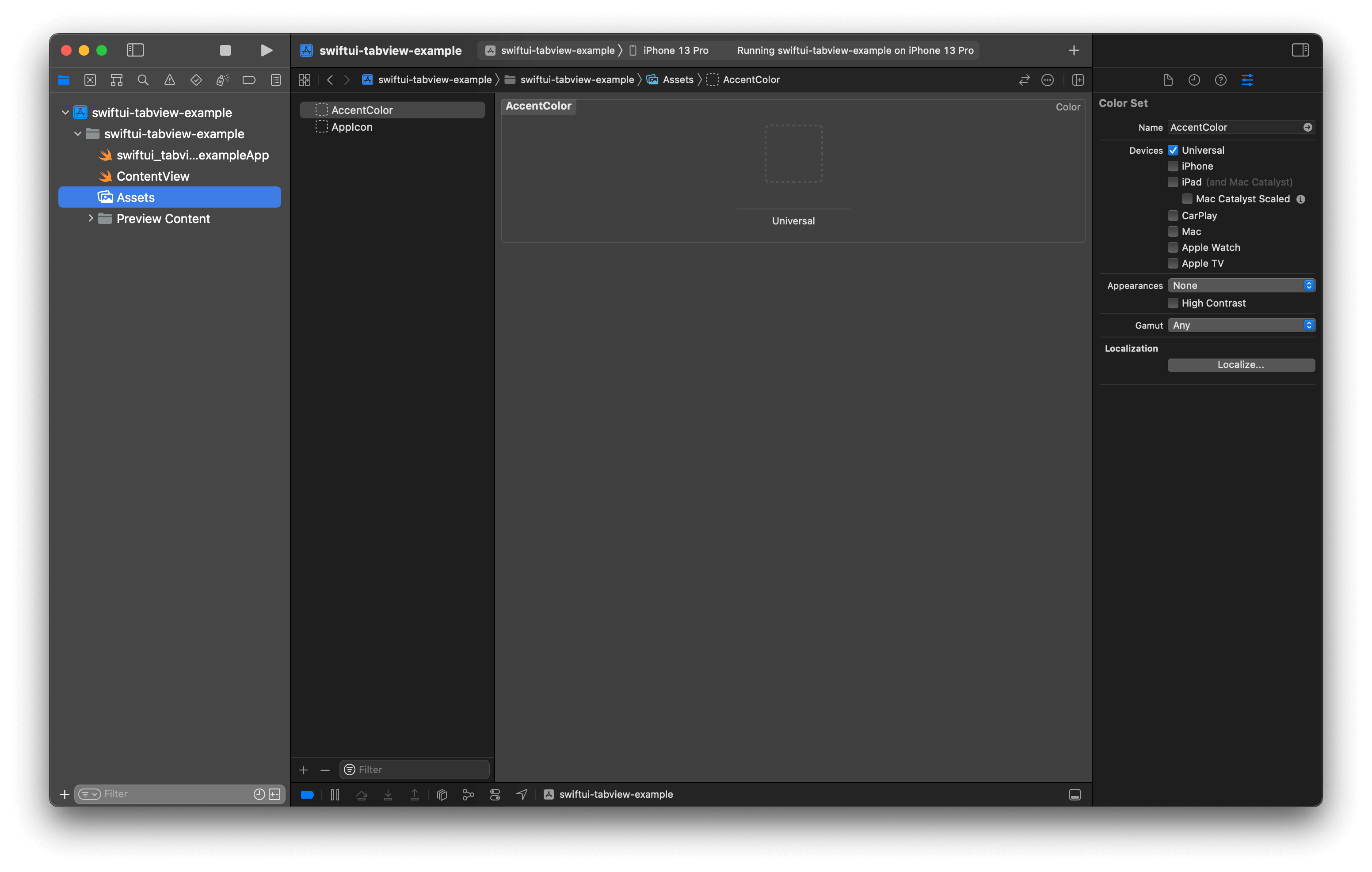
AccentColor
- Then, you can change this to the color of your choice. As an example, I change this value to
.systemPink
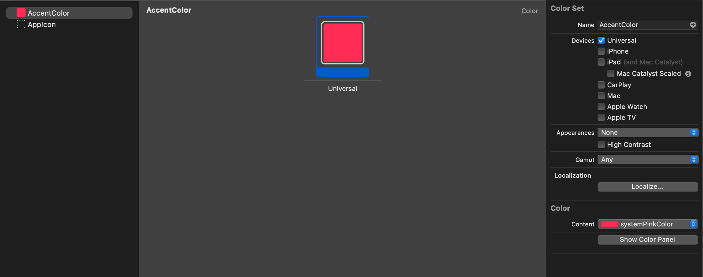
Change AccentColor to the color of your choice.
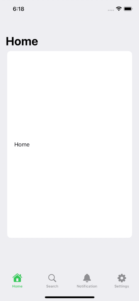
After you change the accent color, the tab bar item in your app will use this color as the selected color.
TabView {
    Text("Home")
        .tabItem {
            Label("Home", systemImage: "house")
        }
    Text("Search")
        .tabItem {
            Label("Search", systemImage: "magnifyingglass")
        }
    Text("Notification")
        .tabItem {
            Label("Notification", systemImage: "bell")
        }
    Text("Settings")
        .tabItem {
            Label("Settings", systemImage: "gearshape")
        }
}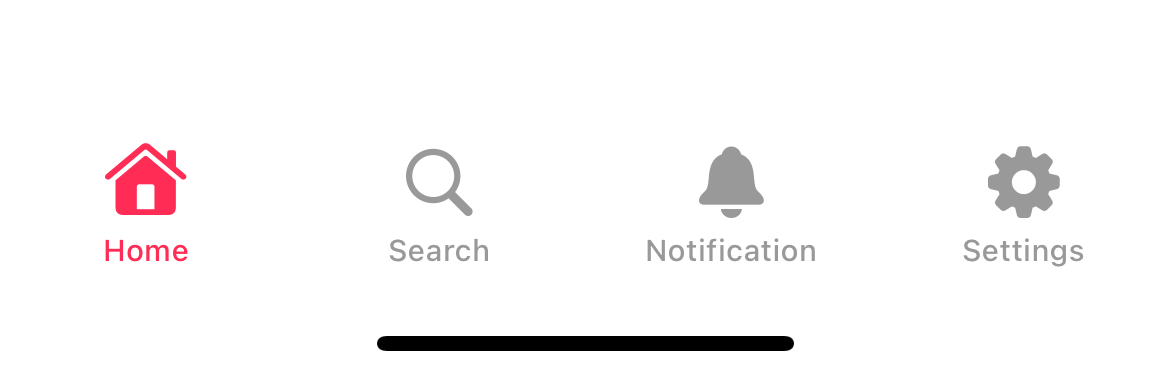
A tab bar automatically picks up an accent color as a selected color.
Caveat
Before iOS 16, you can use .accentColor color modifier on TabView.
TabView {
    ...
}
.accentColor(Color.pink)
But in iOS 16, .accentColor has been deprecated and no longer work with TabView.
You can easily support sarunw.com by checking out this sponsor.
Sponsor sarunw.com and reach thousands of iOS developers.
Change tab bar item using Color Scheme
Since iOS 15, a navigation bar and a tab bar will show/hide its background only when there is content behind it.
A tab bar background only shows when there is content behind it.
In iOS 16, we got a new way to modify the tab bar item color when the background is presented.
To modify a tab bar item color when background is presented, we use toolbarColorScheme(_:for:) modifier.
toolbarColorScheme accept two parameters.
ColorScheme: The preferred color scheme of the background of the bar.ToolbarPlacement: The bars to update the color scheme. Since we want to change the color for a tab bar, we will set this to.tabBar.
You need to apply toolbarColorScheme to each tab view, the same way we use .tabItem. But if you want to apply it to all tab views, you can put all tab views under the same Group and apply toolbarColorScheme there.
In this example, I apply the light color scheme to each tab bar item with .toolbarColorScheme(.light, for: .tabBar).
TabView {
Group {
NavigationStack {
List {
Text("Home")
.frame(height: 500)
.navigationTitle("Home")
}
}
.tabItem {
Label("Home", systemImage: "house")
}
Text("Search")
.tabItem {
Label("Search", systemImage: "magnifyingglass")
}
Text("Notification")
.tabItem {
Label("Notification", systemImage: "bell")
}
Text("Settings")
.tabItem {
Label("Settings", systemImage: "gearshape")
}
}
.toolbarColorScheme(.light, for: .tabBar)
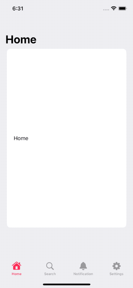
}As you can see, in the initial launch, the active tab bar uses the pink color from the accentColor we set in Asset Catalog.
Then after we scroll the content behind the tab bar, the background shows up, and the tab bar item changes its color to match the color scheme that we set in .toolbarColorScheme(.light, for: .tabBar).
.toolbarColorScheme(.light, for: .tabBar)
This is very helpful when you have a custom tab bar background color that doesn't work well with your accent color.
Recommend
About Joyk
Aggregate valuable and interesting links.
Joyk means Joy of geeK