

5 Laws of UX that Bumble Follows
source link: https://uxplanet.org/5-laws-of-ux-that-bumble-follows-f9876159a216
Go to the source link to view the article. You can view the picture content, updated content and better typesetting reading experience. If the link is broken, please click the button below to view the snapshot at that time.
5 Laws of UX that Bumble Follows
Let’s See What makes Bumble UX design Better than Tinder.
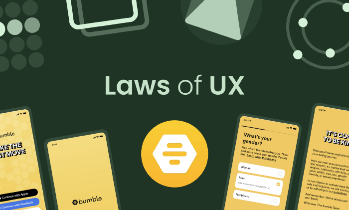
If you don’t know what Bumble is, it is a dating app, which is very popular in some countries after Tinder. Most people nowadays prefer using Bumble over Tinder because of its design and simplicity.
In this article, I am going to share some of the laws that the Bumble app follows that I noticed when I was watching this app’s screenshots on mobbin.com. I have installed it for the research purpose only ;)
All the screenshots are taken from mobbin.com so a big shoutout to them.
Bumble iOS | Mobbin - The world's largest mobile app design reference library
Save hours of UI & UX research with our library of 100,000+ fully searchable mobile app screenshots.
#1 Aesthetic-Usability Effect

I personally like the UI design of Bumble better than Tinder’s UI design. It is much simpler and easy on the eyes. The colors are much more subtle and cool, even though the database of girls is a little smaller compared to Tinder.
This is what the Aesthetic-Usability effect is in real life. If the UI design of your app is pleasing to the user, they will ignore the errors or bad sides of your design, but it has some limits. If Bumble doesn’t even show me any girl images, then I’ll leave, even though the app design is good.
#2 Fitts’s Law
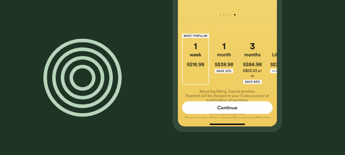
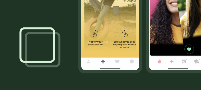
Bumble's designers have designed the app to be used with one hand for the most part. For swiping and liking, you don’t need two thumbs. One can get the job done, and that’s what Fitts’s law is all about.
Fitts’ law explains that the time to acquire an object depends upon the distance and size. For example, if the button is close to your thumb and bigger in size (e.g., the continue button in the above image), you can click on it in less time. The Bumble app uses Fitts’ law on most of its screens.
#3 Doherty Threshold
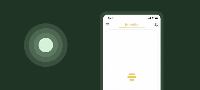
According to Doherty Threshold, productivity soars when a computer and its users interact at a pace (less than 400 ms) that ensures that neither has to wait on the other. Which basically means that providing feedback to the user is very necessary.
Because if you don’t show anything user will feel the app is not working therefore Bumble uses animation or logo when the images of people are loading
#4 Law of Common Region
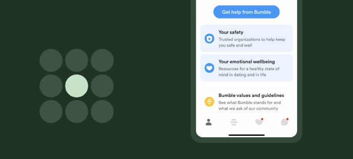
Having a boundary around various elements helps users differentiate elements according to the law of the common region. Elements tend to be perceived as a group if they are sharing an area with a clearly defined boundary. Bumble uses it very effectively, as shown above.
#5 Jakob’s law
If you’ve ever used the Tinder app before using Bumble, you’ll find many things very familiar. Why is that? Bumble follows Jakob’s law and, according to it, users spend most of their time on other sites. This means that users prefer your site to work the same way as all the other sites they already know.
Bumble follows the tinder swipe method because Tinder is the most popular and one of the primary apps for dating. So if you know how to use tinder, you’ll know how to use bumble. That’s the power of familiarity.
So.. As a designer, I can even find all these useful things when I use apps like Bumble instead of looking at the real stuff of the app. What a sad life I am living :) I hope you’ve learned something.
Recommend
About Joyk
Aggregate valuable and interesting links.
Joyk means Joy of geeK