

Designing VR UI in Figma and testing it with no code
source link: https://uxdesign.cc/lets-design-xr-ui-in-figma-and-bring-it-to-xr-with-no-code-a123b9b647ab
Go to the source link to view the article. You can view the picture content, updated content and better typesetting reading experience. If the link is broken, please click the button below to view the snapshot at that time.
Designing VR UI in Figma and testing it with no code
UI has been in constant evolution since 1973 when Xerox Palo Alto Research Center created the first UI as we know it nowadays. Read more about the evolution of UI in this article “UI Evolution: From Computers To Virtual Reality Headsets”.
Now, we are facing the next step on UI evolution, we’re jumping from flat screens to 3D spaces, whether into real world with AR or into virtual worlds with VR, UI will bring to these spaces some features from the flat screen world, and of course, new ways of interaction will born to take advantage of the new 3D medium.
To whom, what and why is this article
The goal of this article is very simple. Show UI designers who are curious about the XR industry, how to design a UI for XR using one of their day-to-day tools (Figma) and bring this UI to an actual XR space. If you’re one of them, this exercise will allow you to understand which font and button sizes to use and understand the distances between your UI and your user.
To complete this exercise you’ll need:
Let’s go!
UI components in VR
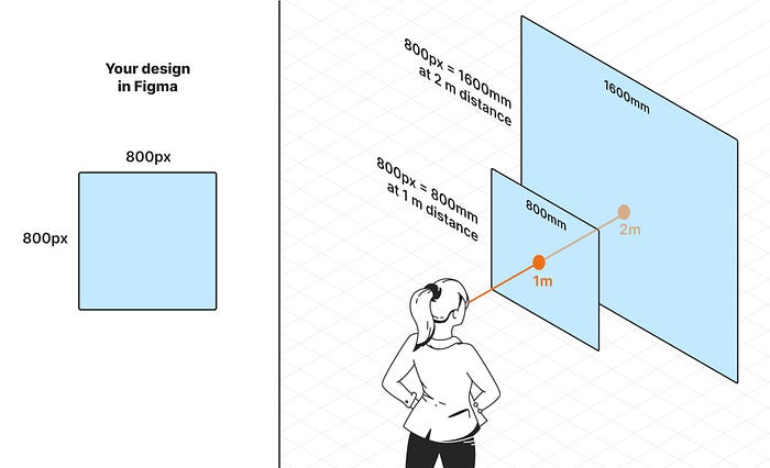
In 3D you won’t work in pixels, instead you’ll do it in meters, centimeters or millimeters. But there is a way you can still think in pixels as you always do, and it is very important you get this concept right, dmm (distance independent millimeters) were created by Google to measure sizes in XR. It establishes that every pixel is one millimeter at one meter of distance. That means you’ll design as if your design was always at a 1m distance, so, in your design, a 800x800 pixels card, will be an 800x800 millimeters card at 1 meter. If your design is intended to be at 4m, just multiply 800x4. We’ll see this in more detail when exporting the assets, but basically you scale the UI by the distance you intend the UI to be seen.
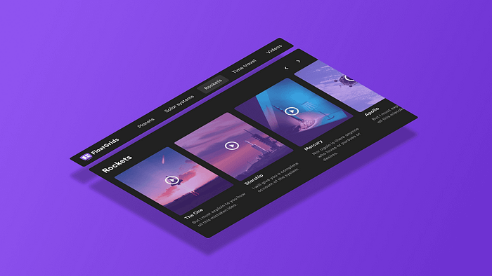
To start with a ready-to-use set of VR components go to the Figma Community and download FloatGrids VR Design System file. Check the page “How to design for VR” to get more guidelines.
Customising foundations in Figma with FloatGrids
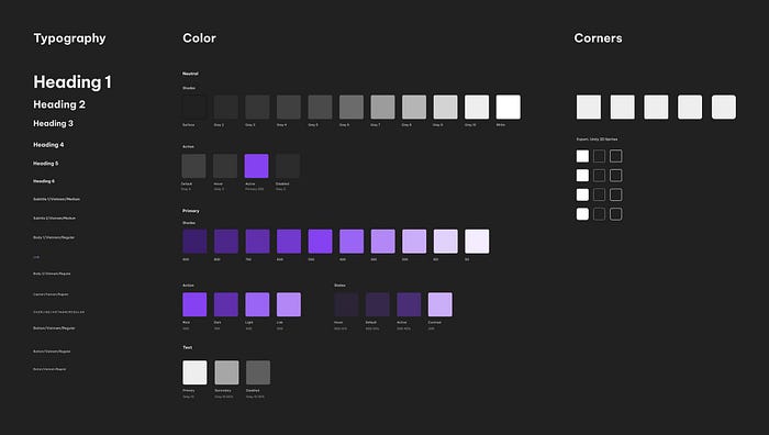
Play with the foundations as you always do in your design systems, change colors and add your own styles so that you get your own design ready.
A quick look at FloatGrids components
Setting up colors
Setting up typography
Final set up
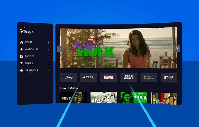
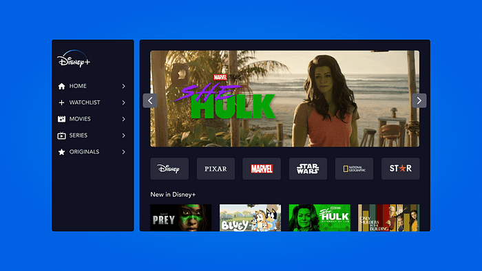
The foundations already look more like Disney Plus, let’s design something!
Design
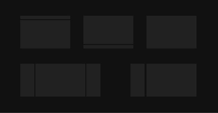
Use one of the examples in the “Examples/Viewports” page as a layout. After that, you already know how to design in Figma ;)
Take a quick look at the whole process
Considerations
Use a 32px margin or something close to it, 16px or 24px for margins feel too tight. I’m using the 8px system just because I’m familiar with it, there is no technical reason to do so.
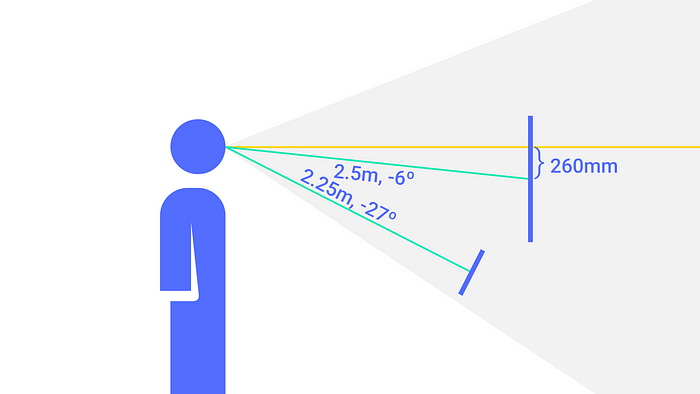
UI in VR floats. You don’t want to place the center of the design just at the center of users’ eyes, that’s not comfortable for them, instead place the center of your design a little bit lower, 260mm according to Google. Once we get to Shapes XR you’ll have the chance to test this and see how uncomfortable is having the center of the design just in front of your eyes, we tend to look a bit lower unconsciously. That’s something you cannot do in Figma obviously, it will be done in Unity, but is very important to consider and hand over to the developers.
Testing your UI in XR with Shapes XR
Exporting assets from Figma
When exporting your design, export it according to the distance you want it to be shown. Do I want this UI to be close to the user so at 1m? Export the asset x1. Start like this, once you get this you can start playing with densities. I recommend exporting for 1m for this exercise, it’ll help you understand better the concept. If you export by 4 remember to optimise the images, you’ll get a better performance in Shapes XR.
Intended distance
- 1m (Export at x1)
- 1,5m (Export at x1,5)
- 2m (Export at x2)
- 3m (Export at x3)
- 4m (Export at x4)
Importing assets to Shapes XR
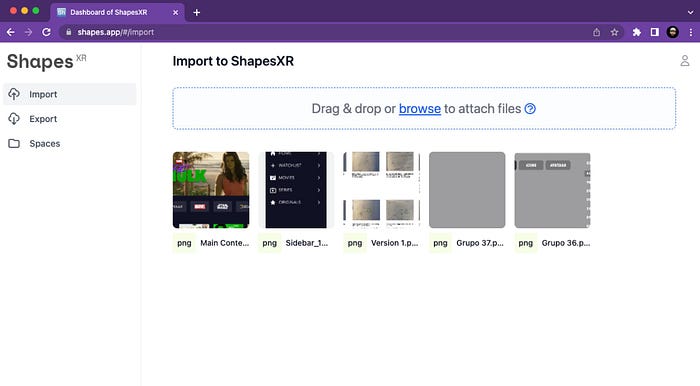
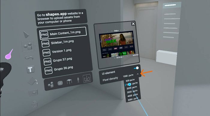
Create an account in Shapes XR and access their web app on the browser. You can upload files there and use them in the Oculus VR app later.
Upload your PNG files from Figma in the Import section.
Using assets in XR space
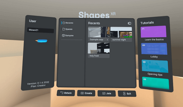
Once in Shapes, select a Sample from the home view. Once in it, use the controller to go to your files, mark them as “UI” using the toogle.
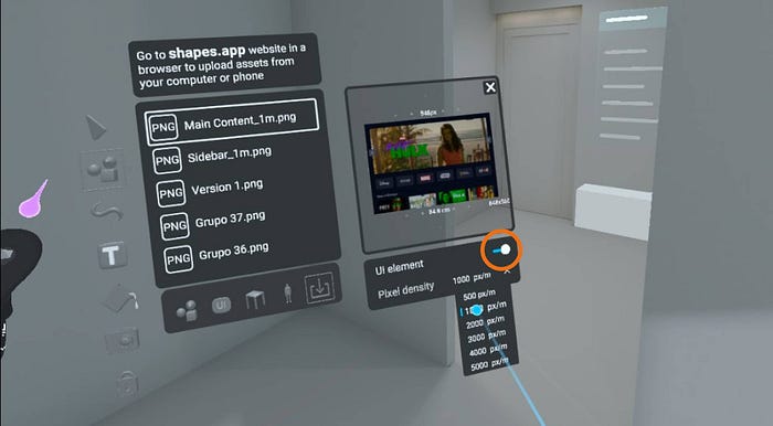
This opens a drop down called “Pixel density”. This feature allows you to work at scale as we mentioned before. Select 1000 px/m. This means 1pixel/mm, so your design is now at the size that is meant to be.
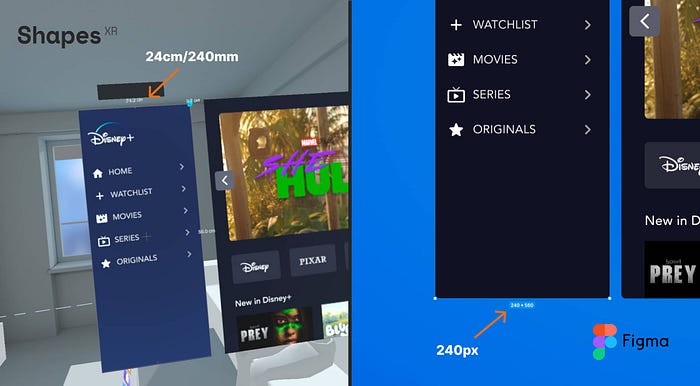
In the next image, you can see how the panel was 240 pixels width on Figma and by importing it at 1000 px/m it is 24cm in Shapes XR. To make it easier, I set the distance to 1m for my design.
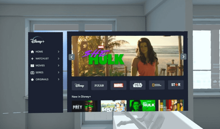
Once you have the asset in your hands, use the snap feature to better align the assets between them, play around with it to get used to the way it works. It’s awesome how precise you can be using this capability.
Finally set your point view at the distance you intended the design to be seen and test how your UI will look once developed.
Whole video from Figma to ShapesXR
Final thoughts
That’s how you can bring your UI into XR environments in barely 10 minutes. But this is just to bring a 2D UI into a 3D environment, which is a good starting point.
Now, think about the possibilities that this opens, the space, how could your UI interact with it, could it change depending on which page the user is at? And the distances, is there any way to make them help in the experience? Or the layouts, could we use any space out of the layout so it is not that flat? How much content can or should I put in one single panel? As you see, a lot of new challenges and problems show up in this new environment. How exciting it is to start playing with these new challenges and come up with new solutions, isn’t it?
I hope you enjoyed this little step by step and it inspired you to create something new and amazing!
Thank you for reading 💜
Recommend
About Joyk
Aggregate valuable and interesting links.
Joyk means Joy of geeK