

Cursing The Curse Of Cursive
source link: https://hackaday.com/2022/09/27/cursing-the-curse-of-cursive/
Go to the source link to view the article. You can view the picture content, updated content and better typesetting reading experience. If the link is broken, please click the button below to view the snapshot at that time.
Cursing The Curse Of Cursive

Unlike probably most people, I enjoy the act of writing by hand — but I’ve always disliked signing my name. Why is that? I think it’s because signatures are supposed to be in cursive, or else they don’t count. At least, that’s what I was taught growing up. (And I’m really not that old, I swear!)
Having the exact same name as my mother meant that it was important to adolescent me to be different, and that included making sure our signatures looked nothing alike. Whereas her gentle, looping hand spoke to her sensitive and friendly nature, my heavy-handed block print was just another way of letting out my teen angst. Sometime in the last couple of decades, my signature became K-squiggle P-squiggle, which is really just a sped-up, screw-you version of my modern handwriting, which is a combination of print and cursive.


But let’s back up a bit. I started learning to write in kindergarten, but that of course was in script, with separate letters. Me and my fellow Xennial zeigeistians learned a specific printing method called D’Nealian, which was designed to ease the transition from printing to cursive with its curly tails on every letter.
We practiced our D’Nealian (So fancy! So grown-up!) on something called Zaner-Bloser paper, which is still used today, and by probably second grade were making that transition from easy Zorro-like lowercase Zs to the quite mature-looking double-squiggle of the cursive version. It was as though our handwriting was moving from day to night, changing and moving as fast as we were. You’d think we would have appreciated learning a way of writing that was more like us — a blur of activity, everything connected, an oddly-modular alphabet that was supposed to serve us well in adulthood. But we didn’t. We hated it. And you probably did, too.
A Fountain of Reinforcement
Was it the rote memorization of these hieroglyphs? The excruciating attention to detail that our teachers seemed to pay to our handwriting when it came to grading literally anything? Maybe it was the fact that in the States, there’s no real rite of passage attached to learning to write in either script or cursive, except that you escaped the bad marks in the penmanship department. Or maybe it was that regardless, eventually you got to use a pen instead of a pencil. I remember being stoked to write in thin lines of indelible blue ink instead of fuzzy, erasable graphite.
Thomas’ first fountain pen. Image via Lamy
In other countries, kids are forced at some point to use fountain pens. According to Editor-in-Chief Elliot, the German kids all go to the store at some point and pick out their first fountain pen, which gave me an a-ha moment. Is this all that’s missing from the Stateside cursive debate? A little bribery positive reinforcement? Yeah, maybe. If there’s one thing that’s easier with a fountain pen than a ballpoint, it’s the ability to make more creative letterforms. Fountain pens are all about dancing with different pressures to form thick and thin lines in proper balance, whereas hard-pressed ballpoints only produce darker, monoline letters.
The Connected History of Cursive
Believe it or not, cursive has gotten easier over time. From 1850 to 1925, the time of widespread adoption of the typewriter, everyone in the US learned Spencerian script, which is a wispy, high-contrast hand developed by one Platt Rogers Spencer. The Palmer method was meant to simplify Spencerian script, as was the competing Zaner-Bloser script, which was developed around 1900. Zaner-Bloser took over with its two distinct alphabets for print and cursive, but the wide differences between the two in the letterforms led to the development of D’Nealian in 1978. By adding ‘monkey tails’ to each print letter, children grew accustomed to the idea that letters could easily be connected together — and start to believe that cursive is much faster than print.


A Language More Private Than Pig Latin (or: Cursive Is Subversive)
Believe it or not, each squiggle represents an entire word. Image via Pinterest
One could certainly argue that it’s 2022 — we’re used to using keyboards of all stripes at this point, which is itself a skill whether you use ten fingers or two thumbs. We don’t leave notes for each other anymore so much as we send texts or even DMs from across the room. If we do handwrite something, it tends to be hasty and scrawled; a product of the time we’re living in. Writing by hand takes patience, even if you’re fast at it. Just one more thing in shortage these days.
So why bother to learn cursive instead of just a nice-looking print hand? Simply put, once you know what’s going on in cursive, you know what to look for, so you get good at reading all kinds of handwriting, cursive or otherwise. (It’s never too late to learn.) And generally speaking, writing in cursive is faster than writing in print.
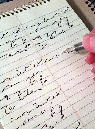
And like the Boomers say, cursive looks like a foreign or secret language to many people under 25, so feel free to try to use it as one. (But if you really want to weed readers out, learn Gregg shorthand — it’s like cursive calculus, or advanced algebra, at least.) My mother most of her working life as a legal secretary, and she could probably keep up with a court reporter’s speed while taking dictation on her steno pad, at least until her hand cramped.
Print In a Digital World
Okay, forget cursive. Why even write by hand anymore when you could takes notes this or that way with your phone or laptop? If you really want to learn or remember something, you just can’t beat writing it down.
We haven’t even begun to talk about the analog-to-digital conversion aspect of merging historically handwritten documents within the world of OCR, talked about the irony of handwriting fonts, or even argued that hard in defense of having nice handwriting. So join me for part two, won’t you?
Main and thumbnail images via Unsplash
Recommend
About Joyk
Aggregate valuable and interesting links.
Joyk means Joy of geeK