

Creating Multiple Axes without Duplicating Marks
source link: https://datavis.blog/2022/09/26/creating-multiple-axes-without-duplicating-marks/
Go to the source link to view the article. You can view the picture content, updated content and better typesetting reading experience. If the link is broken, please click the button below to view the snapshot at that time.
Creating Multiple Axes without Duplicating Marks

Tableau always places the axis for a single measure on the left of the chart and then on the bottom of the chart for a second measure, such as in a scatter plot. Sometimes, however, it makes more sense to have these axes on the opposite side of the chart to help readability.
Jon Schwabish highlighted this point in the below tweet, referencing a Bloomberg chart showing the axis on the right-hand side:
A workaround to show the axis on the right side of the chart in Tableau is to copy your measure and create a dual-axis. A downside of this approach is that Tableau also duplicates all the marks in the view, which – if you have a complicated view – could lead to a longer load time.
Tableau Visionary, Sam Parsons, raised this issue on twitter, below, and provided a link to an idea on the Tableau Forums, which I’d encourage you to upvote. The discussion in the below thread is also worth reading.
Below are two methods for creating the dual-axis without duplicating the marks.
Create a NULL measure in the same data source
This is the original scatterplot view with 5,111 marks (as shown on the lower left corner in the status bar):

First, create a new calculation:
INT(NULL)
This calculation can then be added to the view next to your original measure, here I’m using it on both Rows and Columns for this scatterplot:

Next, select dual-axis from the context menu of each NULL pill:

This will result in axes on all four sides of the scatter plot but the values on the NULL axes will not align. Note, doing this will also add Measure Names to the Colour shelf so remove this as it’s not needed.

To fix that, right-click on the axis and select Synchronise Axis (do this for both the NULL axes):

The NULL axes will update to match the values on the respective pills they have a dual-axis with:

The NULL axes can then be renamed or the name removed by right-clicking on them and selecting Edit Axis… and making the required changes. Here I’ve removed the axis labels. I’ve also hidden the Null values indicator in the lower-right hand corner by right-clicking on it and selecting Hide Indicator:


This approach will create a new column in your data source with a NULL value on every row:

If you’d rather not have this column, see the second option below:
Blend with a dummy data source
This option gives you access to the NULL value to perform the same operations as above but the NULL comes from a second data source.
Copy the below two lines and paste them into Tableau:
Dummy
NULL
This will create a clipboard data source containing one row of data – the NULL value:

If the value is showing as a Dimension in the Data Pane, right-click on it and select Convert to Measure. You may also need to change the data type to integer.
You can now follow the steps from the prior example, adding the dummy measure to the view, dual axis, synchronise etc. Here is the first step – notice how an orange tick has appeared to indicate that blending is taking place:

As we are not linking on any fields, there isn’t actually a meaningful blend taking place but it doesn’t matter in this use case as we are not using a meaningful value, just getting access to the NULL value from a separate source. You can learn more about blends on this help page.
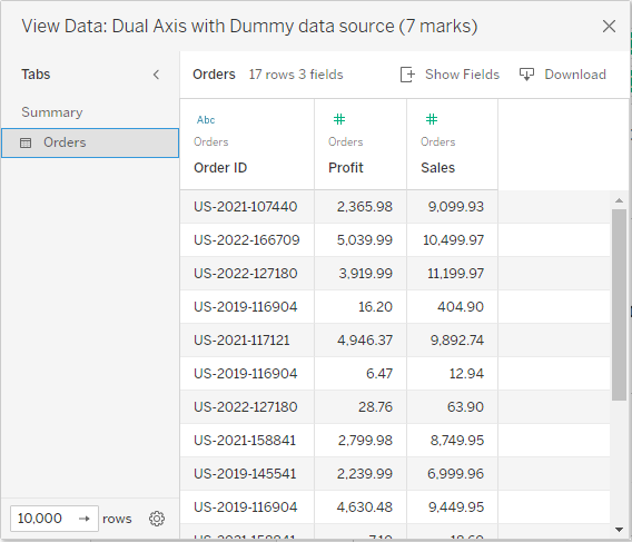
Below is the final view using the blend approach, again, still showing 5,111 marks.

This approach does not create a Null column in your main data source:
I hope this was useful. Please don’t forget to upvote Sam’s idea for providing more flexibility and control over axes in Tableau!
Thanks,
Marc
Recommend
About Joyk
Aggregate valuable and interesting links.
Joyk means Joy of geeK