

How to keep front-end project and design system in sync [Case Study on Why Softw...
source link: https://andrejgajdos.com/keep-front-end-project-and-design-system-in-sync/
Go to the source link to view the article. You can view the picture content, updated content and better typesetting reading experience. If the link is broken, please click the button below to view the snapshot at that time.
How to keep front-end project and design system in sync [Case Study on Why Software Projects Fail]
Today, I am going to show you how to ensure to keep in sync your front-end project and design system.
When you build the first versions of MVP there are a lot of changes in requirements, layout and design system. I am sure you came across a lot of style changes in a new React project.
I decided to write this case study, because I worked on a project where the team was always struggling to keep in sync their front-end project and design system. When I joined this project, they were in the beginning of rebranding with a new design system. Every time they tried to implement a new design system, the project was out of sync with the design system. The team consisted of 15+ full-stack developers, some of them were back-end focused and not experienced in CSS development.
You might be wondering:
I just need to create a theme configuration and use it when implementing styles. It sounds so simple.
However, there can be two issues if you work with a big team on a complex project:
1. Theme configuration is split into several files and implemented by only one developer. Some developers are working only on back-end functionalities. Later at some point when they start working on front-end, they can be lost in theme configuration files. As they implement new styles or new components, they can forget to use some values from theme configuration.
2. If designers are too busy or not experienced, they violate their own design system in app designs. This is something that can be easily overlooked by developers during implementation.
The front-end project was completely out of sync with design system.
I was thinking:
How to solve this issue effectively for this team?
In my previous blog post I talked about pros and cons in CSS Modules vs CSS-in-JS vs Atomic CSS in React projects. The dev team was pretty big and they decided to go with Sass and BEM methodology. The project was SEO focused and CSS-in-JS wasn’t an option. Some developers didn’t like the atomic css approach because of readability jsx with a lot of utility classes.
I noticed two issues in styles implementation:
1. A lot of files that define design systems:

Design system values are located in 20+ files.
2. App designs didn’t match the design system in Figma. Some developers didn’t use all values from theme configuration, but they hardcoded new values (for examples new colors).
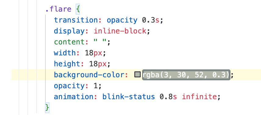
Colours shouldn’t be hardcoded values. We should use variables from theme configuration.
Now, how can we fix this?
Moving content from several files into a single file is very easy. Now, if developers need to update or use theme configuration, they don’t need to search a single value in 20+ files:
$color-black: #000000;
$color-white: #ffffff;
$color-white-02: rgba($color-white, 0.2);
$color-white-05: rgba($color-white, 0.5);
$color-sea-form: #f1f8ff;
$color-system-red: #d06666;

/* ------ SPACING ------ */
$space-base: 8px;
$space-1: $space-base;
$space-2: $space-base * 2;
$space-3: $space-base * 3;
$space-4: $space-base * 4;
$space-5: $space-base * 5;
$space-6: $space-base * 6;
$space-7: $space-base * 7;
$space-8: $space-base * 8;

/* ------ TYPOGRAPHY ------ */
$line-height: 24px;
$line-height-s: 20px;
$line-height-m: 26px;

$font-size-s: 14px;
$font-size: 16px;
$font-size-l: 24px;

/* ------ MISC ------ */
$navbar-height: 70px;
$z-index-popup: 200;
Configuring Stylelint
The second step is to configure the stylelint tool. I believe this should be used in every project where you use CSS, Sass, or even CSS-in-JS. In this blog post you can see how to use stylelint with CSS-in-JS.
Now, how to ensure that developers use values from theme configuration when they implement styles related to design system? How we can be sure developers won’t add new values (colors for example)?
For this purpose we can use declaration-property-value-disallowed-list. This rule allows us to disable specific values for defined css rules. By using regular expressions we have a lot of possibilities for defining disabled values.
For example we have spacing tokens in our theme configuration:
/* ------ SPACING ------ */
$space-base: 8px;
$space-1: $space-base;
$space-2: $space-base * 2;
$space-3: $space-base * 3;
$space-4: $space-base * 4;
$space-5: $space-base * 5;
$space-6: $space-base * 6;
$space-7: $space-base * 7;
$space-8: $space-base * 8;
Let’s say we want to allow only spacing tokens in all margin css rules. We can define a regular expression that matches all digit values with px, em or rem.
{
  "rules": {
    "declaration-property-value-disallowed-list": [
      {
        "/margin/": [
          "/(\\d*\\.?\\d+)\\s?(px|em|rem|%+)/"
        ]
      }
    ]
  }
}
We can define a custom error message, so developers are not surprised why they cannot use digit values.
{
  "rules": {
    "declaration-property-value-disallowed-list": [
      {
        "/margin/": [
          "/(\\d*\\.?\\d+)\\s?(px|em|rem|%+)/"
        ]
      },
      {
        "message": "Please use css values from theme.scss file"
      }
    ]
  }
}
Now, if a developer tries to define margin with a hardcoded value, stylelint throws the error message. You can see a demo here.
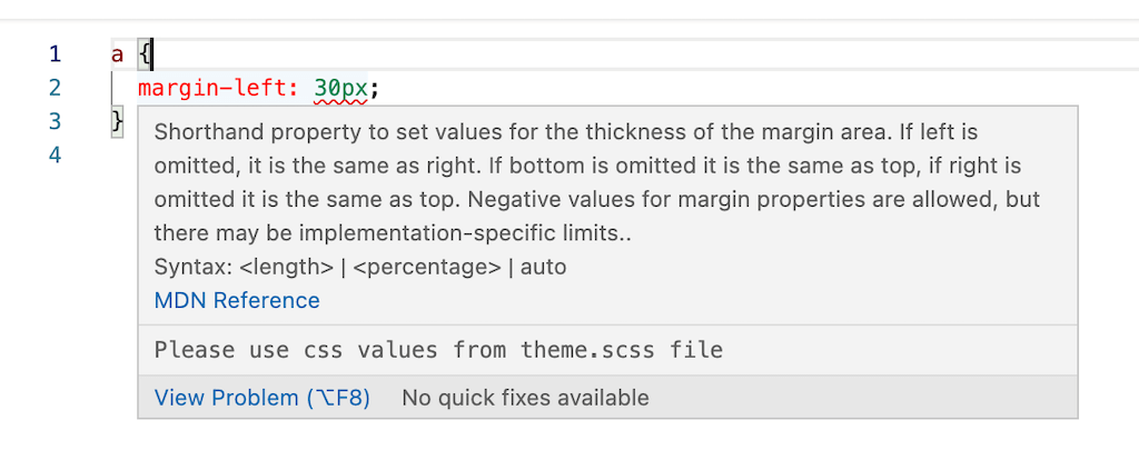
Stylelint custom error message
How to implement pixel perfect layout
It’s common that designs are not pixel perfect and spacing in app design can have various values. In this case, developers just need to use “the nearest” spacing token from the configuration object.
Spacing in app design has different values to spacing tokens in design system. We need to use the nearest value.
If you use Tailwind Design Kit to build the design system and Tailwind CSS, you already have design system and theme configuration in sync. You shouldn’t have an issue where theme configuration is not fully synced with design system.
Another use case is when you come across a new value that is missing in design system, for example a new colour. In this case, developers should notice designers that app designs violate the design system. Developers just need to ask if they should use “the nearest” value or add a new value to theme configuration. If new value is added to theme configuration, the design system should be updated.
We can add more css rules to declaration-property-value-disallowed-list that are related to the design system. Then, we don’t need to worry that the project won’t be synced with our theme (design system).
Configuring ESLint
Let’s say you have common components in your project such as Button, Input, etc that define elements in your design system. We want to be sure that developers use only these components instead of html elements. In this case, we can define a rule in eslint react/forbid-elements. In the configuration of this rule we can define html elements that shouldn’t be used and we should use components instead.
Conclusion
In this blog post, we solved a common issue in many front-end projects where layout is out of sync with the design system. Linting tools Stylelint and ESLint are powerful and provide us other rules on top of “recommended” plugins. We can define rules that help us to keep in sync our styles implementation with design system.
I would like to hear from you.
Do you have any experience where you were struggling to keep in sync your app layout and design system? Are there other Stylelint and ESLint rules that help you to keep in sync the app with design system?
NEED A REACT EXPERT? LET’S BUILD SOMETHING.
GET IN TOUCHLike this:
Recommend
About Joyk
Aggregate valuable and interesting links.
Joyk means Joy of geeK