

How to create Icon Grid and Keyline
source link: https://uxplanet.org/how-to-create-icon-grid-and-keyline-fa22bf59a898
Go to the source link to view the article. You can view the picture content, updated content and better typesetting reading experience. If the link is broken, please click the button below to view the snapshot at that time.
How to create Icon Grid and Keyline
Hello everyone! I am back with another story that can help you create icons more easily. Creating an Icon looks tricky, but you can build an entire library of your own if you have the right tool. In my previous story, I shared How to create icons in Figma. This story is the prequel to Icons.
Let's start!
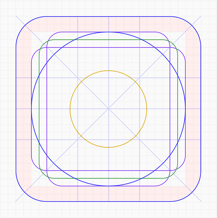
Icon Grid and Keylines
Let’s begin by directing the above image into five sections
- Orthogonal (Lines)
- Live area and Trim area
- Key shapes
Combining these elements in one frame you will get keylines and a grid to create icons.
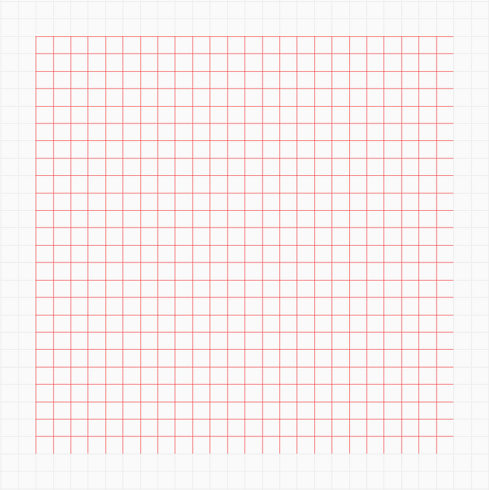
Grid — 1px
A grid is a series of intersecting vertical and horizontal lines running across a structure. The grid acts as an essential supporting structure that can be used to organize graphic elements.
I have used a 1px grid on a 24x24px canvas. I will be creating icons using 1.5px strokes and hence using a 1px grid is more convenient over a 2px grid.
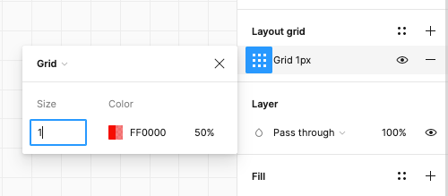
Layout Grid
Add grid on the canvas using Layout Grid option in Figma.
Orthogonals
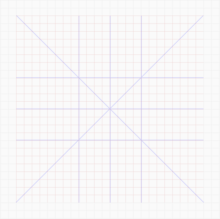
Orthogonal at 90° and 45°
Orthogonals are the keylines that intersect the center point of the canvas and create additional vertices. These lines are commonly placed at 90°, 45°, 15°, and 5°. Mostly 90° and 45° are used. 15° and 5° can be added if required.
Add orthogonal lines at different angles by simply using the line tool.
Live area and Trim area
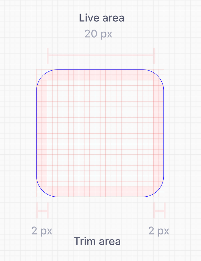
Live area and Trim area
The live area is the space where the main content of the icon is present. If required, the content of the icon can extend to the trim area, but it should not extend outside the trim area.
Key Shape
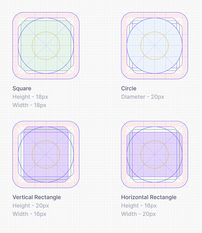
Key Shapes
Key Shapes acts as the helper guide to create basic shapes like Circle, Rectangle and Square.
I have placed five shapes with different dimensions as the key shapes because I will be needing those shapes frequently.
- Two circle of dimension 10 and 20
- One Square of 18px height and width
- Vertical Rectangle of 20px height and 16px width
- Horizontal Recatngle of 16px height and 20px width
Each shape has a different colour so that it is easy to identify while using them.
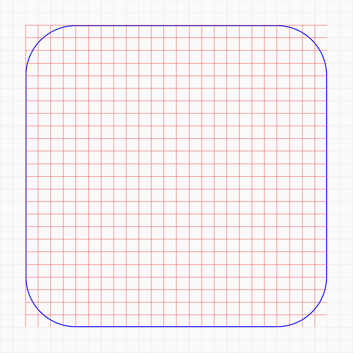
Mask
Mask is the container of the icon. Mask is mostly useful for Logo designs. It is used to clip content to the container. It can have different border radius depending on the use case.
The End
By combining these Steps you will get Icon grid and Keylines. Use it to create a lot of icons :D
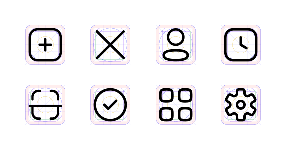
I have created an Icon library using this Grid and keylines for a spend management company — Fyle Technologies
Recommend
About Joyk
Aggregate valuable and interesting links.
Joyk means Joy of geeK