

6 key design principles for creating an engaging visual experience.
source link: https://uxplanet.org/6-key-design-principles-for-creating-an-engaging-visual-experience-1d8c5c3083df
Go to the source link to view the article. You can view the picture content, updated content and better typesetting reading experience. If the link is broken, please click the button below to view the snapshot at that time.
6 key design principles for creating an engaging visual experience.
Know the basics so you can master the complexities.
Art is subjective. And yes, beauty lies in the eyes of the beholder. However, if you’ve encountered a confusing parking sign or a website from the early 90s, you’ll know that poor design exists.
Like any other profession, graphic design also has rigid guidelines that function beneath the surface to harmonize and balance the work. Understanding design principles and how they interplay is crucial for both emerging and senior designers. Consciously implementing them is the secret to producing aesthetically pleasing and practical designs.
When I started as a designer, I didn’t fully understand these principles to be able to leverage them in my designs. However, with time I got acquainted and began to understand what works and, most importantly, why it works.
In this article, we’ll look at each principle individually and understand how they interact to help you reach the targeted audience with the right message.
What are Design Principles?
Design Principles, Image Credit: skh.design
In a nutshell, design principles are rules, behavioural patterns, and considerations to judiciously employ in your designs to minimize users’ cognitive loads and increase appeal. Experts from various disciplines, including behavioural science, sociology, ergonomics, psychology, etc., laid the groundwork for these design principles. They are a representation of the collective knowledge of design pundits and researchers.
How are these principles important for your designs?
Design and usability expert Jared Spool says, “good design, when it’s done well, becomes invisible. It’s only when it’s done poorly that we notice it.” And for this reason alone, good design is difficult to define.
As a designer, you must’ve had moments when you’re about to tear off your hair because something is off in your design, but you can’t put your finger on it. Design principles help you fix this problem and many others throughout the design process by assisting you in determining the core values of your product so that you can make decisions that respect the integrity of those values. And if you and your team have a few sets of protocols to return to, you will naturally have a shared vocabulary and set of standards you can leverage while working together.
Six Core Design Principles
While researching for this article, I found a book called Universal Principles of Design by William Lidwell, Jill Butler, and Kritina Holden. It has a comprehensive collection of 125 concepts(or principles) relevant to your everyday design process. But out of 125, I believe these six form the foundational principles of a good design.
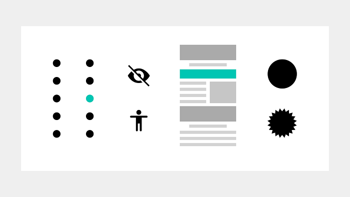
1. Accessibility
Commonly known as barrier-free design.
Let us talk about the elevator in my building to give you an example of an accessible design. It has wide doors that make it simple to enter, a couple of handrails on either side that help people take support, and two sets of controls that are reachable from a seated position. Additionally, the floor numbers are redundantly coded with numbers, icons, and Braille, and feedback is given visually and audibly. Also, it has an emergency phone system that provides access to specialized assistance.
Accessibility in Design, Image Credit: skh.design
By referring to the above example, an ideal accessible design should have four qualities: perceptibility, operability, simplicity, and forgiveness.
- Perceptibility — is when a design is perceivable by everyone, regardless of sensory capabilities.
- Operability — is when a design is usable by everyone, regardless of physical capabilities.
- Simplicity — is when any person, regardless of expertise, literacy, or degree of focus, can readily grasp and use a design.
- Forgiveness — is when a design reduces the likelihood and effects of errors.
Designs must be useable by individuals of all abilities without needing specific modifications. The goal of accessibility in design has always been to accommodate those with impairments. But later, it became more evident that many necessary accommodations we can make to benefit everyone.
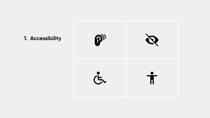
2. Emphasis
Emphasis causes some parts of the design to stand out. Conversely, it can also be used to minimize the degree of prominence of some elements. We use this principle to communicate information in our everyday life. Imagine a public speaker giving a speech without emphasizing certain words. The audience won’t be able to comprehend the message the speaker is trying to communicate.
Emphasis in Design, Image Credit: skh.design
In the same way, emphasis is a design feature that draws the user’s attention. In other words, it is a centrepiece. Whether it’s the headline, a picture, or a Call-to-Action(CTA), this should ideally be the most essential design section. Sometimes designers mistakenly emphasize the wrong website elements, leading to user confusion.
Users should easily find necessary action or vital information to complete a task. As you examine your user journey, you should ask yourself, how am I making it easy for users to complete the tasks they need to do? This might involve adjusting your design’s navigation based on the results of any usability studies you conduct. If someone isn’t finding a critical feature quickly during the study, you want to find a better way to emphasize it.
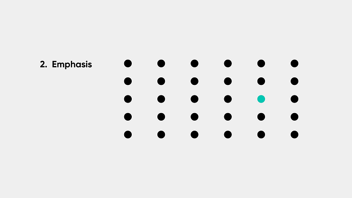
3. Whitespace
The rest of the design principles all relate to the elements you include in your work. White space is the only one that expressly addresses what you don’t contribute.
Whitespace in Design, Image Credit: skh.design
White space refers to spaces in a design devoid of visual features and spaces with underused space around those items. More specifically, it refers to the voids, open spaces, and locations in your design where nothing is present. White space emphasizes a more straightforward design approach by not adding any features to the composition. Indeed, less is more.
It is a common misconception that white space has to be white. Well, not necessarily. It can be of any colour.
4. Hierarchy
Hierarchy is a visual design principle that arranges elements on a page in order of their priority.
Now, you might be wondering how hierarchy is different from emphasis. Although both are related concepts, hierarchy refers to a group of elements organized in order of importance. On the other hand, emphasis is about making one element stand out from other elements.
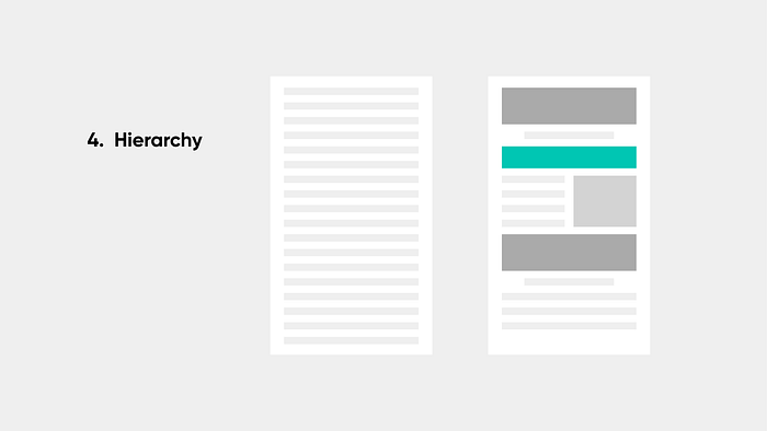
Hierarchy in Design, Image Credit: skh.design
Why do we need a hierarchy? Visual hierarchy is an essential aspect of effective design because everything on your website appears to be of equal value if nothing is essential. In UX design, we always want to clarify to the user where to focus first and what action to take by giving visual clues. Hierarchy helps point users to the first step they should take in their user journey.
5. Contrast
When two or more design components are near one another, the contrast plays a prominent, noticeable function in their degree of difference.
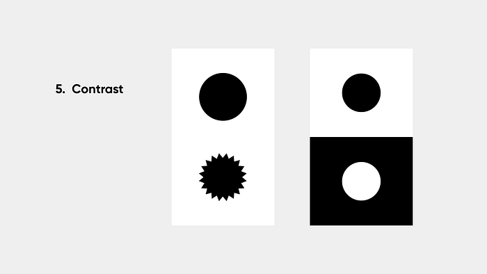
Contrast in Design, Image Credit: skh.design
Although when you hear contrast, only the colour contrast is the first thing that comes to mind. But you can show contrast in your designs by differences in element sizes, shapes, or other characteristics.
6. Alignment
Alignment describes how visual components are positioned, arranged, and organized relative to one another and the overall design. It is a technique for visually linking similar elements to make the design look more cohesive. Aligning various visual elements aids in directing the observer through the design.
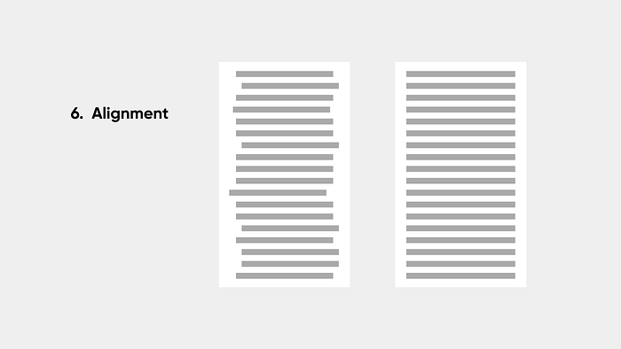
Alignment in Design, Image Credit: skh.design
For example, left- and right-aligned text blocks in paragraph text offer stronger alignment clues than centres-aligned text blocks. Left- and right-aligned text blocks produce an invisible column that is an apparent visual reference for the placement of other design components. Contrarily, centre-aligned text blocks offer more ambiguous visual alignment cues and may be challenging to connect with other elements.
Although rows and columns are the most common way to establish alignment, other, more intricate types of alignment do exist. For example, when aligning pieces diagonally, the relative angles between the unseen alignment lines should be at least 30 degrees apart; any difference at all less than that is too undetectable and too faint.
Final Thoughts
When I was first introduced to these principles, being the rebel I was, I wondered, can we make do without these principles? I think design is an abstract art form, and we’re limiting our vision by following only a few rules. But with time, I learned structured creative direction always trumps abstract art compared to usability or comprehension metrics. Designing something that genuinely looks nice and provides the best user experience is usually done by the designer’s intuition and may require a lot of trial and error.
Recommend
About Joyk
Aggregate valuable and interesting links.
Joyk means Joy of geeK