

UI/UX Design: The Dynamic Island
source link: https://uxplanet.org/ui-ux-design-the-dynamic-island-ce6e3da925c9
Go to the source link to view the article. You can view the picture content, updated content and better typesetting reading experience. If the link is broken, please click the button below to view the snapshot at that time.
Warning: this article represents an unpopular opinion. If you’re easily offended, please feel free to skip it.
Overview
Apple just dropped the next incarnation of their notch that will be available on the iPhone 14. This is pretty big news because it represents something that essentially all designers who do any work with the iPhone/iOS will need to take into account moving forward.
Today, we’ll unpack this new feature that attempts to re-frame the notch problem, and I’m honestly not sure how I feel about it.
Origins of the Notch
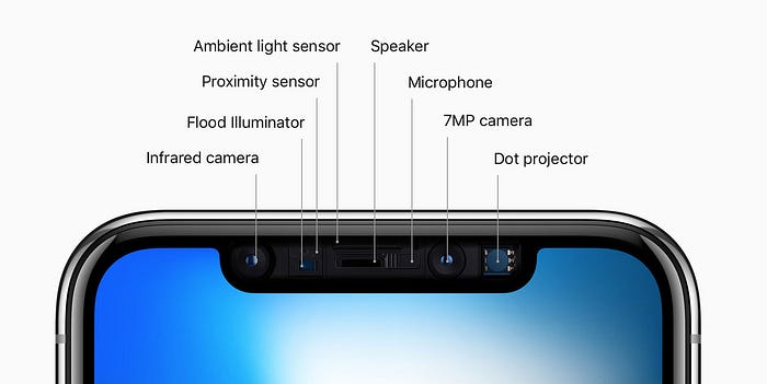
While the iPhone is, of course, not the first phone to incorporate a notched display, when the iPhone X dropped in 2017, it was basically the first widespread device to popularize the trend.
iPhone X, for all its flaws, was the most successful revenue generator for Apple- Technology News…
Riding on 63 million shipments till August 2018, Apple 's iPhone X is on track to be the most successful revenue and…
Ever since, quite a few manufacturers have incorporated notches into their displays, for camera housings all the way to aesthetics and an attempt to replicate the commercial success of the iPhone X.
It’s a long story, but suffice it to say that the notch exists to house hardware that drives some of the more advanced features of the iPhone.
Issues with the Notch
The introduction of the notch came with a few interesting issues. First and foremost, designers now have to deal with the ongoing fight with a screen that has some odd specifications.
https://developer.apple.com/documentation/uikit/uiview/positioning_content_relative_to_the_safe_area
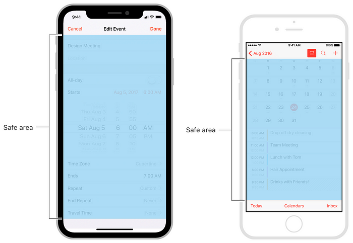
The biggest problems lie in some of the odd-duck safe area issues when it comes to full-screen.
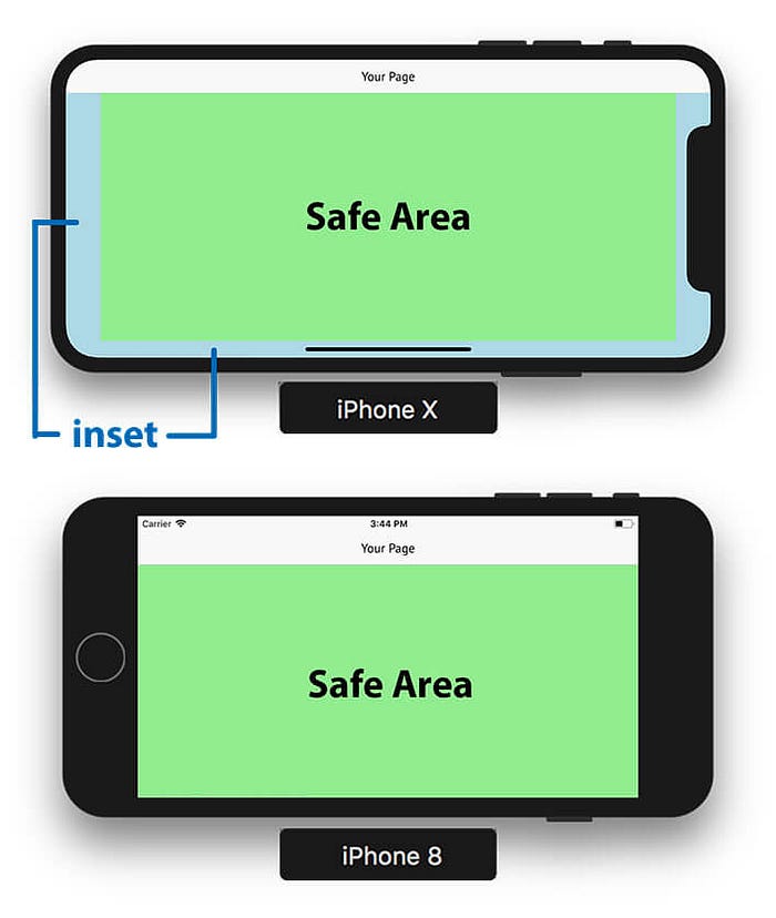
Since its inception, designers have had to take the notch into account, but again, not really a huge issue because the notch stays in one place and doesn’t move around, so it’s been relatively easy to design for with reasonably good adaptability.
Until now…
The Dynamic Island
The Dynamic Island is Apple’s response to having a notch on their screen in the first place, but instead of just saying “hey we have a notch,” they’ve taken it and made it part of their entire platform’s UI.
Is it really a better compromise?
While I certainly don’t have a problem with innovation or attempts at finding a workable solution to complex problem, I do have some misgivings about this particular feature for several reasons.
- We have the status bar for notifications.
- We have push notifications.
- We have all sorts of notifications.
Why do we need another layer to the UI which really only serves to complicate the experience that much more?
If you look at the way the Dynamic Island is intended to be used, it’s dark-mode only, we have no idea what level of system access design and development teams will have to it, and we have no idea what permissions it has as a system level component.
“But Nick, if the users don’t like it they can just close it out.”
No, they can’t. That’s the problem with the DI, it’s always there, and unlike the status bar it can just open of its own volition, no drag-down required.
Unintended consequences
I have a sneaking suspicion that this new, dynamic notch is going to cause more problems than it hopes to solve, and I’ll tell you why:
- Every product team on the planet is going to have to contend with another non-branded component chilling at the top of their user’s experiences as a floating CTA which can’t be dismissed.
- Every time DI opens, it will take away valuable attention that every product is working incredibly hard to garner from their users.
- Everything “above the fold” in your designs will now have to contend with DI and make sure that if the DI is open, your content isn’t being completely superseded by it.
- Every user who uses this new feature will have to continuously figure out what state the DI is in, what’s going on with it, and if it even relates to what they’re trying to do in their selected app.
You see the problem here? It’s non-atomic. It’s a stateful component that’s operating OUTSIDE of the intended user experience, but its state may NOT be tied to the current UX.
This creates a problem because it could be that you as a des/dev team have no control over the DI, and it could easily become a situation where the DI can just sort of push things over the top of your application without recourse.
Can you imagine the issues this could cause with brand association? It’s also only the color of the notch, you can’t change the color, what’s it gonna look like in dark mode?
Again, I have a feeling that this new feature is going to cause a boatload of unintended consequences that aren’t going to work out anywhere near as smoothly as people think it will.
https://www.macworld.com/article/676431/how-the-iphone-14-could-look-without-a-notch.html
This is especially infuriating because there is a high likelihood that a modern iPhone probably doesn’t even need a notch at all.
How the iPhone 14 could look without a notch
When it comes to the iPhone notch, there is great disagreement in the Apple community: some find the notch at the top…
Not the end of the world, but icing on the cake
And listen, here’s the thing: I get it. It’s just one more thing that users, designers, and developers are gonna have to deal with.
And I get it, innovation doesn’t come without trying some stuff that may or may not land. I get it, I swear I do, but this is NOT the first time Apple has done this!
And again, I am NOT trying to rip on the idea of taking a problem and attempting to find a workable solution for it, but I have the horribly funny feeling that DI (the new status bar) is going to cause an inordinate amount of problems, ESPECIALLY for controls that are in the same general area.
This comes from a place of concern
The reason that I even worry about this at all, truth be told, is because I’m afraid that we’ve reached an evolutionary pinnacle in our mobile technology, but instead of moving on to flexible glass, holographic displays, or streamlined UI’s…
- We’re removing headphone jacks.
- Then putting them back.
- And removing bezels.
- Then putting them back.
- Then making the devices smaller, then bigger, then smaller again.
What is this really doing for UX? What is this really doing for the average user? Is it REALLY making their lives better? Or is it just causing more confusion?
→ Did it test well because it’s good, or did it test well because it’s new and people’s brains reward novelty as a natural consequence of being human?
These are questions we ALL have to ask ourselves as UI/UX designers, especially when the changes we make don’t just affect our own experiences, but could very well impact other organization’s experiences as well.
These are the types of things we have to consider regardless of what we’re designing, because with every single stateful component that exists in the UI, it adds another layer of cognitive load to our users, who are already operating at a high-capacity most of the time.
The bottom line
The Dynamic Island is a novel concept, and a great idea on paper, but fundamentally represents a software solution to a hardware problem which honestly shouldn’t exist in the first place.
It takes up screen real-estate in a non-standard way, and I have a feeling that it’s going to cause a massive amount of confusion, especially when applied over applications that are already running in dark mode.
I guarantee there will be some upsides to it, no doubt, but what I can’t guarantee is how this DI will impact user experiences with respect to users who are already taxed to the max with near constant distractions, interruptions, and breakages to their lines of concentration.
In short, form follows function, but in this instance we don’t need more function, we need better form.
Recommend
About Joyk
Aggregate valuable and interesting links.
Joyk means Joy of geeK