
1

自适应和响应式的区别
source link: https://blog.p2hp.com/archives/9575
Go to the source link to view the article. You can view the picture content, updated content and better typesetting reading experience. If the link is broken, please click the button below to view the snapshot at that time.
自适应和响应式的区别 | Lenix Blog
区别:
自适应:需要开发多套界面;
响应式:只需开发一套界面。
1.自适应:
通过检测视口分辨率,来判断当前访问的设备是:pc端、平板、手机,从而请求服务层,返回不同的页面;响应式设计通过检测视口分辨率,针对不同客户端在客户端做代码处理,来展现不同的布局和内容。
2.响应式:
对页面做的屏幕适配是在一定范围:比如pc端(>1024)一套适配,平板(768-1024)一套适配,手机端(<768)一套适配;响应式一套页面全部适配。(可以想象:响应式设计要考虑的内容要比自适应设计复杂的多)
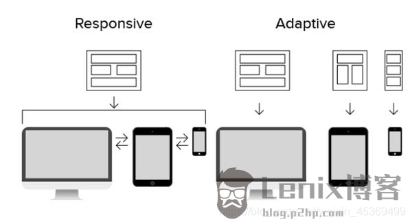
响应式设计(RWD):建立一个网页,通过CSS Media Query,Content - Based Breakpoint等技术来改变网页的大小适应不同分辨率的屏幕。
自适应设计(AWD):为不同类别的设备建立不同的网页,检测到设备分辨率大小后调用相应的网页。
Recommend
About Joyk
Aggregate valuable and interesting links.
Joyk means Joy of geeK