

Website redesign: How I evolved my website
source link: https://matejlatin.com/blog/2022/08/19/how-i-redesigned-my-website/?ref=sidebar
Go to the source link to view the article. You can view the picture content, updated content and better typesetting reading experience. If the link is broken, please click the button below to view the snapshot at that time.
Website redesign: How I evolved my website
I launched my new website in May after taking a long break from my personal business. Taking a few steps back helped me realise what I needed to do to be more productive and efficient. I needed a new website that would elevate my personal brand and be a hub for everything I do. Here’s a short story about how I evolved my personal website.
My personal website used to be on the matejlatin.co.uk domain and consisted of mostly personal articles. I had only written a few of those in the past few years so it didn’t get a lot of traffic. Long gone were the days when I published an article every week. So the website was updated only every now and then. It was running on Jekyll and was hosted on GitHub Pages. That made a lot of sense when I designed and built it because I wanted to improve my Front-End developing skills, as well as Git.
Maintaining that website was quite an effort. Because I posted articles so infrequently, I had to update the dependencies of the Git repository almost every time. Sometimes Jekyll wouldn’t work for some reason and I had to Google the error to find out what was happening. Most times it was something about the Ruby version that I used not being compatible with Jekyll. So I had to find workarounds. All this contributed to me publishing fewer articles as time went on.
Why I redesigned my website
I had three goals for the redesign of my website. I already described how having a Jekyll website impacted on me publishing even fewer articles. So one of my main priorities for the new website was to increase the speed of publishing articles. No more fiddling with the command line just to get the website up and running locally. I needed something where I could start writing a new post immediately.
Another priority was to turn my website into a hub of everything that I do. So no more maintaining three separate websites (each of them on Jekyll, complicating things even more). Just one, where I could publish articles on all the topics that interest me. I used Forestry.io as a CMS for the betterwebtype.com website but it didn’t help enough. I still found it quite complex to publish a post. So all new articles about web typography will now be published on my new website—matejlatin.com.
This ties perfectly into my next goal for the new website—I wanted to focus on my personal brand. With three websites, I had to create and maintain three brands as well. It became exhausting after a while, I just couldn’t keep up. I’m not completely abandoning the Better Web Type and UX Buddy brands that I created, but I am going to slowly shift towards establishing my personal brand as it is me who’s in the middle that connects all these brands.
Design exploration
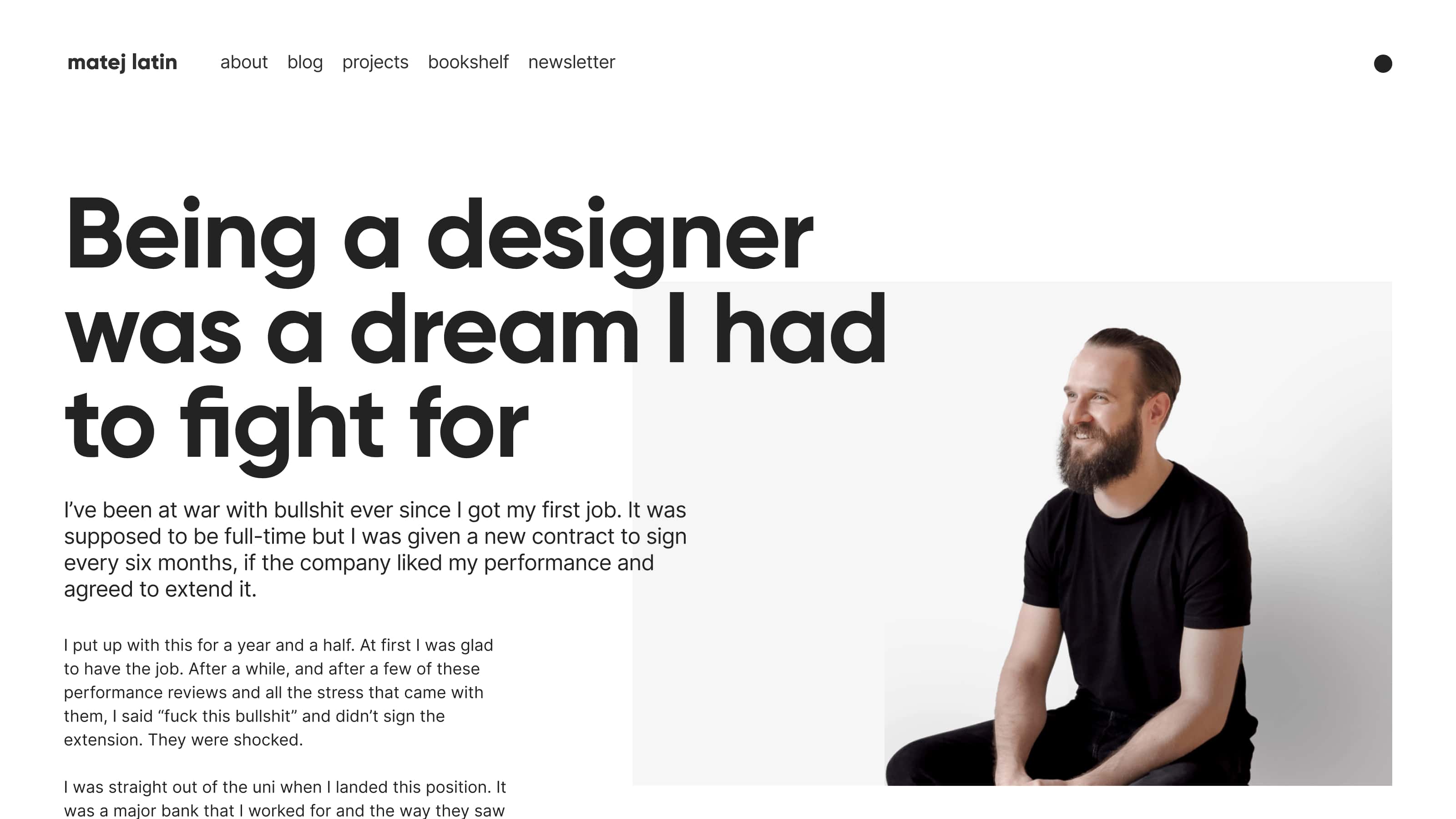
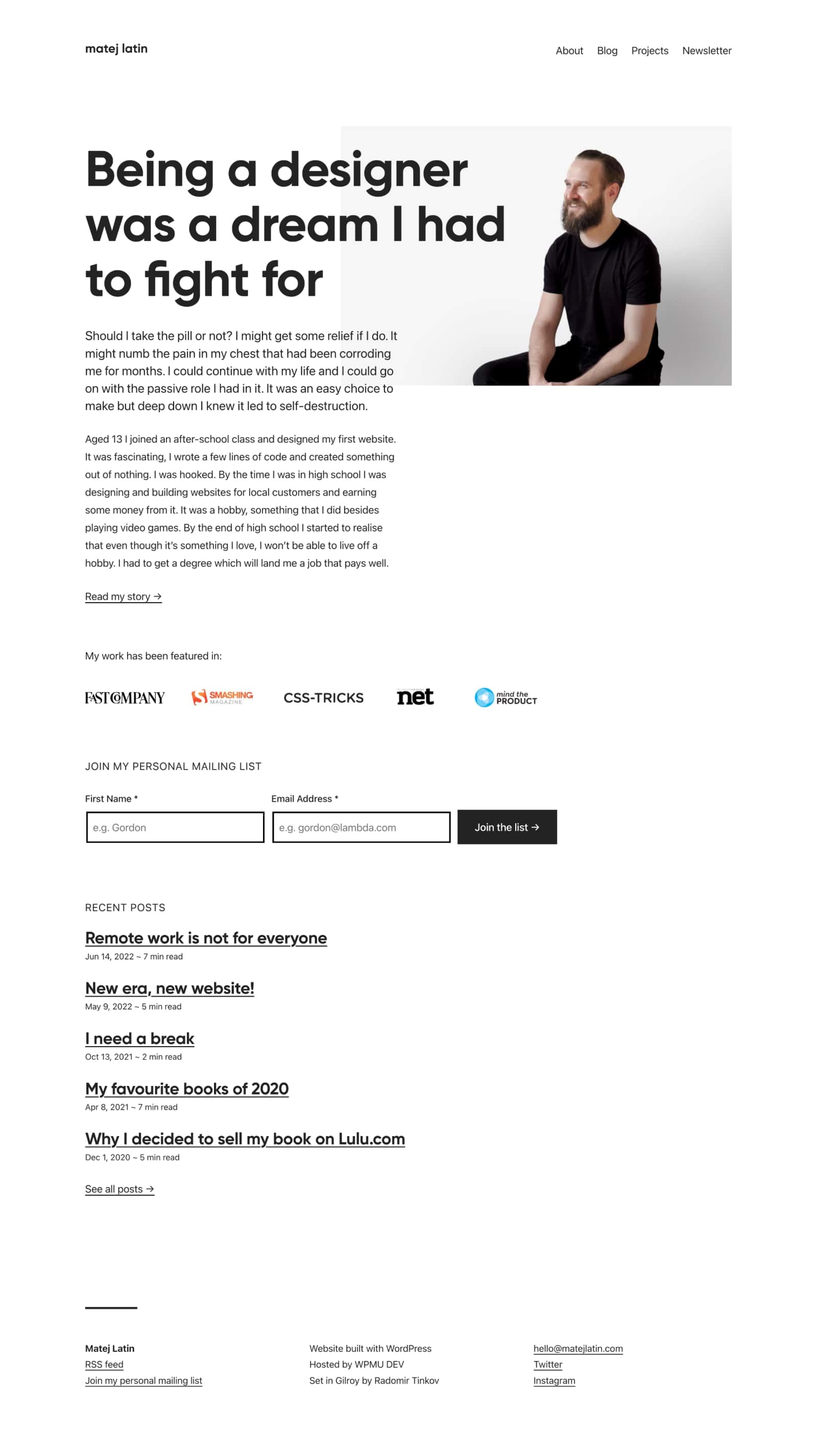
Design-wise, I wanted the new website to be an evolution of the old one, not a revolution. I was sure about two things when I started thinking about the design for the new website. I wanted to use the Gilroy as the main typeface of the website and I wanted the website to be content-focused. So the typeface would be the main element of the new website.
I had already used Gilroy when I created the UX Buddy brand and website and I plan on using it for other projects that will be related to UX Buddy. I feel like it represents me as a person, that’s why I like it so much. I initially wanted to use it in the exact same weight as I did for UX Buddy (Extra Bold), but eventually decided to go with a lighter one (Bold).
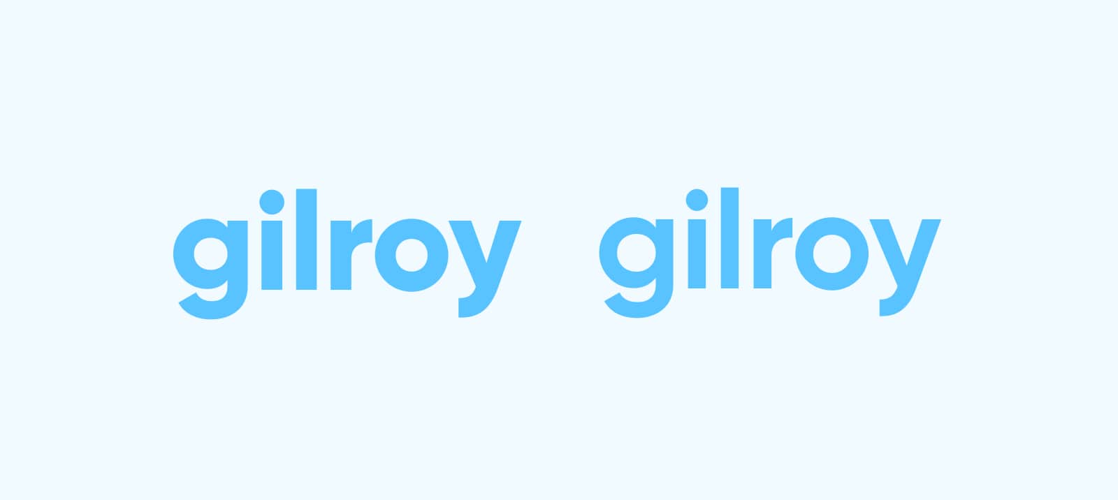
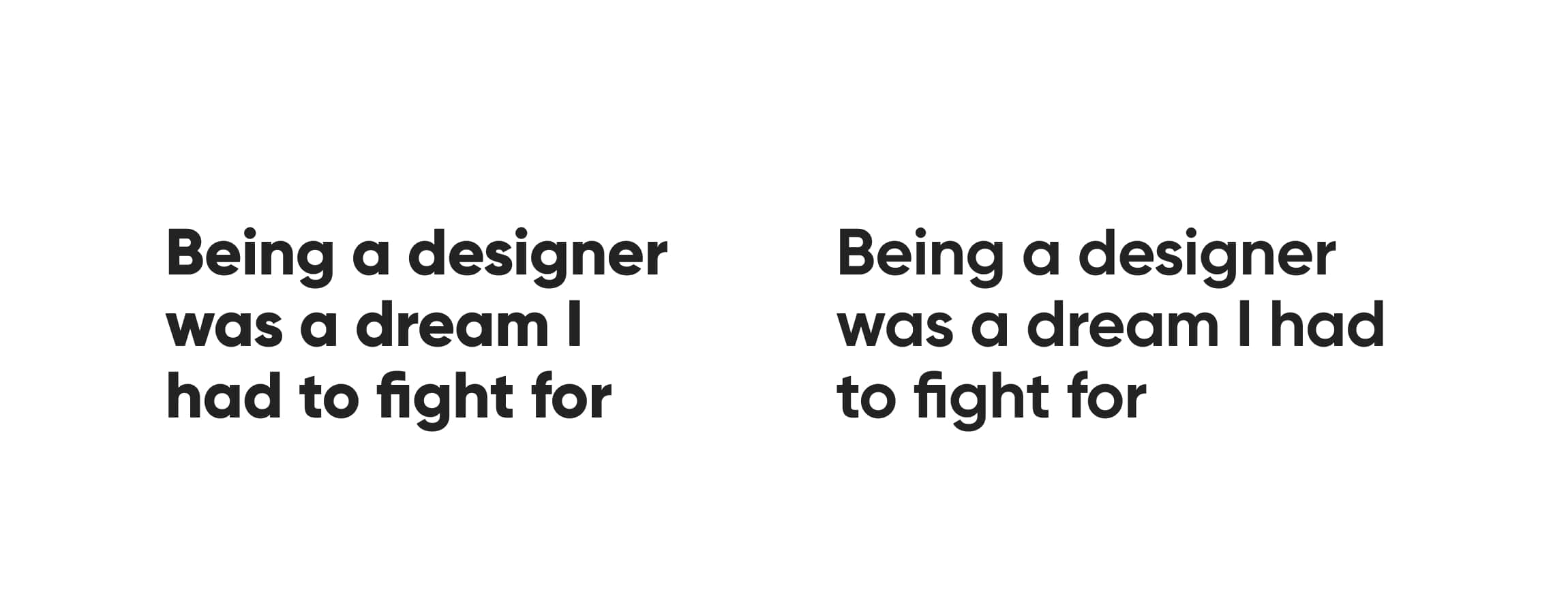
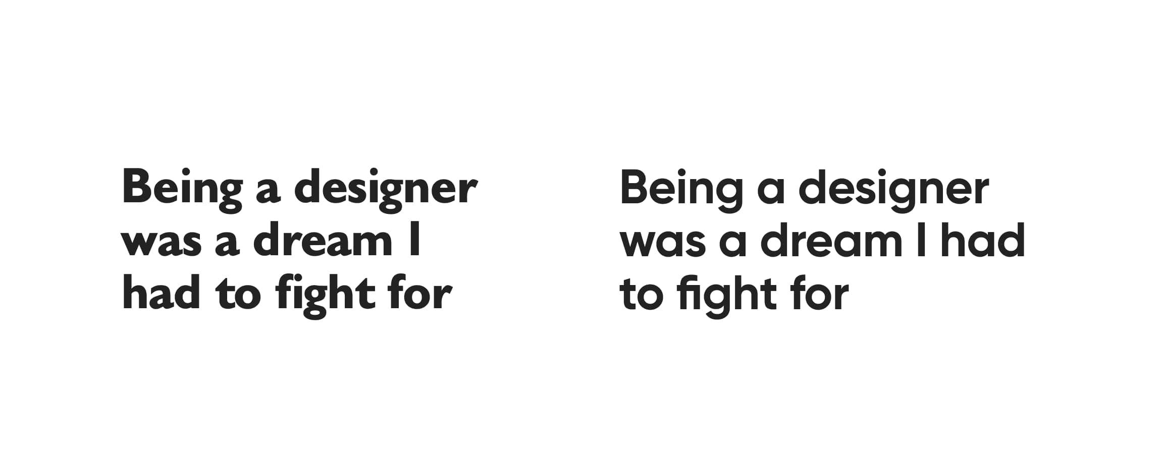
This was an important decision because, as some of you already know about me, I like the main typeface of a website to be the cornerstone that I build the rest around. A lighter weight felt more modern and it’s more flexible too. The Extra Bold maybe looks cooler on its own when comparing weights only (Fig 1), but dark on a white background and with title-long text it looked too dominant and bullish (Fig 2). The Bold weight looked more balanced, sophisticated, refined.
Gilroy now replaces the Gibson typeface that I used on the previous website. The two might look similar at a quick glance but they’re actually quite different. Gilroy is more geometric, it has single-storey “a” and “g” letters which I really like. Gilroy also comes with a bunch of OpenType features and some nice ligatures—notice the lovely “fi” one in the example (Fig 3). To me, the simpler and more minimalistic the typeface the better.
Because I wanted the website to be content-focused, I started with design exploration of what a post would look like. You can see the progression of my exploration in the following images. Figure 4 shows the earliest exploration I did. This one was the closest to the original (old) website, it was a cleaner version of it. I wasn’t sure about such big titles so I explored what it would look like when a title was longer (Fig 5). I had to reduce the size a bit to make it work. Then I explored a change that was more radical compared to the old website. I changed the layout to a more traditional one where the menu is on the top of the website instead of on the side (Fig 6). I also wanted to see what a simpler typeface would look like for the main content. I decided to try out the system font, which is SF on Macs. I quite liked the simplicity it added to the design so I kept it. These earlier explorations were still done with Gilroy in the Extra Bold weight.
 Fig 4: Original redesign exploration
 Fig 5: Exploration with longer titles
 Fig 6: Change of layout and switch to Gilroy
I figured out that I needed to shift the exploration to the homepage in order to take it further. It’s one thing when a design works for the content page, but it needs to work on other pages too. I did one with the Extra Bold weight at first (Fig 7). It was then that I decide to give a lighter weight (Bold) a try (Fig 8).
This exploration was very asymmetrical and very much left-aligned. I liked that, but as you can see on the live website, it didn’t make it to the final result. More on that in the next section.
Going back to WordPress
Keeping up a Jekyll websites was increasingly laborious as I already described. I needed to find a solution that would allow me to go straight to writing when I needed. I don’t have time to fiddle with Ruby updates and dependency management in the command line. I want to get to writing a post in two clicks. And the solution was quite simple: use WordPress. I had already used WordPress in the past but decided to move away from it when I worked on the previous version of my personal website. I already explained how I wanted to improve my coding skills and learn about Git, but I also felt that WordPress was too complex and performing poorly when it came to speed. Jekyll being a static website solved that.
As it turns out, I just had a shitty server for the website that I had built with WordPress. I decided to go back to it because it offers a lot of flexibility, it has improved a lot since I last used it, and it’s so much cheaper now to host on a really good server (if you’re looking for one, I recommend WPMU DEV).
I didn’t stick to my designs
To minimise the amount of coding work in order to launch my website, I decided to use one of the default WordPress themes. Twenty Twenty-One was the closest to what I needed. I changed the background colour, the title typeface, made some layout changes, added a couple of plugins and the website was almost ready. I really liked the default link, button, and form styling from the WordPress theme so I kept it. I didn’t fully implement the designs that I’d made before I started implementing the website. I also liked the positioning of the main menu in the theme that I used so I didn’t make an extra effort to push it to the left as I’d planned in the designs.
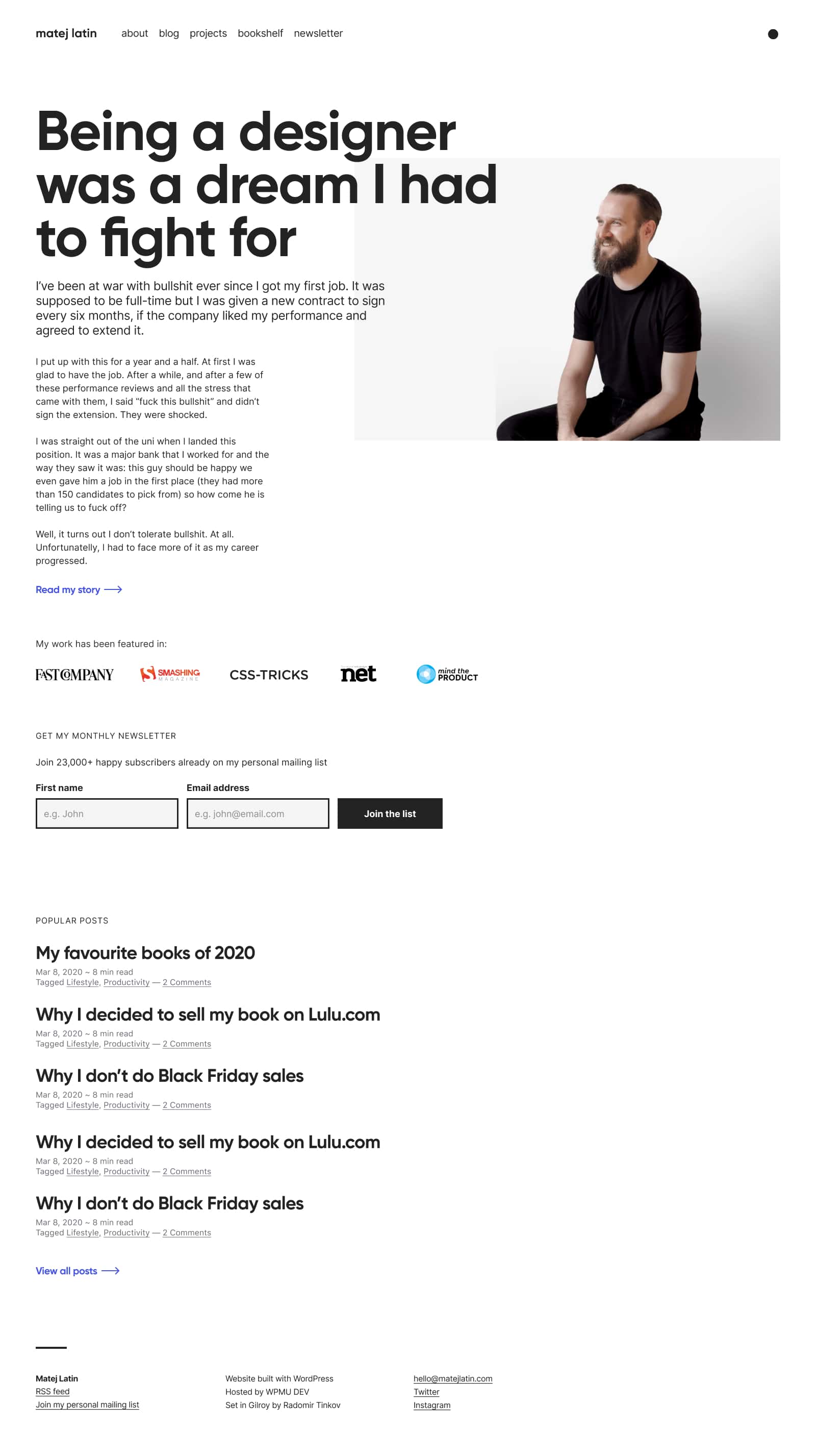
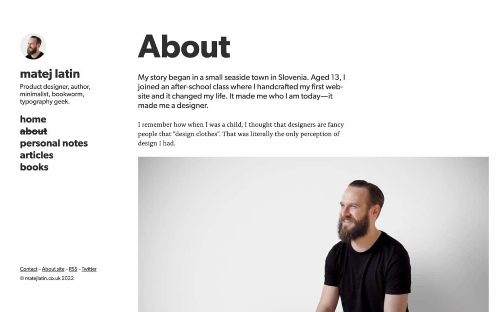
Comparing the original designs on the left (Fig 9) to the screenshot of the actual live website on the right (Fig 10), you can notice that I only used one colour for all text styles (instead of multiple as intended), the links are underlined and not blue, paragraphs are wider and line-height is taller, the main title is a bit smaller, the menu is aligned to the top right instead of left. Notice also that I didn’t use Lorem Ipsum as dummy text in my designs. Instead, I used a draft for a post that I never published. It’s so much better to use some actual content when designing a content-focused website.
It’s the first time that I “ignored” my designs like that. But it saved me some time and it produced a more unexpected result. A result that I’m happy with. I still have a few minor fixes to take care of and then I can work on re-establishing my habit of writing and publishing more often. I now have the solid foundations to build on.
Have you ever purposefully “ignored” your designs like that? If yes, why? What do you think about the redesigned evolution of my personal website? I’d love to hear your thoughts! Let me know in the comments below 👇 I’ll randomly pick one commenter by the end of August and they’ll get a signed printed copy of my book—Better Web Typography for a Better Web.
Get my next blog post in your inbox
Join more than 20,000 designers already on my personal mailing list.
Recommend
About Joyk
Aggregate valuable and interesting links.
Joyk means Joy of geeK