

What is the fixedSize modifier in SwiftUI
source link: https://sarunw.com/posts/swiftui-fixedsize/
Go to the source link to view the article. You can view the picture content, updated content and better typesetting reading experience. If the link is broken, please click the button below to view the snapshot at that time.
What is the fixedSize modifier in SwiftUI
Table of Contents
When you read SwiftUI tutorials, you might stumble on the .fixedSize() modifier. Let's see what it is and why we need it.
You can easily support sarunw.com by checking out this sponsor.
Sponsor sarunw.com and reach thousands of iOS developers.
What is the fixedSize modifier in SwiftUI
The fixedSize modifier fixes the size of modified view at its ideal size.
There are two variations of this modifier: the one that accepts horizontal and vertical arguments and that one which not.
@inlinable public func fixedSize() -> some View
@inlinable public func fixedSize(horizontal: Bool, vertical: Bool) -> some View
And fixedSize() variation is just a convenience method for .fixedSize(horizontal: true, vertical: true).
What is an ideal size
As mentioned above, the fixedSize modifier fixes the size of the modified view at its ideal size.
The big question here is what is the ideal size?
Most of the time, ideal size for any view is a size that is large enough to fit the content of that view.
Here is an example of an ideal size from various views.
VStack {
    // 1
    Circle()
        .fixedSize()
        .border(.pink)

// 2
    Toggle("Toggle", isOn: .constant(true))
        .fixedSize()
        .border(.pink)

// 3
    DatePicker("Calendar",
                selection: .constant(.now))
    .fixedSize()
    .border(.pink)

// 4
    Text("Curabitur blandit tempus porttitor. Fusce dapibus, tellus ac cursus commodo, tortor mauris condimentum nibh, ut fermentum massa justo sit amet risus. Praesent commodo cursus magna, vel scelerisque nisl consectetur et.")
        .fixedSize()
        .border(.pink)

// 5
    Slider(value: .constant(0.8))
        .fixedSize()
        .border(.pink)
}
1 For a Circle shape, it takes the smallest size possible, which is still identifiable as a circle which is 10x10 points in this case.
2Toggle ideal size is large enough for its label and toggle switch.
3DatePicker is quite similar to the Toggle. Its ideal size is large enough for label, date, and time view.
4Text take as much space enough for its content. You can see that it goes beyond the device frame.
5Slider is quite like a circle shape. It takes the smallest size possible. Too small if you ask me, you can't even slide it.
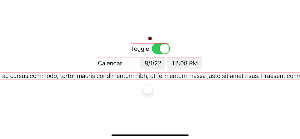
An ideal size from various views.
fixedSize modifier
We learn from last section that fixedSize() force ideal width and height on a view.
But we have another option, fixedSize(horizontal: Bool, vertical: Bool), which can force ideal size on one axis.
In other words, you can have
I think it is easiest to visualize this with a text view.
Let's see how fixedSize() works on a text view again.
// 1
Text("Curabitur blandit tempus porttitor.\nFusce dapibus, tellus ac cursus commodo.\nTortor mauris condimentum nibh.\nUt fermentum massa justo sit amet risus.\nPraesent commodo cursus magna.\nVel scelerisque nisl consectetur et.")
    // equivalent to .fixedSize()
    .fixedSize(horizontal: true, vertical: true)
    .border(.blue)
    .frame(width: 200, height: 200)
    .border(.pink)
1 This time, I use newline characters (\n) to make the text expand in both directions.
.fixedSize(horizontal: true, vertical: true) and .fixedSize() make text grow in both axis to fit the content.
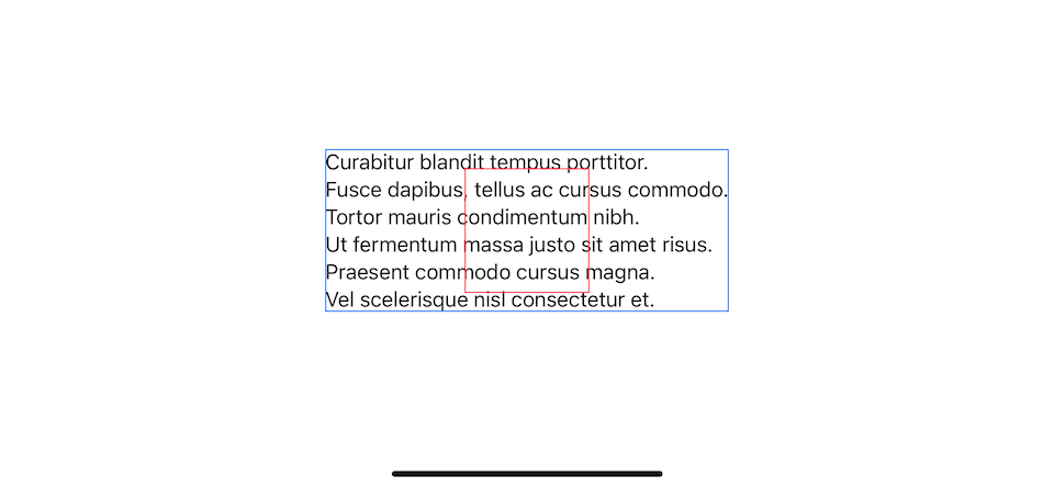
.fixedSize(horizontal: true, vertical: true)
ideal width
To force a view to have an ideal width, we set horizontal to true, .fixedSize(horizontal: true, vertical: false).
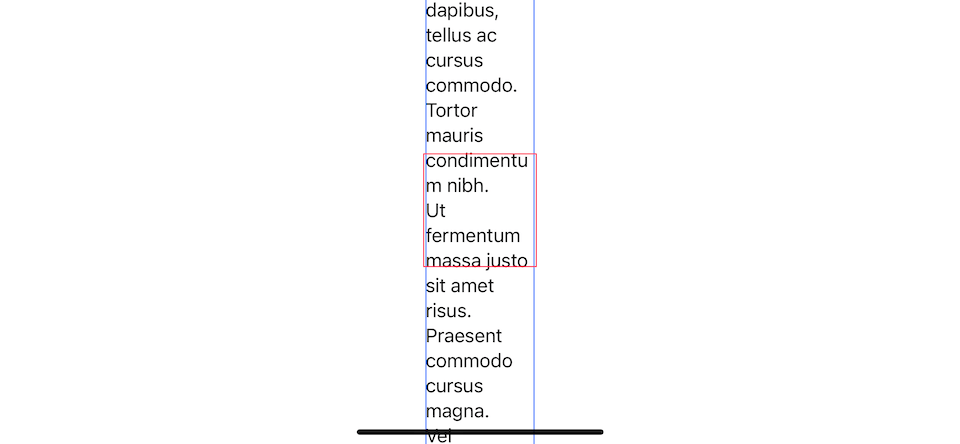
Text("Curabitur blandit tempus porttitor.\nFusce dapibus, tellus ac cursus commodo.\nTortor mauris condimentum nibh.\nUt fermentum massa justo sit amet risus.\nPraesent commodo cursus magna.\nVel scelerisque nisl consectetur et.")
    .fixedSize(horizontal: true, vertical: false)
    .border(.blue)
    .frame(width: 200, height: 200)
    .border(.pink)
This will make a text view occupy its ideal width, which is the largest width of the text. In this case it is the second sentence, "Fusce dapibus, tellus ac cursus commodo."
For the height, it will respect the parent and not go beyond that area.
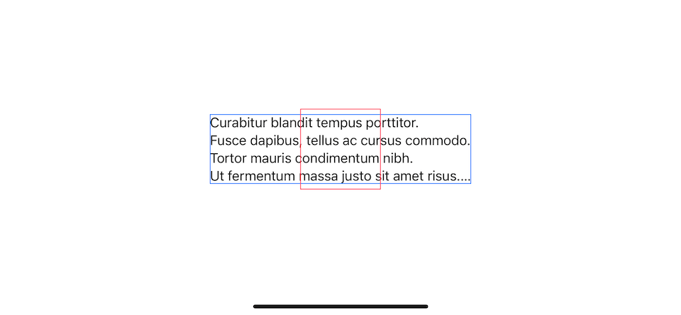
.fixedSize(horizontal: true, vertical: false)
ideal height
To force a view to have an ideal height, we set vertical to true, .fixedSize(horizontal: false, vertical: true).
Text("Curabitur blandit tempus porttitor.\nFusce dapibus, tellus ac cursus commodo.\nTortor mauris condimentum nibh.\nUt fermentum massa justo sit amet risus.\nPraesent commodo cursus magna.\nVel scelerisque nisl consectetur et.")
    .fixedSize(horizontal: false, vertical: true)
    .border(.blue)
    .frame(width: 200, height: 200)
    .border(.pink)
Width is constrained by its parent, but the height can grow indefinitely to fit its content.
.fixedSize(horizontal: false, vertical: true)
You can easily support sarunw.com by checking out this sponsor.
Sponsor sarunw.com and reach thousands of iOS developers.
Why do we need fixedSize modifier
Most of the time, .fixedSize() will yield the result you might not want, as you can see in the What is ideal size section.
The place where I find people use the most is in container view, e.g., VStack and HStack. When using .fixedSize() on a container view like VStack, it will ask for the ideal size from its children and use that to calculate its size.
We can use this technique to make all children match each other size.
Let's say we have three buttons with different widths.
VStack {
    Button {

} label: {
        Text("Log in")
            .bold()
            .foregroundColor(.white)
            .padding()
            .background(.pink, in: Capsule())
    }
    Button {

} label: {
        Text("Register")
            .bold()
            .foregroundColor(.white)
            .padding()
            .background(.pink, in: Capsule())
    }
    Button {

} label: {
        Text("Continue as a Guest")
            .bold()
            .foregroundColor(.white)
            .padding()
            .background(.pink, in: Capsule())
    }
}
Each button has a different width based on its content.
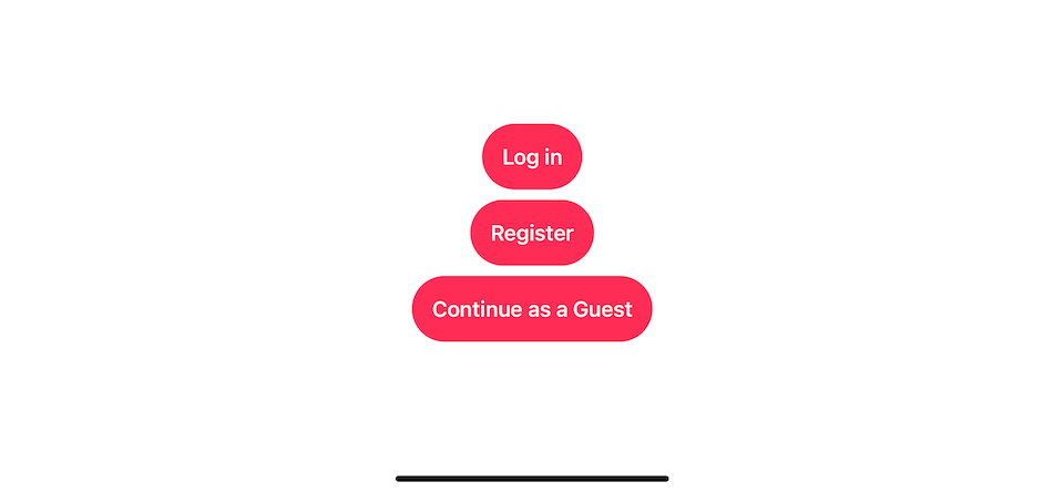
Each button has a different width based on its content.
To make each button grow horizontally to match the largest button, you might apply .frame(maxWidth: .infinity) on each button.
But that doesn't work, .frame(maxWidth: .infinity) will make the buttons grow to match available space, which is device width.
VStack {
    Button {

} label: {
        Text("Log in")
            .bold()
            .foregroundColor(.white)
            .frame(maxWidth: .infinity)
            .padding()
            .background(.pink, in: Capsule())
    }

Button {

} label: {
        Text("Register")
            .bold()
            .foregroundColor(.white)
            .frame(maxWidth: .infinity)
            .padding()
            .background(.pink, in: Capsule())
    }

Button {

} label: {
        Text("Continue as a Guest")
            .bold()
            .foregroundColor(.white)
            .frame(maxWidth: .infinity)
            .padding()
            .background(.pink, in: Capsule())
    }
}
Using .frame(maxWidth: .infinity) will make the buttons grow to match the device width.
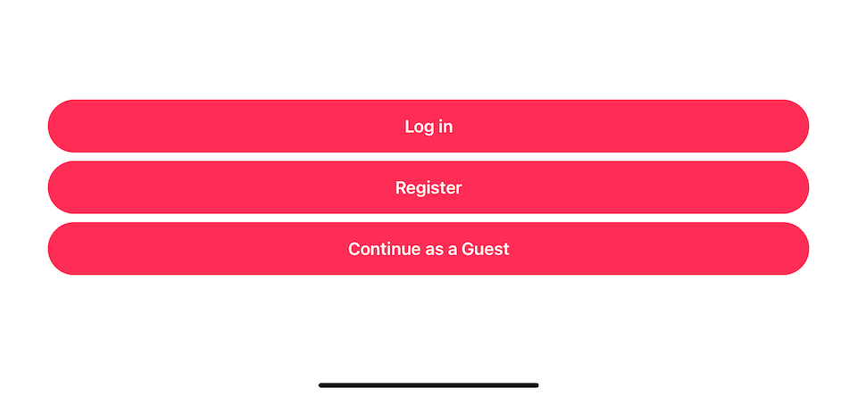
Using .frame(maxWidth: .infinity) will make the buttons grow to match the device width.
This is where .fixedSize() helps. Apply .fixedSize() on VStack will constrain its size large enough to hold the ideal sizes of each button.
VStack {
    Button {

} label: {
        Text("Log in")
            .bold()
            .foregroundColor(.white)
            .frame(maxWidth: .infinity)
            .padding()
            .background(.pink, in: Capsule())
    }

Button {

} label: {
        Text("Register")
            .bold()
            .foregroundColor(.white)
            .frame(maxWidth: .infinity)
            .padding()
            .background(.pink, in: Capsule())
    }

Button {

} label: {
        Text("Continue as a Guest")
            .bold()
            .foregroundColor(.white)
            .frame(maxWidth: .infinity)
            .padding()
            .background(.pink, in: Capsule())
    }
}
.fixedSize()
Using .fixedSize() on VStack will constrain its size large enough to hold the ideal sizes of each button, which is equal to the last button.
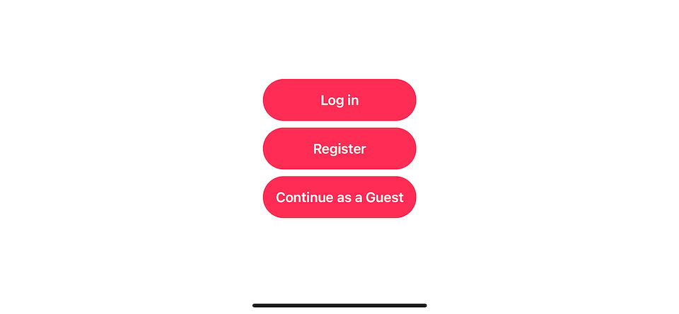
.fixedSize() on VStack will constrain its size to be large enough to hold the ideal sizes of each child view.
You may also like
Setting background color in SwiftUI is not as straightforward as UIKit. Let's learn how to do it.
SwiftUIMost complex custom views can be made by composing many basic shapes together. Today we will learn basic operations that we can do with them. It may seem trivial, but knowing these basics will benefit you in the future.
SwiftUIShow and hide transition animation in ZStack can be glitchy. Learn how to fix it with a simple trick.
SwiftUIRead more article about SwiftUI
or see all available topic
Enjoy the read?
If you enjoy this article, you can subscribe to the weekly newsletter.
Every Friday, you'll get a quick recap of all articles and tips posted on this site. No strings attached. Unsubscribe anytime.
Feel free to follow me on Twitter and ask your questions related to this post. Thanks for reading and see you next time.
If you enjoy my writing, please check out my Patreon https://www.patreon.com/sarunw and become my supporter. Sharing the article is also greatly appreciated.
How to change a navigation bar color in SwiftUI on iOS 16
A navigation bar is an essential part of iOS apps. It is a part where we usually apply color to match our branding. In iOS 16, we can customize a navigation bar purely in SwiftUI.
Responsive layout in SwiftUI with ViewThatFit
Making SwiftUI views responsive usually involves a lot of GeometryReaders and if-else. In iOS 16, SwiftUI got a new view that makes it easier. Let's learn how to do it.
Recommend
-
54
God Mode — no more RSI NOTE: Emacs 25.1 is required for this package to work well. This is a global minor mode for entering Emacs commands without modifier keys. It's similar to Vim's separation of command mode and insert...
-
83
You might have noticed that all collection processing functions are inline. Have you ever asked yourself why are they defined in this way? Here is, for example, simplified filter function from Kotlin…
-
20
README.md PartialSheet A custom SwiftUI modifier to present a Partial Modal Sheet based on his content size.
-
25
You might saw some examples of fixed size modifier usages while trying to fix the issue with multiline text in SwiftUI . But do you know what exactly fixed size modifier does? How does it work? Today I want to t...
-
3
The magic of redacted modifier in SwiftUI 22 Oct 2020Redacted modifier is the thing that will have a great impact on how iOS apps handle loading states. During WWDC20, Apple showed us the easy way of hiding the data from home-scree...
-
9
Exploring Jetpack Compose: Padding Modifier By hitherejoeIn Android3...
-
12
BottomSheet BottomSheet makes it easy to take advantage of the new UISheetPresentationController in SwiftUI with a simple .bottomSheet modifier on existing views. Requirements iOS 15+ Xcode 13+
-
10
Searchable modifier in SwiftUI: A UISearchController and UISearchBar equivalent 07 Jul 2021 ⋅ 16 min read ⋅ SwiftUI
-
5
The power of accessibilityRepresentation view modifier in SwiftUI 01 Sep 2021The SwiftUI Release 3 has a lot of improvements in the area of accessibility. It provides all the missing APIs like accessibility rotors, but it also give...
-
12
Bottom Sheet in SwiftUI on iOS 16 with presentationDetents modifier 18 Jul 2022 ⋅ 5 min read ⋅
About Joyk
Aggregate valuable and interesting links.
Joyk means Joy of geeK