

Amazon Prime Video
source link: https://uxdesign.cc/accessibility-analysis-why-amazon-prime-video-is-the-worst-streaming-service-cfd95c2ed7cc
Go to the source link to view the article. You can view the picture content, updated content and better typesetting reading experience. If the link is broken, please click the button below to view the snapshot at that time.
Accessibility analysis: why Amazon Prime Video is the worst streaming service
An accessibility review of Netflix, Prime Video, Apple TV+, Disney+, and HBO Max.

The amount of streaming services is already incomprehensible, it’s vaster than the mycelial network from Star Trek: Discovery, and a proper consolidation — although seemingly inevitable — is probably years away.
When we compare and review these streaming services, we tend to do it from a content perspective. Which service has the best movies and series (quality), and which has the largest amount of movies and series (quantity)? And which has the best user experience?
As all of these services mature and the overlap in features and designs grows closer, the gap in accessibility remains quite large. So I set out to compare and review five of the biggest services — Netflix, Amazon Prime Video, Disney+, Apple TV+, and HBO Max — from a web accessibility perspective.
Here are my findings.
Disclaimer: I have only reviewed the web experience of these services, simply because I have a passion for web accessibility in particular and because there are easy-to-use tools available for these kinds of web accessibility audits. A more comprehensive review of all devices would be awesome, but I’m not qualified to do that.
Audio Descriptions
Audio descriptions are “the verbal depiction of key visual elements in media and live productions.” It is meant to provide information on visual content that is considered essential to the comprehension of the program.
The American Council of the Blind’s (ACB) Audio Description Project has a comprehensive database of streaming services providing audio descriptions, and it’s frequently updated. By cross-referencing the ADP database with various sources on how many titles each streaming service has, we can estimate the audio description coverage of each streaming service.
Bear in mind, though, that it’s a lot harder to reach full coverage if a) you have a huge library of titles, and b) the titles are provided by a third party.
Having said that, here’s the list of audio description coverage among the five giants Netflix, HBO Max, Amazon Prime Video, Apple TV+, and Disney+.
1. Apple TV+
Number of titles, according to JustWatch: 128.
Number of audio described titles, according to the ADP: 128.
Audio description coverage: 100%.
2. Disney+
Number of titles, according to Metacritic: 1,100+.
Number of audio described titles, according to the ADP: 976.
Audio description coverage: 88%.
3. HBO Max
Number of titles, according to Metacritic: 3,500+.
Number of audio described titles, according to the ADP: 676.
Audio description coverage: 19%.
4. Prime Video
Number of titles, according to Metacritic: 25,000+.
Number of audio described titles, according to the ADP: 3,615.
Audio description coverage: 14%.
5. Netflix
Number of titles, according to Metacritic: 15,000+.
Number of audio described titles, according to the ADP: 1,968.
Audio description coverage: 13%.
Closed Captions
Closed captions are a text version of the spoken part of a television, movie, or computer presentation.
In the United States and Canada, the terms “subtitles” and “captions” have different meanings.
Subtitles assume the viewer can hear but cannot understand the language or accent, or the speech is not entirely clear, so they transcribe only dialogue and some on-screen text. Captions aim to describe to the deaf and hard of hearing all significant audio content — spoken dialogue and non-speech information such as the identity of speakers and, occasionally, their manner of speaking — along with any significant music or sound effects using words or symbols.
– Wikipedia.
Although most other countries do not distinguish between subtitles and closed captions, I’ve opted to go with the American definition of captions for this review (i.e, describing to the deaf and hard of hearing all significant audio content).
All of the five streaming services in this review have closed captions on all their titles, so it boils down to legibility, and since Jourdain Searles recently did a really good review of the legibility of closed captions in Vulture, I’m going to use that for this particular section.
The legibility of closed captions according to Vulture:
1. Disney+
Legibility: 4.5
”Disney+ flexes its giant budget with an embarrassment of riches: size options, color options, font types, background colors — the whole shebang.”
2. Netflix
Legibility: 4
”Netflix, arguably the most popular streaming service, has the options if you look for them. (…) once you get there, you can change the subtitle font type, color, and size. There’s also the option to add a drop shadow to the text, something that can make it easier to distinguish the subtitle from the rest of the action on the screen.”
3. HBO Max
Legibility: 3.5
”(…) if you want to watch something fancy, you’re going to have to deal with plain white text. But if you want to watch old episodes of Dexter’s Laboratory, you’re good.”
4. Prime Video
Legibility: 3
”Of all the big streamers, Amazon Prime has the least options for subtitle customization. (…) But at least they’re easy to find.”
5. Apple TV+
Legibility: 1
”While Apple TV+ does have an impressive number of language options, it has very limited options for subtitle customization in the player.”
Axe/Wave Audits
Deque Systems’ Axe suite and WebAIM’s Wave suite are accessibility tools used to run automated tests in the browser. Both provide Google extensions (Axe DevTools and WAVE Evaluation Tool respectively) and those are the ones I’ve used. Kudos to
for suggesting combining the two!Here are the results of the automated tests:
1. Netflix
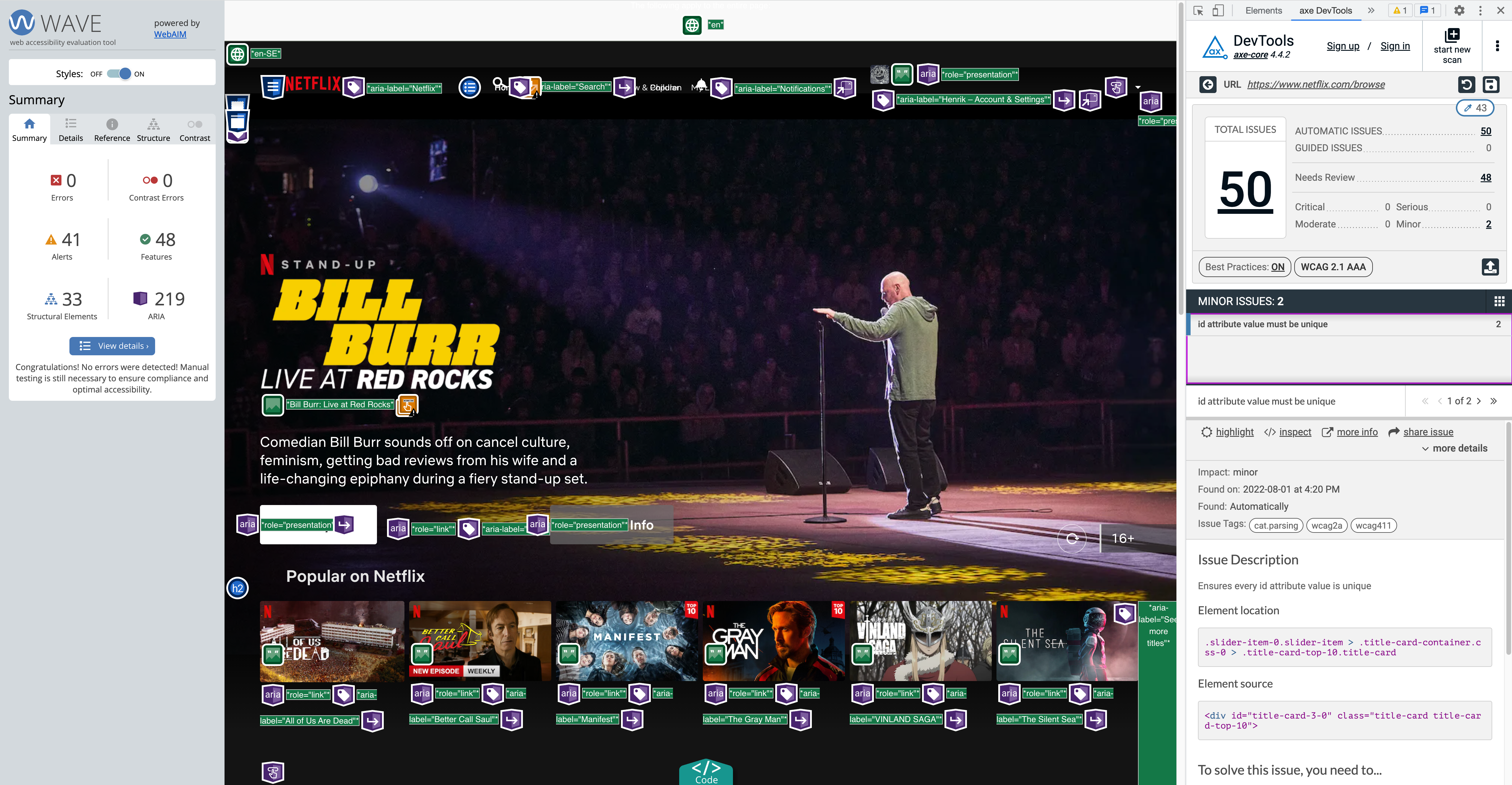
- Wave: 0 errors and 41 alerts.
- DevTools: 0 critical, 0 serious, 0 moderate, 2 minor issues.
Most of the 48 “Needs Review” issues in the DevTools summary have to do with color contrasts, and the reason why they need a manual review is that the “element’s background color could not be determined due to a background gradient.”
The 2 minor issues are that the document has multiple static elements with the same id attribute. They’ve basically put <div id="title-card-3-0"> in multiple places. Here’s why that’s a bad idea:
ID attribute values must be unique
Rename any duplicate ID attributes values. Duplicate IDs are common validation errors that may break the accessibility…
32 of the 41 alerts listed by Wave are labeled as “Possible heading” (text appears to be a heading but is not a heading element), 7 are redundant links, one is a redundant title text (title attribute text is the same as text or alternative text), and one is described as “a <video> or <audio> element is present.” It’s a bit difficult to determine in the UI summary exactly what the last issue derives from, but I believe it has to do with the fact that thumbnail previews don’t have synchronized captioning or transcripts.
To summarize, Netflix is surprisingly good at making its web app accessible, according to the automated Wave and DevTools tests. If I was a product manager at Netflix though, I’d take measures to ensure color contrasts are rock solid, effectively avoiding text on images. White boxes with black text might not be as visually appealing than text on images, but it’s 100% accessible.
2. HBO Max

- Wave: 1 error, 2 alerts.
- DevTools: 1 critical, 1 serious, 63 moderate, 0 minor.
The critical issue listed in the DevTools summary is a missing required ARIA attribute, and the serious issue is nested interactive controls which can cause focus problems for assistive technologies (they should have focusable descendants instead). Most of the moderate issues concerns lack of landmarks but more importantly, there are 16 cases of scrollable regions that don’t have keyboard access. Shame on you HBO! Also, there’s no <h1> element.
The vast amount of “Needs Review” issues is mainly concerning color contrast. The transparent menu items fail miserably at this, but most of the 400+ examples are actually fine thanks to a heavy black overlay in the lower parts of the banners.
The Wave error is an empty heading (the HBO Max logo is an <h1> but it doesn’t contain an actual heading, only an aria-label, an aria-role, and the svg logo). The 3 alerts consist of a lack of landmarks, a redundant link, and a <noscript> element (according to Wave, it can’t be used to provide an accessible version of inaccessible scripted content).
Overall, HBO has made a decent job ensuring an accessible experience for their users.
3. Apple TV+

- Wave: 26 errors, 4 alerts.
- DevTools: 1 critical, 3 serious, 2 moderate, 11 minor issues.
The critical issue listed in the DevTools summary is that images lack alt text, 2 of the 3 serious issues have to do with insufficient color contrast, and the last serious issue is that an ARIA input field doesn’t have an accessible name. One of the moderate issues is that there’s no <h1> element, and the other one is that some page content is not contained by landmarks. 10 of the minor issues are inappropriate uses of ARIA roles and one is multiple static elements with the same id attribute.
15 of the 26 Wave errors are lack of alt texts, 8 are buttons that are empty or has no value text, and 3 are broken ARIA references (aria-labelledby or aria-describedby reference exists, but the target for the reference does not exist). 3 of the 4 alerts are redundant links and 1 is a very small text (inside a hidden element; Wave suggests it’s 10px or less but I wasn’t able to locate it in the CSS).
26 errors in Wave is quite daunting, but it’s still pretty good compared to others.
4. Amazon Prime Video

- Wave: 11 errors, 6 alerts.
- DevTools: 2 critical, 11 serious, 21 moderate, 1 minor issues.
Of the 2 critical issues listed by DevTools, the most devastating one is that zooming and scaling is disabled. This is problematic for people who rely on screen magnifiers to properly see the contents of a web page, because users with partial and/or low vision often choose to enlarge the fonts on their browser to make text on the web easier to read.
The second critical issue is a button element that doesn’t have inner text that is visible to screen readers. 10 of the serious issues have to do with incorrect use of <ul> , <ol>, and <li> elements, and there’s one case of a link without discernible text. 20 of the moderate issues are cases of missing landmarks, and the last one is lack of level-one heading. The minor issue is an inappropriate ARIA role.
The 11 Wave errors are all related to missing alt text, missing/empty form labels, multiple form labels, empty heading, and an empty button. 2 of the alerts are redundant links, 2 are the presence of <noscript> elements, and 2 are the presence <video> or <audio> elements (same as Netflix).
The amount of issues recorded by both tools are quite embarrassing, but the worst parts are the disabled zooming and scaling and incorrect use of list elements. Lack of <h1> is listed as a moderate issue in DevTools, but personally I think it’s a pretty mortifying error.
5. Disney+
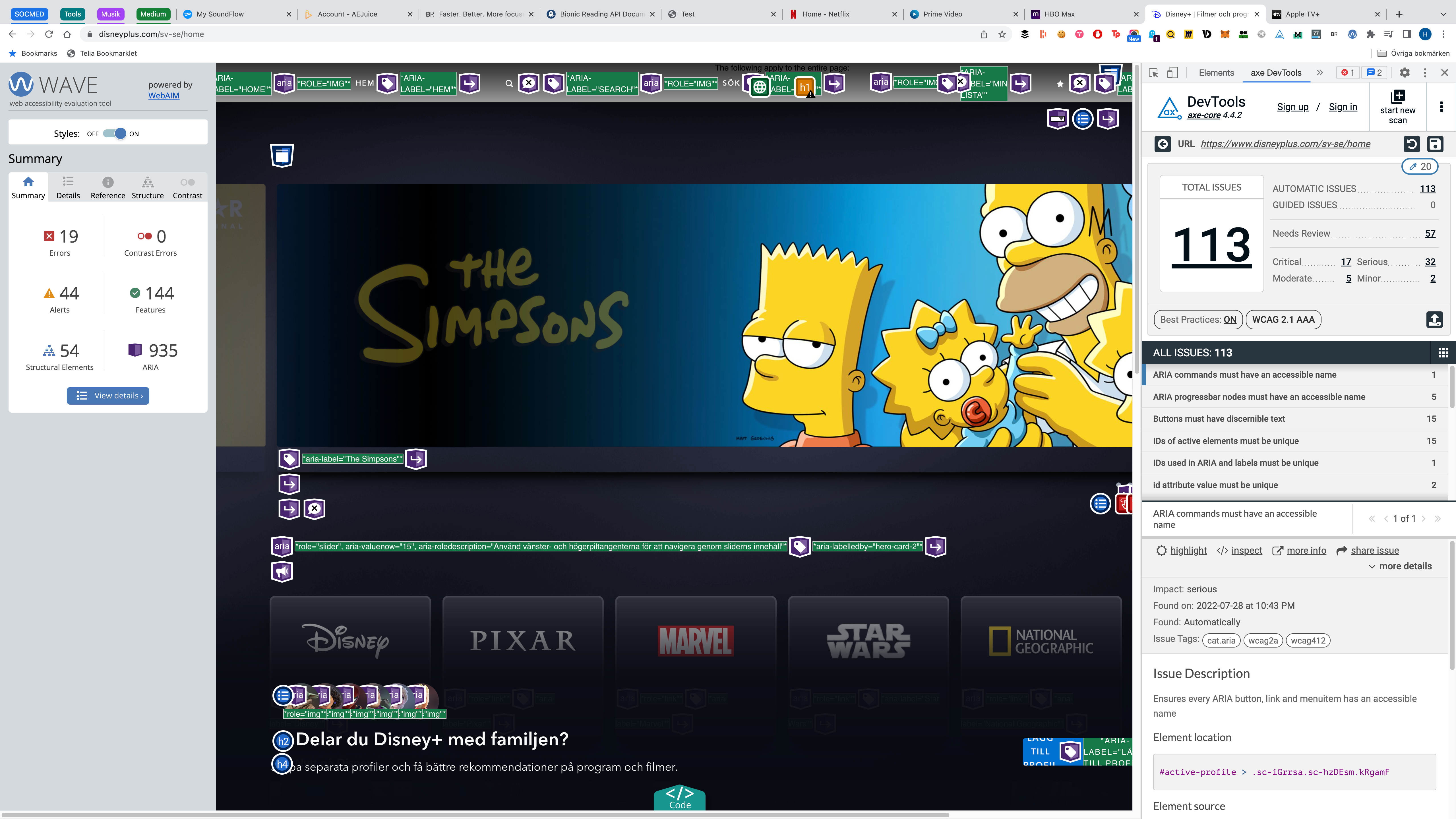
- Wave: 19 errors, 44 alerts.
- DevTools: 17 critical, 32 serious, 5 moderate, 2 minor issues.
We’re looking at a combined 119 issues and errors here. That’s quite staggering, to say the least.
Just like with Prime Video, the most devastating critical issue listed by DevTools is that zooming and scaling is disabled. Stop disabling it for crying out loud! There are also 15 cases of buttons with indiscernible text and one case of elements referenced with ARIA with the same id attribute. The serious issues are as follows:
- ARIA commands must have an accessible name (1).
- ARIA
progressbarnodes must have an accessible name (5). - IDs of active elements must be unique (15).
<li>elements must be contained in a<ul>or<ol>(3).- Interactive controls must not be nested (2).
role='img'elements must have an alternative text (6).
The moderate issues is a lack of level-one heading (what’s up with this apparent fear of <h1 >??) and lack of landmarks, and the minor issues are two cases of id attribute values that aren’t unique.
The 19 Wave errors are 16 cases of empty buttons, 2 cases of empty headings, and an empty form label. 35 of the 44 alerts are nearby images having the same alt text 🙄, a missing level-one heading, two cases of “very small text,” and 6 cases of <video> or <audio> elements being present.
Remember the “Disney+ flexes its giant budget with an embarrassment of riches” summary on the closed captions? Well, it would have been nice if it had flexed a little of that budget with an “embarrassment of accessibility riches” when developing their web app as well. Because right now it’s just an embarrassment of inaccessible junk, unfortunately.
Summary
As you can see, Amazon Prime Video ends up second to last in all three sections, although the audio descriptions section is a bit ambiguous; despite having the biggest amount of audio descriptions (1,647 more than Netflix and literally 3,487 more than Apple TV+), they have an even greater amount of titles lacking audio descriptions.
While Apple TV+ has full coverage, meaning that an Apple TV+ user can experience every single title with audio descriptions, more than 20,000 titles on Prime Video are inaccessible for people relying on audio descriptions.
And although the Prime Video web app is slightly better from a browser accessibility perspective than Disney+, they have the least options for subtitle customization of all the big streaming services while Disney+ flexes “an embarrassment of riches.”
Bear in mind that this isn’t a scientific study — I have only scratched the surface. And yet, I think it’s safe to say that Amazon has a lot of work to do in this area.
If you enjoy reading stories like these and want to support me as a writer, consider becoming a Medium member. It’s only $5 a month — that’s less than a large Salted Caramel Mocha at Starbucks! ☕️ And it gives you unlimited access to stories on Medium. If you sign up using my link, I’ll earn a small commission. 👐
Recommend
About Joyk
Aggregate valuable and interesting links.
Joyk means Joy of geeK