

3 Tools to Document Your React Components Like a Pro
source link: https://blog.bitsrc.io/3-tools-to-document-your-react-components-like-a-pro-21ad336bae22
Go to the source link to view the article. You can view the picture content, updated content and better typesetting reading experience. If the link is broken, please click the button below to view the snapshot at that time.
3 Tools to Document Your React Components Like a Pro
A quick overview of different tools designed for this particular task

Chances are, if you’re a developer you hate documenting your code. I’m not talking about the classic //This function saves the user to the database comment on top of the saveUser function. Instead, I’m talking about writing useful, lengthy and detailed documentation about your work.
We all hate it at some point, because after all, it feels like we’re not producing anything, instead, we’re wasting time on something that no one needs right now.
It’s a common feeling, and it’s wrong.
Documentation is needed, especially for complex systems that will be re-used by others. In this case, we’re talking about UI components, but we could be discussing anything shareable really. If others are going to be using your code, then you very much need to make sure every single thought you had that was used to design and write that code is written down somewhere. That is the only way you’ll have to make sure the user of your library understand how it works (because they understand how — and most importantly, why — you built it that way).
Let’s take a quick look at some tools that will help you lessen the impact of writing that hated documentation and produce something useful to you and others at the same time.
1. Document (& Share) Components with Bit
Bit is an open-source tool (with native integration to Bit.dev’s remote hosting platform) that helps you create and share atomic components. What does this mean? That you can build independent components from scratch or extract sections of your code and share them as independent components on a Bit server (e.g. Bit.dev). This last bit (no pun intended!) is crucial, because it allows you to extract code from an already ongoing project and extend it and version it as if it was a completely independent 3rd party dependency.
On top of that, Bit auto-generates documentation for each component shared on Bit.dev. It parses TypeScript types and enriches them with relevant TSDocs annotations.
If you happen to have a README file in the component’s directory, it will make sure to integrate it as well.
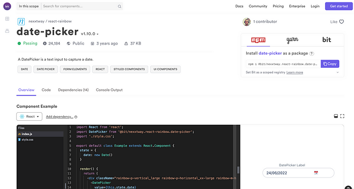
For example, this date-picker component shared on Bit will have the following docs generated (a composition of both a README file and “harvested” properties table):
And below that, you also get to see the detailed code examples and harvested props as mentioned before:
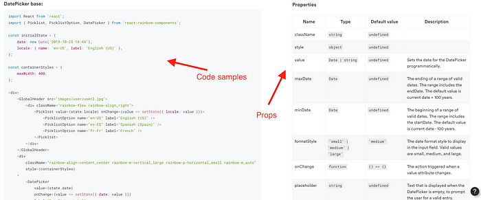
Of course, don’t forget the live widget next to the editable code from the first screenshot which provides a perfect preview of what you’d be integrating into your project. Sometimes that is a much better documentation than hundreds of pages of technical details.
If you’re looking for a way to auto-generate most of the documentation or at least, auto-format it without you having to do “a lot”, then Bit is definitely an option. Especially if you integrate it into your development life-cycle, then you get to take advantage of everything else it provides other than the docs.
2. Storybook
Now, if on the other hand, you’re looking to create a full blow site that allows your users to review all your components then Storybook is definitely an interesting option you might want to check out.
The point here is that you’re not just trying to document and share a single component, but rather, you’re working on a component library (a set of related components that share the same design principles). Then in that case, the integrated approach from Storybook might be just the thing you need.
Look at the following screenshot:
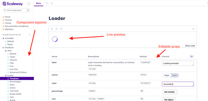
Any user trying to understand how to use your components will be happy to see that they can easily find the component they’re looking for, check it out with a live preview and even mess around with the props to understand how they affect the end result.
Now, don’t get me wrong, this is fantastic, but it’ll require some work. It’s not like Storybook is going to read your code and come up with that wonderful and interactive UI on its own. You have to put on the hours. Lucky for you, it’s not that hard, and it’s incredibly well documented (as expected). Their getting started guide is super clear and easy to follow along, so make sure you check it out before deciding to ditch it because it looks like a lot of work.
Storybook is definitely your go-to if you’re looking to design a complex design system.
3. GitHub Pages + Docsify
Now, hear me out.
Bit will do fantastically if you’re trying to document isolated or just a few components together. Storybook will be your go-to choice if you’re building a massive design system.
But what if you’re in the middle? What if you have a set of components and want to customize how your docs look? What if the auto-generated, everyone looks the same, kinda feel from Bit is not enough?
Then your best choice is Github pages.
Why is that?
Because chances are, if you’re doing this, you already have your code there. Also, Github pages is a free service that provides you, not only with a pre-styled site for you to customize, but it does so completely free. You get docs and hosting, all together for free.
On top of that:
- Publishing new content is as easy as pushing a commit to the repo.
- Writing the docs can be done using Markdown, so you don’t have to worry about HTML, like, at all.
- You can, if you want to, customize the domain name for free (you do have to pay for the domain name, but Github pages won’t charge you for adding the custom domain like other services normally do).
Suppose on top of that, you add something like Docsify which allows you to create simple and powerful documentation sites. In that case, you have a perfect combo ready to rock!
One of the main features that I love about Docsify is that it will include a powerful full-text search into your static site. I mean, c’mon, who doesn’t want that for their documentation?!
The downside to this approach, is that you have to write the docs yourself. There is no auto-generated draft you can use to jump-start the process. That might be a problem if you don’t like writing docs, but then again, the best pieces of documentation are usually the ones that are manually created.
What kind of documentation do you like for your projects? Auto-generated docs coming out of your code comments? Full detailed and interactive documentation that shows exactly how it can be used? Or perhaps custom pages with the text you feel makes sense in each situation?
Are you using other tools for this? Share them in the comments!
Bit: Build Better UI Component Libraries
Say hey to Bit. It’s the #1 tool for component-driven app development.
With Bit, you can create any part of your app as a “component” that’s composable and reusable. You and your team can share a toolbox of components to build more apps faster and consistently together.
- Create and compose “app building blocks”: UI elements, full features, pages, applications, serverless, or micro-services. With any JS stack.
- Easily share, and reuse components as a team.
- Quickly update components across projects.
- Make hard things simple: Monorepos, design systems & micro-frontends.
Recommend
About Joyk
Aggregate valuable and interesting links.
Joyk means Joy of geeK