

Quentin Tarantino Fonts: Exploring the Mastermind
source link: https://thedesignest.net/quentin-tarantino-movie-fonts/?ref=sidebar
Go to the source link to view the article. You can view the picture content, updated content and better typesetting reading experience. If the link is broken, please click the button below to view the snapshot at that time.

Quentin Tarantino Fonts: Exploring the Mastermind
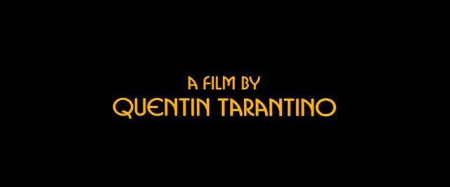
You probably haven’t noticed but Quentin Tarantino managed to shove tons of contrasting movie fonts in opening credits and to get away with it.
Reservoir Dogs Font
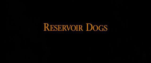
Fonts by Pacific Title & Art Studio
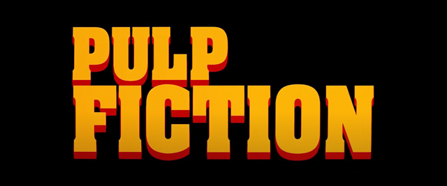
Pulp Fiction Font
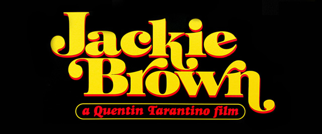
Jackie Brown Font
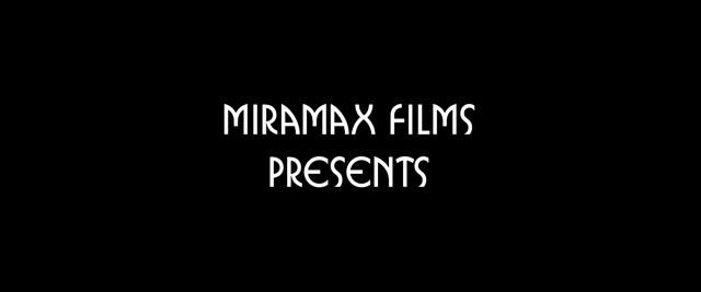
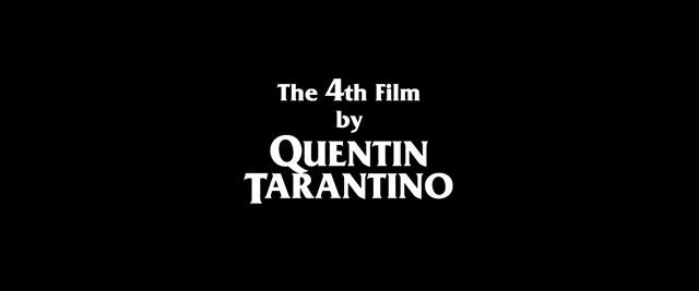
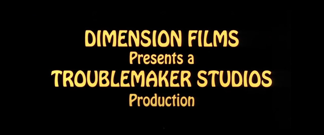
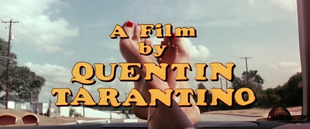
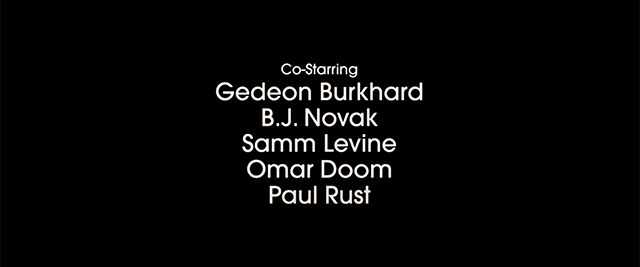
Of course, the opening credits have a rampage of other typefaces, but there’s something in common among so many Tarantino movies. There are three chosen movie fonts, appearing in the majority of films: Busorama, Friz Quadrata, and ITC Bookman. I’ll show them to you a bit later but all you need to know right now is that they’re present in the above-mentioned movies.
Meet Jay Johnson, Everybody!

Jay Johnson
Has designed Main Titles for many of the most memorable films of the recent past. His designs have complimented and enhanced those films.
Kill Bill Font

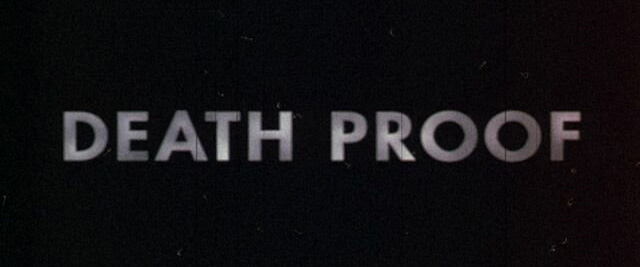
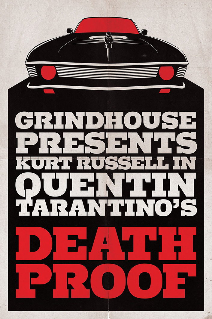
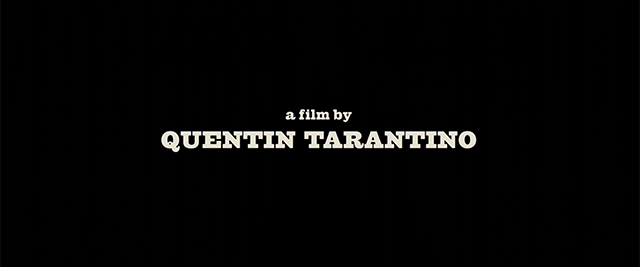
Death Proof Font
Inglourious Basterds Font
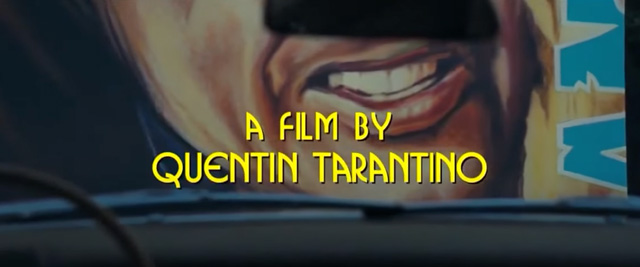
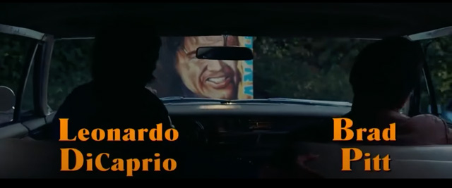
The turn has come to speak about the choking on satire Quentin Tarantino’s movie has brought to the world — “Inglourious Basterds.” What an abundance of fonts you’re exposed to… again! Starting from the intro, opening movie credits let you go through four different fonts in all their glory. Well, on the whole, this is not an unusual format as we already know, but you see how more personalized it is.
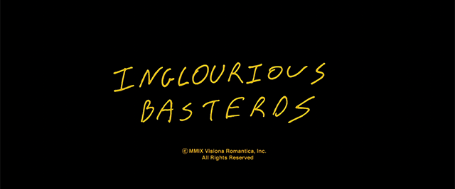
Handwritten font on the Inglourious Basterds script’s cover page, made by Quentin Tarantino himself.
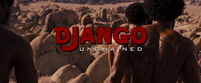
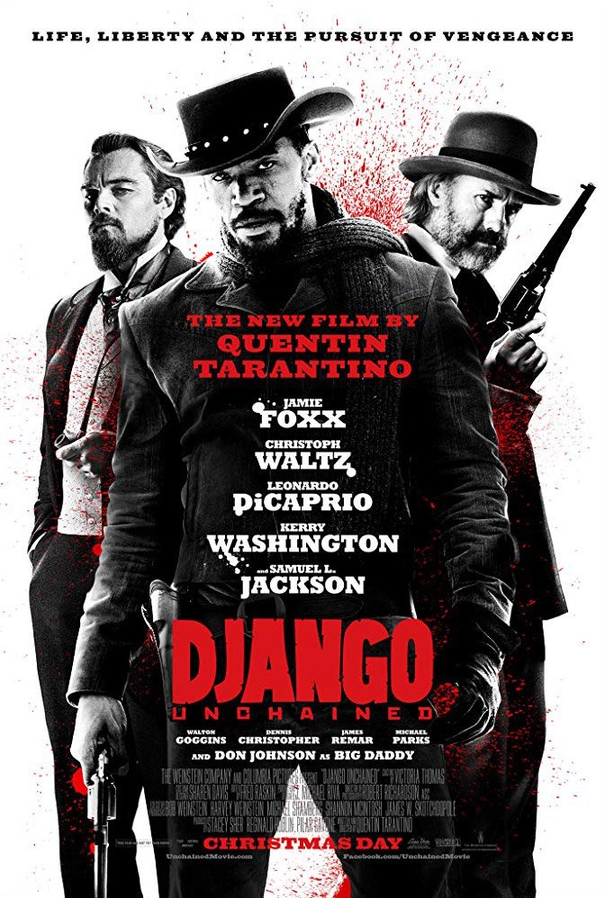
Django Unchained Font
Bank Gothic
cufonfonts.com
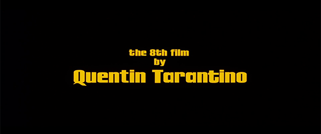
The Hateful Eight Font
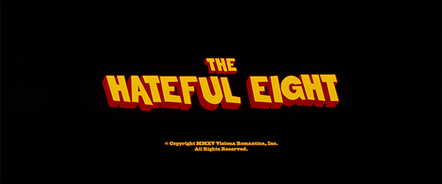
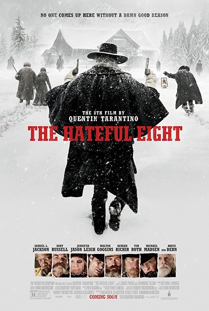
Stymie
dafontfree.net
In 1931, Morris Fuller Benton created the Stymie typeface for the American Type Founders (ATF). Later weights were later added by Sol Hess at Lanston Monotype and Gary Powell at ATF.
One Upon a Time in Hollywood Font
Frequently Asked Questions
Recommend
About Joyk
Aggregate valuable and interesting links.
Joyk means Joy of geeK